Dashboard: KeyValueList component unintuitive design
Expected Behavior
It should be intuitive to use all of the UI components in the Dashboard.
Actual Behavior
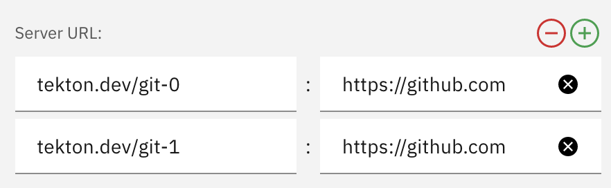
The KeyValueList component, introduced in the Secrets modal, has some unintuitive behavior that should be addressed. Per @AlanGreene's comment:
I'd like to get some design input on the controls for adding/removing items from the list, in particular for removal... IMO having the remove button at the top of the list remove an item from the bottom of the list seems odd. Since this is a pattern we're starting to reuse in multiple places in the UI we should make sure we're not causing confusion.
Additional Info
@kimholmes @mii-w do you have any input? 🙂
 ncskier
All 3 comments
@ncskier
Here is the design for "add annotation" in Secret creation:
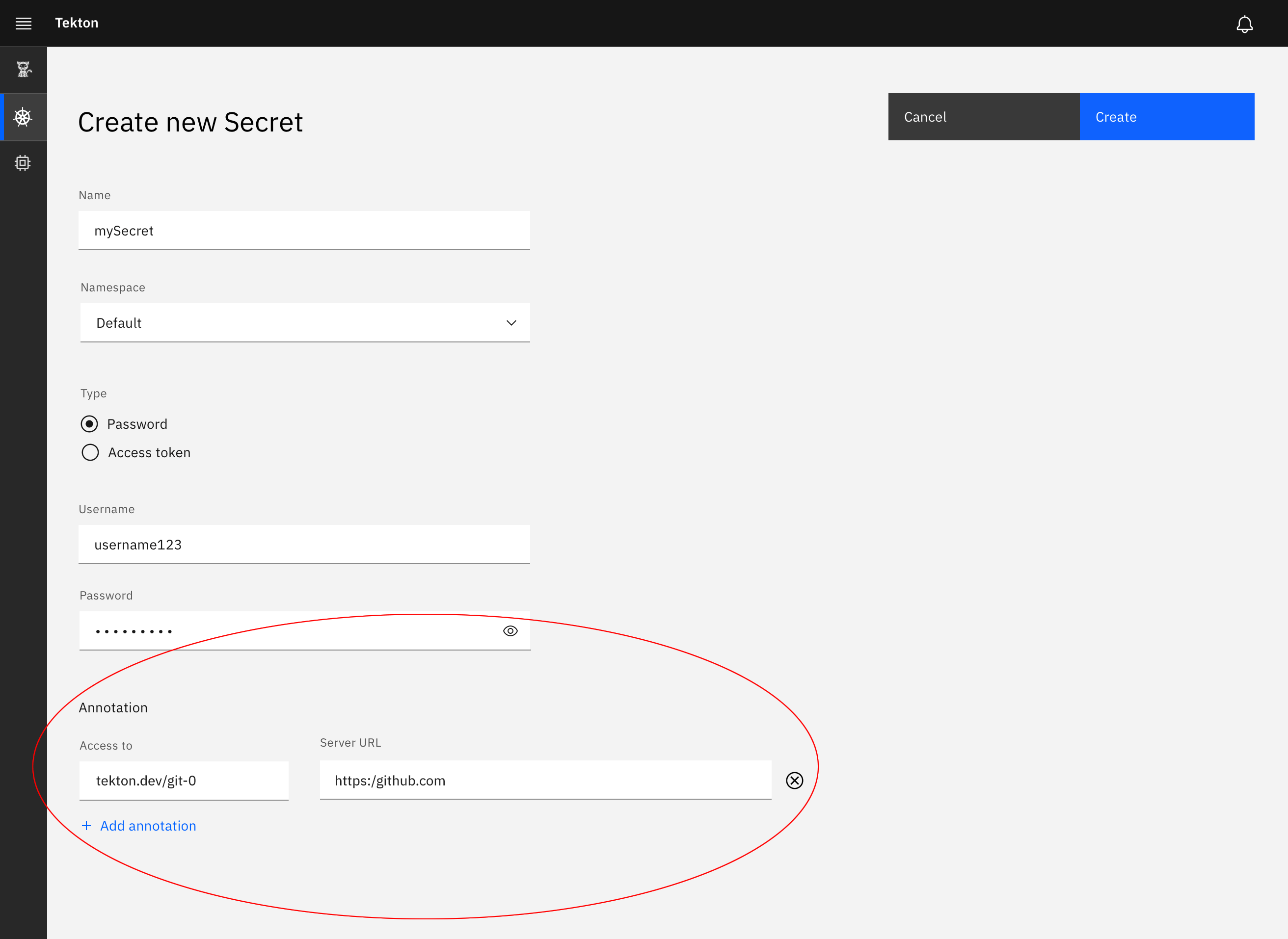
- The user can click on "Add Annotation to add another row below the current row:
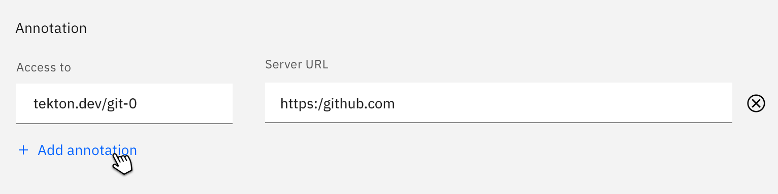
2.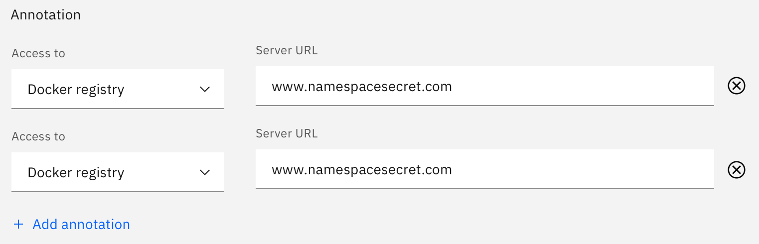
- They can delete rows by clicking the (X) at the end of the row.
- For the hint text. Please see the specs here on the Carbon site:
https://www.carbondesignsystem.com/components/form/code - The user can click in the field to type. If they delete their text, the hint text reappears.
 kimholmes
on 18 Nov 2019
kimholmes
on 18 Nov 2019
Thanks @kimholmes!
ncskier
on 18 Nov 2019
@AlanGreene, looking at figure 2 there, I think we'll need to modify the KeyValueList shared component. There is a Dropdown in this instance, but the CreatePipelineRun modal will have a Text Input Field where the Dropdown is (https://github.com/tektoncd/dashboard/pull/699). What would be the best way to structure this shared component?
I think we could have the shared component handle the "add" and "remove" behavior, and it could use a prop to know what to render in the list (in figure 2, the prop would be the Access to Dropdown & Server URL Text Input Field). However, I don't know if there would be a problem tracking the data & error handling through the component. What do you think?
ncskier
on 19 Nov 2019
Related issues
 sm43
·
4Comments
sm43
·
4Comments
 Fabian-K
·
3Comments
Fabian-K
·
3Comments
 Megan-Wright
·
4Comments
Megan-Wright
·
4Comments
 eddycharly
·
6Comments
eddycharly
·
6Comments
 a-roberts
·
4Comments
a-roberts
·
4Comments
Most helpful comment
@ncskier

Here is the design for "add annotation" in Secret creation:
2.
https://www.carbondesignsystem.com/components/form/code