Darktable: free the top bar in darkroom, replace it with a menu
Right now, the top bar in darkroom contains the same filtering options as the lighttable, which are only useful to fetch images for the filmstrip at the bottom.
As many people, having a 16:9 screen, I try to free a maximum amount of vertical space so the filmstrip is almost always collapsed, as the header panel, and I don't remember once using the filtering options in darkroom (if I need to see the other pictures in the collection, it will be the collection set in lighttable, I don't need to change it in darkroom).
The problem is, when using drawn masks, I never remember which of Ctrl/Shitf/Alt controls opacity, size, orientation or feathering, and these hints appear in my collapsed header. This is awful ergonomy TBH. Also, trying to increase the feathering size of a path with mouse wheel often ends up with dragging it away or increasing its size.
I was using Krita the other day, and they deal with that pretty cleverly:
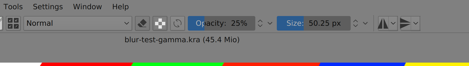
What if we ditch the filtering options in darkroom top bar and replace them with sliders for masks opacity, size, feathering and orientation (for the liquify tool), possibly mask locking options for size or position ?
 aurelienpierre
All 27 comments
I support this. I try to utilize all the darkroom screen space for editing. All except the right panel are collapsed/hidden except for rare occasions.
 ptilopteri
on 13 Dec 2019
ptilopteri
on 13 Dec 2019
This is a very good idea. Left and right thumbs up.
 ArJo45
on 13 Dec 2019
ArJo45
on 13 Dec 2019
I like it. There have been several issues reported lately involving the questionable placement of the opacity information, and gaining vertical screen space is always nice.
 junkyardsparkle
on 13 Dec 2019
junkyardsparkle
on 13 Dec 2019
For my 2 cents, we should rethink a little more tools placements for darkroom top and bottom panels at least. We have several tools more or less useful for darkroom, but they are placed in different parts of the ui, requiring to let many panels open.
For my part, I would like to have a unique (bottom or top, whatever) bar with that inside (not ordered) :
- clipping, etc... buttons
- prefs button
- ?? new masks tool ??
- hint box
For the other tools :
- the info line can be put in the right panel...
- as said, grouping, sorting, etc... are not really useful in darkroom
- styles button : why not adding it in history lib, that would centralize styles actions
 AlicVB
on 14 Dec 2019
AlicVB
on 14 Dec 2019
This would be a bit more complex, remember the hint message can be multi-line, today I think we have at most 3 lines. Would that fit in a simple top or bottom panel? I don't think so... or the text will be very small.
 TurboGit
on 14 Dec 2019
TurboGit
on 14 Dec 2019
good point :(
AlicVB
on 14 Dec 2019
For me a screen like this would be an enhancement:
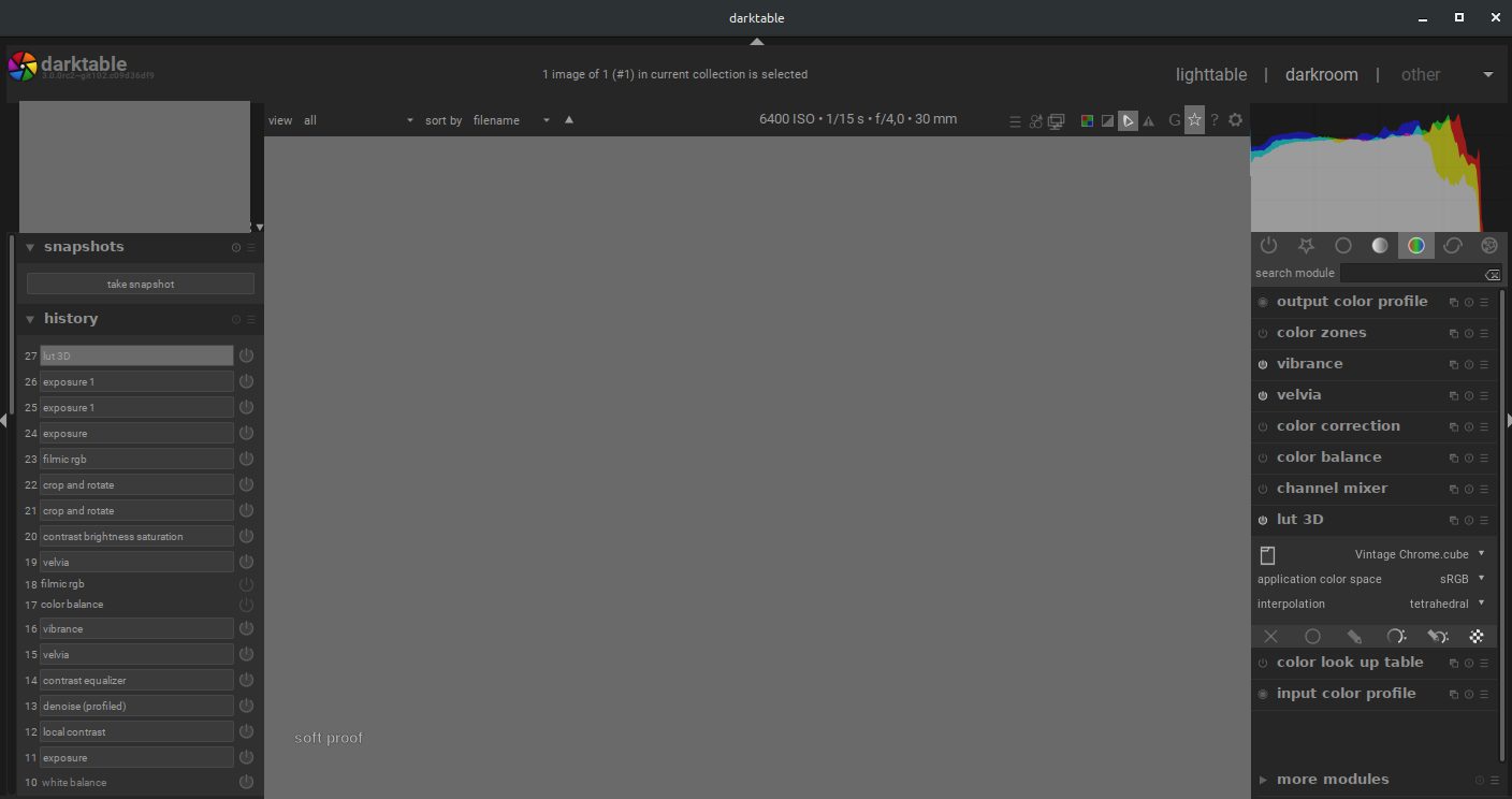
The buttons below of the photo are moved above it. This would save one line for buttons.
Moreover I would like to be able to collapse the title bar (with darktable logo, '1 image ... is selected' and the menu with 'lighttable', 'darkroom' and 'other')
The text '6400ISO ... 30mm' could be replaced by new buttons and menues
 pphotography
on 15 Dec 2019
pphotography
on 15 Dec 2019
For me a screen like this would be an enhancement:
The buttons below of the photo are moved above it. This would save one line for buttons.
I agree we have to save space but not this way. That make the line too charged and quite awful for me. I'm more on to, first, remove the filter options as they are not so useful on darkroom. I never use them on darkroom, but quite often on lighttable.
Moreover I would like to be able to collapse the title bar (with darktable logo, '1 image ... is selected' and the menu with 'lighttable', 'darkroom' and 'other')
This is already possible with : Ctrl+h (you could even choose to show it in a view, not in another).
To @aurelienpierre and others : I agree that we need to improve this. Having a line for the most useful options would be good (in darkroom, the most useful ones are in the bottom panel ; even Group or star icons are not so useful in darkroom view, help and preferences not so often except maybe for new users and a short amount of time). And yes, this include masks infos.
Maybe this could just replace filter options in darkroom view. Or even better some options to let the user choose what to show and where, like this with the images infos line.
 Nilvus
on 18 Dec 2019
Nilvus
on 18 Dec 2019
I fear that moving the display options from bottom bar to upper bar might overcrowd it. I think it is consistent to keep display-related tools at the bottom, keeping in mind that bar can be toggled on/of with Ctrl+Alt+B.
My proposal is rather to add a contextual toolbar in the topbar to control the currently active tool options (opacity, feathering, smoothing, direction of gradient, etc.), rather than the 3 lines of text advertising the keyboard shortcuts in the header panel. Depending which tool is active, only the available options would appear. Maybe the keyboard shortcuts can be reminded there too.
aurelienpierre
on 29 Dec 2019
Maybe the keyboard shortcuts can be reminded there too.
If there are visible controls for opacity, size, etc then tooltips with the shortcuts would probably be enough. I really like the idea of having visible controls for these somewhere. My personal preference would probably be to put them above the module groups (and maybe shrink the histogram a little), but others would probably not like losing vertical space in that panel.
junkyardsparkle
on 29 Dec 2019
Maybe the keyboard shortcuts can be reminded there too.
If there are visible controls for opacity, size, etc then tooltips with the shortcuts would probably be enough. I really like the idea of having visible controls for these _somewhere_. My personal preference would probably be to put them above the module groups (and maybe shrink the histogram a little), but others would probably not like losing vertical space in that panel.
I prefer not losing vertical space on that panel, except if it's possible to view these controls only when we activate and use them, and having used space when not used/activated.
Nilvus
on 30 Dec 2019
This issue did not get any activity in the past 30 days and will be closed in 7 days if no update occurs. Please check if the master branch has fixed it since then.
![github-actions[bot] picture](https://avatars2.githubusercontent.com/in/15368?v=4&s=40) github-actions[bot]
on 30 Jan 2020
github-actions[bot]
on 30 Jan 2020
Agree with this but it's hard to know where the best place to put it is. Really anything that relies on the top and bottom bars in darkroom disrupts my workflow as I usually keep them hidden. Recently with issues around opacity defaults being incorrectly set, I was constantly having to re-show the top bar so I could see the current mask opacity, then hide it again to maximise screen real-estate.
 elstoc
on 2 Feb 2020
elstoc
on 2 Feb 2020
Perhaps a positionable box like has been done with the "image infos" line?
elstoc
on 15 Feb 2020
Ok so I've had a play around with the code and I have a solution for the hinter message. It's not perfect but I think it might work at least in the short term. Essentially it would be to add a new preferences option (like the image infos line) to choose where to display hinter messages. Because the messages can be variable in size, I think centre-top, centre-bottom, left-bottom, right-bottom are the only reasonable places (to avoid all of the modules moving). In order to handle the reduced width of the side-panels I'd have to change the use of it so that line breaks would essentially be optional, limited to 2 lines for top and 1 line for bottom-center, 4 lines otherwise. It's a bit hacky so I thought I'd gauge opinion first.
elstoc
on 14 Mar 2020
A problem IMO is with people who rightfully disable top&bottom bar (hey, it's free real estate for image!) and then have no location for hinter & hints.
Best scenario would be:
- If selected location available - show hint there
- if selected location not available - show hint on 2nd bar
- if no bars for hinter are available - show hint in dismissible overlay (eg something similar to shortctut hints with dynamic shortcuts)
that 3rd option could be disabled via options... and it would be cool if it was dismissible via click on it.
What do you think?
 johnny-bit
on 14 Mar 2020
johnny-bit
on 14 Mar 2020
Lack of top or bottom bar was why I had the bottom of the left and right panels as alternative locations. I did think about overlays but really wanted to avoid anything that might cover up the image and of course a dismissable overlay only works if its presence is not dependent on the mouse hovering over a shape (you'd have to make sure the dismiss button also overlaid the shape, which would cause problems interacting with the shape itself) - then what if you leave and re-enter the shape again or have a different message to display?
My suggestions are also a little bit based on what I thought I could realistically achieve myself and would be a relatively minor code change. Your suggestion is probably achievable but it's beyond my skills at the moment.
elstoc
on 14 Mar 2020
@johnny-bit
A problem IMO is with people who rightfully disable top&bottom bar (hey, it's free real estate for image!) and then have no location for hinter & hints.
Best scenario would be:
1. If selected location available - show hint there

2. if selected location not available - show hint on 2nd bar

3. if no bars for hinter are available - show hint in dismissible overlay (eg something similar to shortctut hints with dynamic shortcuts)
that 3rd option could be disabled via options... and it would be cool if it was dismissible via click on it.
or maybe
ptilopteri
on 14 Mar 2020
or maybe dismissal
? I don't understand?
johnny-bit
on 14 Mar 2020
Think it was meant to say "escape key" dismissal
elstoc
on 14 Mar 2020
yes
ptilopteri
on 14 Mar 2020
If you have 10 different drawn shapes, the hint message will be different for hovering over each type of shape. If I hover over each shape in turn what does that dismissal mean? Don't ever show that hint again? Show it again if I leave the shape and re-enter. I can just see a scenario where you're forever dismissing interfering messages and eventually just turn them off in frustration. Better if the hint is just entirely out of your way in the first place.
elstoc
on 14 Mar 2020
Essentially it would be to add a new preferences option (like the image infos line) to choose where to display hinter messages
Hinter messages still suck. I don't think adding another option/pref here is a sensible thing to do. Having to properly hover the right masking shape, then press a custom set of keys while scrolling is a very bad workflow:
- you don't have visual feedback of the opacity changes (how many % ?)
- you are limited to a ±5 % increment
- you don't have a visual control (slider/scale)
- you need a keyboard and a mouse (touchscreen -> [ ])
Key shortcuts are good if they are shortcuts to something else.
aurelienpierre
on 14 Mar 2020
IMO for an efficient workflow it beats having to select the shape, go to a separate widget to adjust it, then select another shape to repeat. Fine to have a widget to allow that stuff visually but it should be possible with shortcuts too, and there should be some way to remind people what the shortcuts are.
elstoc
on 14 Mar 2020
Is there a widget to do all that with masks? IMO if yes then key shortcuts should be in tooltips for them and we'll have no problem ;)
johnny-bit
on 14 Mar 2020
I think that's what @aurelienpierre was suggesting originally - that those sliders should be in their own module/widget.
elstoc
on 14 Mar 2020
Just as a remark re: moving buttons to the top: the whole dt window is currently limited in min width by the top and bottom toolbar. On small screens people can't ever show them or the window will become bigger than the screen. moving thing into the same toolbar will make that problem worse and make dt unusable on even bigger screens. And now that fonts are much bigger than they used to be the problem isn't less serious, too.
 houz
on 12 Apr 2020
houz
on 12 Apr 2020
Related issues
 AxelG-DE
·
5Comments
AxelG-DE
·
5Comments
 mjut
·
5Comments
pphotography
·
3Comments
mjut
·
5Comments
pphotography
·
3Comments
 lapineige
·
4Comments
lapineige
·
4Comments
 ChristopherRogers1991
·
6Comments
ChristopherRogers1991
·
6Comments
Most helpful comment
Agree with this but it's hard to know where the best place to put it is. Really anything that relies on the top and bottom bars in darkroom disrupts my workflow as I usually keep them hidden. Recently with issues around opacity defaults being incorrectly set, I was constantly having to re-show the top bar so I could see the current mask opacity, then hide it again to maximise screen real-estate.