Darktable: Stars / rating should not be resized (Negatives)
Stars growing too big in the negatives display
I think, the stars and the rating - sitting underneath each photo - are way too big. Especially when I change the size of the negatives to bigger/less photos, the stars are enlarging too.
I am finding this not very helpful, as these huge stars are distracting from the photo itself.
I am trying to explain with the following screenshots I made:
_The size of the stars is okay when looking at a lot of photos:_
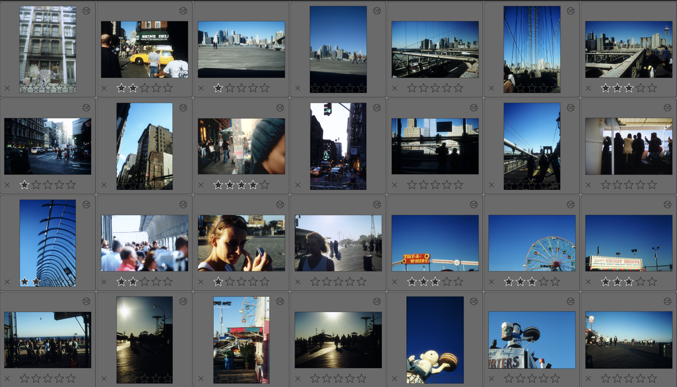
_Even by zooming in just a bit, the stars are growing:_
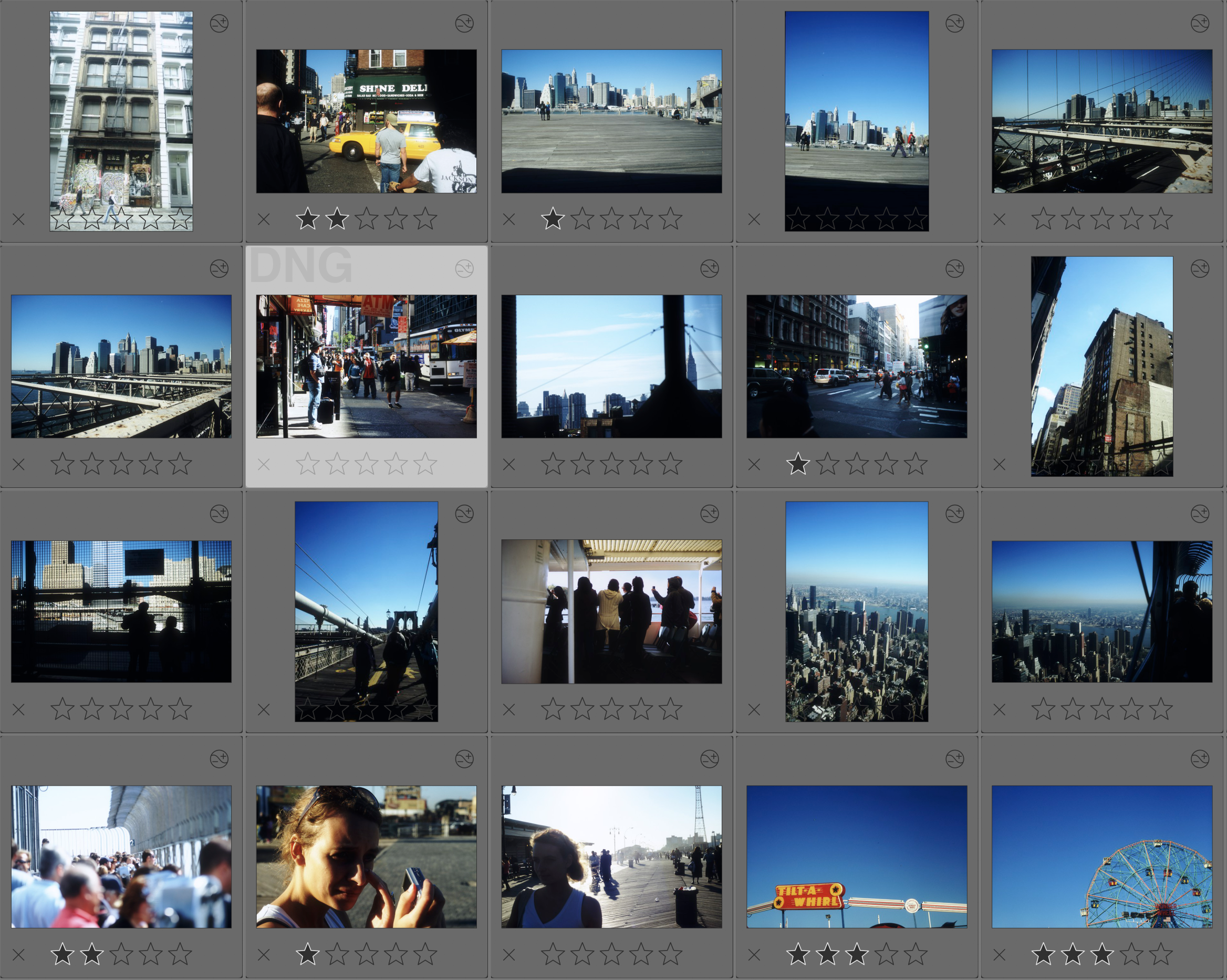
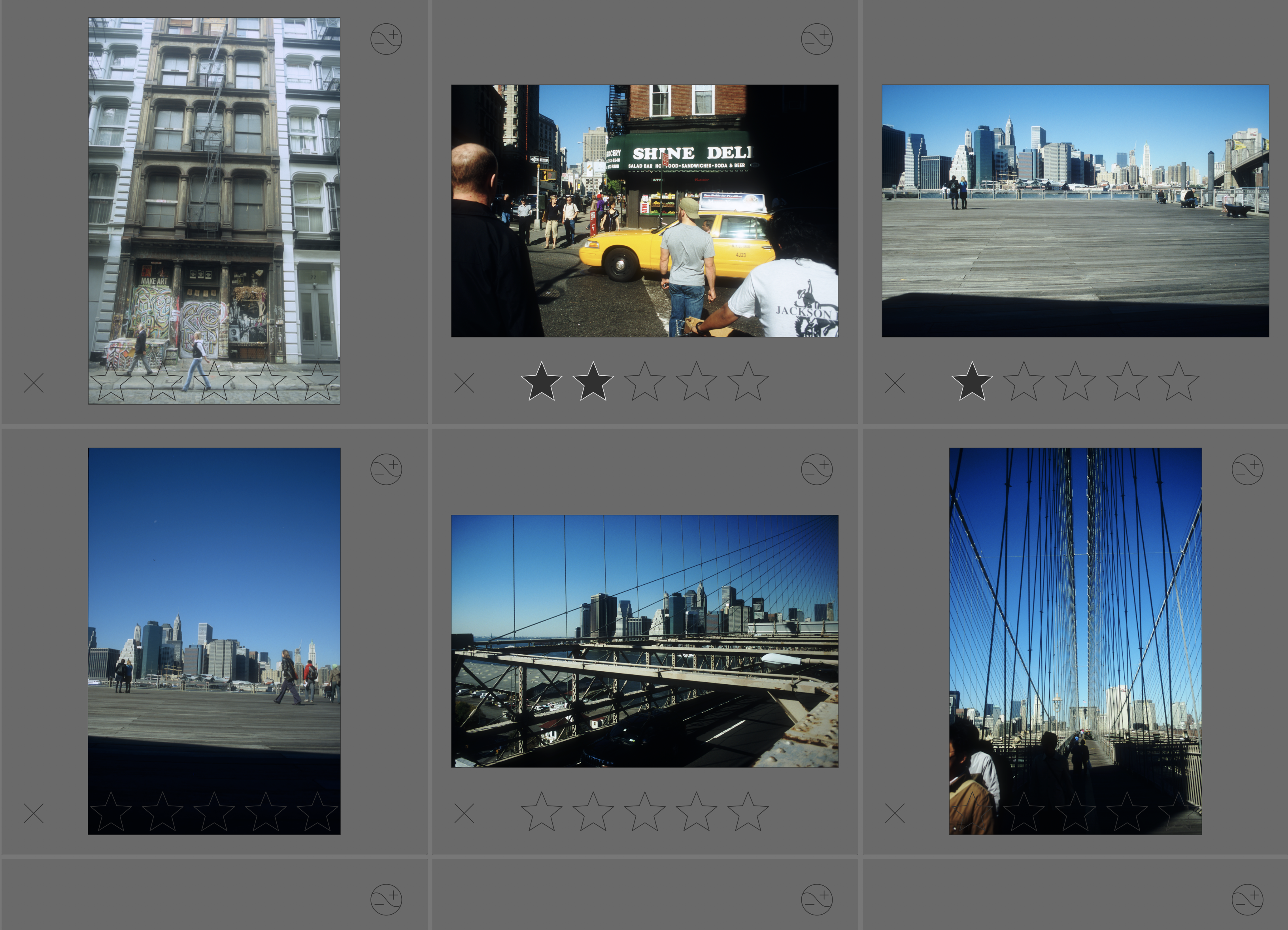
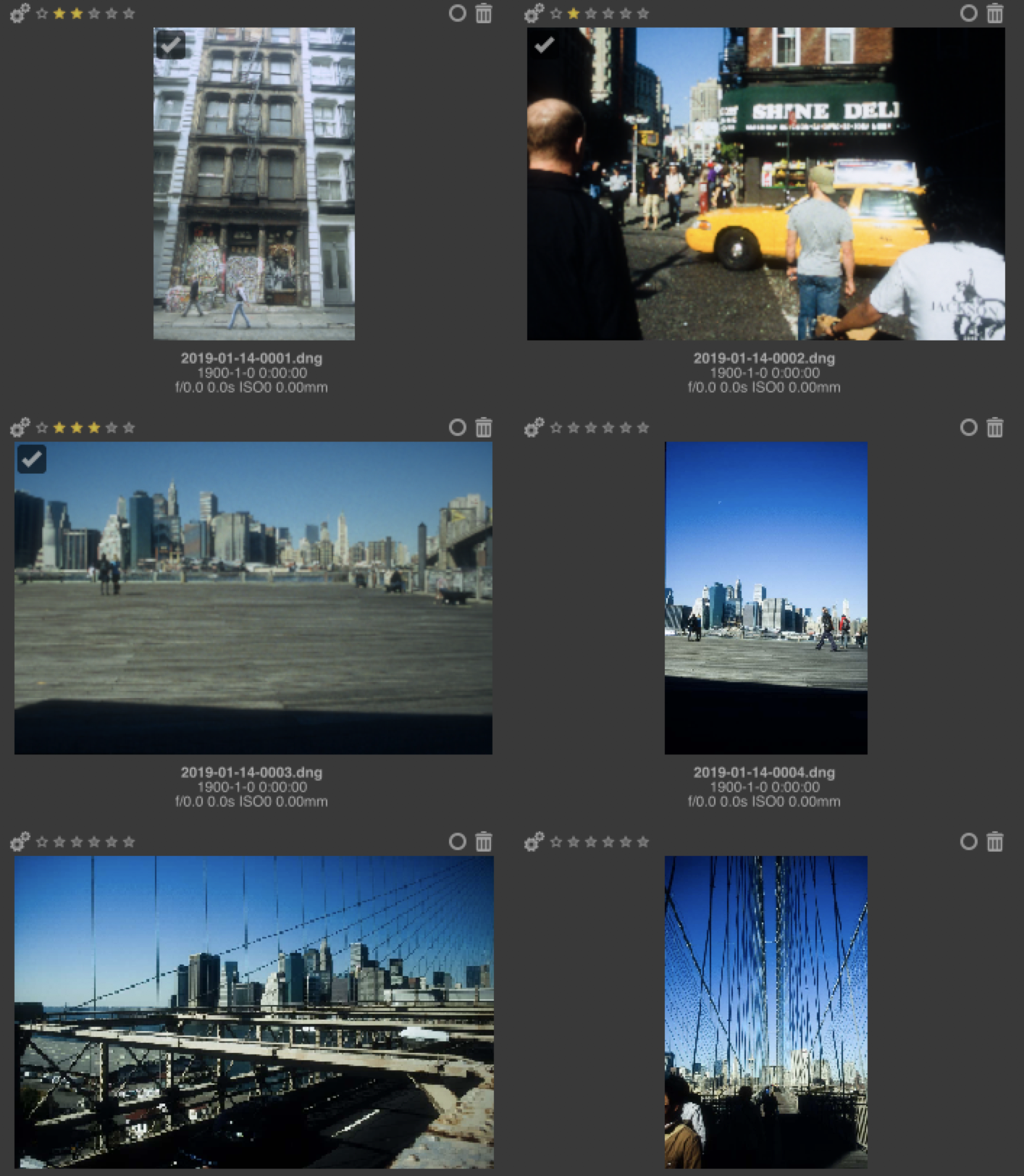
_With enlarging the photos even more, the stars are enlarged way too much:_
Make the stars and colour rating part of the UI
I would love to see a consistent size, no matter what zoom factor in the negatives view.
I don`t know, how to achieve this – I was messing with the css-files (in the themes folder) without finding a solution.
A look at RawTherapee
Just to explain a bit more the idea, see following screenshots taken from RawTherapee.
(Don't get me wrong, I like the Darktable view better. I just think, RawTherapee handles the zoom better..)
_When resizing the images, stars are not being resized and still looking neat:_
This is no bug
Of course – but I think, this would be an overall improvement of the look and UI of Darktable. Unfortunately, I am no developer and I have no idea where to change this.
I tried to change the css-files in the themes. But that does not do the trick...
 mjut
mjut
All 5 comments
The stars are drawn as Cairo objects, so the CSS won't change anything.
I have redone the styling for the darkroom, but I didn't got time for the lighttable yet. It definitely needs some clean-up and redesign too (at least to get rid of the borders and shadows).
 aurelienpierre
on 25 Sep 2019
aurelienpierre
on 25 Sep 2019
Thanks for the information. I am looking forward to the new version of darktable.
I am interested in taking a look at it myself. Is this the "Cairo" you are talking about: https://en.wikipedia.org/wiki/Cairo_(graphics) ?
As I am a frontend developer, this is something I've never worked width..
mjut
on 25 Sep 2019
Yeah, Cairo is the vector drawing from GTK project.
aurelienpierre
on 25 Sep 2019
The stars are drawn as Cairo objects, so the CSS won't change anything.
I have redone the styling for the darkroom, but I didn't got time for the lighttable yet. It definitely needs some clean-up and redesign too (at least to get rid of the borders and shadows).
As I answer to @mjut on pixl.us for this, that's confirm what I was thinking : not related to CSS. I agree to @mjut : it's clearly one of the last thing on the UI to improve visually. unfortunately, I don't have skills on that and not time to learn them.
 Nilvus
on 25 Sep 2019
Nilvus
on 25 Sep 2019
I'm working on that right now.
aurelienpierre
on 25 Sep 2019
Related issues
 pphotography
·
3Comments
pphotography
·
3Comments
 schwerdf
·
4Comments
schwerdf
·
4Comments
 sboukortt
·
3Comments
sboukortt
·
3Comments
 bapBardas
·
6Comments
bapBardas
·
6Comments
 denever
·
4Comments
denever
·
4Comments
Most helpful comment
I'm working on that right now.