Client: Notifications panel UX changes (add errors + in progress)
This is a proposal for some UX changes that @jounih and I discussed earlier this week.
It follows the discussion in https://github.com/aragon/aragon/issues/63, but this one is about agreeing on a solution to have errors in 0.5.
Concepts
Generally speaking, a dapp has some specific properties compared to traditional apps:
- Actions can succeed or fail without any reliable way to know the result in advance.
- Actions can take an indefinite amount of time to proceed (without any progress feedback).
For these reasons, it would be useful to apply the following principles when possible:
- The UI should not block when a transaction is performed.
- When possible, the UI should immediately reflect the action, before it completes.
- The result of this action (e.g. a new vote created in the list) should be represented as being “in progress”.
- In case of failure, the action result should be represented as being a failure. From this point, it should be possible to open the notifications panel to retry (see the changes to the notifications panel below), and / or to discard it.
- In case of success, the action result appears normally (e.g. it becomes a normal vote row, and the voting buttons become available).
- It should be possible to retry a failed transaction.
Notifications panel
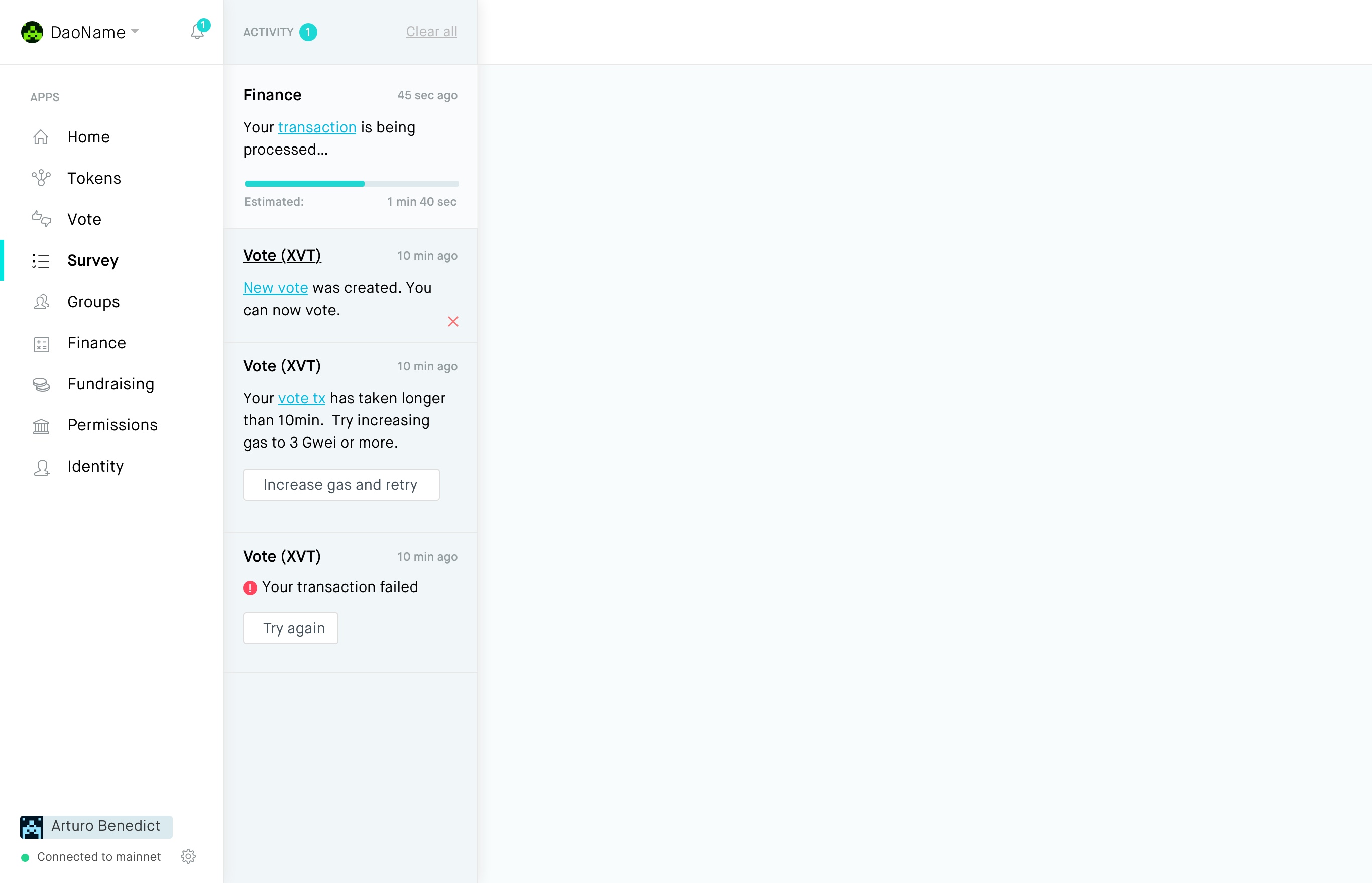
- The panel should contain three types of items: notification (which could be a simple message or a transaction success), error, and in progress.
- Notifications and errors have an unread status, which clears when the panel is opened (ideally by checking if the item is in the visible area of the scroll view).
- The button to open the panel can display three types of badges, only one at a time: notification, error, and progress. The priority is the following:
- If there are any unread error items, display the error badge (e.g. red)
- Otherwise, if there are any in progress items, display the progress badge (e.g. animated blue)
- Otherwise, if there are any unread items, display the notifications badge (e.g. green)
- The badge number corresponds to the represented item type. For example, if there are 3 unread errors and 2 unread notifications, it should display 3, not 5.
- Error items should have a retry button, so that the gas price can be adjusted.
- In progress items are always at the top, except if a progress item above it transforms into a notification / error while the panel is opened. In that case, the reordering is done when the panel is closed.
- In progress items can not be cleared.
- It should be possible to delete items individually.
- Items could have an expanded mode, with more information / actions attached to them.
@izqui @bingen @sohkai @luisivan @onbjerg thoughts?
 bpierre
All 10 comments
Thanks @bpierre. Just wanted to add a bit of background on this - one of the UX issues with blockchain generally is that it takes some time for on-chain operations, and often there is no clear feedback for the user in the UI what is going on, how long it will take, what the user can do in the meanwhile etc.
Having updates of on-chain events (progress, easy retry if the tx failed etc) shown in the notifications panel will alleviate that problem.
And since the transactions can sometimes take a long time, having them happen in the background - and not blocking the UI - is also a useful UX improvement, so the user can keep using the app. (Obviously reflecting pending changes on the main UI also).
 jounih
on 2 Mar 2018
jounih
on 2 Mar 2018
Wondering about the error case: how do we detect if it failed? Low gas transactions could just be stuck for an extremely long time; should we consider that a failure and have a way to send a new transaction that supersedes the original?
If a transaction failed because it reverted, there's nothing we can do (besides provide bug reports).
 sohkai
on 3 Mar 2018
sohkai
on 3 Mar 2018
Wondering about the error case: how do we detect if it failed? Low gas transactions could just be stuck for an extremely long time; should we consider that a failure and have a way to send a new transaction that supersedes the original?
I don’t think it should be considered a failure because the user can still decide to wait, but we should definitely have, on the progress status, the information that something is taking too long. In that case we could also have a “retry” button (with a better naming, maybe “override” or “cancel & retry”), similar to the one in the error item, so people can override the transaction if they want to.
bpierre
on 3 Mar 2018
@chris-remus had an interesting idea about turning the Home app into a center of transactions related to the user, indicating the progress of each transaction in a more extended way. You could see that you have opened a vote and that if it passes, next step is withdrawing funds etc. I think that makes sense to provide even richer info that doesn't fit into the notifications panel
 luisivan
on 5 Mar 2018
luisivan
on 5 Mar 2018
Going further on errors, what is considered an error then?
sohkai
on 5 Mar 2018
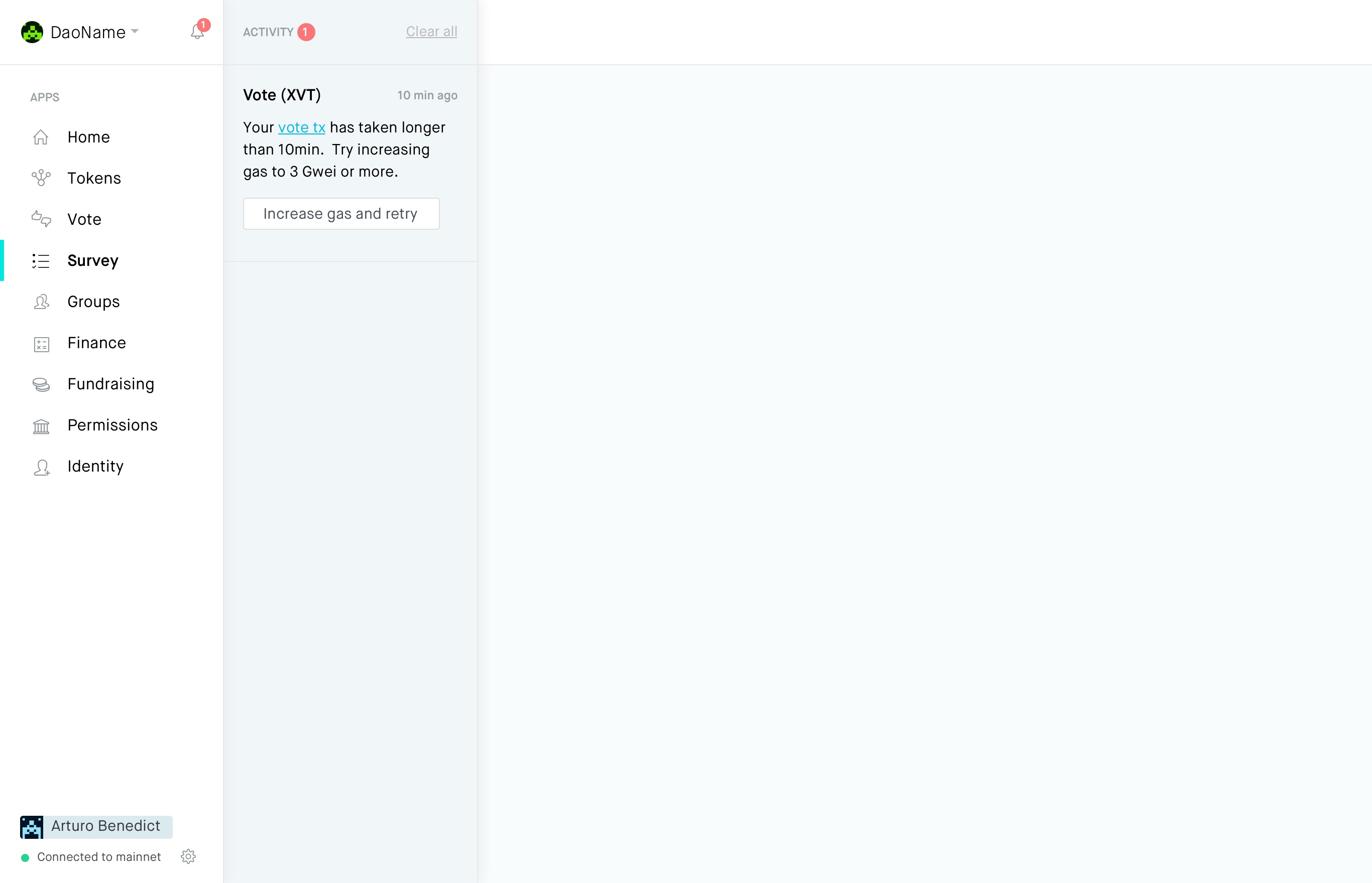
Failed transaction
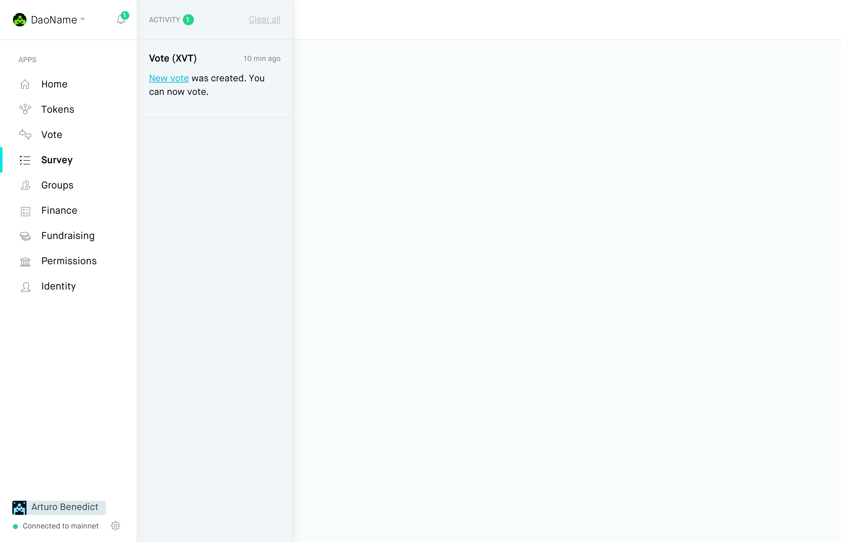
Successful transaction
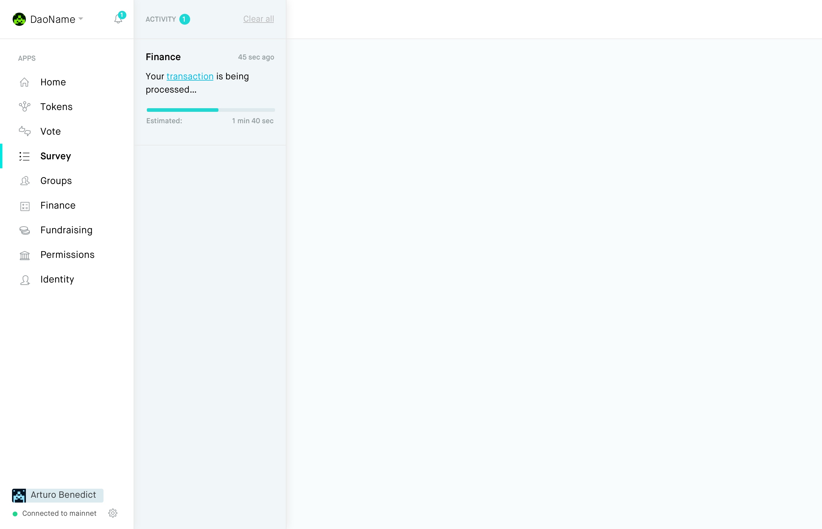
In-progress transaction
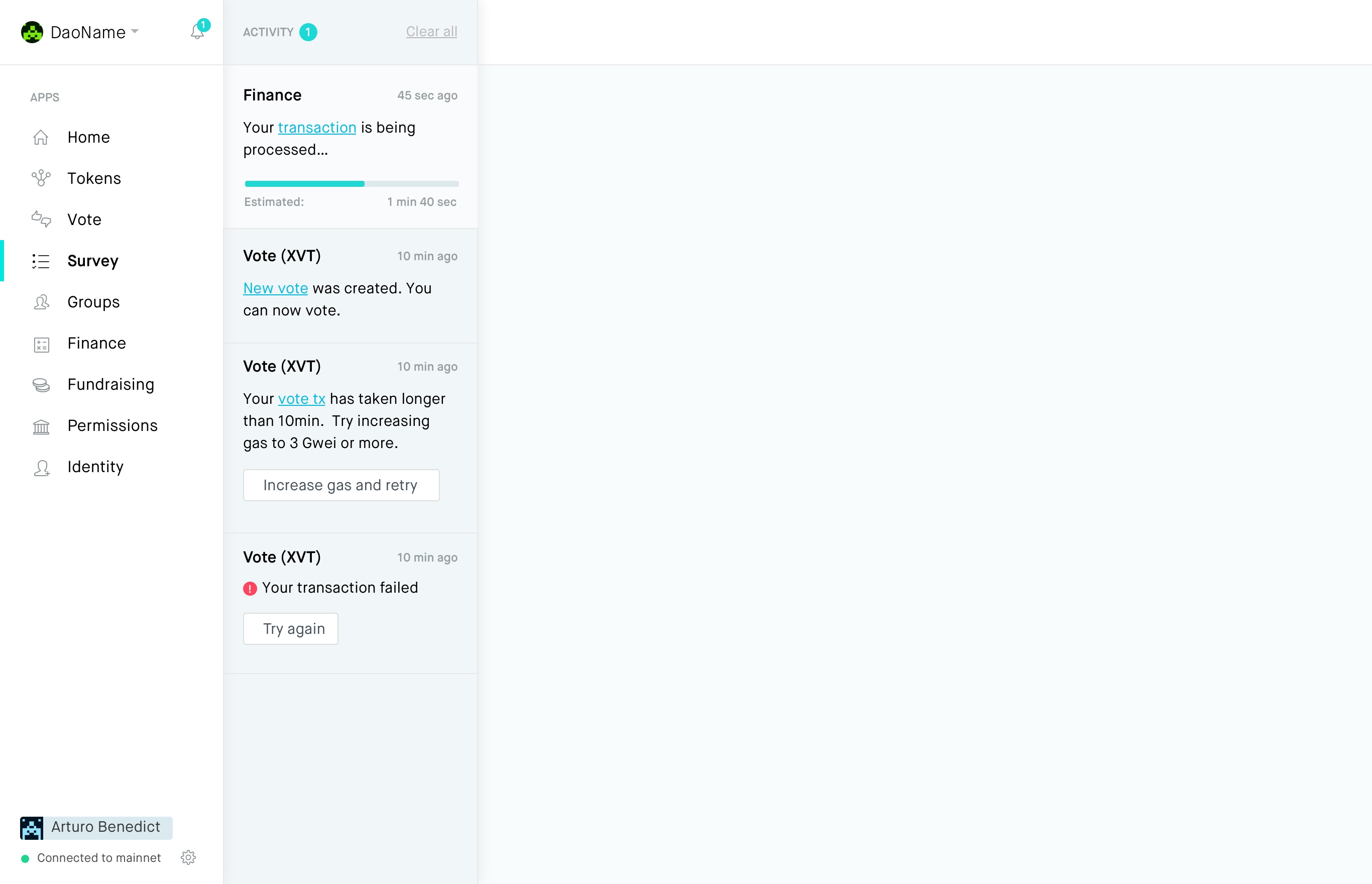
Combined transactions (previously unread with light bg)
Hover states
Hovering on any item shows a cross to remove the item from the list. Hovering on the app name underlines it, tapping/clicking it takes you straight to that app
jounih
on 18 Oct 2018
Is this issue up for grabs?
 0x6431346e
on 3 Nov 2018
0x6431346e
on 3 Nov 2018
@0x6431346e We're not working actively on this yet, and this is definitely a high-value improvement to the app.
The notifications bar is mostly already implemented (but commented out) in aragon/aragon, and we'd need new components for the notification cards themselves and their states. The integration with aragon.js could be the most interesting though; we might need to repurpose or rework the current notifications API (since it was designed for apps to send notifications rather than displaying user transactions).
@jounih @luisivan @lkngtn I'm not sure if we have a complete story for notifications–are we still expecting apps to send notifications from other users' actions (e.g. "Someone else created a vote")?
sohkai
on 6 Nov 2018
@0x6431346e I've removed the Aragon DAC label from this as this is something we will be taking on in the next two quarters :).
sohkai
on 10 Dec 2018
Closed by #674
sohkai
on 26 Apr 2019
Related issues
 Ro5s
·
4Comments
Ro5s
·
4Comments
 john-light
·
3Comments
john-light
·
3Comments
luisivan
·
3Comments
luisivan
·
4Comments
john-light
·
3Comments
john-light
·
3Comments
luisivan
·
3Comments
luisivan
·
4Comments
Most helpful comment
Failed transaction

Successful transaction

In-progress transaction

Combined transactions (previously unread with light bg)

Hover states
Hovering on any item shows a cross to remove the item from the list. Hovering on the app name underlines it, tapping/clicking it takes you straight to that app