Clarity: Color palette doc-missing hex numbers and minor improvements
Color palette documentation - minor bugs and improvements
3 issues to address:
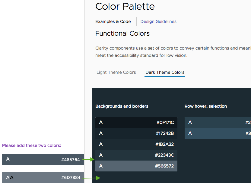
1) In the dark theme palette, 2 colors need to be added to the 'Background and Borders' set:
- #485764
- #6D7884
See attached image for details
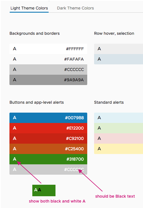
2) In Light theme > Buttons and app-level alerts
The color #CCCCCC is labeled with white text. It should be black text
The green #318700 is labeled with a white "A" on the left side. It should show both a white and a black "A" to denote that both text colors are accessible on it. See attached image for details
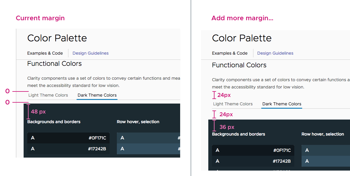
3) Problem: People have commented that they didn't see the tabs under Functional Colors for Light theme and Dark theme. It may become more visible if more space were added above and below the tab. See image for recommended spacing.
IMAGES for issues above:
Issue 1:
Issue 2:
Issue 3:
 lil-kim
All 6 comments
I have a question about issue 3. The 48px margin, that needs to be reduced to 36 px is coming from a global style for all _h6_ elements on the site. Changing it will have effect on many places. For example, the vertical spacing between cards lower on the same list, will also be reduced.
My suggestion is to stay safe and only add the margin preceding the tab labels and leave the ones below them as they currently are. Any attempt to fix the local instance only will lead to complications, or hacky solutions.
Please, advise.
 Jinnie
on 6 Nov 2018
Jinnie
on 6 Nov 2018
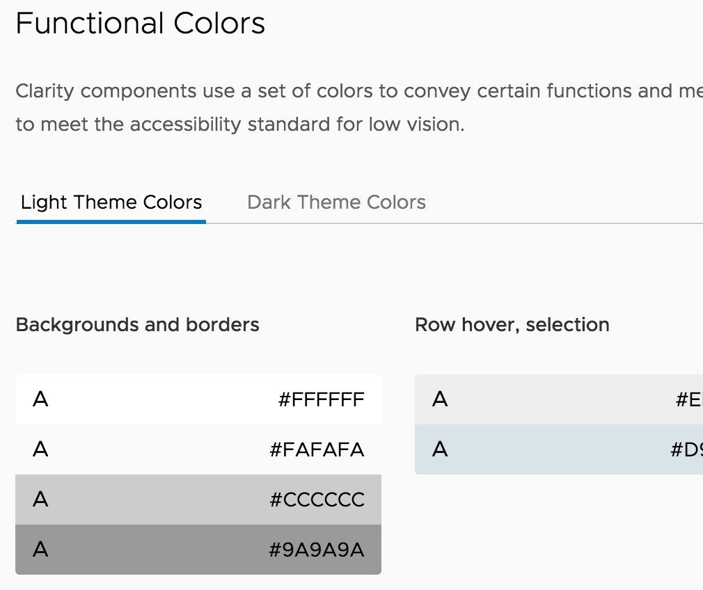
Btw, the current margin (below labels) is not 0, it is 12px. So we'll have the same margin1 + margin2 total value. I can safely change this one to 24px, as requested, but we may get too large whitespace there on the light theme (+12px compared to now).
Light theme example:
Jinnie
on 6 Nov 2018
318700 will be globally substituted to #2F8400, as requested in #2535, and it will remain accessible only against white.
Jinnie
on 7 Nov 2018
Hi @Jinnie
Thanks for explaining the problem with issue #3. Let's go with your suggestion.
lil-kim
on 7 Nov 2018
@Jinnie
The white space in the light theme example above looks good to me. Now there's enough space around the tabs that it doesn't get lost in the page. Thanks!
lil-kim
on 7 Nov 2018
Hi there 👋, this is an automated message. To help Clarity keep track of discussions, we automatically lock closed issues after 14 days. Please look for another open issue or open a new issue with updated details and reference this one as necessary.
![github-actions[bot] picture](https://avatars.githubusercontent.com/in/15368?v=4&s=40) github-actions[bot]
on 18 Sep 2020
github-actions[bot]
on 18 Sep 2020
Related issues
 ChrisKaun
·
3Comments
ChrisKaun
·
3Comments
 BugsyFTW
·
3Comments
BugsyFTW
·
3Comments
 clane
·
3Comments
clane
·
3Comments
 beaker1977
·
3Comments
beaker1977
·
3Comments
 elesueur
·
3Comments
elesueur
·
3Comments
Most helpful comment
318700 will be globally substituted to #2F8400, as requested in #2535, and it will remain accessible only against white.