Clarity: Datagrid - Responsive: Stack Columns on Small Screens
Select one ... (check one with "x")
[ ] bug
[x] feature request
[x] enhancement
Expected behavior
It would be great if the Datagrid component could switch to a "stacked" view if the screen is too narrow to fit all the columns.
Behavior should be similar to the "reflow" mode in the Table component in PrimeNG
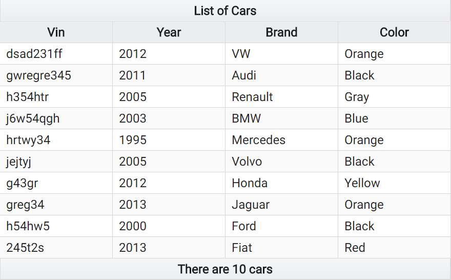
Example A - Column View:
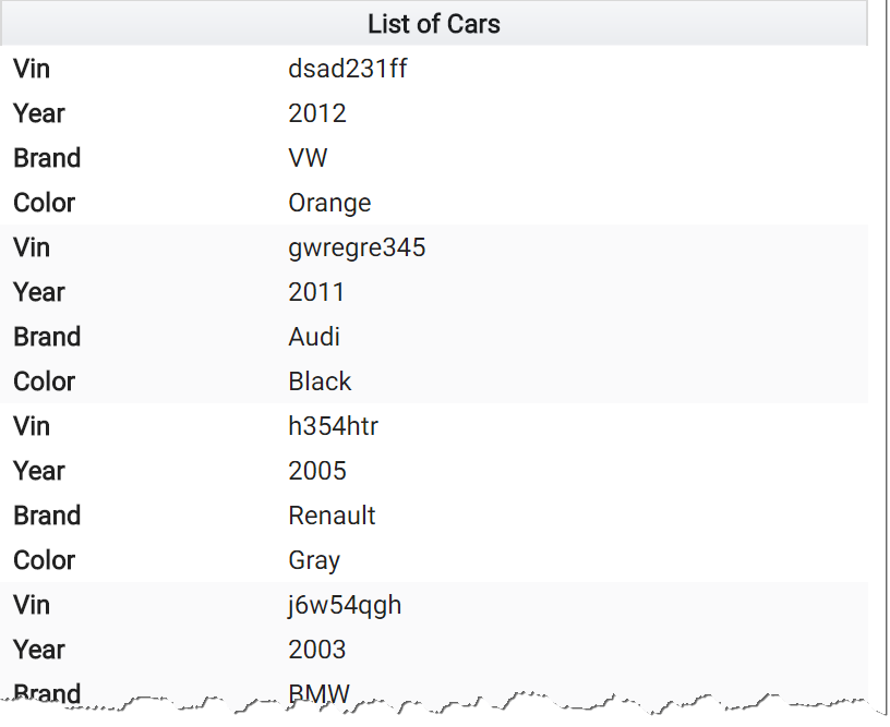
Example B - Stack View:
Actual behavior
Currently, a horizontal scrollbar appears
Environment details
Angular version: 5.2.3
Clarity version: 0.11.4
 aditorium
All 4 comments
I remember having this conversation with @reddolan a while back, and as much as there are many possibilities to make datagrids more usable on smaller screens, the solution employed by PrimeNG is definitely not the one we would go for. @reddolan please correct me if I'm wrong, but if I remember correctly the conclusion was that it was completely counter-productive to have such redundancy of column names, losing half of the screen real estate, when the whole point is that you have less screen real estate.
My personal opinion is that something like this would be incredibly better, and we actually already are using a flexbox-based table: https://hashnode.com/post/really-responsive-tables-using-css3-flexbox-cijzbxd8n00pwvm53sl4l42cx#advanced-example
 youdz
on 13 Feb 2018
youdz
on 13 Feb 2018
Thanks @youdz for your comment. I fully agree, the "Really Responsive Tables using CSS3 Flexbox" example is much better from a UX perspective.
Anyway, as my HTML5/CSS3 skills are quite limited, I was basically hoping that you would implement something like this in the Clarity Datagrid component at some point in time.
aditorium
on 14 Feb 2018
Nice to have, but as an option.
 sdurnov
on 26 Apr 2018
sdurnov
on 26 Apr 2018
We are investigating some options for how to make a more responsive datagrid, and this is a specific suggestion for that larger goal. We have a bigger ticket #3098 for datagrid responsiveness that I'll point to and close this in favor of it.
 gnomeontherun
on 29 Jan 2021
gnomeontherun
on 29 Jan 2021
Related issues
 ChrisKaun
·
3Comments
ChrisKaun
·
3Comments
 gperdomor
·
3Comments
gperdomor
·
3Comments
 ph55
·
3Comments
ph55
·
3Comments
 reddolan
·
3Comments
reddolan
·
3Comments
 amellnik
·
3Comments
amellnik
·
3Comments
Most helpful comment
I remember having this conversation with @reddolan a while back, and as much as there are many possibilities to make datagrids more usable on smaller screens, the solution employed by PrimeNG is definitely not the one we would go for. @reddolan please correct me if I'm wrong, but if I remember correctly the conclusion was that it was completely counter-productive to have such redundancy of column names, losing half of the screen real estate, when the whole point is that you have less screen real estate.
My personal opinion is that something like this would be incredibly better, and we actually already are using a flexbox-based table: https://hashnode.com/post/really-responsive-tables-using-css3-flexbox-cijzbxd8n00pwvm53sl4l42cx#advanced-example