Select one ... (check one with "x")
[ ] bug
[ ] feature request
[x] enhancement
Proposed enhancement
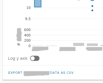
Currently Clarity toggles have a label before the toggle (or no labels). However, there's some cases where a label on the right side might make sense -- for example a left aligned control outside of a form group. This screenshot shows how this looks with the label on the left.

Would labels on the right be consistent with the style guidelines, and if so, could it be enabled?
This currently has a hacky workaround -- leaving a blank label and following the toggle with a span causes the text to be misaligned, but setting the label to aligns the span text correctly (at the cost of a small space in front of the toggle) as shown in the screen shot below.

Reproduction of behavior
(Labels can be seen in documentation)
Environment details
Angular version: 4.x.x
Clarity version: 0.9.x
OS and version: all
Browser: all
All 3 comments
I think this is a reasonable request. We should allow for a CSS class on the .toggle-switch element that places the label to the right of the toggle switch.
I've been looking for an easy project to get started contributing. This looks like it might be a good one. I'll work on this and touch base when I have something.
Hi there 👋, this is an automated message. To help Clarity keep track of discussions, we automatically lock closed issues after 14 days. Please look for another open issue or open a new issue with updated details and reference this one as necessary.
Most helpful comment
I've been looking for an easy project to get started contributing. This looks like it might be a good one. I'll work on this and touch base when I have something.