Clarity: Dropdowns have excessive spacing with large lists
Select one ... (check one with "x")
[ ] bug
[ ] feature request
[ x ] enhancement
Expected behavior
- many entries in the list, constrained by viewport => clipped content that is not accessible
- Other problems include dividers having excessive spacing and the internal padding within
.dropdown-menuclass and its top margin ( causes a slight gap )
Actual behavior
Suggested fix: compensate by restricting height according to a natural container and letting the list overflow with scrolling. This can be done via CSS; however it is better if widgets commonly accept some type of constraint definition to aid when real estate is limited. This aligns better to responsive strategies.
Reproduction of behavior
Environment details
- Angular version: 2.0.X
4.2 - Clarity version:
0.9 OS and version:
Browser: [all ]
 mattmutt
All 8 comments
I think putting a maximum height by default on Dropdown is too problematic though.
But what we can do is let you, the consumer, set a max height to any dropdown in CSS depending on your own constraints, and we would make sure that the styles can handle it and that the dropdown menu would scroll. I think that would be the most flexible solution.
 youdz
on 10 Aug 2017
youdz
on 10 Aug 2017
Per earlier discussion with @mattmutt
This issue covers a few suggested enhancements/changes to dropdowns...
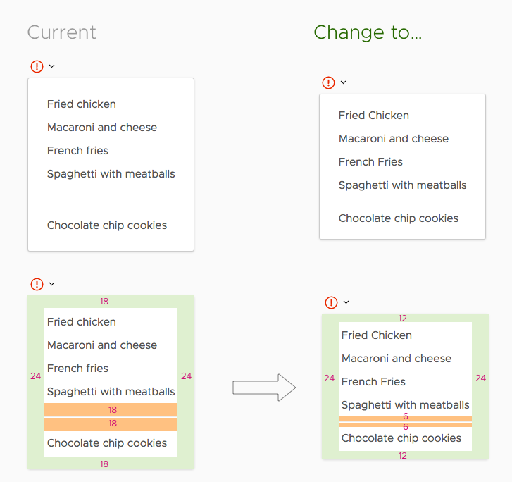
1) Tightening up the whitespace above and below dividers in a dropdown menu.
2) Tweaking the whitespace at the top and bottom of a dropdown menu such that it better matches the perceived horizontal whitespace on the sides and, incidentally, tightens up a bit.
3) Adjusting the placement of dropdown menus triggered from the header so that they appear closer to the bottom of the header.
and
4) Gracefully handling scrolling when a dropdown is to large to fit on a page. <= this may need to be part of the "collision detection" issue #1262
@reddolan and @lil-kim : I support the top 3 suggestions from what I have seen of them. If one of you could advise on the edits, I'd appreciate it.
@youdz : Is number 4 a collision detection feature or something that can be accomplished with just CSS on our end?
 mathisscott
on 10 Aug 2017
mathisscott
on 10 Aug 2017
If we have to detect that it doesn't fit, it's collision detection, yes.
youdz
on 10 Aug 2017
@mathisscott, Will see what I can do.
 lil-kim
on 10 Aug 2017
lil-kim
on 10 Aug 2017
Here's the spec for padding adjustments:
Reviewed & approved by: @mathisscott, @reddolan
lil-kim
on 11 Aug 2017
when a dropdown is aligned to be on the bottom, there remains a 2px top margin inside .dropdown-menu. While tiny, it does expose 2 pixels of non active space between the target and the top edge of the popped up dropdown widget. What does this mean in simple terms? Dropdowns would not be flush to their target container.
mattmutt
on 14 Aug 2017
@mattmutt
This was intentional. When working with moving the dropdowns in the header, I found that pushing them flush to the bottom of the header was not as effective at communicating the relationship between the trigger and the dropdown. So I adjusted spacing to where it was a combination of visually appealing and reinforced that relationship.
mathisscott
on 14 Aug 2017
Hi there 👋, this is an automated message. To help Clarity keep track of discussions, we automatically lock closed issues after 14 days. Please look for another open issue or open a new issue with updated details and reference this one as necessary.
![github-actions[bot] picture](https://avatars.githubusercontent.com/in/15368?v=4&s=40) github-actions[bot]
on 15 Oct 2020
github-actions[bot]
on 15 Oct 2020
Related issues
 amellnik
·
3Comments
amellnik
·
3Comments
 clane
·
3Comments
clane
·
3Comments
 JohannesRudolph
·
4Comments
JohannesRudolph
·
4Comments
 aaronfrost
·
3Comments
aaronfrost
·
3Comments
 ChrisKaun
·
3Comments
ChrisKaun
·
3Comments