Cht-core: Ability to customize icons shown on main tabs (contact, tasks, etc)
What feature do you want to improve?
The icon displayed on each of the main tabs (Messaging, Contacts, Tasks, Analytics, etc.) is not currently configurable. In cases where users have <400px screen width, the text is hidden and only the icon appears so for some users, this icon may be the only descriptor they get about the purpose of that tab. It is therefore important that the tab be contextually relevant for the project and workflow. It is somewhat common to change the text that displays on each of these tabs and in those cases: it is important that the text and the icon align.
Describe the improvement you'd like
Add a new mechanism through which the tab icons can be configured.
Additional context
For the Covid-Moh-Ke project, MoH users have requested to change the text to "home" and the icon to something like a house.
Our default icon for tasks is not immediately self-evident and annecdotally may be a popular icon to change based on the project context.
 kennsippell
All 22 comments
After conversation with @abbyad , reluctantly adding this issue to 3.8.2 to meet immediate partner expectations.
 MaxDiz
on 6 May 2020
MaxDiz
on 6 May 2020
I am not certain yet that it needs to be added to 3.8.2, but is being prioritized to figure out how to best deal with a deployment where this has become a blocker.
 abbyad
on 6 May 2020
abbyad
on 6 May 2020
Dropping from 3.8.2 as that release has been stopped for now. Please reach out to product-management on Slack or comment here to discuss prioritising this.
 garethbowen
on 7 May 2020
garethbowen
on 7 May 2020
removing 'covid' label since this no longer seems to be a blocker for the deployment. Returning to 'needs triage' in the end-user backlog
MaxDiz
on 14 May 2020
I believe this is still required for the deployment to switch back to a release. @SMurithi, @derickl, can one of you please confirm, and work to get this scheduled with @n-orlowski?
abbyad
on 15 May 2020
Confirmed that this issue is still a high priority for the MoH Ke deployment. Adding to the next roadmap planning discussion
MaxDiz
on 20 May 2020
Adding to the v3.10 release based on partner requirement. Per discussion with @garethbowen we can build a custom 3.9.0+icon branch post release (if needed) or wait for 3.10.0.
MaxDiz
on 1 Jun 2020
Does anyone have insight into what the ideal implementation of this should be?
Options that I though about:
- Is it enough to change the FontAwesome icon and have a text field per tab?
- Should we allow selecting an existent resource icon and have a dropdown per tab? We already have a mechanism of uploading resource icons.
- Something completely new.
- A combination of the above.
I'm personally leaning towards using resource icons in combination with allowing other FontAwesome icons.
 dianabarsan
on 10 Jun 2020
dianabarsan
on 10 Jun 2020
Resource icon approach make sense.
I will check with the deployment team re using FontAwesome vs allowing any icon to be uploaded. FontAwesome is limited to their approval so does not give as much flexibility. Are there eng implications for allowing any icon (ie outside of the FontAwesome library) to be uploaded?
MaxDiz
on 10 Jun 2020
Any icon = new resource icon or some completely new image resource type?
dianabarsan
on 10 Jun 2020
Resource folder is not limited to FontAwesome, correct?
If so, any icon = ability to upload any icon that conforms to the resource folder requirements (size, file type, etc).
MaxDiz
on 10 Jun 2020
Resource icon = .png or .svg files .
Thanks for clarifying.
dianabarsan
on 10 Jun 2020
I second the approach proposed by @n-orlowski. For partners such as MoH this flexibility is important.
 SMurithi
on 12 Jun 2020
SMurithi
on 12 Jun 2020
@SMurithi can you please share the approach proposed by Nicole?
dianabarsan
on 12 Jun 2020
@dianabarsan this is what I mean - ability to upload any icon that conforms to the specs required (size, file type, pixelation/resolution etc).
SMurithi
on 12 Jun 2020
Because of how our menu works and the multiple states that a header icon has (inactive, hovered, and active), there's a downside in allowing "any icon that conforms to the specs" to be a header icon.
We allow .png and .svg images as icons.
There are ways that we can apply an overlay over a png image to change its color, but these are not widely supported by browsers. If we allow png icons as header icons, they will be a static color without any hover/active effects.
My initial thought was to filter out resource icons to the ones that are in svg format when selecting a header icon, but we can allow any icon with the above caveat.
dianabarsan
on 17 Jun 2020
@dianabarsan makes sense. If you can provide documentation on any limitations / guidance for best display, I think we're good to go. Thanks for looking into it!
MaxDiz
on 17 Jun 2020
Ready for AT on 6410-configurable-menu-icons.
Documentation PR https://github.com/medic/cht-docs/pull/161
dianabarsan
on 26 Jun 2020
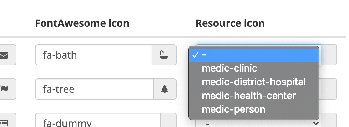
The Admin console Resource icon dropdowns only displays four options instead of the whole list in the Icons section; that this mean only these 4 are svg as in the dos @dianabarsan ?
 ngaruko
on 2 Jul 2020
ngaruko
on 2 Jul 2020
@ngaruko that's correct. you can also check which ones are svg's by looking at the resources document in the DB and checking its attachments to verify.
dianabarsan
on 2 Jul 2020
Merged into master.
dianabarsan
on 3 Jul 2020
Notes for AT:
In App Management, click Images > Header Tabs Icons
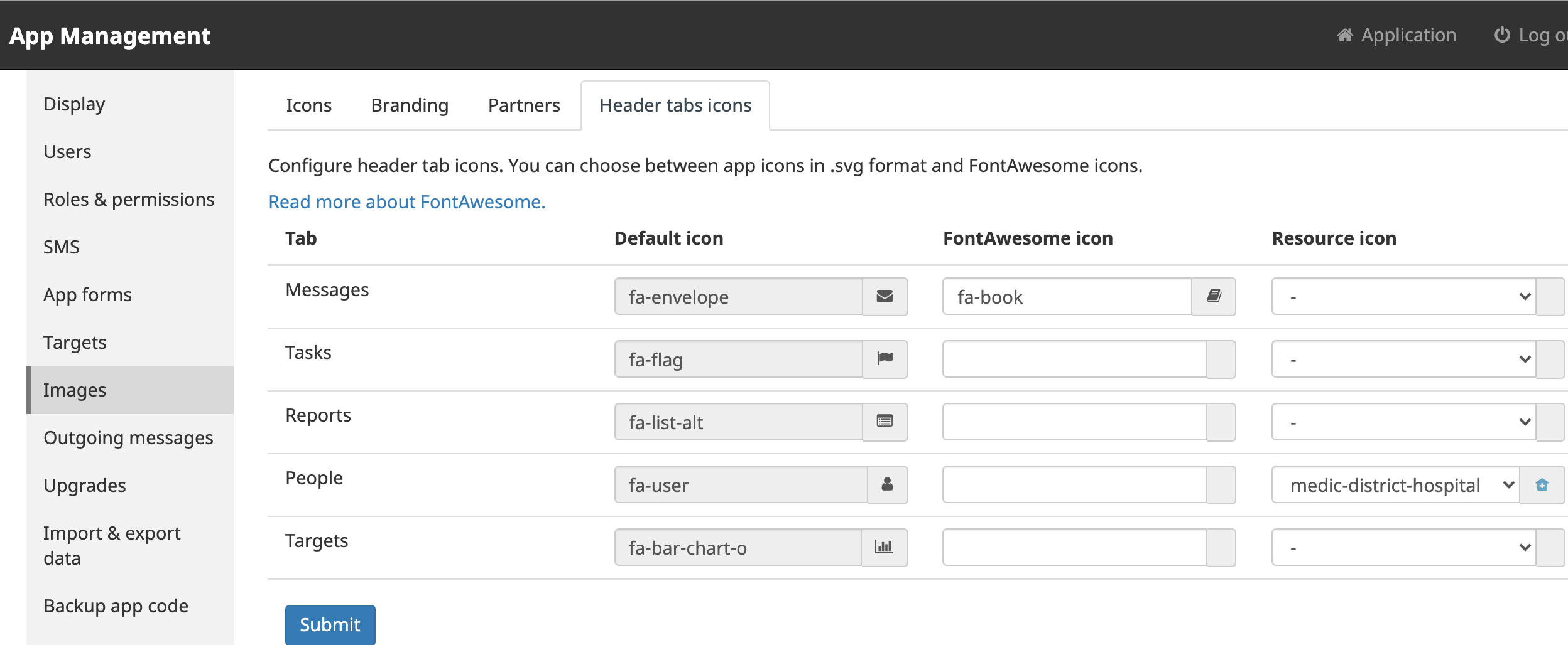
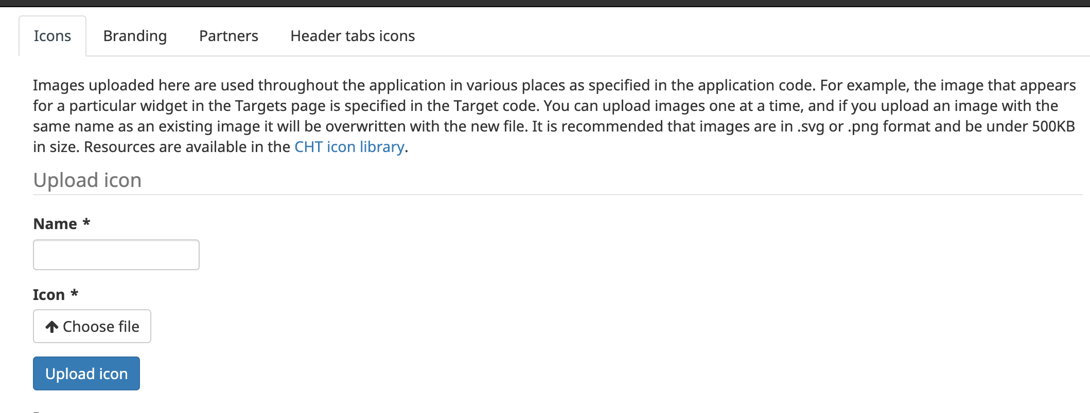
Either add a font awesome icon or select a saved svg resource icon. These can be added to the resources folder or uploaded manually on the Icons tab on the same Images page .
ngaruko
on 8 Sep 2020
Related issues
 sglangevin
·
30Comments
sglangevin
·
30Comments
 SCdF
·
47Comments
SCdF
·
47Comments
 benkags
·
36Comments
sglangevin
·
35Comments
benkags
·
36Comments
sglangevin
·
35Comments
 alxndrsn
·
31Comments
alxndrsn
·
31Comments