Cherrytree: Some Toolbar icons are invisible on dark theme @Linux
$ apt list --installed | grep -i cherrytree
cherrytree/groovy,now 0.99.25-2 amd64 [installed]
 AliGeyik
All 17 comments
It would be nice if we could customize the icons, as long as we're dreaming! :)
Cherrytree is the best!
 rogue-ronin
on 10 Dec 2020
rogue-ronin
on 10 Dec 2020
@AliGeyik Yes... I guess it happens that your theme app background have the exact same color as the icons. Here I attach a fix to all the black icons (including the finders). I added a light border to them.
@AliGeyik Forgot to ask, Is that Plasma DE?
 userfav
on 10 Dec 2020
userfav
on 10 Dec 2020
Thanks @userfav much appreciated
 giuspen
on 10 Dec 2020
giuspen
on 10 Dec 2020
I have this exact problem. How do I add your fix to my cherrytree? I see they are just svg files but where do they go?
 T-2
on 10 Dec 2020
T-2
on 10 Dec 2020
the updated icons will be in 0.99.26
giuspen
on 10 Dec 2020
@giuspen I set up a virtual machine to test the looking of the icons with a dark theme, so I fix some of them that I dind't include in the first patch, simplify some of the smallest icons and also gave them more contrast. Examples:
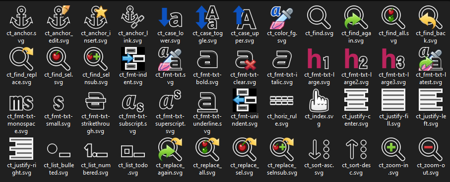
Toolbar with llight/dark icons:


Files:
userfav
on 11 Dec 2020
Those work for me! Thanks
T-2
on 11 Dec 2020
Great job @userfav I'll update with your latest
giuspen
on 11 Dec 2020
@AliGeyik Yes... I guess it happens that your theme app background have the exact same color as the icons. Here I attach a fix to all the black icons (including the finders). I added a light border to them.
@AliGeyik Forgot to ask, Is that Plasma DE?
Yes, v5.19.5
AliGeyik
on 15 Dec 2020
@aligeyik @T-2 Just asking for opinions of dark theme users here, in 0.99.26 you will see the icons, now for the 0.99.27, what you do thing about this mockup? (I'm specifically asking about the bold, strikeout, italic , underline, superscript/subscript, small and and monospace icons):

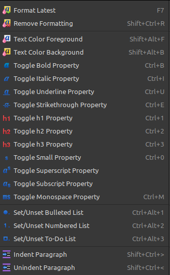
This are the same icons on a light theme:


userfav
on 15 Dec 2020
Even better! I like those!
T-2
on 15 Dec 2020
I am a dark theme user, and I really like the white outline on the prior set. I'd like to see that around the red "h" in the header-size icons as well (in that set).
The black edges around the blue icons in this set looks blurry and indistinct to me. One of the points of a dark theme to me is for the icons to pop off the background with a burst of high-contrast.
I prefer symbolic icons, honestly -- the ones that use shaded colors are hard to decipher, especially when they're small. Too cartoonish -- icons are nearly becoming logograms now, and the clearer and simpler ones appeal to me because they don't require me to invest cognition in deciphering the artwork. I also like it when I can change the icon set to a different single, simple color.
Now that I know that you can change the icons by putting them into the configuration directory, I may just set my own up.
Thanks for all your hard work and the kindness of sharing it!
rogue-ronin
on 16 Dec 2020
@rogue-ronin thanks for your feedback, I think that I will be going with something like this:


Still, some working is needed on them.
userfav
on 16 Dec 2020
Looks nice!
rogue-ronin
on 16 Dec 2020
Looking better every time!
Could I suggest that the bottom edges of the x the *arrow *in the top two
icons could use something to define them? Perhaps some white? You might
want to consider something similar with the indent and unindent blue
portions.
Also, you mentioned not wanting to use the first letters of bold, italic or
underline so that it would be more generic for other languages. You should
consider something for monospace as MS is clearly falling under this
rubric. Perhaps something that looked like an old-school LED letter A?
(Like on old red LED calculators or alarm clocks.) Or something slightly
more pixelated, like these letters:
https://www.dreamstime.com/dotted-text-electronic-digital-lighting-alphabet-letters-numbers-airplane-monitor-vector-set-display-scoreboard-dot-image171317519
Thank you for including me in this email chain, I really appreciate the
opportunity to give my observations and opinions.
Aloha!
On Wed, Dec 16, 2020 at 4:01 AM userfav notifications@github.com wrote:
@giuspen https://github.com/giuspen Giuspen, with the feedback from
others users I adjust the icons so the same can be seen acceptable with
lighter or darker themes, I use some transparency so the white borders will
not be too jarring also I unified the colors of all icons that can have
problems with the contrast. Also I made some tweaks on the icons with the
"insert" characteristic (added a "plus") so now are more easy to interpret.
Preview: of the same icons on light and dark:[image: imagen]
https://user-images.githubusercontent.com/46328784/102357643-4ece1780-3f8d-11eb-94e5-3ecbd45328d5.png
[image: imagen]
https://user-images.githubusercontent.com/46328784/102357752-6f966d00-3f8d-11eb-9ea7-47601ac879b5.png[image: imagen]
https://user-images.githubusercontent.com/46328784/102357619-470e7300-3f8d-11eb-9439-d3d8047625da.pngFiles: icons_dark-theme_fixes_2020-12-16.zip
https://github.com/giuspen/cherrytree/files/5703134/icons_dark-theme_fixes_2020-12-16.zip—
You are receiving this because you were mentioned.
Reply to this email directly, view it on GitHub
https://github.com/giuspen/cherrytree/issues/1414#issuecomment-746331805,
or unsubscribe
https://github.com/notifications/unsubscribe-auth/ADL7PURKX56RZUP7Y64MXLDSVC4TDANCNFSM4UUS6TNA
.
rogue-ronin
on 16 Dec 2020
@rogue-ronin Noted!, thanks for your feedback!
userfav
on 17 Dec 2020
Excellent fix for the dark theme icons.
Thanks
T-2
on 22 Dec 2020
Related issues
 ForumLiker
·
8Comments
ForumLiker
·
8Comments
 mamsiir
·
8Comments
mamsiir
·
8Comments
 valentinbesse
·
8Comments
valentinbesse
·
8Comments
 4Syno
·
6Comments
4Syno
·
6Comments
 ElnuDev
·
6Comments
ElnuDev
·
6Comments
Most helpful comment
@giuspen I set up a virtual machine to test the looking of the icons with a dark theme, so I fix some of them that I dind't include in the first patch, simplify some of the smallest icons and also gave them more contrast. Examples:
Toolbar with llight/dark icons:
Files:
icons_2020-12-11_update.zip