Cascadia-code: Some Cascadia Code Light's glyphs (or their elements) look even lighter in bold style in Microsoft Word
Environment
Cascadia Code version number: 2007.015
Application (with version) used to display text: Microsoft Word for M365 (ver. 2007 build 13029.20292 MS Store
OS platform and version: Windows 10 Pro (ver 2004 build 19041.388)
Screen resolution (i.e. 220dpi): 120dpi (125%)
Steps to reproduce
Compare these Cascadia Code Light glyphs in regular and bold styles:
B ę G g I i Į į j P T Y y r m Z z Ž ž
Expected behavior
Bold version should be thicker
Actual behavior

P.S. Thank you for the light versions of the font. They are very useful especially for printing.
 AlexYash
All 8 comments
Wow! I honestly can say I’ve never seen anything like this before.
Word’s Bold button is a crotchety piece of old code that wants things to be _just so_ in a font so I’m not surprised that it is misbehaving here when trying to deal with a variable font. One thing to keep in mind—due to limitations in the software, the button is mechanically bolding the letterforms rather than intelligently picking the correct weight from the variable font. So the quality of the bold that you get will not be particularly good. The only exception is when you bold the “Regular” as it is style linked to the “Bold” weight.
I’ll follow up with the folks over in Word and see if I can figure out what might be going on. In the meantime, I suggest that in situations where you want to use Light as the base font that you manually assign the Regular weight of Cascadia Code to be the bold in place of pushing the Bold button.
 aaronbell
on 30 Jul 2020
aaronbell
on 30 Jul 2020
Yes, I also guessed that this might be Word's issue and checked it in LibreOffice Writer. Funny part - it works correctly there. But there were some other issues with document conversion so it's not a solution in my case
Just for better understanding of my scenario. I'm creating verbs table which look like this:
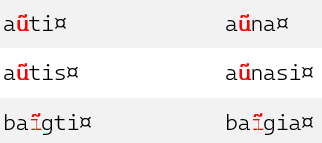
I had to use bold style because there is no difference between black and red color when I'm printing on my b&w laser printer (I have no idea why there is no difference in grayscale - all settings are fine), so my idea was to make those chars bold so it would be easier to differentiate them.
I've also tried to export it to PDF and print it via Adobe Acrobat Reader. It handled it better but it looks that Reader doesn't handle variable font correctly as printed text looks like it has been printed using regular Cascadia Code font. I'll try to experiment with it later.
AlexYash
on 30 Jul 2020
Also interesting is that it works fine in Word on Mac. 🤷♂️
Using bolder type is totally fine—I'd just suggest manually switching to "Cascadia Code Regular" rather than using the bold button. You'll get a bolder weight, and it won't display this weird behavior :/
Yeah, PDF export appears not to work as well as it should :(. I think that's a long-standing issue. For your purposes, I'd suggest uninstalling the TTF Cascadia Code, and instead installing the static instance OTFs. Screen rendering won't be as crisp, but you'll get the right weights in PDF export.
aaronbell
on 30 Jul 2020
Thanks for hints!👍
Looks like Windows Terminal "overwrites" OFT fonts with bundled TTFs. I'll try to play around with it tomorrow.
AlexYash
on 3 Aug 2020
I've tried OTF fonts but got another interesting effect.
Steps to reproduce:
- Uninstall Windows Terminal and all Cascadia Code TTF fonts.
- Install all Cascadia Code OTFs.
- Install WT.
Looks like the system prefers TTF fonts as it reports WT TTF versions in Fonts settings and OTF for PL variations.
As a result MS Word works with Cascadia font family correctly now. Even that bold font issue which I had reported has disappeared.
But... Acrobat Reader DC now doesn't recognize Cascadia Code fonts correctly now. I've tried different PDF export options in Word including font embedding but it looks like this:

UPD. It looks like Acrobat Reader DC has some strange font handling mechanism as after several attempts it renders Cascadia Code glyphs correctly but still there are some issues with combining diacritical marks.
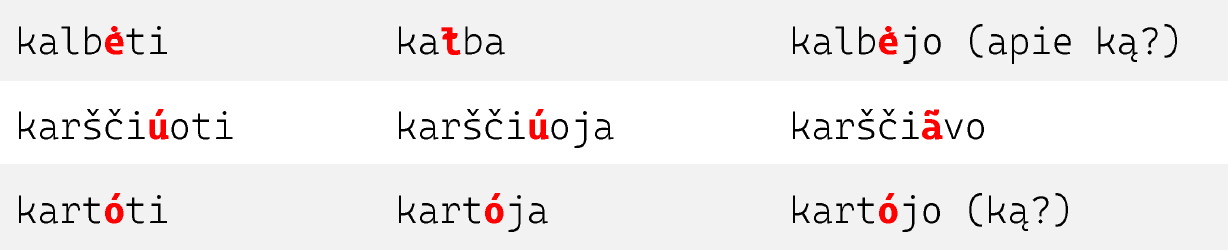
Also Reader doesn't reflect Cascadia Code fonts in Document properties - only default system fonts.
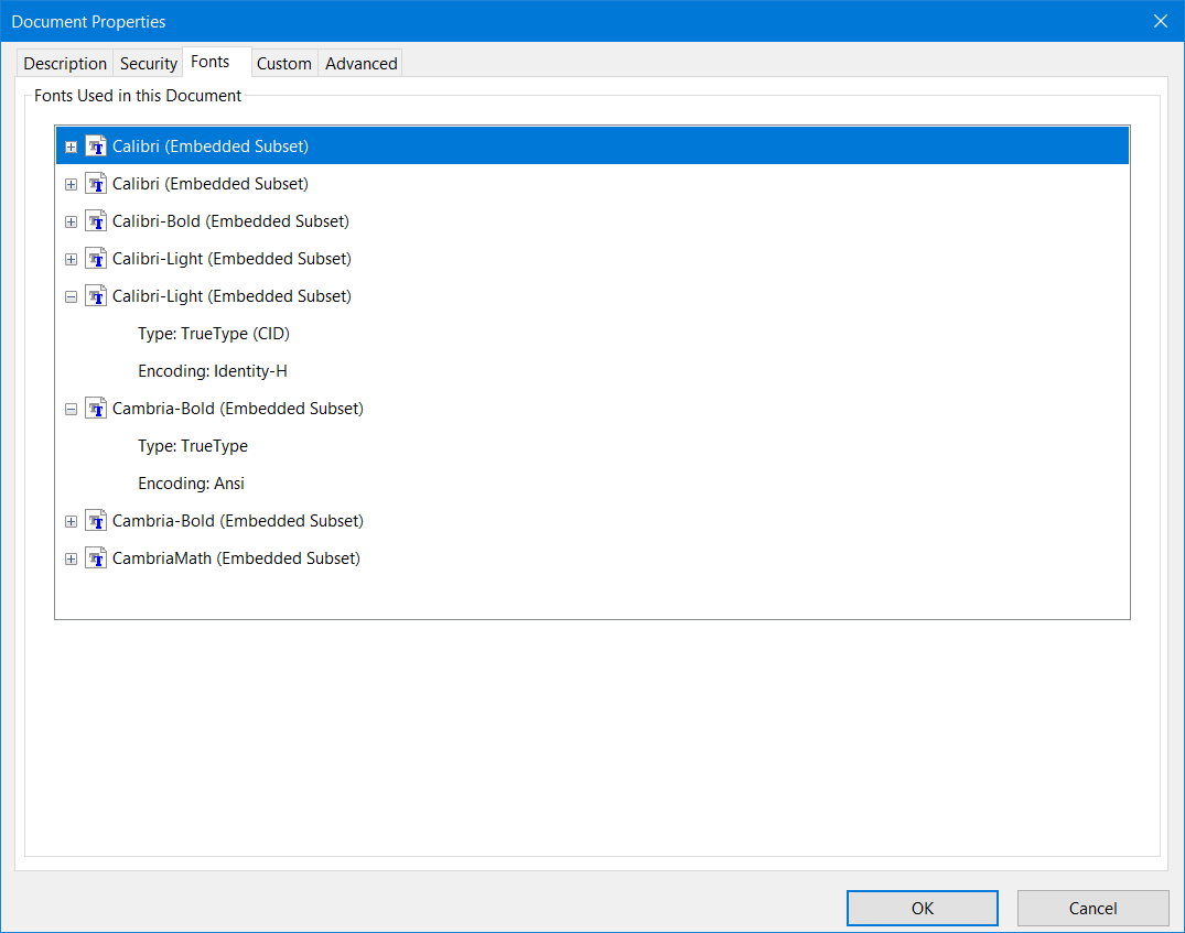
_P.S._ I guess we can close this issue as it seems that these are applications' issues but not the font's ones. I just want to try to remove WT and TTF versions completely and look what will happen with OTF versions only.
AlexYash
on 3 Aug 2020
Thanks so much @AlexYash for all your investigations :). Here's some info for you:
1) Windows Terminal will always prefer its own TTF instances (Cascadia Code and Cascadia Mono) of the font over any that are installed by the user. This can be overcome by setting the "PL" versions of the above two fonts, which are functionally identical (except for the addition of the PL glyphs). This is a known issue.
2) The issue with the combining marks was due to the way that glyphs2ufo converts formats. It should be resolved with PR #333, whenever that is pulled in.
3) Unfortunately, I don't really know what is going on with Adobe Reader. I'd assume it has something to do with not supporting variable fonts, but couldn't tell you for sure. I'll be interested to find out the results of your testing just the OTFs.
Getting back to the bolding issue—I don't have a definite answer as to why it is happening. One theory is that the boldening mechanism is misinterpreting the outlines and considering one or the other as a counter rather than a stroke, therefore shrinking it instead of boldening it. However, as I don't observe this issue in other environments, I believe it is external to the font's functionality (as in, the font is working correctly and it is being misinterpreted by an external engine) and so will close this issue.
aaronbell
on 3 Aug 2020
Something else I forgot to mention. Instead of using the bold button for Cascadia Code in Word, I'd strongly recommend just selecting a heavier weight (like Cascadia Code Regular or SemiBold, for the Light). That way you'll get the correctly weighted forms instead of however the application decided to bold the glyphs.
aaronbell
on 3 Aug 2020
@aaronbell thank you very much for your support. I've followed your advice regarding heavier weight as soon as you had suggested and it works for sure. Everything else is JFYI in case it could be useful for you. :)
AlexYash
on 3 Aug 2020
Related issues
 tabatkins
·
6Comments
tabatkins
·
6Comments
 mdtauk
·
6Comments
mdtauk
·
6Comments
 schorrm
·
7Comments
schorrm
·
7Comments
 pmartin-brierley
·
5Comments
pmartin-brierley
·
5Comments
 teebeast
·
5Comments
teebeast
·
5Comments