Cascadia-code: Use better `==` symbol
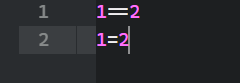
It is hard to distinguish between these two:
1==2
1=2
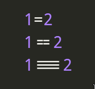
Borg-sans-mono has a better symbol for this:
https://github.com/marnen/borg-sans-mono
 aminya
All 9 comments
Hm. To be honest, I think that they're sufficiently differentiated simply by their lengths, and adding a break in the middle kind of defeats the purpose of even having a ligature. I do appreciate your frustration though, and am interested to hear if others share it. For the time being I'll leave this open to see if others chime in, but do not have any intent to change it currently.
Thanks!
 aaronbell
on 1 Jun 2020
aaronbell
on 1 Jun 2020
When you look at this in a big code base, in which necessarily these are not written near each other it is very hard to determine between the two. The purpose of a font should be to enhance the experience of the user, but now the user goes into a guessing game!
I want to say that this does not question the ligature usage at all. We can choose a single ligature that has a custom space in between the two =, which is not possible normally.
The same goes for _, I always wished that these were easier to detect, like:
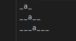
In case you decide not to do this for the whole font, if we can have a separate patch that does not include these ligatures, that would be good too.
aminya
on 2 Jun 2020
I agree with this. I often have trouble telling a single equals sign from a double one, especially if there isn't a point of reference.
adding a break in the middle kind of defeats the purpose of even having a ligature.
I disagree. The point of ligatures is to make code easier & quicker to read. If we have to double check equals signs to make sure that there's two of them and not one, that's not very productive and it goes against the point of having them! They can also have the function of making text look prettier, but that should only be a secondary function.
 aggserp4
on 3 Jun 2020
aggserp4
on 3 Jun 2020
Thanks for fixing this!
aminya
on 30 Jun 2020
I actually like the old one better.
Is there a variant or a way to force using those ligatures? Maybe instead of changing it to two separate ones make one but should span the max full width of two characters?
 weitzhandler
on 6 Aug 2020
weitzhandler
on 6 Aug 2020
the old is better
actually if someone enabled ligatures, he won't want to see there is a space between two =, otherwise, why enable the ligatures?
if someone doesn't like there's any space between two =, why doesn't he disable ligatures?
 Sherlock-Holo
on 25 Aug 2020
Sherlock-Holo
on 25 Aug 2020
== is just one ligature among 100s that Cascadia provides. Why disable everything just because of one?
You can patch this symbol if you hate this extra space.
https://admcpr.com/automating-the-patching-of-cascadia-code-to-include-nerd-fonts/
https://github.com/gaplo917/Ligatured-Hack
aminya
on 25 Aug 2020
for people who want no space between two =, after updating to the latest version, the == becomes unaccepted
Sherlock-Holo
on 25 Aug 2020
I'm also gonna share my sentiment here. When someone enables ligatures they want a wide assignment sign. Hence == should be displayed as a single wide character.
weitzhandler
on 26 Aug 2020
Related issues
 Taomyn
·
3Comments
Taomyn
·
3Comments
 DoubleDeez
·
5Comments
DoubleDeez
·
5Comments
 tabatkins
·
6Comments
tabatkins
·
6Comments
 flowchartsman
·
6Comments
flowchartsman
·
6Comments
 pmartin-brierley
·
5Comments
pmartin-brierley
·
5Comments
Most helpful comment
I agree with this. I often have trouble telling a single equals sign from a double one, especially if there isn't a point of reference.
I disagree. The point of ligatures is to make code easier & quicker to read. If we have to double check equals signs to make sure that there's two of them and not one, that's not very productive and it goes against the point of having them! They can also have the function of making text look prettier, but that should only be a secondary function.