Cascadia-code: Feature Request: Provide more weights
Description of the new feature/enhancement
Many IDE's do not have the settings as a configurable file( like some text editors: example Atom has stylesheet.less, Visual Studio Code has settings.json ) where you can choose the weight of the font.
I am thinking that more weights would be awesome to have. I really like the Iosevka structure:
It has weights 8 weights but it would be more than enough to have 4 Light, Regular, Medium and Bold:
Thin
Thin italic
Thin oblique
Extralight
Extralight italic
Extralight oblique
Light
Light italic
Light oblique
Regular
Italic
Oblique
Medium
Medium italic
Medium oblique
Semibold
Semibold italic
Semibold oblique
Bold
Bold italic
Bold oblique
Extrabold
Extrabold italic
Extrabold oblique
 cata0309
All 27 comments
I am not sure if the font needs both an Italic and an Oblique. They both serve the same purpose, except an Italic will alter the letter shapes to better suit the slant - whereas an Oblique is mostly the same letters, but slanted.
 mdtauk
on 28 Sep 2019
mdtauk
on 28 Sep 2019
4 are must have : Italic, Regular, Medium and Bold any additional weight would be just a bonus
@mdtauk I agree
cata0309
on 28 Sep 2019
I made an issue #90 asking for it to be a Variable font, which would allow for using a slider or numeric value like 450 to set the weight of the font.
It would also allow setting the width of the characters, which would allow narrow, normal to wide characters.
mdtauk
on 28 Sep 2019
I know this is a great feature but this would be helpful just for the text editors/IDE's that allow writing stylesheet for the editor. This would work if they make use of the fact that "it will be a variable" font and generate or make a way to generate the font weights.
cata0309
on 29 Sep 2019
I know this is a great feature but this would be helpful just for the text editors/IDE's that allow writing stylesheet for the editor. This would work if they make use of the fact that "it will be a variable" font and generate or make a way to generate the font weights.
Most Variable fonts tend to export some fixed instance weights, as well as include the "breakpoints" for those weights within the font, for compatibility with older software.
It makes the creating of the font much easier, as it is a single set of outlines to maintain.
mdtauk
on 29 Sep 2019
@mdtauk very clear explanation, thank you !
cata0309
on 29 Sep 2019
Hi, guys, I'm not an expert at all in this area, but what I see is that this nice font renders too bold, using Intellij IDEA on MacOS. Is there anything that could be done about it, or ..?
Thanks for the really nice font!
 dodalovic
on 2 Oct 2019
dodalovic
on 2 Oct 2019
+1 I'd love to have a light version of this font, because even with 100% dpi scaling everything is so chunky in VSCode it feels like the letters leak into eachother. (on W10)
In cmd it feels better though I don't know why.
 GregoryHorvath
on 4 Oct 2019
GregoryHorvath
on 4 Oct 2019
Can we get a compressed version?
 musm
on 7 Oct 2019
musm
on 7 Oct 2019
My preference is Consolas (and Roboto Mono), too bad Consolas has horribly glyph support and very few math glyphs .
musm
on 7 Oct 2019
I'd love to have a light version of this font. I'm using FiraCode Light weight, size 15. I tryed Cascadia but it's so chunky and bold on VS 2019 (Windows 10).
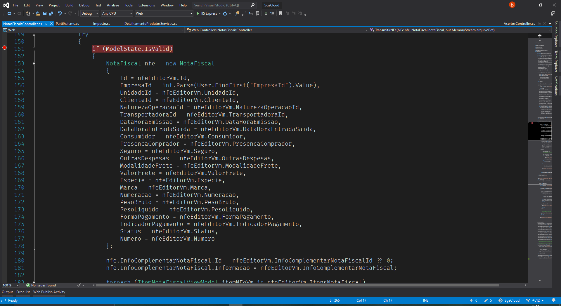
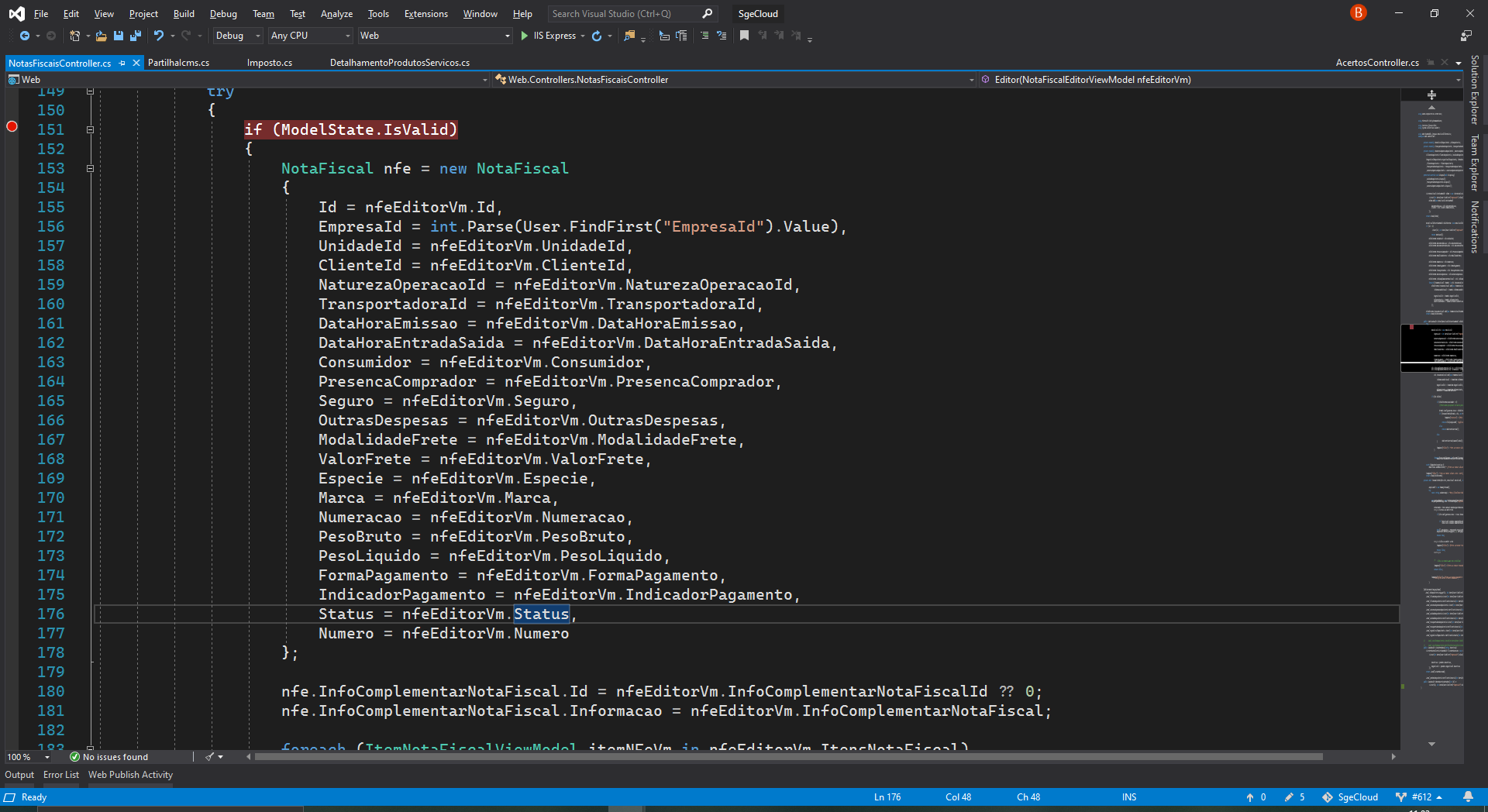
 Braytiner
on 7 Oct 2019
Braytiner
on 7 Oct 2019
Still wait for Light built version, it's bold in Intellij
 txhai
on 21 Nov 2019
txhai
on 21 Nov 2019
I would describe the current default weight as more of a Semi/Demi Bold, than a true Bold. Certainly chunky compared to most Regular/Normal or Medium weights.
mdtauk
on 21 Nov 2019
this is probably the most anticipated feature
 tuananh
on 23 Nov 2019
tuananh
on 23 Nov 2019
For those that want a thinner font on JetBrains IDEs (IntelliJ, Webstorm, etc), try going to Appearance & Behavior > Appearance > Antialiasing and changing it to Greyscale. This could be considered a temp fix till this issue is resolved.
 TaylorRayHoward
on 2 Dec 2019
TaylorRayHoward
on 2 Dec 2019
For those that want a thinner font on JetBrains IDEs (IntelliJ, Webstorm, etc), try going to Appearance & Behavior > Appearance > Antialiasing and changing it to Greyscale. This could be considered a temp fix till this issue is resolved.
Thanks for the tip. Made it much less of an eyesore for me. FYI, a similar result can be achieved in VSCode by setting 'Font Aliasing' to 'antialiased' in settings.
 michaelkthai
on 2 Dec 2019
michaelkthai
on 2 Dec 2019
"eyesore" is a terrifically unkind thing to say about somebody else's project. :smile:
 DHowett-MSFT
on 2 Dec 2019
DHowett-MSFT
on 2 Dec 2019
@DHowett-MSFT You're right. I love the FF itself - I moreso meant the bolder typeface alongside the rest of my specific editor setup made it an eyesore.. It's certainly not the designer's problem that I didn't figure out what settings to use with it sooner :grimacing:
michaelkthai
on 3 Dec 2019
good font.but it seems everything is bold in termimal, regular font weight is really need.
 emailsters
on 17 Jan 2020
emailsters
on 17 Jan 2020
It will come ~March, check: https://github.com/microsoft/cascadia-code/wiki/Roadmap
GregoryHorvath
on 17 Jan 2020
The font is nice, but looks bold in Visual Studio. A light weight would be very visually pleasing for pages with lots of markup.
 lhughey
on 23 Jan 2020
lhughey
on 23 Jan 2020
Worth making sure you have antialiasing turned on in your IDE especially if you're using a hi-dpi monitor like any recent macbook. In sublime you set the following in your preferences:
        "font_options":
    [
        "gray_antialias"
    ],
 patrickfatrick
on 30 Jan 2020
patrickfatrick
on 30 Jan 2020
It will come ~March, check: https://github.com/microsoft/cascadia-code/wiki/Roadmap
March can't come soon enough
tuananh
on 11 Feb 2020
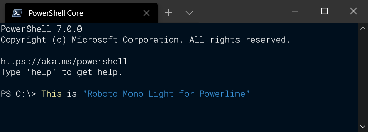
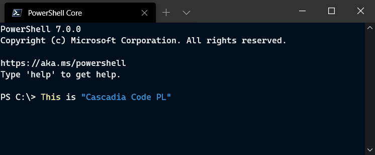
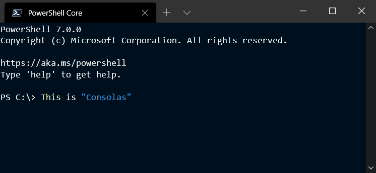
Need a Light weight variant that's crisp.
Cascadia Code PL definitely need to go on a diet.
Roboto Mono Light for Powerline
Cascadia Code PL
Consolas
 SidShetye
on 19 Mar 2020
SidShetye
on 19 Mar 2020
FYI, this seems to have been resolved with the latest release. I see that the bold font now renders fine in Intellij Idea:

 electronic-dk
on 13 May 2020
electronic-dk
on 13 May 2020
I think it is still using a faux bold, but with new hinting.
mdtauk
on 13 May 2020
Hey maintainers! Are you able to share any updates about progress towards this?
No pressure at all, just excited for the lighter weights as my (very subjective) eye struggles with legibility of the regular weight.
Thank you!
 idan
on 4 Jun 2020
idan
on 4 Jun 2020
Related issues
 GustavBrock
·
6Comments
GustavBrock
·
6Comments
 rivy
·
5Comments
rivy
·
5Comments
 khoshroomahdi
·
4Comments
khoshroomahdi
·
4Comments
 dkgreer52
·
4Comments
dkgreer52
·
4Comments
 teebeast
·
5Comments
teebeast
·
5Comments
Most helpful comment
Hey maintainers! Are you able to share any updates about progress towards this?
No pressure at all, just excited for the lighter weights as my (very subjective) eye struggles with legibility of the regular weight.
Thank you!