Cascadia-code: En dash showing in PowerShell directory listings in Windows Terminal
Environment
Cascadia Code version number: 1909.16
Application (with version) used to display text: Windows Terminal (Preview) v0.4.2382.0
OS platform and version: Windows 10 Pro 10.0.18362 N/A Build 18362
Screen resolution (i.e. 220dpi): 3840 x 2160 / 125% scale
Steps to reproduce
Display the contents of a directory in PowerShell:
> dir
Expected behavior
The Mode should be displayed with all hyphens:
d-----
-a----
Actual behavior
The character after the letter (and before in the case of a) is an en dash instead of a hyphen:
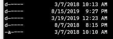
The en dash is also slightly lower than the hyphen.
 twwilliams
All 13 comments
I believe that's actually a ligature side-effect. The first character after the letter is the hyphen; the following ones are Cascadia's -- or --- ligatures. You can see this happening yourself if you type multiple hyphens at a prompt; doesn't matter which, behavior is the same in PS, zsh, or cmd.
A similar side-effect can be seen if you use the > character at the end of your prompt and type a hyphen, thus:
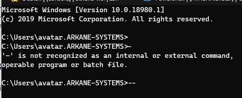
...where a single hyphen ligates with the prompt. As do various other characters (=, >).
 cerebrate
on 19 Sep 2019
cerebrate
on 19 Sep 2019
Right. It's a deliberate ligature. It corrects itself when typing at the command line but isn't corrected on program output.
twwilliams
on 19 Sep 2019
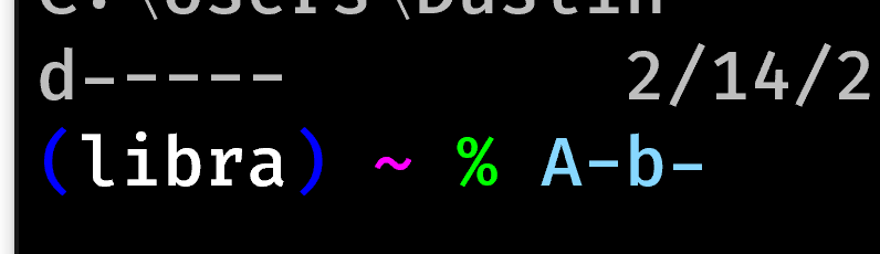
I think that just depends on the surrounding text. If you type the relevant bit of the PS output at the command line, you get the same semi-ligated result:

cerebrate
on 19 Sep 2019
You're right. It shows up with one hypen, goes way with two, and then returns with four or more.
twwilliams
on 19 Sep 2019
At current the font doesn't actually contain an en-dash or em-dash. If the editor is automatically swapping two hyphens for an en-dash or em-dash, it may be that you're seeing font fallback to a different font where the height of the dashes is different. All the dashes in Cascadia Code are at the same height.
Anyway, I'll be sure to add those in and it should get sorted out :)
 aaronbell
on 21 Sep 2019
aaronbell
on 21 Sep 2019
@aaronbell It looks like this is actually because of the substitution for [lowercase letter] followed by - (to hyphen.lc). Fira Code acts the same here.
 DHowett-MSFT
on 22 Sep 2019
DHowett-MSFT
on 22 Sep 2019
Since Fira does the same thing, I'm inclined to close this "by design". Dropping the hyphen to meet a lowercase character is likely to be broadly incompatible with powershell's mode listing.
DHowett-MSFT
on 22 Sep 2019
Is this about alignment with lowercase versus uppercase?
If you were to add an Opentype substitution rule for a hyphen following a hyphen.lc glyph, that should keep the preceding hyphens aligned.
A Space or Uppercase character would then swap it back to it's uppercase and numeric alignment.
 mdtauk
on 22 Sep 2019
mdtauk
on 22 Sep 2019
Ahh, I see. I misunderstood. It seems to me that @mdtauk's solution seems like a good one. It would at least look consistent within a single run of lowercase-specific characters.
aaronbell
on 22 Sep 2019
I'm thinking about this further, and thinking it might make sense to remove the case sensitive features entirely (as it is a "nice to have" feature) rather than looking to account for every circumstance where there will be mismatches between the ligature set and the hyphen.
Any concerns with this?
aaronbell
on 23 Sep 2019
I think there is something to be said for including it, as coding is not just about words and the typical reading and sentence structures.
Symbols and operators have meaning, and visually aligning them to the text surrounding is very nice.
But consistency and trying not to add confusion to the meaning and intent.
These fonts also have drawing glyphs, and hyphens and bars get used for treeviews etc.
I'm not wedded to them, but if they can be made to work, it's a nice character of the type family
mdtauk
on 23 Sep 2019
Makes sense. What I'm trying to solve for is a situation where a lowered form is followed by another element that should then be ligated. For example a->. In that case, we would see this:
a- (low hyphen)
a-> (normal ligature)
So I'm trying to (a) avoid a situation where the height of the hyphen jumps up and down as a user types, and (b) needing to create lowercase versions of most all the ligatures.
I think that it might be better to remove them for now, and then revisit the implementation later. If nothing else but to provide more consistent and expected text entry and rendering.
aaronbell
on 23 Sep 2019
Other Opentype fonts handle lowercase punctuation as the default, and handle uppercase as their own thing.
Code is mostly lowercase (ignoring Assembly, and other edge cases) as well as numerals. So until you are able to include it in a great way, I would suggest optimising for lowercase initially, or centre all symbols in the vertical space and treat them as iconic, rather than typographic.
I am also one person, and others should speak to their needs
mdtauk
on 24 Sep 2019
Related issues
 teebeast
·
5Comments
teebeast
·
5Comments
 AndreaPasqualini
·
4Comments
AndreaPasqualini
·
4Comments
 ratishphilip
·
3Comments
ratishphilip
·
3Comments
 Quppa
·
4Comments
Quppa
·
4Comments
 tabatkins
·
6Comments
tabatkins
·
6Comments
Most helpful comment
I think that just depends on the surrounding text. If you type the relevant bit of the PS output at the command line, you get the same semi-ligated result: