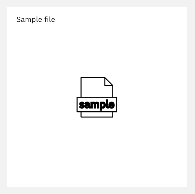
Carbon: "Sample file" pictogram renders wronlgy
Detailed description
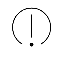
The "Sample file" pictogram's label is rendered pretty thick and looks out-of-place compared to the other pictorgams.
Steps to reproduce the issue
- Visit https://www.carbondesignsystem.com/guidelines/pictograms/library
- Search for "sample"
 janhassel
All 6 comments
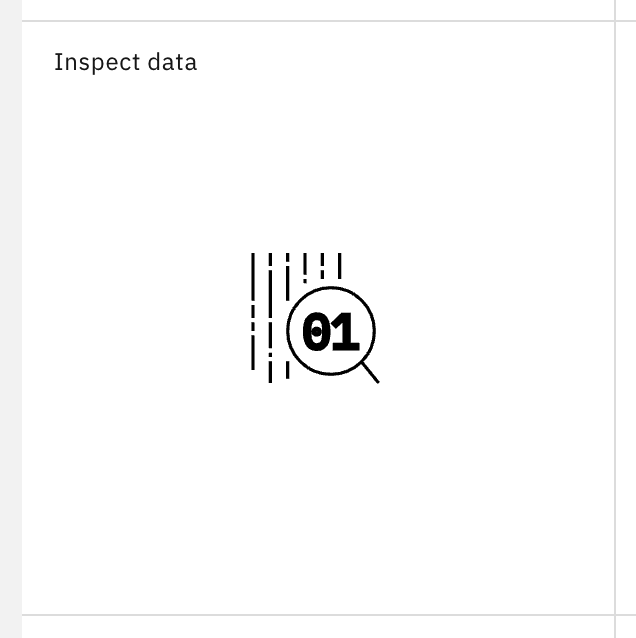
This also seems to be an issue with "Inspect data" pictogram.
(update 2)
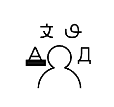
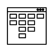
There are several other pictograms that have a stroke and a fill which seems unintentional.
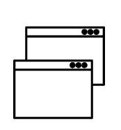
"Code syntax" (window controls)

"Dialogue"

"Language 04"
"Question and answer"

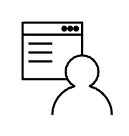
"App developer"

"User interface"
"Web developer"
"Windows"
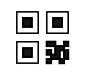
"QR code"
"Video chat"

"Question"

"Warning"
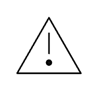
"Warning alt"
janhassel
on 20 Jul 2020
Yes this is incorrect. We are figuring out a way to fix this in the assets themselves so they will show up correctly.
 laurenmrice
on 20 Jul 2020
laurenmrice
on 20 Jul 2020
Are there any updates on this one? We're using some of these pictograms and they look really awkward next to other "normal" pictograms.
janhassel
on 25 Aug 2020
bump @laurenmrice do you know if this sprint's pictogram work would cover this?
 joshblack
on 19 Oct 2020
joshblack
on 19 Oct 2020
I am assuming yes if we will be updating the packages with Michael Dudleys new pictogram assets.
laurenmrice
on 19 Oct 2020
we just received a second update to the updated pictograms late last week so we are currently in the process of diffing them against the current set of pictograms and updating metadata accordingly
related #6923
 emyarod
on 19 Oct 2020
emyarod
on 19 Oct 2020
Related issues
 jendowns
·
3Comments
jendowns
·
3Comments
 JordanWSmith15
·
3Comments
JordanWSmith15
·
3Comments
 windgaucho
·
3Comments
windgaucho
·
3Comments
 ahoyahoy
·
3Comments
ahoyahoy
·
3Comments
 mouadcherkaoui
·
3Comments
mouadcherkaoui
·
3Comments