Carbon: Contribution: City Icon Hamburg - Elbphilharmonie
1. Team name
IBM Studios Hamburg
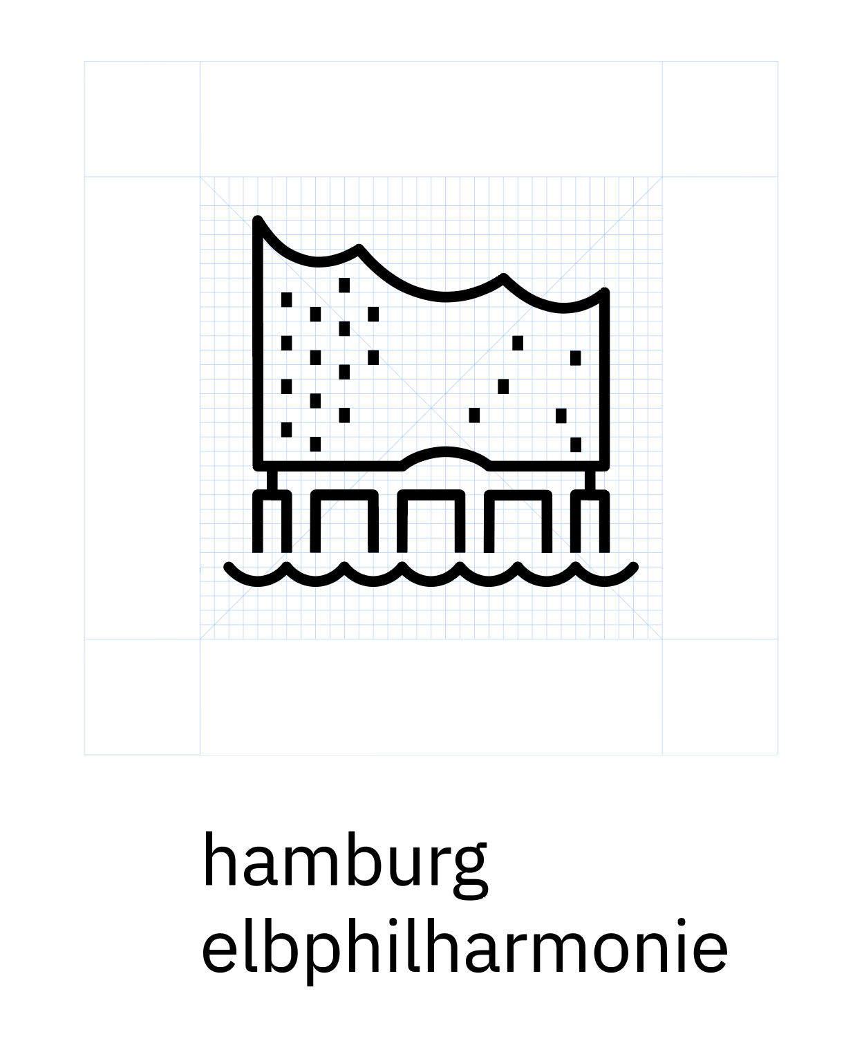
2. Icon name
City Icons / Hamburg / Elbphilharmonie
3. Please briefly describe what the icon is supposed to represent and the use case(s) its being used for.
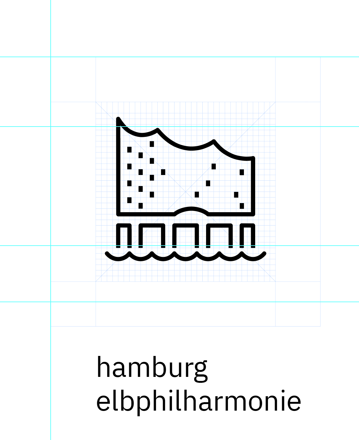
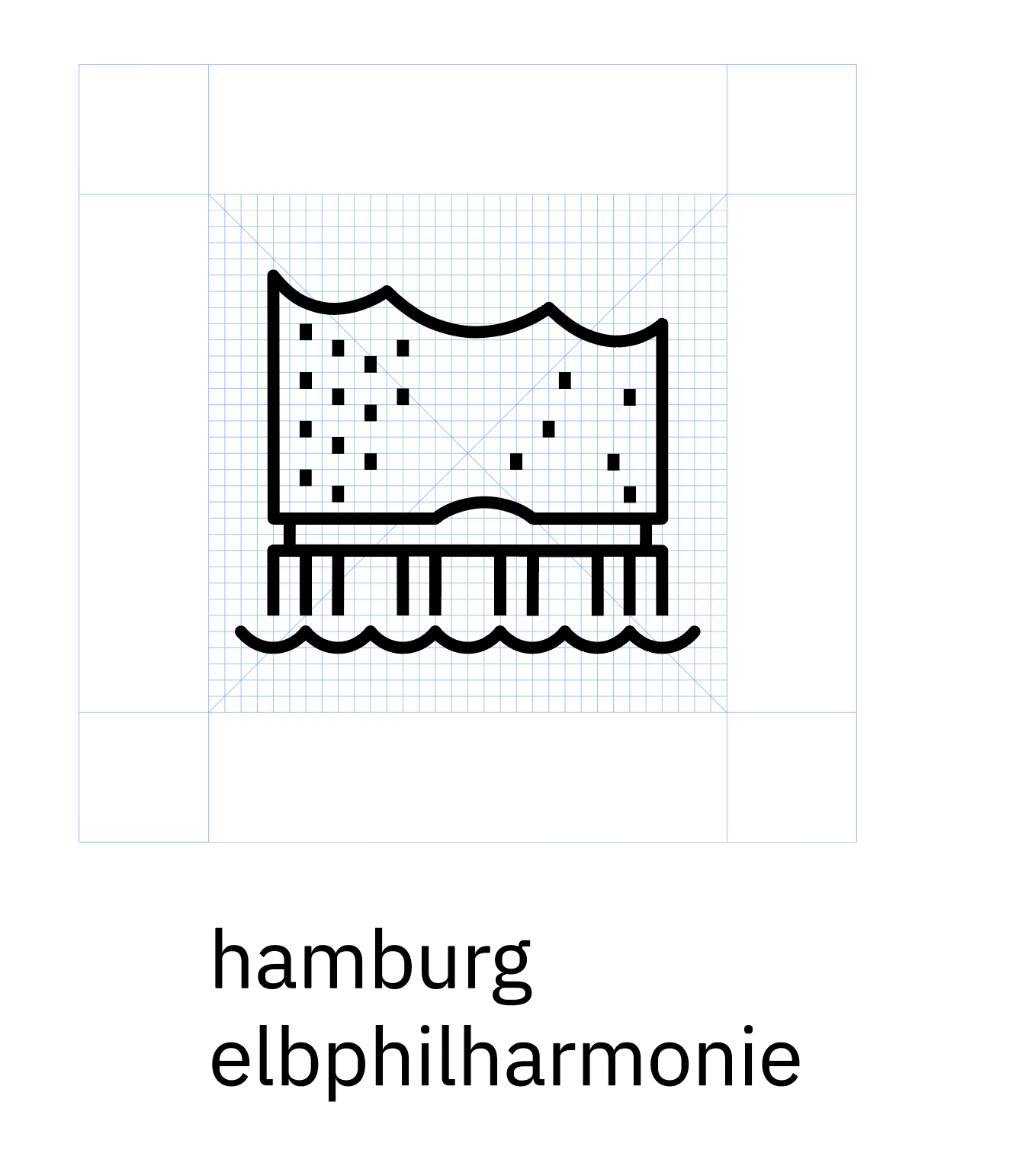
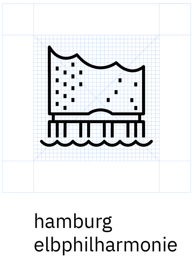
The alternative city icon is derived from the world famous Elbphilharmonie located at Hamburg harbour. It should be used for IBM Developer / IBM Garage location Hamburg.
4. Box Link
https://ibm.box.com/s/5z49kionp55gnhs3x9uy2tcpo8ypouph
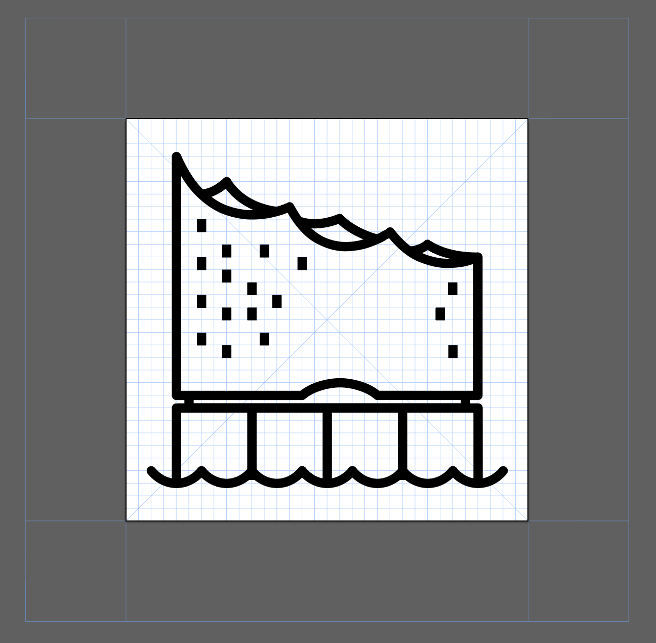
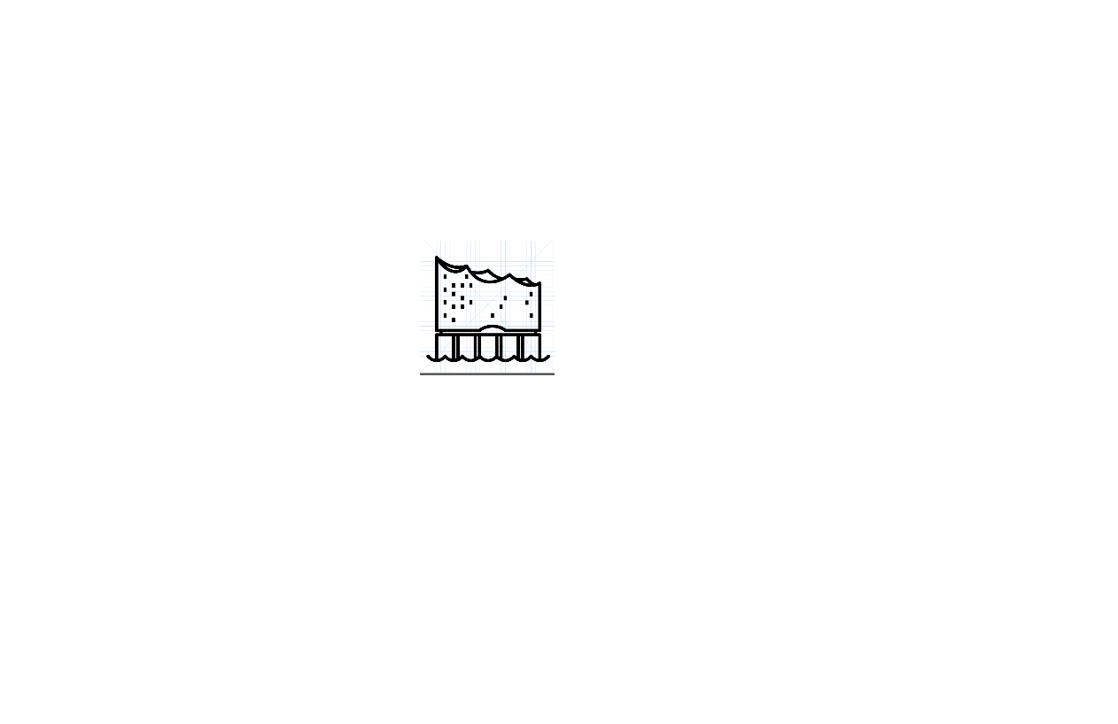
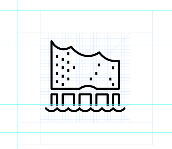
5. Screen Shot
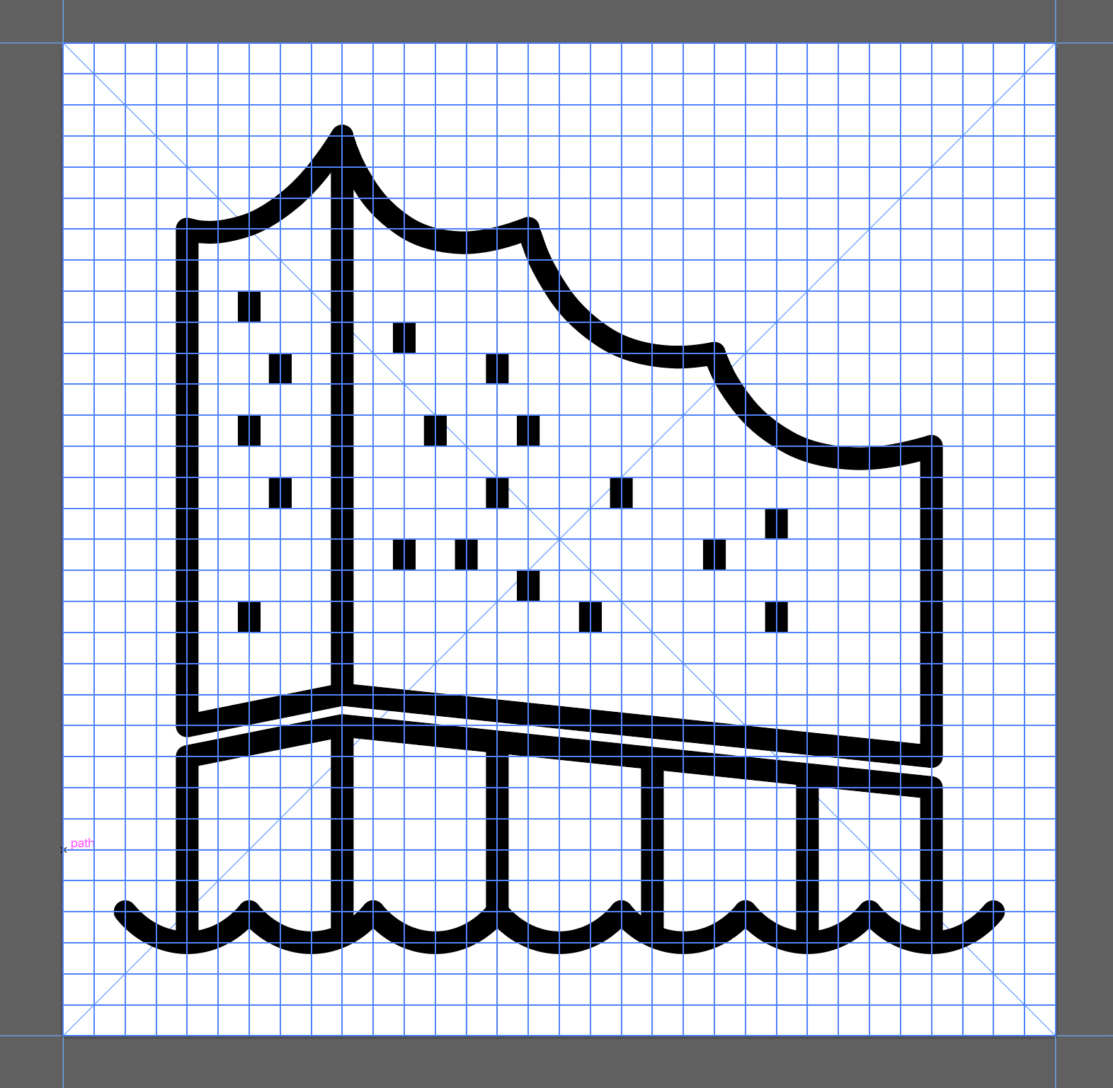
- Close-up screen shot of the icon with the pixel grid turned on
 fabianklonsdorf
All 43 comments
This is in the wrong repo. @conradennis can you provide the correct link to the pictogram repo.
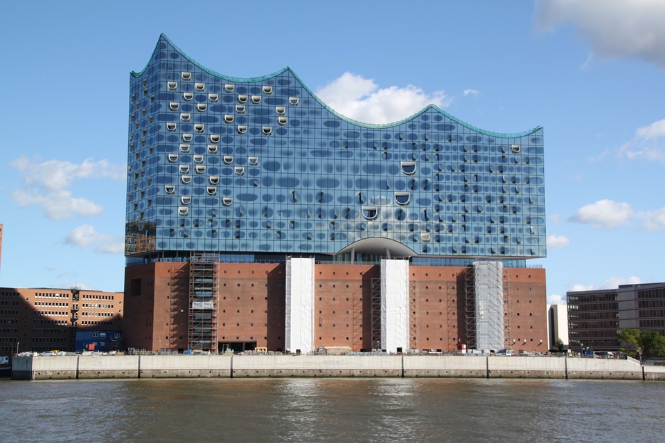
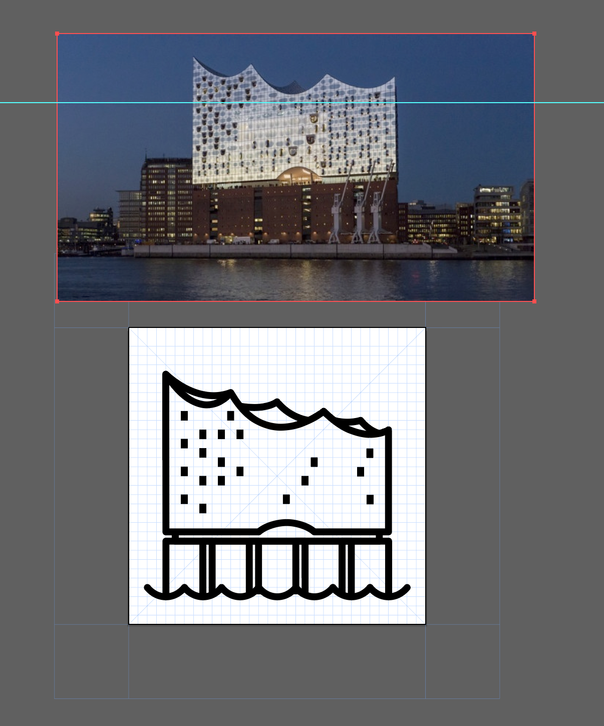
In terms of pictogram please try a view of building without perspective. More straight on view. Note some of the guidance in the IDL site which describes this.
https://www.ibm.com/design/language/iconography/pictograms/design
 mjabbink
on 19 Jan 2020
mjabbink
on 19 Jan 2020
mjabbink
on 19 Jan 2020
@mjabbink if this is the wrong repo, this site needs to be updated: https://www.ibm.com/design/language/iconography/pictograms/contribute/
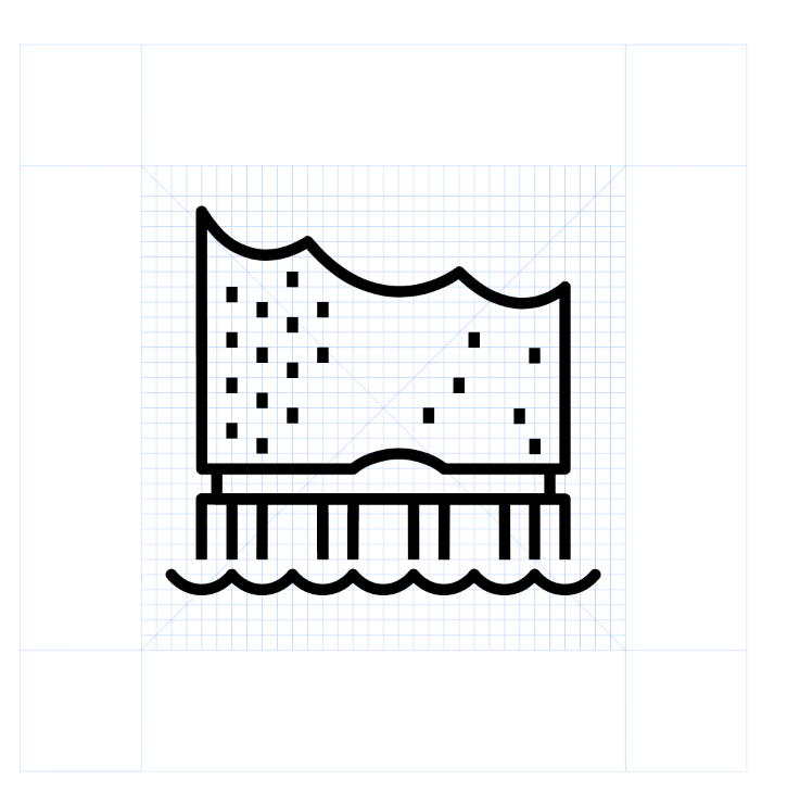
Would that go more into the direction you imagine?:
fabianklonsdorf
on 20 Jan 2020
Or with some details added:
fabianklonsdorf
on 20 Jan 2020
fabianklonsdorf
on 4 Feb 2020
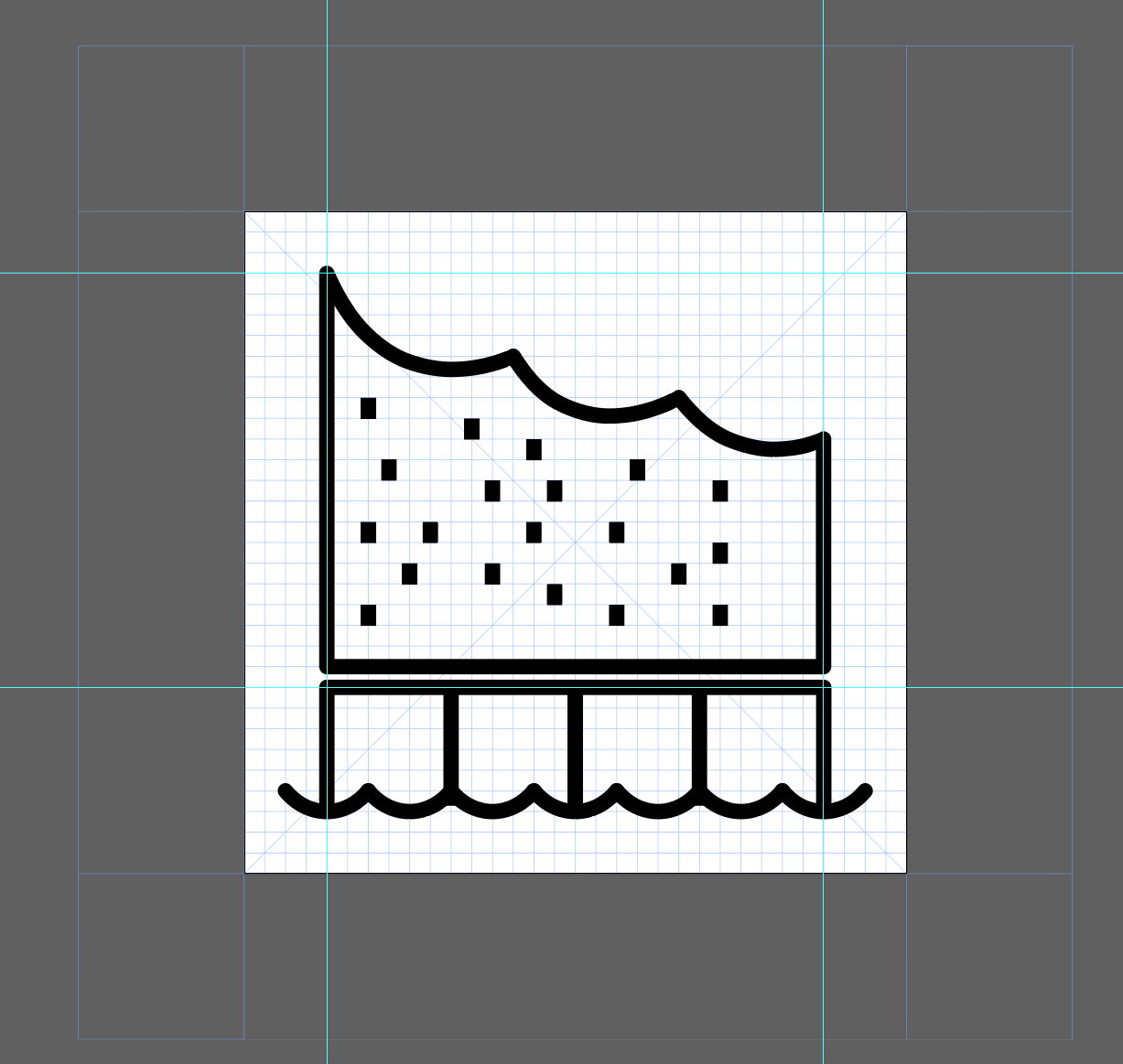
Better. I like the one with arc that applied a thumbs up to. I think maybe the scalloped too is to steep. I also wonder if the bottom can reflect the panel structure more versus just single lines?
mjabbink
on 11 Feb 2020
I think maybe one more unit between top and bottom parts. I also think you can remove the details of the roff that are in the back
these details get fussy and close in when smaller
mjabbink
on 11 Feb 2020
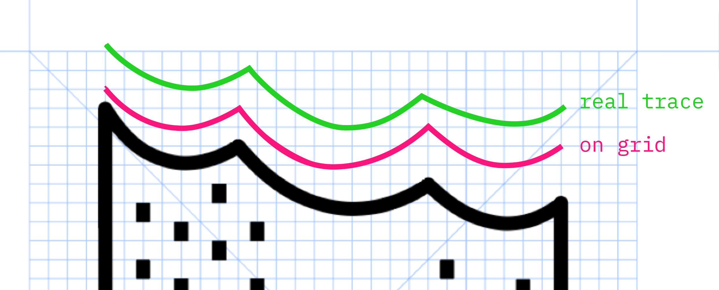
Are you using the right stroke weight? Should be .72pt. Also please reference other water to make sure you’re aligned in scale or the ends of the line being rounded.
mjabbink
on 11 Feb 2020
Looks like water is rounded. You can download the master file here:
https://www.ibm.com/design/language/iconography/pictograms/design/#resources
mjabbink
on 11 Feb 2020
@fabianklonsdorf somehow your last image is not appearing in the repo?
mjabbink
on 11 Feb 2020
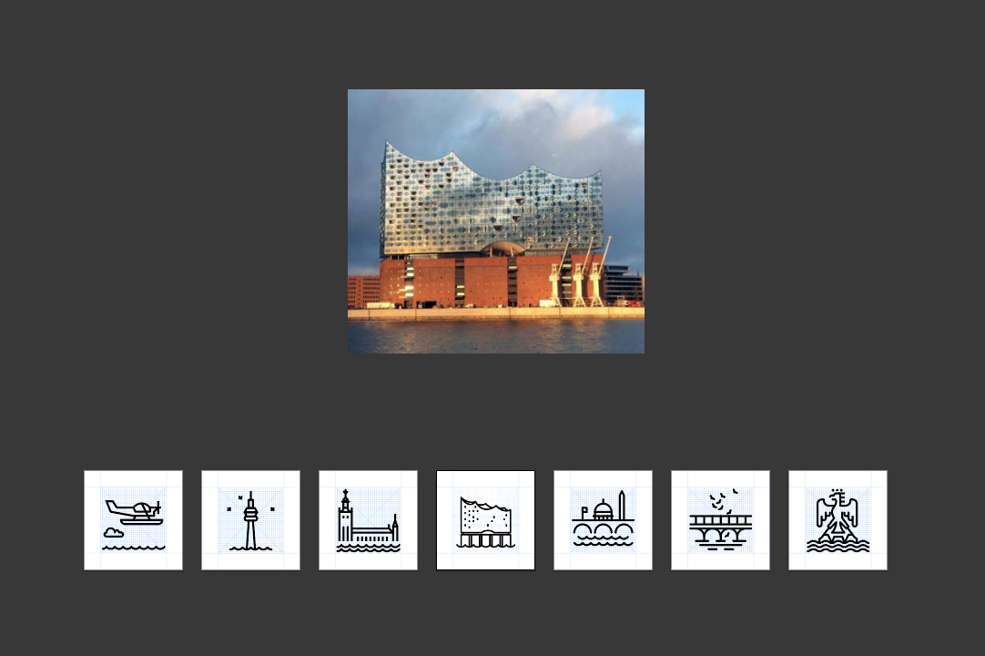
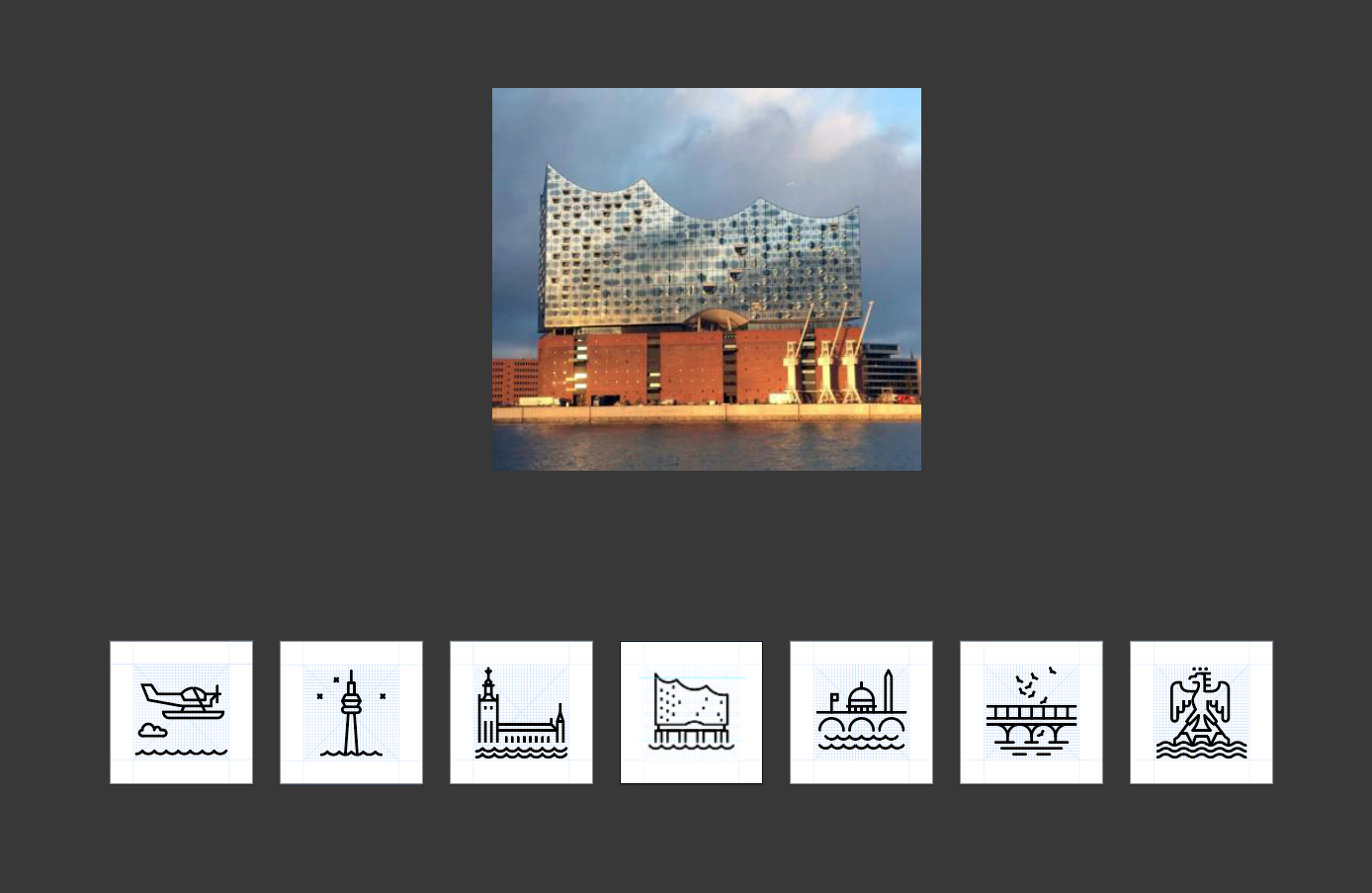
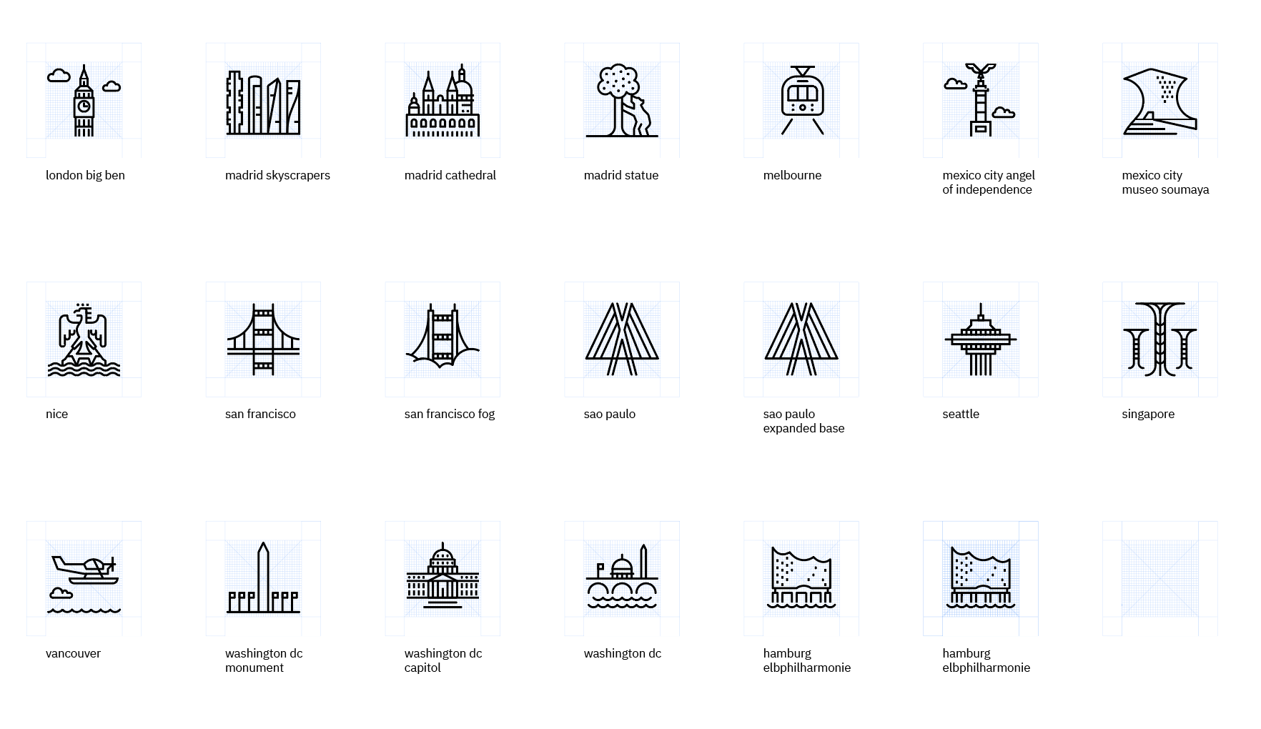
@fabianklonsdorf to do a final assessment can you place the pinto among 10 or so other city pictograms. also please connect with Silvio Hajdin
mjabbink
on 11 Feb 2020
@mjabbink strange, just tried to edit a word.
Here it is again:
yeah - used the 0.72px stroke weight and also used the water thats used in the pictogram master.
Will work on your other hints and provide the final assessment soon. :)
fabianklonsdorf
on 11 Feb 2020
@fabianklonsdorf - will provide some additional feedback and we can then take the picto through the final stages + commit process.
 silviohajdin
on 12 Feb 2020
silviohajdin
on 12 Feb 2020
@silviohajdin okay, I'll wait then for your additional feedback and will provide you then with the latest proposal. :)
fabianklonsdorf
on 12 Feb 2020
@fabianklonsdorf - pls. consider the following:
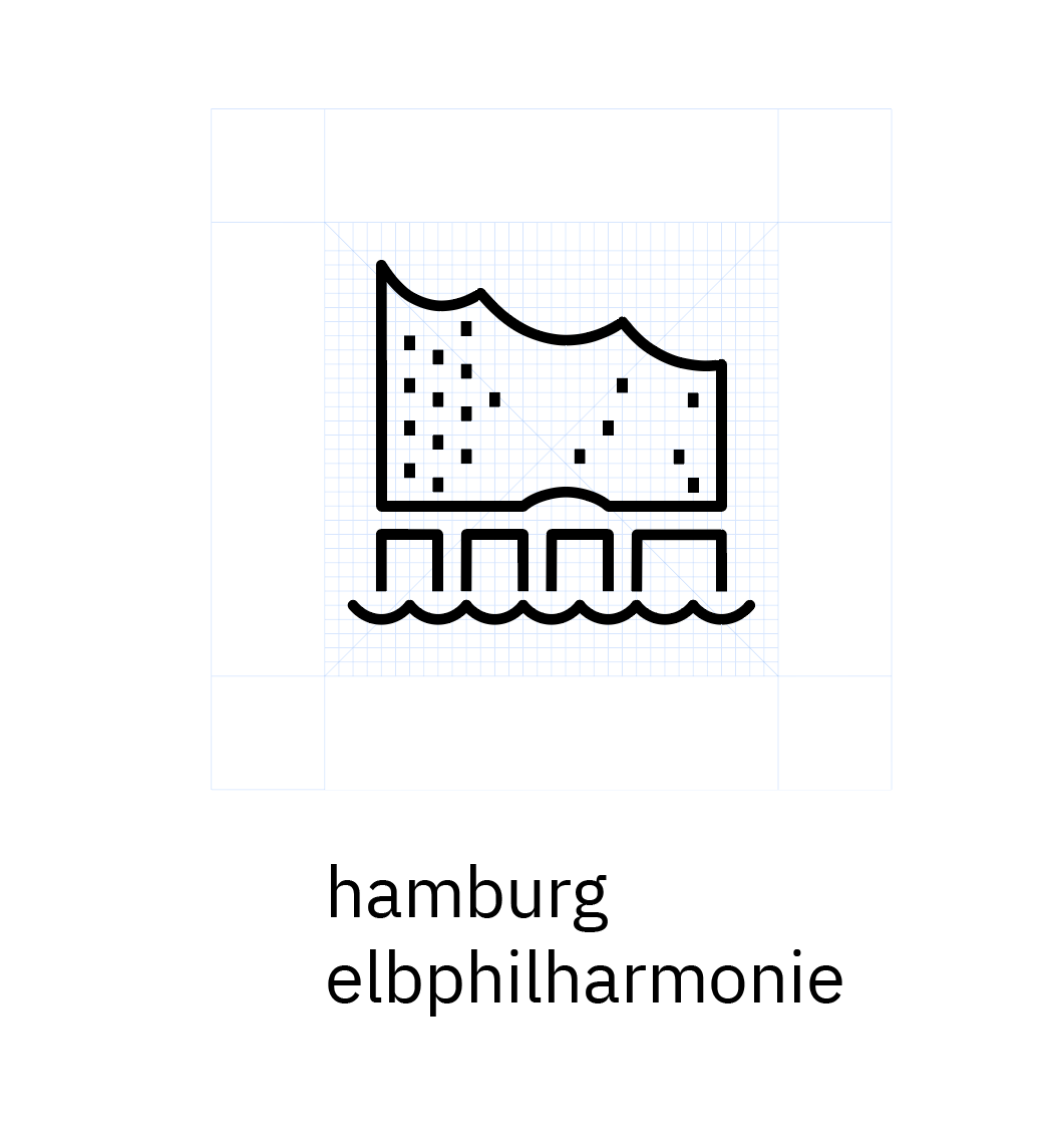
• We're normally aiming for straight-on view, viewing from the ground/water level if showing the entire structure. Using that view, and looking at the straight-on reference photo above, it seems that you wouldn't even see the back 'spikes' on the roof. To Mike's point, these tend to plug in and lose clarity when the pictogram is used at smaller sizes. Recommend to remove back 'spikes' and only keep the front ones per your single-roof-outline studies above.
• Looking at our 'water' pictograms comparison, with your current treatment in the middle, consider adding some more separation between the water wave and the structure. This will give the pictogram more clarity and will convey that 'raising from the water' concept you're showing with the Elbphilharmonie, just like we're doing with the Stockholm pictogram immediately to the left of your treatment. Adding 1-2 unit wave separation would work well.
• As Mike already commented, adding another unit between the brick base and glass superstructure will help with clarity when used at smaller sizes.
• Additionally, if the available grid structure will allow for it, consider adding another unit between the 4 vertical 'pillar' lines to accentuate them better, especially when the pictogram is reduced.
silviohajdin
on 13 Feb 2020
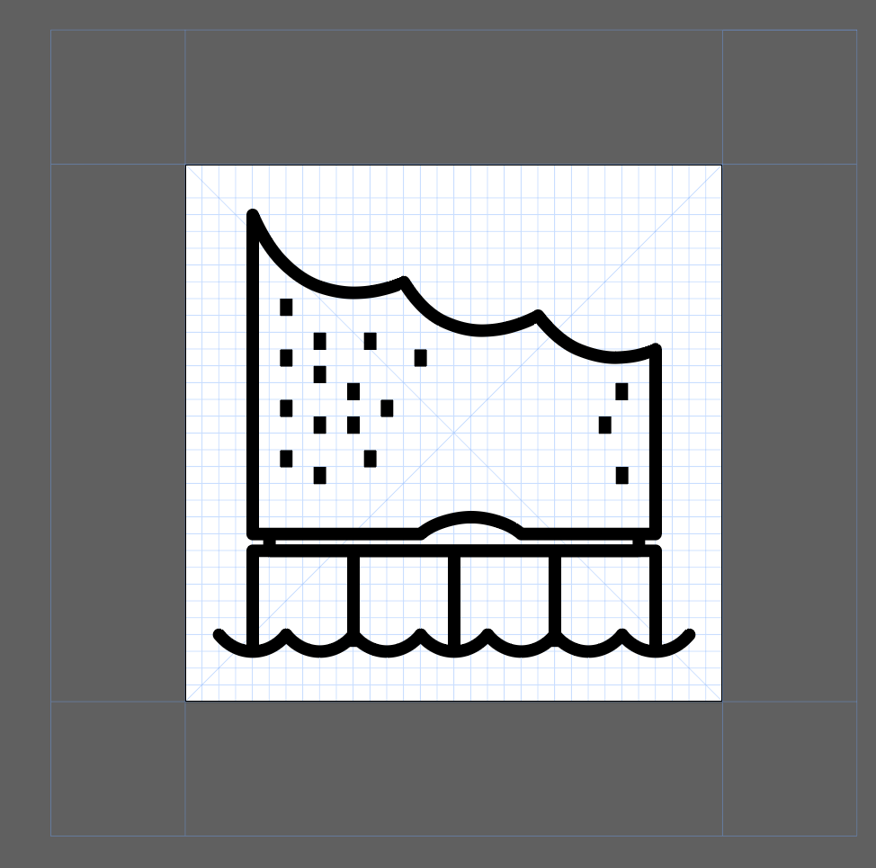
@silviohajdin sorry for the confusion. as I was seeing the png in github I saw, I need to change something.
What about that:

Also the contextual picture shows basically that the first proposal doesnt really work - so I worked on the brick basement.
fabianklonsdorf
on 13 Feb 2020
this could also work?
fabianklonsdorf
on 13 Feb 2020

or should the basement better be made of same sized brick basement parts?
fabianklonsdorf
on 13 Feb 2020
this would be also an option, but the base now looks a little like a piano, which is not the worst relation, as it's basically an opera house.
fabianklonsdorf
on 14 Feb 2020
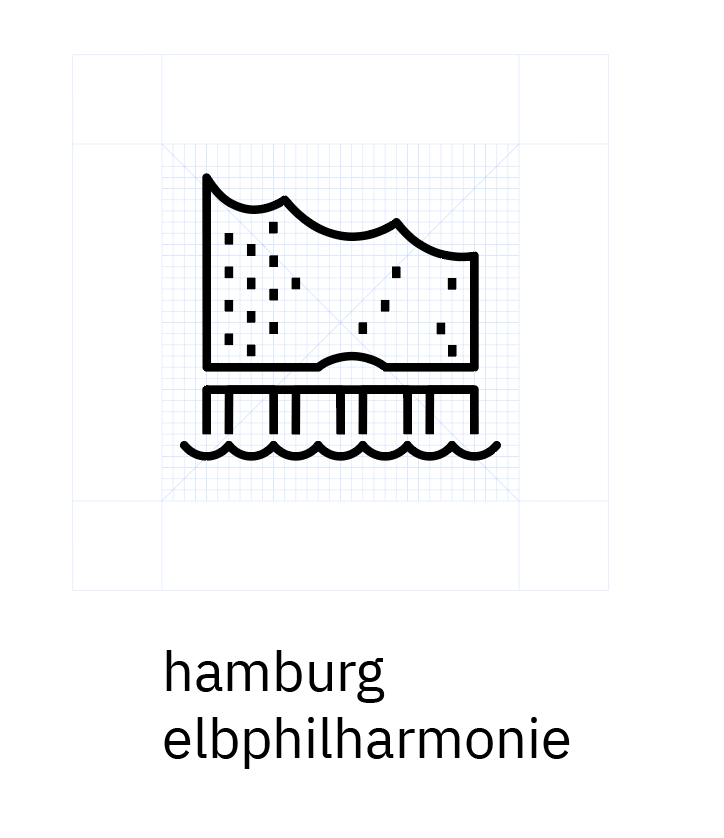
@fabianklonsdorf - good iterations, you can see how some of these simple interventions quickly bring essential features forward, and hold clarity well when the pictogram is scaled down to smaller sizes. As we always strive to be as true and as close to the chosen motif, a couple of remaining interventions would be great, and we'll then be ready to share with Mike for his final review:
• consider connecting the glass superstructure to the brick base by adding two inset verticals per screenshot above (otherwise the floating glass superstructure is kind of disconnected and literally detached from the base, which isn't true to the real building)
• connecting the top brick base horizontal all the way across is great, like you did in the last iteration above, but using an earlier rendition from today, shown below - that one to me lends itself best as the basis for the final, connected version:
silviohajdin
on 14 Feb 2020
@fabianklonsdorf - one final observation - looking at the straight-on reference photo, the last / right-most roof 'spike' is only marginally lower than the third one. To that same point around being as true to the original as we can in our style and grid structure, consider accentuating that last spike.
silviohajdin
on 14 Feb 2020
@silviohajdin AWESOME! Thank you.
Based on your feedback, I connected the basement with the glass structure. Also I positioned the 3rd spike a little more like the reality.
Here with a few other pictograms.

fabianklonsdorf
on 14 Feb 2020
@fabianklonsdorf - great, thanks for the tweaks. Please humor me and create the second version that connects the top of the brick structure into a single base/foundation for the glass superstructure, and we'll put both of these forward to Mike.
While the latest connected treatment works really well, it leaves impression (especially in larger views) that the glass superstructure is supported by stilts, which isn't the case in reality. We can call your final design above, version 'A', and the version per quick intervention below can be version 'B'. Please follow each version with the contextual depiction with other pictograms as you have it above, and we'll send it Mike's way for review and approval - thanks!
silviohajdin
on 14 Feb 2020
@silviohajdin awesome. Here are the two versions. Also both in context with some other pictograms. Let me know if you have more thoughts on that. :)
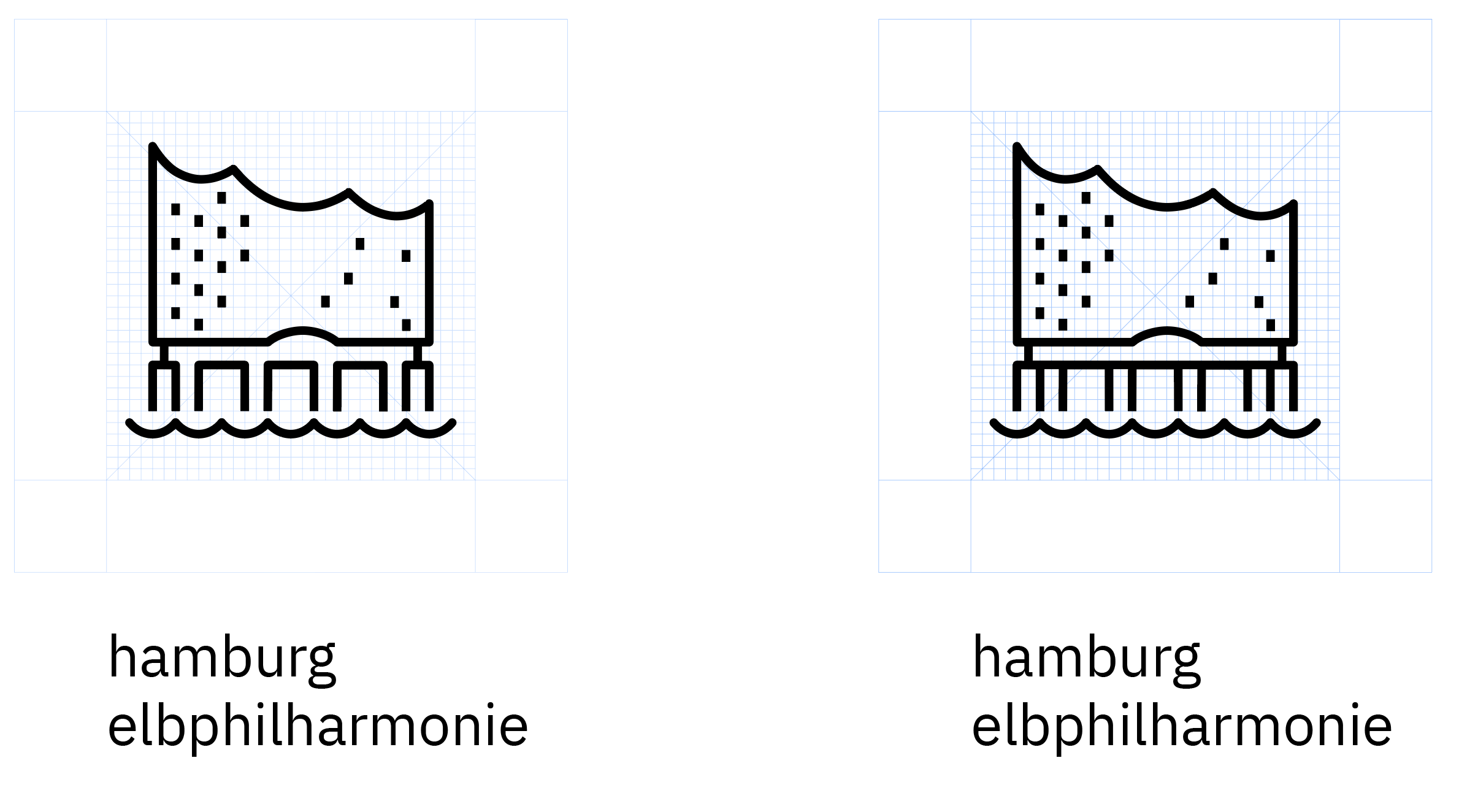
fabianklonsdorf
on 14 Feb 2020
@fabianklonsdorf - great, thanks. @mjabbink please take a look at the two versions above; both now work well at smaller sizes and in the context of other pictos, with my slight preference for the version on the right as it's more true to the actual structure.
silviohajdin
on 14 Feb 2020
These work and probably agree the right one is best in the set as well as it being more true to the structure.
Is the roof line still too steep? The images of the actual architecture show the right side with a slight pitch than it increases as it goes towards the left side of the structure. Minor detail but a distinctive part of the roof
mjabbink
on 14 Feb 2020

mjabbink
on 14 Feb 2020
maybe it kills the drama of pictogram if we get to accurate but worth a try first.
mjabbink
on 14 Feb 2020
@mjabbink cool, thanks for the feedback.
done. 👍
fabianklonsdorf
on 14 Feb 2020
thanks @fabianklonsdorf who never sleeps :D
final thoughts @mjabbink ? a bit more tame but sill works nicely, and more true to the real thing.
silviohajdin
on 14 Feb 2020
I can go either way if Nefertiti’s not true
mjabbink
on 14 Feb 2020
Maybe to tame. I prefer the previous
mjabbink
on 14 Feb 2020
Great exploration though.
mjabbink
on 14 Feb 2020
thanks @mjabbink - we have the winner @fabianklonsdorf in the previous, more dramatic rev below:
silviohajdin
on 14 Feb 2020
really nice work @fabianklonsdorf and a great motif choice - please generate the SVG per https://www.ibm.com/design/language/iconography/pictograms/contribute and attach it here.
silviohajdin
on 14 Feb 2020
@silviohajdin @mjabbink Awesome, thank you!
Attached, you'll find the SVG export. :)
2020-02-17_Carbon-Icon-HAM-Elphilharmonie-01.svg.zip
Feel free to reach out for any other comments. 👍
fabianklonsdorf
on 17 Feb 2020
@joshblack is this in the wrong repo?
 vpicone
on 17 Feb 2020
vpicone
on 17 Feb 2020
@vpicone @joshblack that's the repo stated on that website: https://www.ibm.com/design/language/iconography/pictograms/contribute/#contribution-process
fabianklonsdorf
on 17 Feb 2020
Definitely not your mistake @fabianklonsdorf! Just something I needed to PR a fix for 😄
PR up @vpicone https://github.com/carbon-design-system/design-language-website/pull/442
 joshblack
on 18 Feb 2020
joshblack
on 18 Feb 2020
@vpicone @joshblack - great, as this particular issue is now completed and can be closed.
silviohajdin
on 18 Feb 2020
@silviohajdin I believe we'll want to add this into the pictogram library right?? Let me know if not. If that's the case we can use this issue to capture adding it to the library. If it's not, then totally fair!
joshblack
on 18 Feb 2020
@joshblack - yes indeed, moved the commit of the pictogram into task https://github.ibm.com/brand/pictograms/issues/24 and we'll commit to the master pictogram library through there.
silviohajdin
on 18 Feb 2020
Awesome! Sounds good 😄
joshblack
on 18 Feb 2020
Related issues
 laurenmrice
·
3Comments
laurenmrice
·
3Comments
 windgaucho
·
3Comments
windgaucho
·
3Comments
 snidersd
·
3Comments
snidersd
·
3Comments
 ajdaniel
·
3Comments
ajdaniel
·
3Comments
 drewdistefano
·
3Comments
drewdistefano
·
3Comments