Carbon: Problem with dark themes' `$ui-02` and '$ui-03` values are the same
Problem:
Dark theme's $ui-02 and '$ui-03` are the same.
$ui-02
It appears $ui-02 has the same usage and values as $field-02 on all themes. Potentially we can drop $ui-02 if there's never a use case for it.
$ui-03
$ui-03 are showing up in the following places:
- Accordion, divider lines
- Code snippet with numbers, divider line on the left between num and code
- Tabs, underline for unselected
- Progress indicator, progress bar
- Pagination, divider lines
- Overflow, rule
- Data table, header bar
 shixiedesign
All 21 comments
Proposing to change $ui-03 to these values
| White | G10 | G90 | G100 |
| --- | --- | --- | --- |
| G20 #DCDCDC | G20 #DCDCDC | G80 #3D3D3D | G80 #3D3D3D |
To do:
- [x] @laurenmrice is gonna implement the new
$ui-03value in the components listed above, then, - [ ] Make PR to
carbon-elementsrepo to update the token - [ ] Make PR to
carbon-websiterepo to update the token in website - [ ] Update in Kits
shixiedesign
on 4 Apr 2019
I know this bug has now been closed and marked as done... but it the changes suggested above don't appear to have made themselves over into the theming package... will they at some point
 johnjesse
on 11 Oct 2019
johnjesse
on 11 Oct 2019
Reopening for now since it seems like this hasn't been addressed, looking at the theme package.
 abbeyhrt
on 29 Jan 2020
abbeyhrt
on 29 Jan 2020
@laurenmrice looking into it, the dark theme values for ui-02 and ui-03 are still the same, do we know what value one of them needs to be updated to?
abbeyhrt
on 29 Jan 2020
we are still trying to figure that out ! :)
 laurenmrice
on 29 Jan 2020
laurenmrice
on 29 Jan 2020
Example image of the problem of what we currently experience with ui-03. When a component with rules has a light prop set in the dark themes, the rules end up blending into the components background making it appear broken:
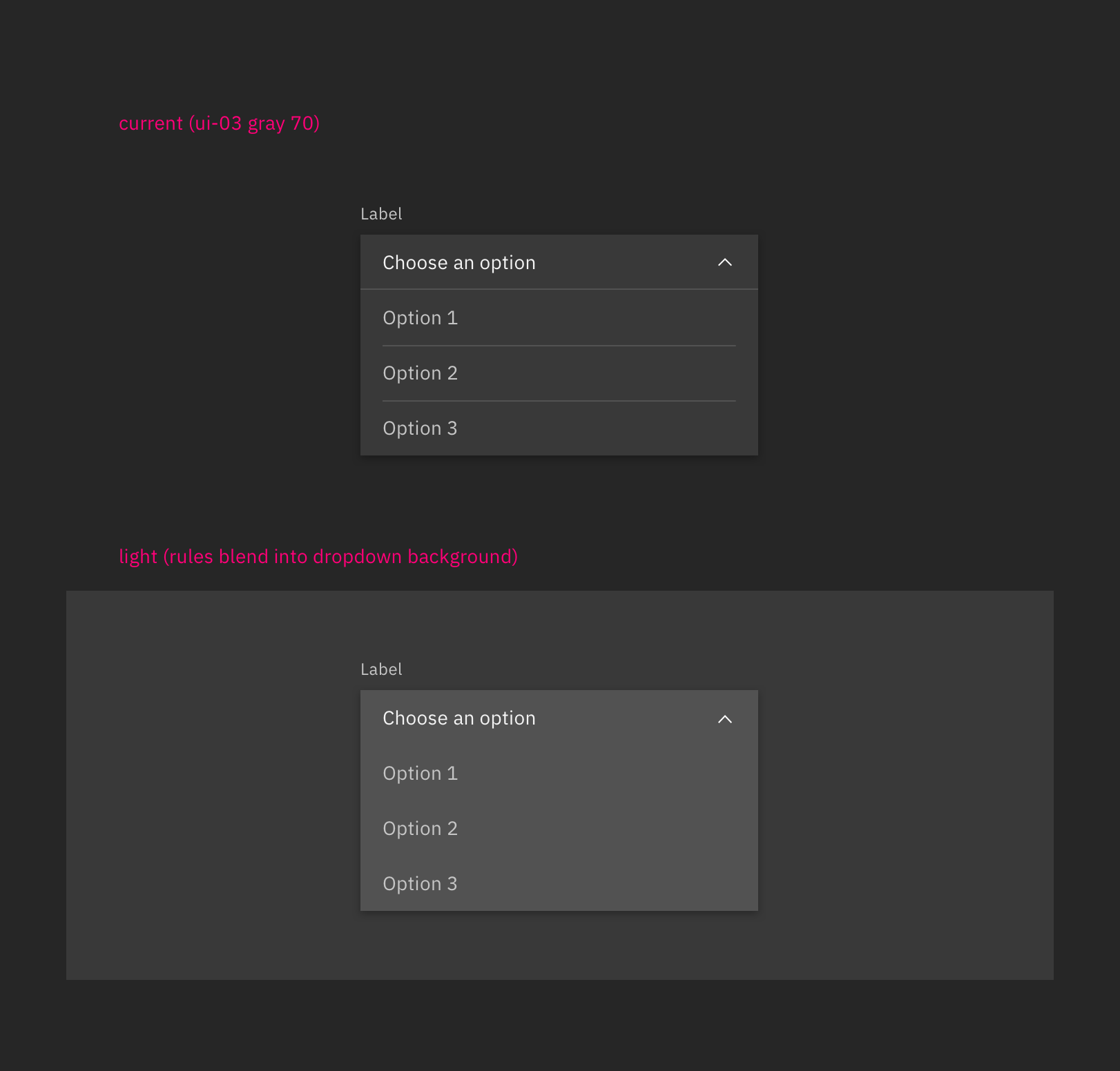
Did an explore of changing values for ui-03 in the dark theme, this would be the best solution that would correct our light prop problems with components that have rules.
| G90 | G100 |
| --- | --- |
| G60 #6f6f6f | G70 #525252 |
This does create some high contrast issues for components in general that are placed on their ui-background and isn't as subtle as we would like.
A better solution we can explore is having more control over our light props so we could adjust the rules in addition to the background color instead of having to change values for the ui-03 token across the board. @tw15egan to look into this.
laurenmrice
on 24 Feb 2020
@laurenmrice do we have color values for what the rules should be if the light prop is applied?
 tw15egan
on 5 Mar 2020
tw15egan
on 5 Mar 2020
Yes, we would want to change the rules to be a step lighter for the light prop.
Gray 90 theme
Change to Gray 60 #6f6f6f
Gray 100 theme
Change to Gray 70 #525252
laurenmrice
on 5 Mar 2020
Seems like we are using $ui-01 for the menu dropdown background, so not sure this issue needs any action at the moment. The website seems to have the same information, and it seems to be rendering correctly in the theme switcher.
tw15egan
on 5 Mar 2020
I think the code is just not using the right tokens. By default dropdown/combobox/multiselect should be getting field-01 backgrounds. When the light prop is enabled it should then get field-02. Right now in code when the light prop is enabled, I see that only the top item that is selected gets field-02 and the items in the open drawer do not. Those also should be field-02
Overflow menu is working correctly, which shows the ui-03 rule color blending into the background.
laurenmrice
on 6 Mar 2020
The way we have it defined is as follows:
| | Token | White | G10 | G90 | G100 |
|------------------------|----------|--------|--------|--------|--------|
| Dropdown Field | field-01 | gray10 | white | gray80 | gray90 |
| Dropdown Menu | ui-01 | gray10 | white | gray80 | gray90 |
| Dropdown Rule | ui-03 | gray20 | gray20 | gray70 | gray80 |
| | | | | | |
| Dropdown Field (light) | field-02 | white | gray10 | gray70 | gray80 |
| Dropdown Menu (light) | ui-01 | gray10 | white | gray80 | gray90 |
| Dropdown Rule (light) | ui-03 | gray20 | gray20 | gray70 | gray80 |
As you can see, if we switch it to use the field as the background, every light will get 10 steps closer. This is fine for the light themes since they will be a step away from the rule. But on the dark themes, they will disappear since all 3 values will be the same.
If we are going to expand the application of light variations within a theme, it seems like we need a new set of tokens that are explicitly used in these scenarios. I think this solution may be needed regardless, as even the white (g10 --> g20) and g10 (white --> g20) have variation in the contrast between the background and the rule.
tw15egan
on 6 Mar 2020
ok that makes sense. For our website, would it be possible to only surface these tokens specifically for the components that have a light prop and not list them as the global tokens we have on our color usage page for example?
laurenmrice
on 6 Mar 2020
I'm not too sure about how we are scoping variables, but since we need a distinct value for each theme I would think they would need to be made global and live in the theme package. Another solution would be to modify the existing dark themes to work with a field-01/field-02 menu background.
We could always just keep these values, as the Dropdown _is_ showing up to spec based on what's on the website, and then focus on matching overflow menu to the dropdown styles since it is "working"
tw15egan
on 6 Mar 2020
We need to modify the existing dark themes to work with a field-01/field-02 menu background. That's how it was originally speced in our design and then with the v2 color update i think thats when we ran into this issue.
laurenmrice
on 9 Mar 2020
So are we going to go with
| G90 | G100 |
| --- | --- |
| G60 #6f6f6f | G70 #525252 |
as the updates to the themes? And then we can change the menu backgrounds to use the field tokens
tw15egan
on 9 Mar 2020
yaaasss
laurenmrice
on 9 Mar 2020
@tw15egan are those suggested changes to the $ui-03 token?
johnjesse
on 9 Mar 2020
not for the actual token itself, but only modifying it in the light prop for dark themes.
laurenmrice
on 9 Mar 2020
@laurenmrice we aren't able to modify tokens with just a light prop. When we use the light prop, we can just specify another token to use. So we'd either need to create a new token, or we need to update the values.
So currently we use field-01 as the dropdown background. When we use the light prop, we specify the background to be field-02. We can't change it to a hardcoded value, otherwise, it would always be that value no matter what theme is defined.
tw15egan
on 9 Mar 2020
Oh right sorry, reread above comments ^ we will need to create a new token to use instead of updating ui-03 token values. We don't want to update values for ui-03 because then it will affect components negatively across the board that don't have a light prop.
laurenmrice
on 9 Mar 2020
I would be fine with calling this new token decorative-01 until we audit our token naming for v11.
Values per theme:
White | G10 | G90 | G100 |
| --- | --- | --- | --- |
| G20 #e0e0e0 | G20 #e0e0e0 | G60 #6f6f6f | G70 #525252 |
laurenmrice
on 16 Mar 2020
Related issues
 emyarod
·
3Comments
emyarod
·
3Comments
 JordanWSmith15
·
3Comments
JordanWSmith15
·
3Comments
 AnthumChris
·
3Comments
AnthumChris
·
3Comments
 ahoyahoy
·
3Comments
ahoyahoy
·
3Comments
 kalyanixraut
·
3Comments
kalyanixraut
·
3Comments