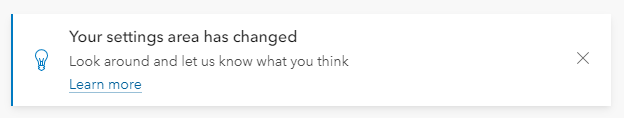
Calcite-components: Enhancement: calcite-notice - add option to change the close icon to a different action
Description
From the story book
Design
Acceptance Criteria
Relevant Info
Which Component
Example Use Case
 AdelheidF
All 32 comments
There was a similar request for alert - in my mind a good addition to both notice and alert : https://github.com/Esri/calcite-components/issues/2012#issuecomment-827792704
 macandcheese
on 13 May 2021
macandcheese
on 13 May 2021
@macandcheese Would users expect the info icon to close it?
 jcfranco
on 4 Jun 2021
jcfranco
on 4 Jun 2021
The info icon opens a popover. It will never be closed in this use case.
AdelheidF
on 4 Jun 2021
I don't think so... it would also likely be any Calcite UI Icon so somewhat up to the implementer?
macandcheese
on 4 Jun 2021
@AdelheidF Thanks for clarifying.
@macandcheese Would there be a use case for a trailing icon next to the close button? If so, we could add an icon-end slot and still allow it to be dismissed if necessary.
jcfranco
on 4 Jun 2021
That was the ask in the issue linked above https://github.com/Esri/calcite-components/issues/2012#issuecomment-827792704 - slot makes sense for having a tooltip, if we can style the border to and limit size of slotted icon to match that of the appended dismiss "x"
macandcheese
on 4 Jun 2021
Awesome. I think that will work. To recap, this should:
- add an action-end slot for
calcite-actions
- placed before the close icon
- close icon can be independently toggled via
dismissed - styling should match the designs from the comment you linked above.
Does the above seem correct? Did I miss anything?
jcfranco
on 4 Jun 2021
Seems good to me!
macandcheese
on 4 Jun 2021

do it
 bstifle
on 4 Jun 2021
bstifle
on 4 Jun 2021
Installed.
@AdelheidF Can you help verify once you use the latest next or the next beta release (beta 58)? 🙇🏼♂️
jcfranco
on 23 Jun 2021
I'm using next.231.
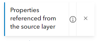
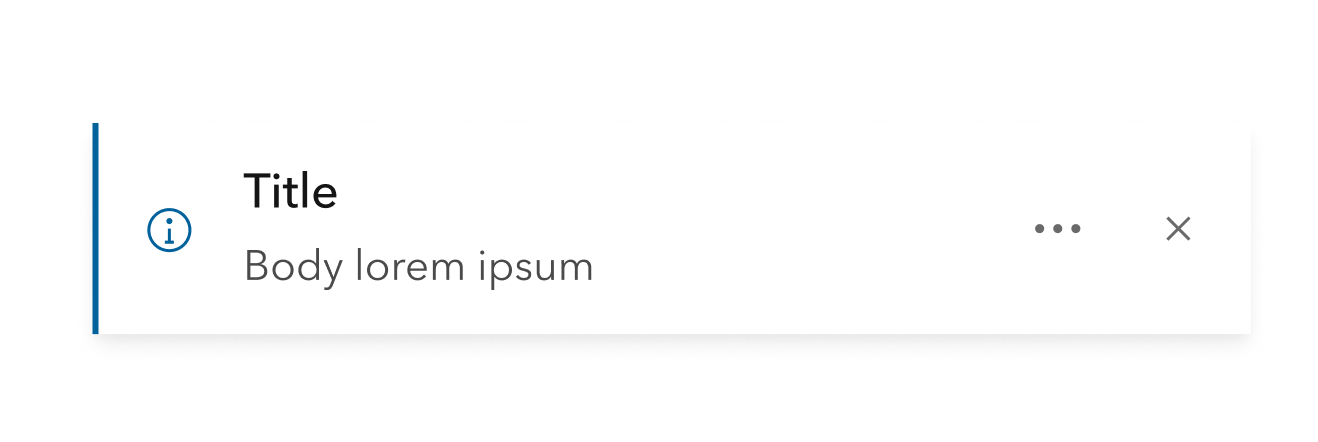
Do we really need these vertical lines?
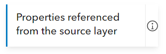
Without adjusting the position of the icon...
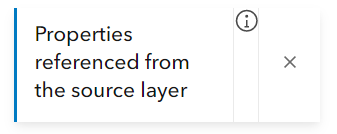
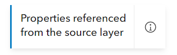
now with aligment...
... and padding
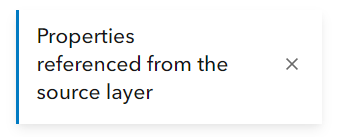
no icon...
this is my desired design...
AdelheidF
on 23 Jun 2021
Do we really need these vertical lines?
I think we can remove the divider if there's only one icon displayed. @macandcheese WDYT?
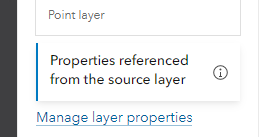
Weird how the action is not aligned. Can you confirm if that is a slotted icon or an action? If it's an action, can you share a snippet for the above?
jcfranco
on 23 Jun 2021
I'm now adding a vertical-align...
Slot "action-end" didn't work for me.
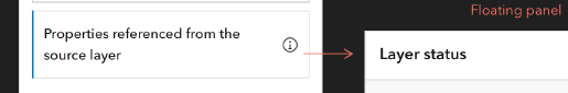
<calcite-notice
class={CSS.properties}
width="full"
scale="s"
active={true}
onClick={this.openStatus}
>
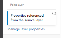
<div slot="title">
{strings.propsFromSource}
</div>
<calcite-icon
slot="icon-end"
icon="information"
scale="s"
class={CSS.propertiesIcon}
></calcite-icon>
</calcite-notice>
The vertical lines denote hit / touch area, this action should be treated the same as the dismiss button. It also visually matches an alert displaying a queue length and a dismiss button, so I don’t think we should change that design, although I agree it looks weird when not spaced consistently.
Re: The question of alignment - this is the drawback to suggesting content areas with slots vs. being more prescriptive ie accepting an icon string and tooltip text string.
It’s advantageous in many ways to use slots but it adds a lot of risk around design fragmentation.
macandcheese
on 23 Jun 2021
Slot "action-end" didn't work for me.
I renamed the class but not the slot. 🤦🏼 Fixing...
jcfranco
on 23 Jun 2021
The slot is for a calcite-action to help with layout and button interactions.
It also visually matches an alert displaying a queue length and a dismiss button, so I don’t think we should change that design, although I agree it looks weird when not spaced consistently.
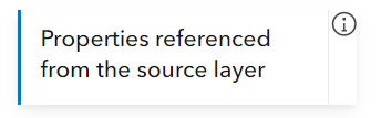
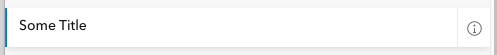
@macandcheese The dismiss button by itself doesn't have the vertical line (https://esri.github.io/calcite-components/?path=/story/components-notice--simple). Do we show vertical lines when we have an action and the close button? Or do we show it always?
jcfranco
on 23 Jun 2021
Let’s use alert when queue and dismiss are present as the example to follow. When slotted action and dismiss are present, use vertical lines on either side of the slotted action.
If it’s just the single item (action or dismiss), treat it as we do the dismiss now (no border).
cc @bstifle to confirm the designs in Storybook are up to date / have parity with Figma.
macandcheese
on 23 Jun 2021
So the correct slot name should be "action-end"? I use a similar slot name in other components and there it's called "actions-end" (with an s). Are you sure you want to go with "action-end"?
AdelheidF
on 23 Jun 2021
I used single because all of the designs had only one action at the most, but I do see that in my list of requirements I used plural. @macandcheese, @bstifle can you confirm if notice would support multiple actions? If so, I can update accordingly.
jcfranco
on 23 Jun 2021
well. We dont add the verical lines in block/panel/value list etc. not sure we should add those here
bstifle
on 23 Jun 2021
bstifle
on 23 Jun 2021
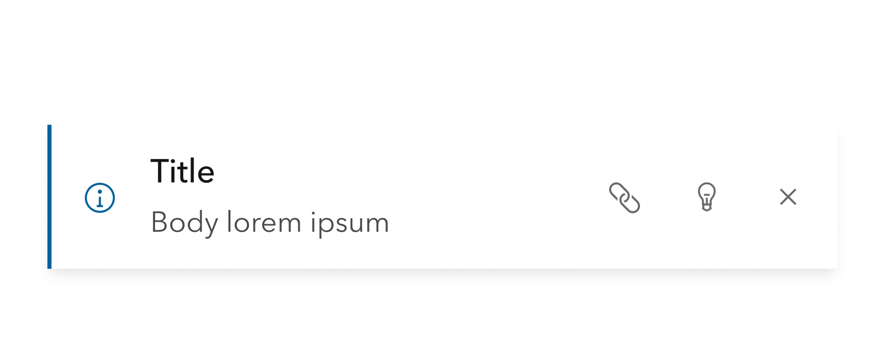
@bstifle Noice! One more question: if there's only one action, show it directly and skip the ... menu (w/o vertical lines as well)?
jcfranco
on 23 Jun 2021
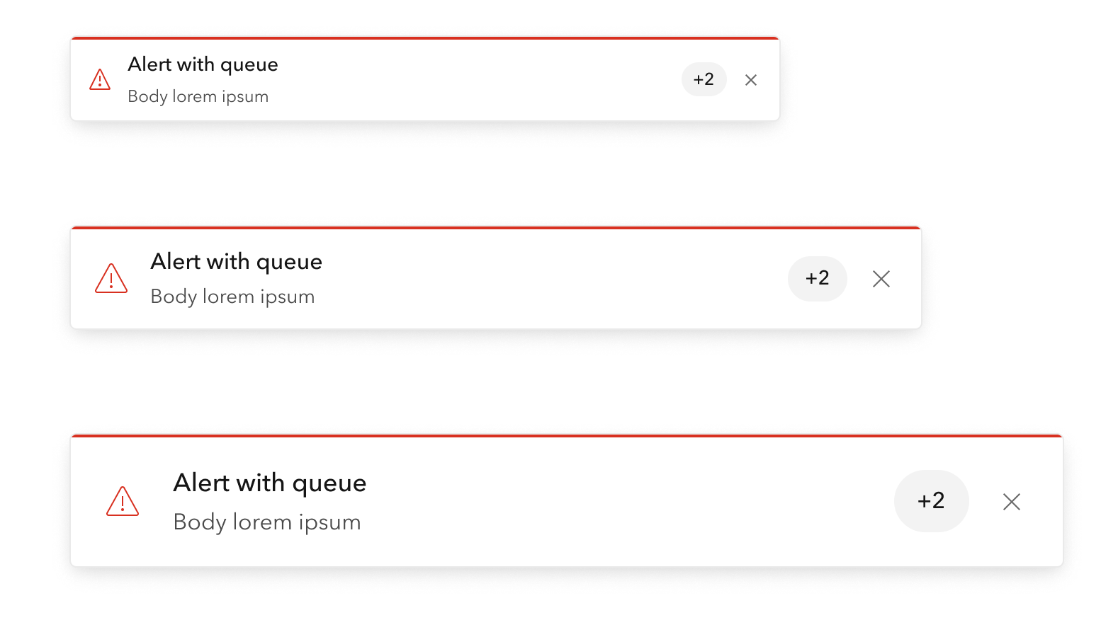
Alert is a more analogous component than any of block, panel, or value list, and this is how we treat two trailing "things":
Let's make sure these are all visually consistent. I don't have a strong preference to what end. Maybe make the "queued" value a chip with no lines ever.
macandcheese
on 23 Jun 2021
@jcfranco
@bstifle Noice! One more question: if there's only one action, show it directly and skip the
...menu (w/o vertical lines as well)?
sorry that was confusing. the dots were not meant to be an overflow. just an action next to X. would just stack em to the side like this if more than one:
bstifle
on 23 Jun 2021
Let's make sure these are all visually consistent. I don't have a strong preference to what end. Maybe make the "queued" value a chip with no lines ever.
Chip for queue would be dope
bstifle
on 23 Jun 2021
@bstifle Got it. 👍🏼
Should we doc a recommended amount of notice actions? We could tackle this later if we need a mechanism to deal with the notice title/message overflowing into the actions area.
jcfranco
on 23 Jun 2021
no more than 2 would be best. that screen shot up there would be worst case in my opinion
bstifle
on 23 Jun 2021
I'll have a PR for this today that will:
- remove vertical delimiters
- rename
action-endslot toactions-end - support multiple actions
- update action slot doc with recommended number of actions to use
jcfranco
on 23 Jun 2021
Thanks everyone!
jcfranco
on 23 Jun 2021
Installed.
jcfranco
on 30 Jun 2021
@AdelheidF Slot names should be fixed (now actions-end). Can you help verify?
jcfranco
on 30 Jun 2021
Tested with next.234. Looks good, thank you.
Without any styling
With styling
With close icon
AdelheidF
on 1 Jul 2021
Related issues
 nwhittaker
·
5Comments
nwhittaker
·
5Comments
 asangma
·
4Comments
asangma
·
4Comments
 kMcPherson1
·
4Comments
AdelheidF
·
4Comments
AdelheidF
·
4Comments
kMcPherson1
·
4Comments
AdelheidF
·
4Comments
AdelheidF
·
4Comments
Most helpful comment
Seems good to me!