Calcite-components: Enhancement: Add Tabs slot in Panel
Idea to have Panels have Tabs built in via @TheBlueDog .
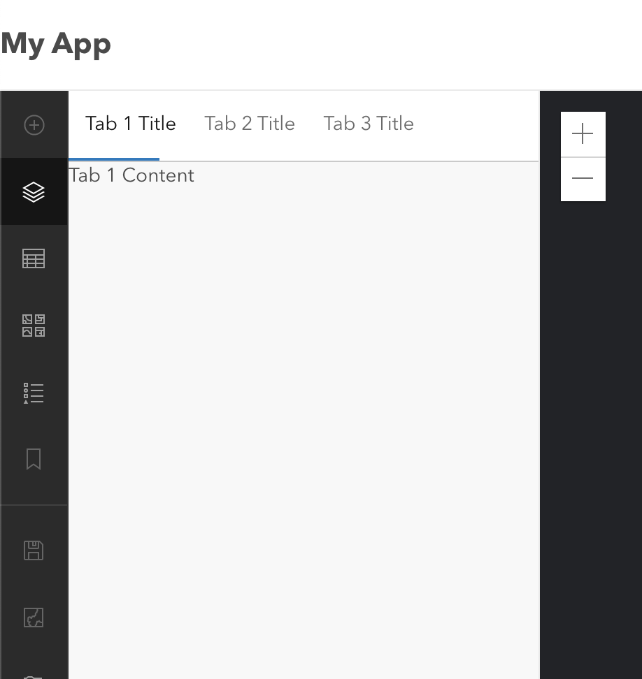
With the available props here are some quick mockups with tabs and how they can display within Panel:
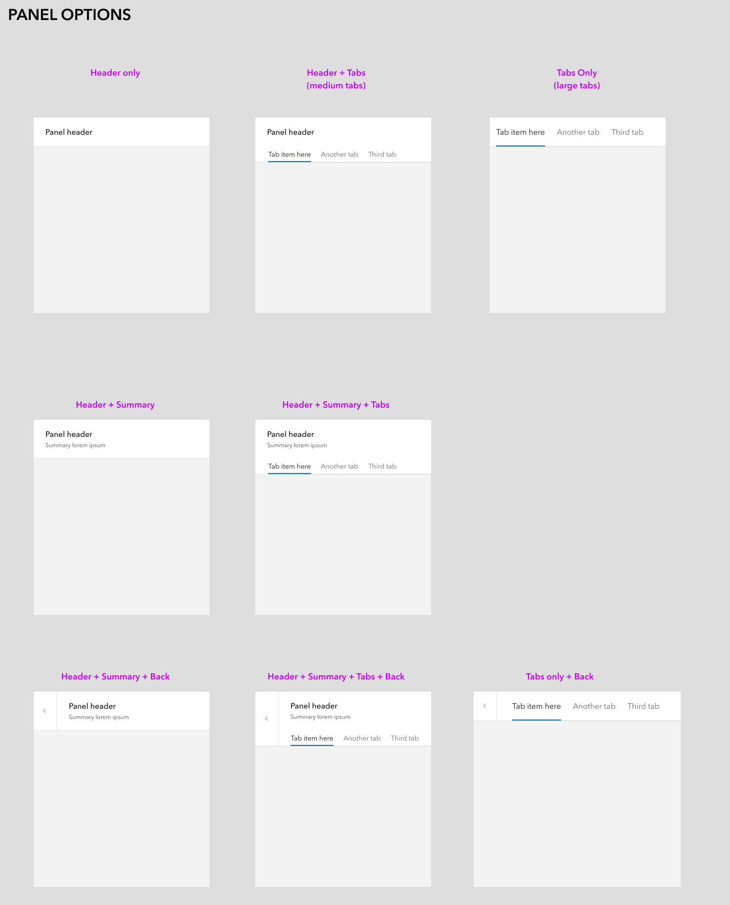
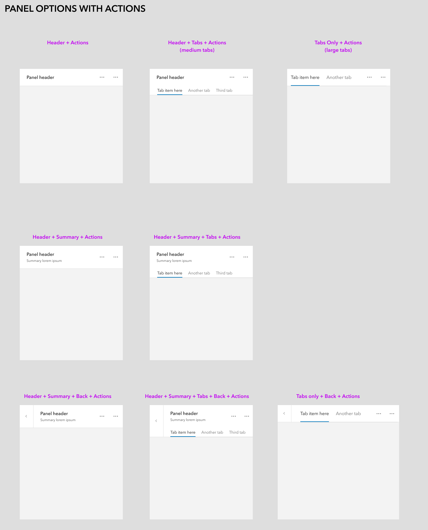
 bstifle
All 29 comments
This feature would be useful in Field Maps!
 TheBlueDog
on 13 May 2021
TheBlueDog
on 13 May 2021
Yeah this is nice, visual feedback for now is limited to spacing - it would be nice for the space between title / summary text and top of tabs, to match the space from the top of the panel to the top of title / summary area (obviously the tabs themselves have spacing in addition to the panel, so that might be tough to rectify for a slotted item).
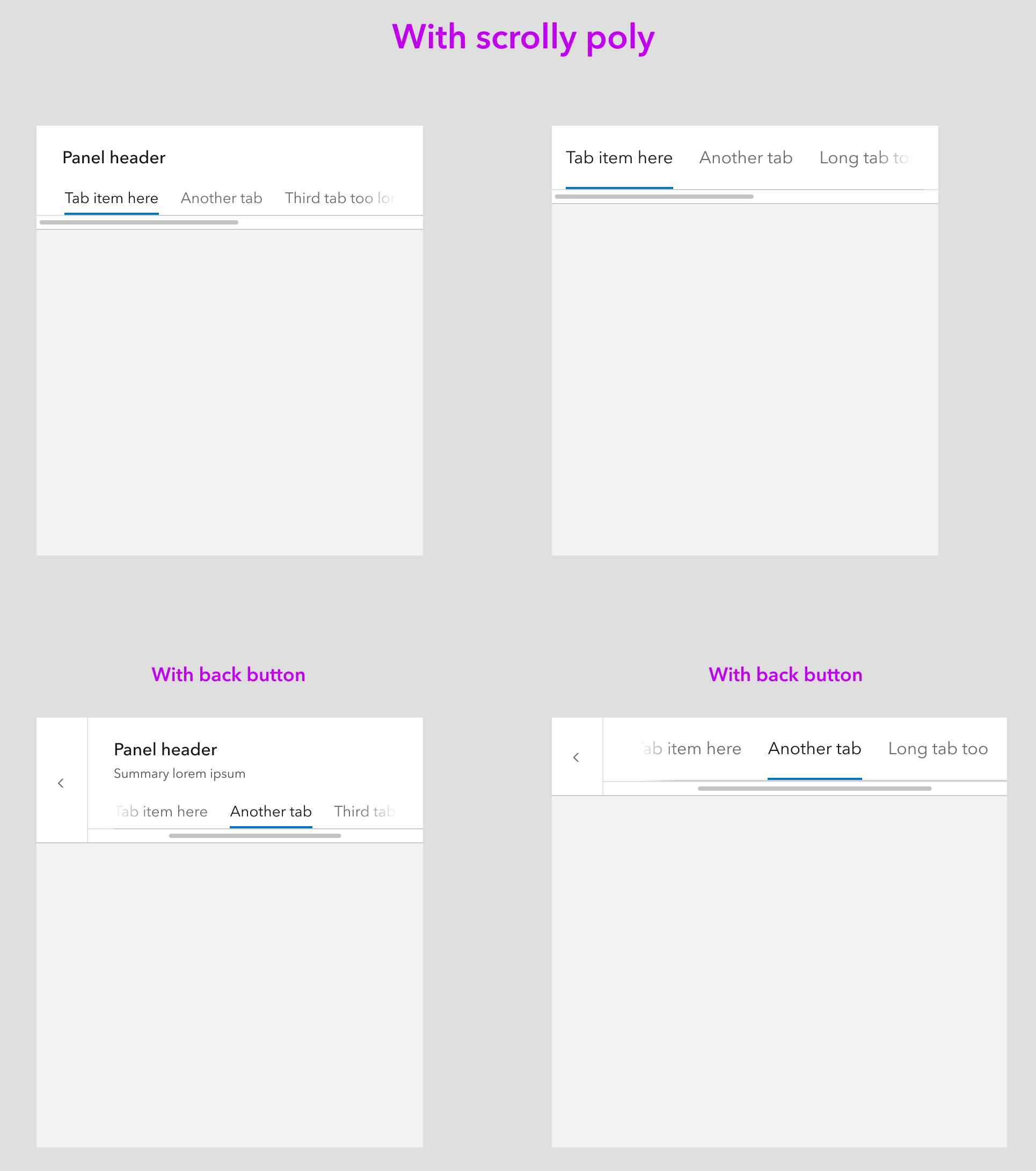
Would be curious to see how tabs with long titles (or more than 3) work with scrolling in panels, especially the smaller width instances.
This reminds me of this old request for a slotted calcite-stepper in the header of a modal, to use the bottom border similarly: https://github.com/Esri/calcite-components/issues/734
 macandcheese
on 14 May 2021
macandcheese
on 14 May 2021
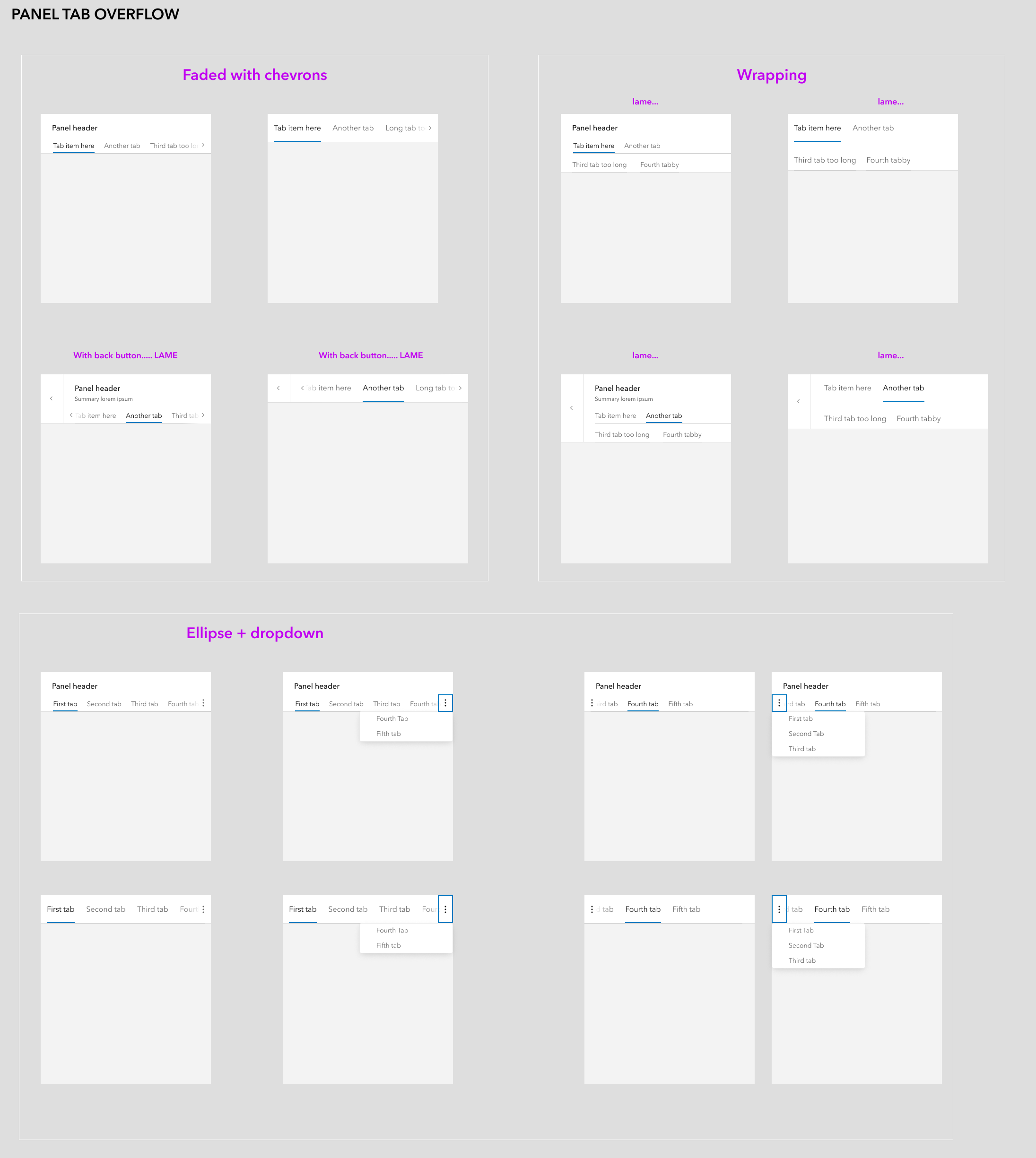
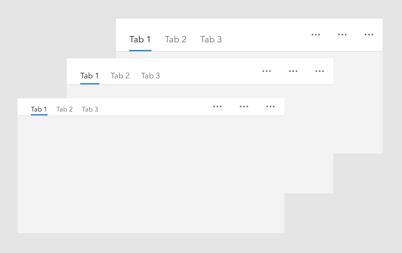
@macandcheese some ideas for tab overflow. I prefer the bottom one with the dropdown
bstifle
on 15 May 2021
Hrm… could it just scroll horizontally? Not ideal but neither is having a ton of tabbed content in a small space. That’s also how tabs currently work - in my mind having an ellipsis w overflow items potentially beneath another overflow menu could get dense.
Maybe we can just make a slight update to the current tabs to have some kind of visual indicator there are more w/in a horizontally scrollable container?
macandcheese
on 15 May 2021
sure that could work. just slap a scrolly on there
bstifle
on 17 May 2021
bstifle
on 17 May 2021
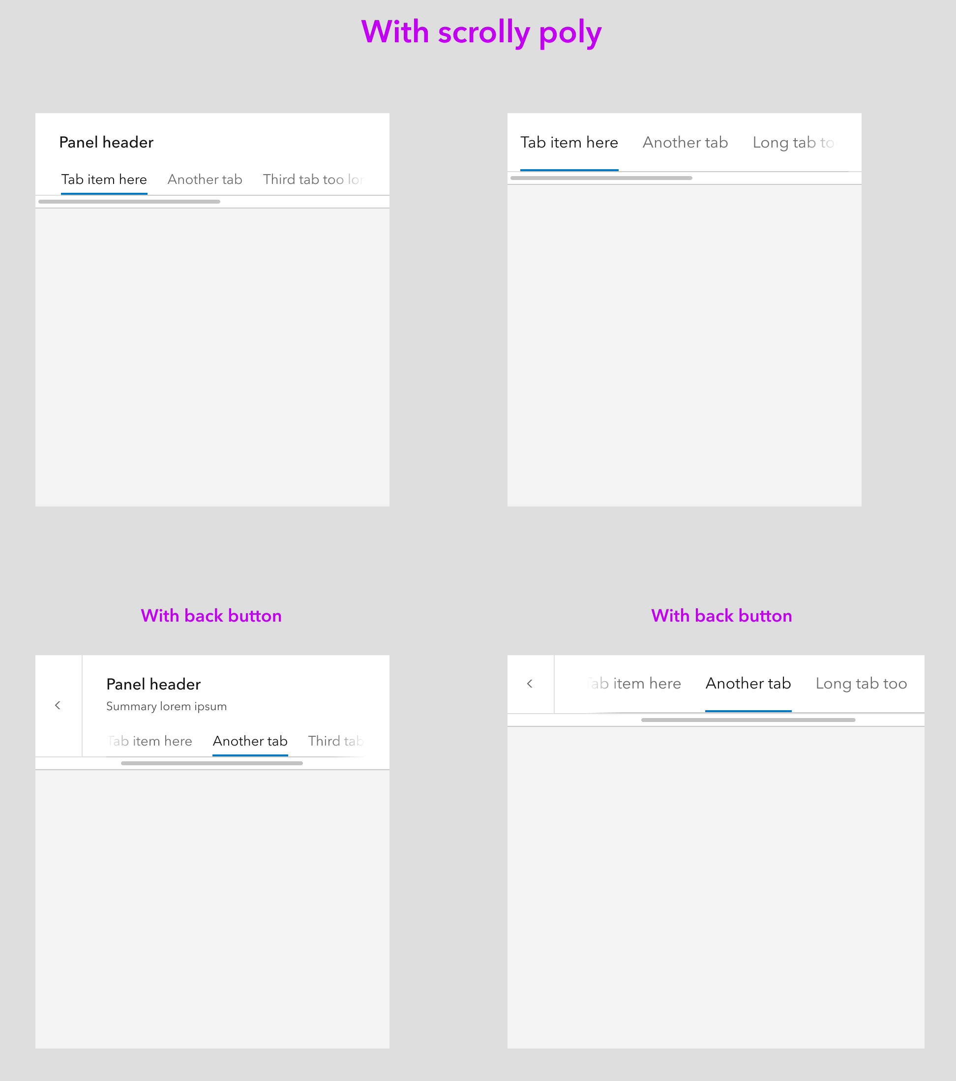
Yeah, not sure we need comps or anything in figma / sketch since scrolling is already a part of tabs?
In the above, only the tab area would scroll - having the scroll bar under the back button insinuates the whole area is overflow-x.
macandcheese
on 17 May 2021
better closer warmer
bstifle
on 17 May 2021
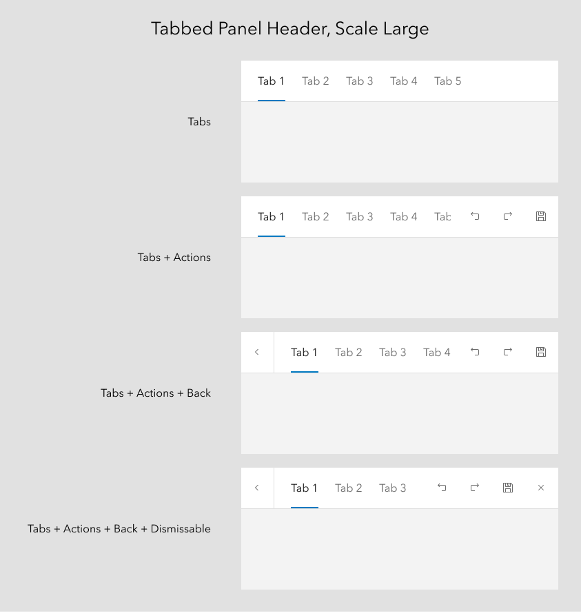
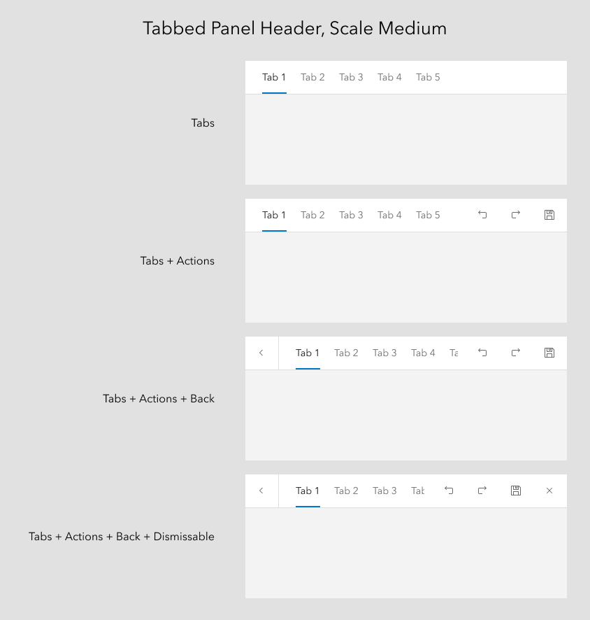
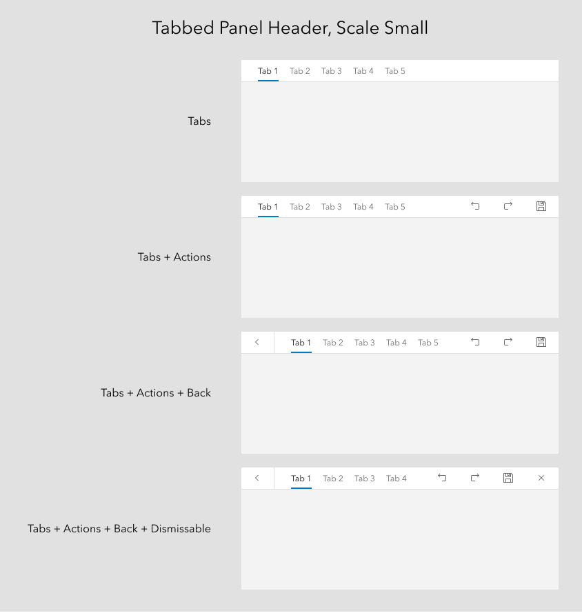
Placing tabs in the panel header is a requirement for the new Arcade editor. It looks like the "Tabs only" option would work for our needs, but we would probably want the option to use medium tabs rather than large.
Current UI:
What we'd like:

 bpatterson88
on 2 Jun 2021
bpatterson88
on 2 Jun 2021
After doing some experimenting with adding tabs to existing panel header patters, got talking with @bpatterson88 and his need is for scale. Neither of our use cases have a need for Heading/Summary in addition to the tabs.
Proposing a simpler solution to implement... this would include the options for back button, actions, and dismiss-able. There would be a new scale property for the header component that changes the scale of the tab set.
TheBlueDog
on 4 Jun 2021
The horizontal misalignment of the text and icons is painful. If we are gonna build these into the component, let's increase the margin between the active line and the tab text to be centered
bstifle
on 4 Jun 2021
Not sure that Panel needs a specific slot for Tabs.
Seems like you could put Tabs in the default slot of Panel.
 asangma
on 4 Jun 2021
asangma
on 4 Jun 2021
Also, if you don't add a heading or summary, the Header node doesn't render, so you build the tabs inside the default slot.
asangma
on 4 Jun 2021
I also think that the Panel would probably need to manage the tab navigation.
Or Tabs would need to be reworked to be able to let the tab nav manage tab content that is in a different node.
This is because Panel's header is one node, and Panel's content is another node.
asangma
on 4 Jun 2021
@asangma You thinking that a tabbed would need to be its own standalone component?
TheBlueDog
on 4 Jun 2021
Examples of how the scaled versions would look. This would require a change in the spacing of tabs, such that the label centers itself vertically in the space.
Note: A solution for scroll/overflow is not reflected in these.
TheBlueDog
on 4 Jun 2021
Tab nav titles already scroll horizontally when the space is too small to accommodate all the items.
Because this is utilizing an existing back button in the header I think the designs should solve for also having a header text lockup, since that is already present, even if unneeded from these two use cases. Seems weird to not make that available imo
macandcheese
on 4 Jun 2021
agreed. we should have all the possible variations accounted for
bstifle
on 4 Jun 2021
the alternative would be making this its own component. but not sure that's necessary
bstifle
on 4 Jun 2021
I'm wondering if there's a true use case for Header + Summary + Tabs. Would there be scaled versions of those?
TheBlueDog
on 6 Jun 2021
A use case the docs site has is for the tabs to represent knob groups, with a title on top as in the comps.
Currently we are using blocks but tabs will help us save verticals space if this enhancement becomes available with a title and description area.
Could this be a slot that, if present, adjusted the styling to match the comps? Having extra borders doesn't work because it doesn't allow inline alignment.
macandcheese
on 7 Jun 2021
The main issue at hand (as I understand it) is an alignment issue.
Seems like we could solve this by matching spacing, font-size, and font-weight between CalciteTabTitle and CalcitePanel's header contents.
As far as the actions, seems like we can leverage our existing "actions-end" (and if need be "actions-start") slot pattern that we're using in a number of other components.
We can also add an appearance property to CalciteTabNav for the background color, e.g. appearance="solid".
This would keep a consistent DOM for CalciteTabs, e.g. everything lives inside the CalciteTabs element. As such, it can continue to handle behavior without needing to crawl the DOM for related elements.
Enhancing Panel to deal with tab navigation that will have tab content in a different node would introduce a number of new and different implementation patterns and also encourage what seems to be me to be non-ideal UX, e.g. tabbed navigation inside a drill-in.
asangma
on 8 Jun 2021
After discussion with @asangma, I'm going to explore using tabs without a header or panel. As mentioned above, this may result in an enhancement to the tabs component instead.
TheBlueDog
on 8 Jun 2021
@TheBlueDog can you provide visual examples of the intended workflow? Tough to see what the result of that discussion is without some visuals for everyone to see.
macandcheese
on 8 Jun 2021
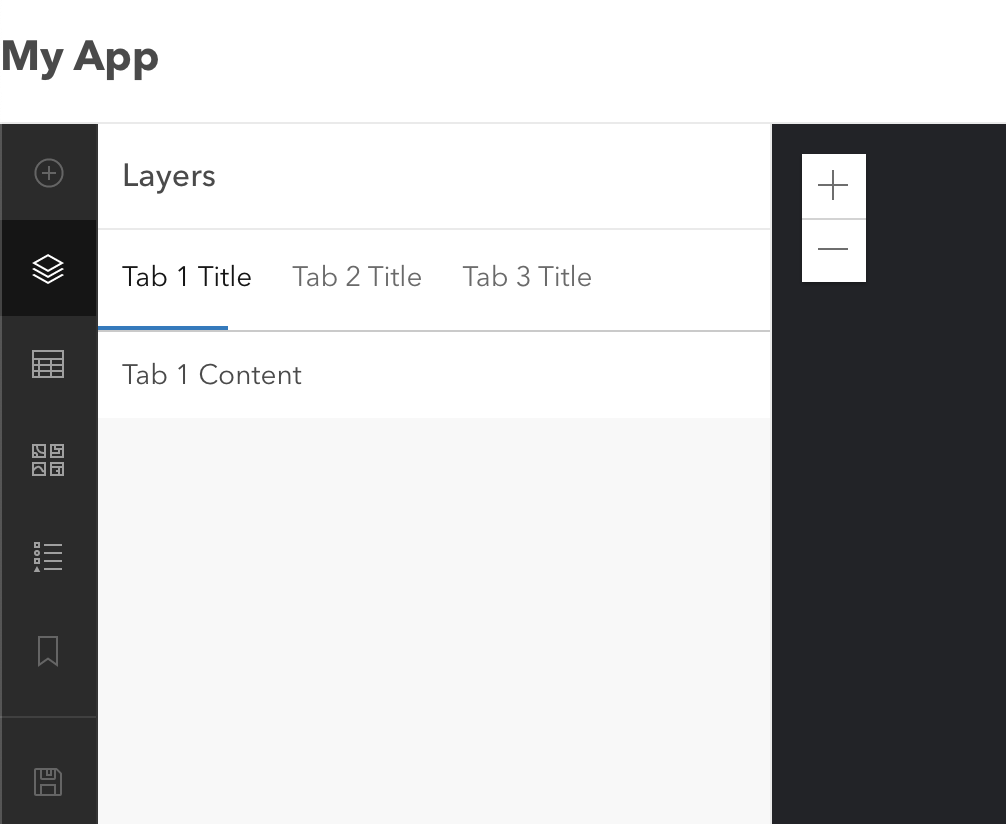
@macandcheese Here's our current production app. When the user selects a layer in the leading panel, the center panel is updated to show the form and templates canvas. The tabs are used to switch between those two views.
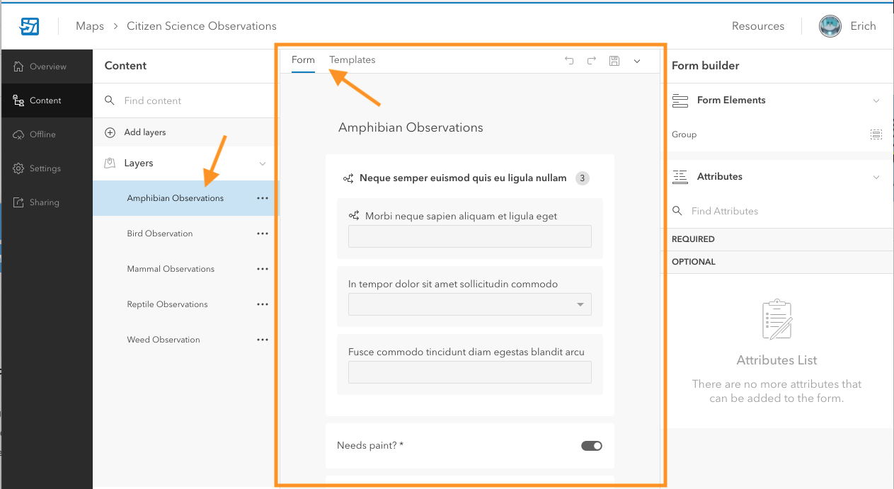
What I'm exploring is removing the canvas from using a panel and applying the tabs in a way that is more in line with the way they are designed to be used. This does pose a design problem in that we have a set of actions that were in the panel header that no longer fit anywhere.
TheBlueDog
on 9 Jun 2021
Going to leave this design discussion open until next Tuesday 6/22
bstifle
on 15 Jun 2021
All here, we don't have a final design for this and we need to move forward. @TheBlueDog @asangma @macandcheese
bstifle
on 22 Jun 2021
We are going to. look at a whole different approach, moving the canvas area out of a panel and the existing tabs float above the content area. Just reviewed this design with our PO yesterday. We won't be needing this any longer.
TheBlueDog
on 23 Jun 2021
Sounds good, thanks for the follow up!
bstifle
on 23 Jun 2021
Related issues
 kMcPherson1
·
4Comments
kMcPherson1
·
4Comments
 nwhittaker
·
5Comments
nwhittaker
·
5Comments
 joeyHarig
·
5Comments
joeyHarig
·
5Comments
 driskull
·
4Comments
bstifle
·
3Comments
driskull
·
4Comments
bstifle
·
3Comments