Calcite-components: Enhancement: calcite-accordion button slot
Description
Ability to add a button to the header of calcite-acccordion. There are props for title and subtitle, but no option to include any button or action in the accordion header.
Which Component
calcite-accordion
Example Use Case
 joeyHarig
All 5 comments
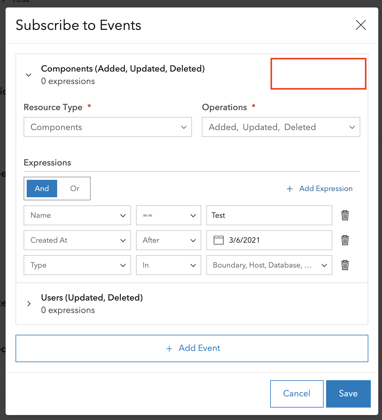
Hey @joeyHarig - do you have a screenshot of a more high level view of that UI?
Right now accordion items don’t really have facility for being dismissed or deleted (you can obviously just remove from DOM, but if the trash can in the screenshot above deletes the accordion item it is contained within, that may be a weird UI moment).
We have action slots in block and other components so there is precedent, but I would be worried about conflating the accordion component with some others if it becomes more of a sub-in for a line-item, if that makes sense!
 macandcheese
on 30 Mar 2021
macandcheese
on 30 Mar 2021
@macandcheese Thank you for taking a look at this.
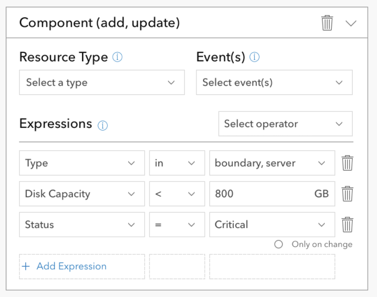
We are building a UI that allows users to configure notifications and subscribe to custom events. There could be several events and each event may have several expressions. We are using accordions to collapse the events the user isn't currently working on.
The user needs to be able to delete events and it seems like a better use of space to place that action in the accordion title as opposed to inside the accordion body.
joeyHarig
on 30 Mar 2021
On the instant app team we've run into a few cases where it would be nice to be able to add slotted content to the accordion item header. One use case is the Nearby app where we add the count of items inside the accordion to the header. Here's an example:
 kellyhutchins
on 25 Jun 2021
kellyhutchins
on 25 Jun 2021
In the Instant Apps configuration experience, we use calcite-accordion-item to show/hide the calcite-color-picker. However, there isn't a simple way to display a color that is currently selected.
It would be great if there was a slot to pass in an element like calcite-color-picker-swatch to display the selected color. Another thing that can be useful is to pass in/specify an icon via slot or attribute.
 rslibed
on 25 Jun 2021
rslibed
on 25 Jun 2021
Having the actions-end and actions-start slots that block does would be useful here.
macandcheese
on 29 Jun 2021
Related issues
 AdelheidF
·
4Comments
AdelheidF
·
4Comments
 driskull
·
3Comments
driskull
·
3Comments
 kMcPherson1
·
4Comments
kMcPherson1
·
4Comments
 bstifle
·
3Comments
joeyHarig
·
4Comments
bstifle
·
3Comments
joeyHarig
·
4Comments
Most helpful comment
Having the actions-end and actions-start slots that block does would be useful here.