Calcite-components: Bug: calcite-popover - close button in weird position
It sounds like the current location of the close icon of a popover is by design. But it does look weird if the popover is a bit longer.
If you still think the current behavior is how it should be, please close this issue...
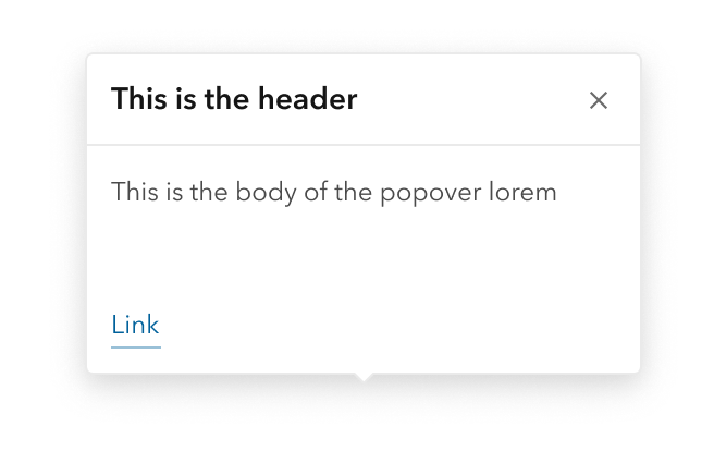
This is a popover containing a div
This is a popover containing a panel
This is a popover containing a tile
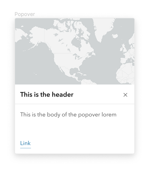
It would be nice if it were closer to the top-right like this design.
To get this look currently I have to add a flow and a panel inside the popover, even for this small case here. E.g. similar to this one.
Actual Behavior
Expected Behavior
Reproduction Steps or Sample
1.
Relevant Info
_Version_: @esri/calcite-components@<version>
- [ ] CDN
- [ ] NPM package
 AdelheidF
All 26 comments
Oh weird, yeah that close button should always be in the right-top corner
 bstifle
on 12 May 2021
bstifle
on 12 May 2021
Thanks for the correction @bstifle.
Should take much to fix it.
 asangma
on 13 May 2021
asangma
on 13 May 2021
ok so after talking with julio and adam, i think we did that deliberately........ so maybe its not a mistake. just cant remember when we did that with the X haha.
i kinda dont mind either way. since the x on the side matches what we do with alert
bstifle
on 13 May 2021
@bstifle @julio8a @macandcheese
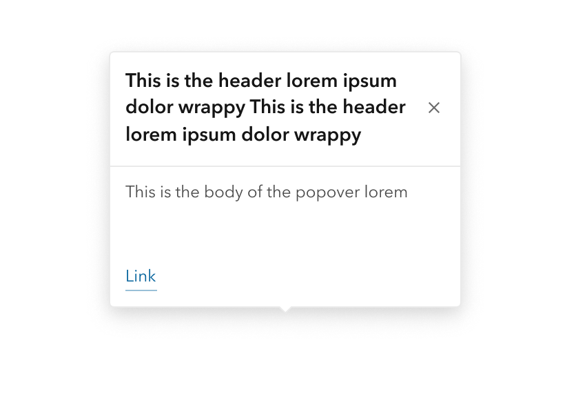
This looks bad when the popover has more than one or two lines of text in it. Having an X in the corner of a dialog is a convention that's been around since GUI computers have existed… seems odd to decide to do it differently for this, doesn't _look_ very deliberate to me.
Seems like the popover is used more like a dialog (modal, panel etc) and less like an alert or an in-line notice. Maybe it needs its own little header element to constrain the X, that way it can be consistent and not look bad when there's more text or images in the popover.
 mitc7862
on 13 May 2021
mitc7862
on 13 May 2021
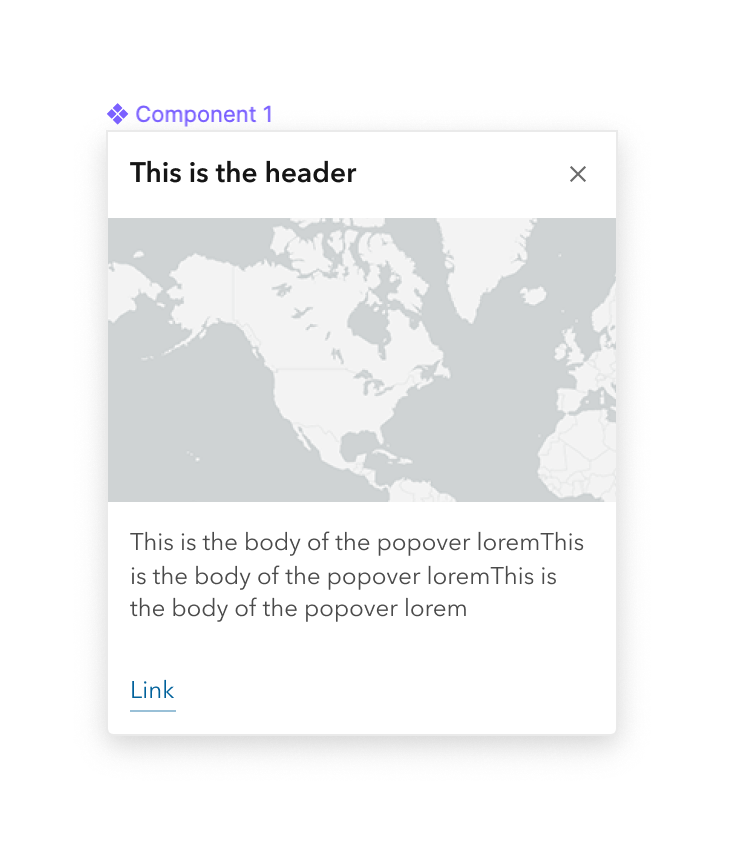
u mean like this? we'd need to require a header at that point
bstifle
on 13 May 2021
and if the header wrapped, youd get this, which to me is just fine
bstifle
on 13 May 2021
Yeah, that's how headers have behaved, so I'd be happy with something like that
mitc7862
on 13 May 2021
ok then next problem, what if no header?
bstifle
on 13 May 2021
Maybe it could revert to what it's currently doing…
Also, not sure what should happen if the image slot is filled.
would the header be above the image or below?
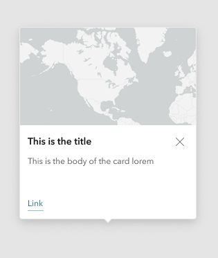
Full discloser, we're not using the image slot anywhere in MV at the moment, but it's a nice option to have.
mitc7862
on 13 May 2021
would be fine with this
bstifle
on 13 May 2021
this fine too. no reservations
bstifle
on 13 May 2021
ok then next problem, what if no header?
I set it up to do what it currently does when there's no heading (and thus no header).
I think the header-less design still works with the close button mimicking what Notice does.
asangma
on 27 May 2021
re: image.
There's no image slot.
That being said, a user can an image into the default slot and set its width to 100%, and it works nicely.
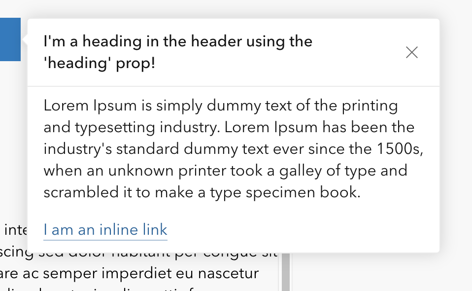
~ignore the heading size and weight here and the lack of border~
updated
~Matches modal styles.~
updated 2
per @bstifle
asangma
on 27 May 2021
@bstifle Mind verifying this one?
asangma
on 28 May 2021
Tested with next.209
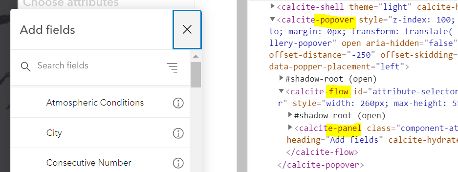
Now it doesn't set the focus anymore on the close button. This worked before this update. And I don't see a difference in the location of the close icon.
calcite-tile
div
AdelheidF
on 28 May 2021
@AdelheidF Thanks for catching the focus issue. I may need some help from @jcfranco or @driskull on that one.
asangma
on 28 May 2021
I tried popover.heading (to fix the location of the close icon) and wrapped the content text in a calcite-label. This did not work correctly because calcite-label didn't add the <label> element and so the styling is off. Is this expected?
 width=750/>
When calcite-label is used in other places it looks like this
If I use a div as the content of the popover and copy the styles from calcite-label then it looks OK. But I'd rather use calcite-label directly so the styles come with it.
font-size: var(--calcite-font-size--1);
line-height: 1rem;
margin-bottom: 0.75rem;
AdelheidF
on 28 May 2021
@AdelheidF This might need to be a different issue. Right now, the default slot of Popover is left unstyled to avoid conflict. A general solution for this might be a utility class or content component, but it's probably outside the scope of this issue.
asangma
on 2 Jun 2021
@driskull Could use some help with the close button focus.
asangma
on 2 Jun 2021
calcite-label isn't really meant to be used for displaying just text, instead it should be used when wrapping a control. Agree with Alan the issue in the recent screenshots above could probably just be handled by styling a div or p tag with utility classes.
 macandcheese
on 2 Jun 2021
macandcheese
on 2 Jun 2021
@asangma you probably need to call setFocus instead of focus here now that is an action. https://github.com/Esri/calcite-components/blob/3c2d9a4f2e85548fc34f23ccc1bc51c2b26e6594/src/components/calcite-popover/calcite-popover.tsx#L220
 driskull
on 3 Jun 2021
driskull
on 3 Jun 2021
Thanks @driskull!
asangma
on 4 Jun 2021
@driskull Still having some trouble here. Let me know if you have time Monday to look at it.
asangma
on 5 Jun 2021
Yeah sounds good
driskull
on 5 Jun 2021
setFocus for "close-button" should be working now.
@driskull Added you as an assignee if you feel like verfeeing.
asangma
on 8 Jun 2021
Focus is working again, thanks.
AdelheidF
on 8 Jun 2021
Related issues
asangma
·
4Comments
 kevindoshier
·
4Comments
AdelheidF
·
4Comments
kevindoshier
·
4Comments
AdelheidF
·
4Comments
 joeyHarig
·
5Comments
bstifle
·
3Comments
joeyHarig
·
5Comments
bstifle
·
3Comments