Calcite-components: A11y: Generic avatars should have an accessible color contrast ratio
Summary
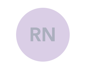
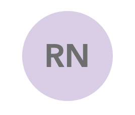
In an accessibility audit performed by Level Access, it was flagged that the contrast ratio of the generic profile thumbnails does not pass accessibility standards. While most of the time these are decorative images, we could darken the text to a color like #6E6E6E to make this pass AA standards and still look good.
Actual Behavior
Expected Behavior
 capeoples
All 5 comments
I think @paulcpederson had mentioned that on the current Online avatar, they can infinitely generate color parings. I'm wondering if we can generate a set?
The thing would be to avoid people having the same color?
CCing @bstifle (The color guru2.0)
 julio8a
on 27 Jan 2021
julio8a
on 27 Jan 2021
yeah we worked on these so that they would always pass contrast. text color looks off. should be 6a6a6a.
@paulcpederson hel!p
 bstifle
on 27 Jan 2021
bstifle
on 27 Jan 2021
It... is #6a6a6a , no help needed my dude.
@capeoples the offending avatar is probably not a calcite-avatar yet? In that case the answer your a11y woes is to update it to use calcite-avatar!
 paulcpederson
on 27 Jan 2021
paulcpederson
on 27 Jan 2021
Feel free to reopen if this is indeed a bug in CC
paulcpederson
on 27 Jan 2021
Thanks all!
julio8a
on 27 Jan 2021
Related issues
 AdelheidF
·
4Comments
AdelheidF
·
4Comments
 ethanbdev
·
4Comments
ethanbdev
·
4Comments
 kMcPherson1
·
4Comments
AdelheidF
·
4Comments
kMcPherson1
·
4Comments
AdelheidF
·
4Comments
 eriklharper
·
5Comments
eriklharper
·
5Comments
Most helpful comment
It... is #6a6a6a , no help needed my dude.
@capeoples the offending avatar is probably not a calcite-avatar yet? In that case the answer your a11y woes is to update it to use
calcite-avatar!