Calcite-components: RadioGroup - Rounded
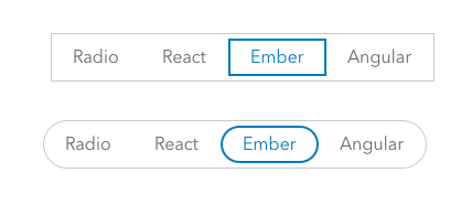
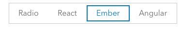
I propose a rounded property on RadioGroup.
We are going to see an increasing number of cases where a decision point in a workflow will need a radio group, but that moment may not benefit from the horizontal separation that RadioGroup currently delivers.
In this case, the options below the pills change depending on which item is selected.
cc @mitc7862 @bstifle @macandcheese @paulcpederson
 asangma
All 34 comments
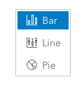
i wouldn't have them separated like that. they look just like chips tags/filtering
 bstifle
on 16 Jul 2020
bstifle
on 16 Jul 2020
IMO these look like chips, where more than one can be selected - not a single-choice radio group. They also look like the + field comparison buttons (?) above.
but that moment may not benefit from the horizontal separation that RadioGroup currently delivers.
What does this mean exactly?
 macandcheese
on 16 Jul 2020
macandcheese
on 16 Jul 2020
we already have this square design in the works, we could potentially add a round version i suppose.... though it seems a little too "apple"
bstifle
on 16 Jul 2020
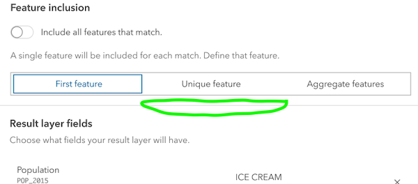
One of the issues with the radio group in its current form and in this use case is that it behaves as a horizontal separator.
Also, I think it's OK that they look like the other buttons.
Recall that in their default design they also look like out regular buttons.
asangma
on 16 Jul 2020
@asangma
i just think it might be a combo of feature creep on radio groups, as well as a style creep on chips.
can you use normal radio buttons?
bstifle
on 16 Jul 2020
Recall that in their default design they also look like out regular buttons.
Yeah, there's an issue to update the radio group to Bryan's example above (sans rounded version) to alleviate that.
https://github.com/Esri/calcite-components/issues/639
The above design can pretty much be achieved with chips, but we don't really have the concept of "selectable" chips (ie a developer would need to handle the interaction amongst the chips), and I suspect most instances of "selectable" chips are usually a multi-select situation.

<calcite-chip appearance="clear">
   First feature
</calcite-chip>
<calcite-chip appearance="clear">
    Unique feature
</calcite-chip>
<calcite-chip appearance="clear" color="blue">
    Aggregate features
</calcite-chip>
Thanks @macandcheese.
@bstifle We totes mcgoats could use regular radio buttons.
The intention here is to convey that those options have significant effects on the results of this workflow.
Just looking for a way to have the weight of the radio-group while not adding another horizontal divider...or one with a weird width or full-width.
asangma
on 16 Jul 2020
As a note, for "First feature" there would be no options below it.
asangma
on 16 Jul 2020
cool, so the examples you just made up there, you could use the Small prop, and the height is around 32px with 14px type. little more petite
bstifle
on 16 Jul 2020
@bstifle Wouldn't I still get a radio-group that is either a weird width or full-width and acting as another horizontal separator?
asangma
on 16 Jul 2020
I think the concern is that those look just like chips, which currently don't have any "selected" state / toggle-ability. You could just use chips and change color / appearance type on selection, but even then I feel like a "chip selection" workflow insinuates a multi-select, not a single-select.
I see what you mean about "horizontal separator", but I don't think the "fit to size of options" one causes any more of an issue than the side-by-side inputs acting in a similar fashion. I think generally there are a lot of UI shapes, sizes, and column widths of elements going on in the workflow, so to that end I agree that the radio group wouldn't do much to help there.
macandcheese
on 16 Jul 2020
i still recommend normal radio buttons if the concern lies with too many lines/separators
bstifle
on 16 Jul 2020
there are plenty of input fields in there that add to the lines and such, so i'm not really seeing the argument for not using this fella
bstifle
on 16 Jul 2020
@bstifle Do you think the UX of a radio button revealing different sets of options makes sense?
asangma
on 16 Jul 2020
it could, but with all these options proposed i still recco this new radio group design

sorry for the redundancy haha
bstifle
on 16 Jul 2020
i'm not really seeing the argument for not using this fella
I think if when it acts as a kinna header for a section, it works well.
In this case, it is inside a section and messes with the visual hierarchy.
asangma
on 16 Jul 2020
but that's literally what it was designed for 😭 changing/revealing content beneath it
bstifle
on 16 Jul 2020
i guess you could use Tabs as well
bstifle
on 16 Jul 2020
Indeed. I get that.
In the case of "First feature" it'd be a problem.
asangma
on 17 Jul 2020
so does "Feature Inclusion" change what populates in "Result Layer Fields"? if so, do you need the line?
bstifle
on 17 Jul 2020
Yeah...those are two separate sections.
asangma
on 17 Jul 2020
That's kinna what I'm talking about in regards to the visual hierarchy and radio-group adding a horizontal divider.
asangma
on 17 Jul 2020
So if there's resistance to the rounded approach, I think we need to rework the existing design some.
In the interface, it still looks pretty similar to CalciteButton.
I know there is a 👎 on the rounded look, but in an interface, it works.
asangma
on 13 Aug 2020
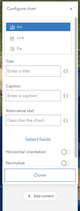
Unrelated.. Could we figure out a way to make a Calcite-stepper work for this workflow (no icon, vertical, and not setting "complete" on any steps would be really close to this)...
macandcheese
on 13 Aug 2020
@macandcheese #862
asangma
on 13 Aug 2020
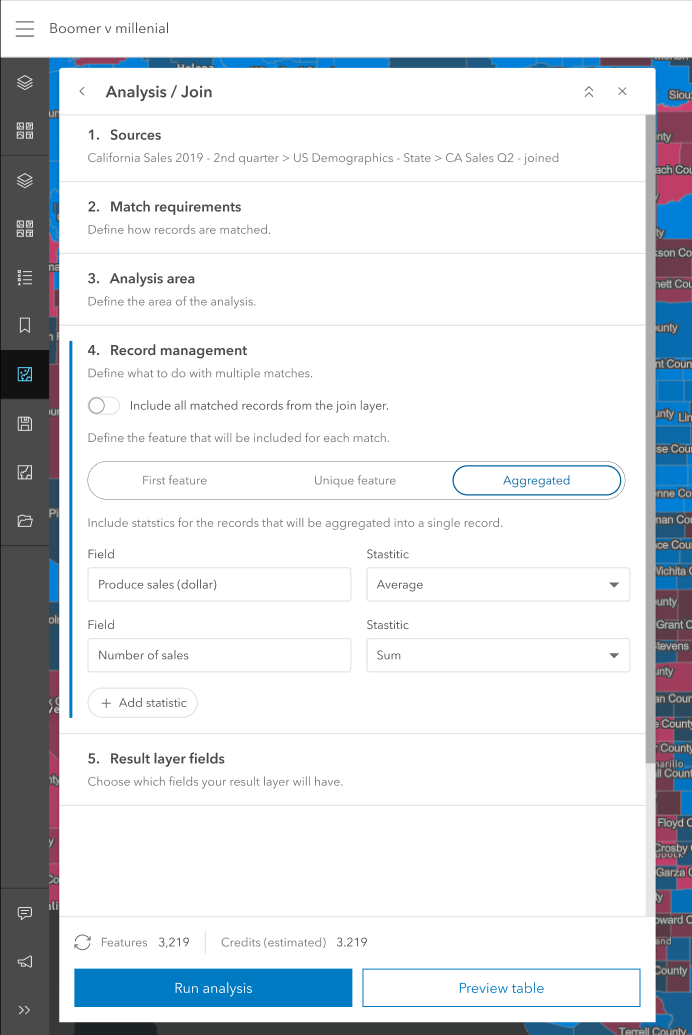
Following up on this...the radio group falls apart in panels.
We could use a pattern that perhaps allows the items to wrap.
We ended up with something more like
asangma
on 2 Oct 2020
Wraps like this...not amazing, but works.
asangma
on 2 Oct 2020
Can something like this work? also suggest using Small instead of Medium
bstifle
on 2 Oct 2020
There's also vertical layout mode, a bit extra line height... But, yes generally panels seem very narrow to accommodate more than two things in horizontal lockups, so scale "s" would certainly help as well.
macandcheese
on 2 Oct 2020
Right yeah, vert:
bstifle
on 2 Oct 2020
A slightly wider panel option might help a lot of these UI breathe a bit more too? I know there was talk of a "really wide" version but maybe an "m" between this and that?
macandcheese
on 2 Oct 2020
re: panel width
Panel widths will be highly dynamic, and our designs and components will need to handle narrow panels. Also, consider what happens if there's more than three options...or when we're localizing to German or Latvian.
re: scale
scale="s" is the first thing we tried, but it's still brittle. We will still run into the width problem when there are more options, when an option has a slightly longer string, or when localizing.
re: wrapping
@bstifle
Can something like this work?
We tried that. And it's a quick technical fix. Would we want to do that? Like would we do that in a mobile interface?
re: Vertical
Seems like we're losing the intent of the design in this case. It also starts to look like a stack of buttons too similar to a Done & Cancel pattern. Not sure how well it works in the panel.
I think we need more UI options with radio-group.
asangma
on 3 Oct 2020
This issue has been automatically marked as stale because it has not had recent activity. It will be closed if no further activity occurs. Thank you for your contributions.
![github-actions[bot] picture](https://avatars.githubusercontent.com/in/15368?v=4&s=40) github-actions[bot]
on 24 Nov 2020
github-actions[bot]
on 24 Nov 2020
Closing in favor of a different approach.
asangma
on 27 Mar 2021
Related issues
 jcfranco
·
3Comments
jcfranco
·
3Comments
 ethanbdev
·
4Comments
ethanbdev
·
4Comments
 AdelheidF
·
4Comments
AdelheidF
·
4Comments
 nwhittaker
·
5Comments
nwhittaker
·
5Comments
 capeoples
·
5Comments
capeoples
·
5Comments
Most helpful comment
I think the concern is that those look just like chips, which currently don't have any "selected" state / toggle-ability. You could just use chips and change color / appearance type on selection, but even then I feel like a "chip selection" workflow insinuates a multi-select, not a single-select.
I see what you mean about "horizontal separator", but I don't think the "fit to size of options" one causes any more of an issue than the side-by-side inputs acting in a similar fashion. I think generally there are a lot of UI shapes, sizes, and column widths of elements going on in the workflow, so to that end I agree that the radio group wouldn't do much to help there.