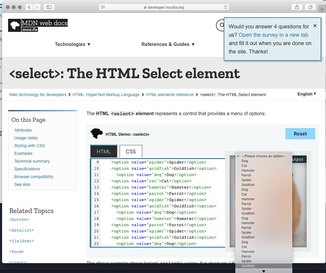
Calcite-components: Component: Native Select
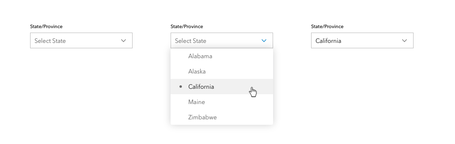
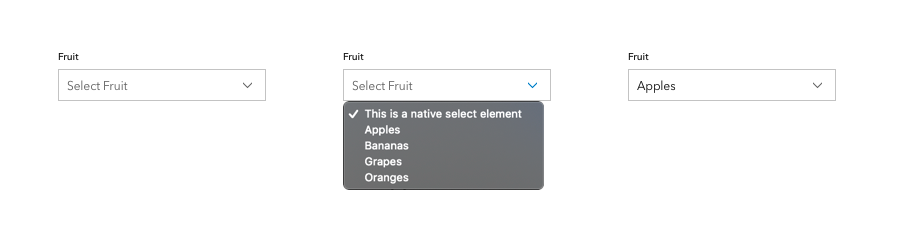
Style the closed state of the native select. Has the added benefit of spinner UI for mobile.
Don't need to style the expanded list.
 julio8a
All 46 comments
Assigning to @macandcheese since this will just take the styles from inputs/forms.
julio8a
on 23 Jan 2020
@bstifle, can you put together a mock-up for this? Mainly referencing the input styles and post here.
Dev: @Esri/calcite-components, does anyone have some cycles to work on this?
@subgan82, maybe you or someone else working on charts can help implement this?
It should be just styling the native select when it's closed. The menu should stay native (benefit of spinner i.e. iOS)
julio8a
on 6 May 2020
@subgan82, maybe you or someone else working on charts can help implement this?
Yes @julio8a we can help implementing it, if calcite team is tied up on other issues.
cc: @kumarGayu
 subgan82
on 6 May 2020
subgan82
on 6 May 2020
Style based on calcite inputs + calcite dropdowns
 bstifle
on 7 May 2020
bstifle
on 7 May 2020
this is a little more accurate, for native styles
bstifle
on 7 May 2020
@subgan82, @kumarGayu
This one is ready to go. Please reach out to Bryan if you have any design-related questions.
julio8a
on 13 May 2020
Thanks @julio8a we will go over it and get back.
subgan82
on 13 May 2020
- Does it support selecting multiple items ?
subgan82
on 13 May 2020
No support for multiple-select. Dropdown or Combobox can be used for that.
julio8a
on 13 May 2020
Hi, will it support icons at the options level, and next (left | right) to the selected option?
 pemberdom
on 14 May 2020
pemberdom
on 14 May 2020
@pemberdom - Not within a native select option - the dropdown component supports icons (and both left / right). https://esri.github.io/calcite-components/?path=/story/dropdown--with-icons Would that work for the use case?
 macandcheese
on 14 May 2020
macandcheese
on 14 May 2020
We are actually using the dropdown component for our use case, but the missing element is the caret/chevron, which makes it easier for the user to understand what kind of element they're dealing with.
Our case is the following:
- having a list of options having label + icon
- the selected option appears at the first level, meaning selected label + icon
- a caret/chevron is displayed
- having the equivalent of the "outline" style from the calcite-button
It'd be a mix between the Split Button and the Native Select (Edit: and the Dropdown):

pemberdom
on 14 May 2020
@pemberdom - yeah, good use case. We tried to discuss what this component that's "in between" would look like when we specced the dropdown and the select... kind of that in between that appears like an input, has an indication of dropdown like a caret, and populates the field with the selected (single select) item.
macandcheese
on 18 May 2020
This came up here: https://github.com/Esri/calcite-components/issues/922
I think we should tackle this, and since we should be able to rely on it only being populated with options that contain just text values, we can consider also add a typeahead filter that's opt-in via prop... which I know @mitc7862 @bpatterson88 etc have needed for awhile.
Potential Props:
filterable - adds typeahead live filter
native (need better term?)- styles the interactive element but renders the options as native, ideally brings up iOS / Android mobile spinner
macandcheese
on 31 Aug 2020
We definitely have a need for this in several UI's where we currently use dijit/form/ComboBox.
Do we need to make native opt-in? Seems like we should just use the spinner on mobile for everybody? Either way that's something we could figure out down the line as an additional prop.
 paulcpederson
on 1 Sep 2020
paulcpederson
on 1 Sep 2020
We definitely have a need for this in several UI's where we currently use
dijit/form/ComboBox.Do we need to make
nativeopt-in? Seems like we should just use the spinner on mobile for everybody? Either way that's something we could figure out down the line as an additional prop.
No we could certainly browser detect, that might be a nice feature out of the box to default to native spinners in that way.
But, there may be a desire w/in an interface to render the browser native options even on desktop, whatever that might be (of course that would probably conflict with a typeahead filter... )
macandcheese
on 1 Sep 2020
Can we up the priority of this? Users are refactoring a bunch of interfaces and could really use this soon.
 asangma
on 1 Sep 2020
asangma
on 1 Sep 2020
If filterable - the "input" should allow direct typing to filter.
macandcheese
on 1 Sep 2020
I talked to Jeremy and we're going to wait for this component before we release the new Stencil filter component. I also know the new charting component needs it. It would be great if it could make it at least for our Map Viewer Beta 10 release (end of October). Beta 9 is end of September.
 AdelheidF
on 2 Sep 2020
AdelheidF
on 2 Sep 2020
I can start on this by next week.
macandcheese
on 2 Sep 2020
I assume we'll want to support optgroup use case - datalist seems like it could be handled by filterable prop here, but that would't match the semantic element for that since datalist itself is the containing element (optgroup is still contained within select).
Perhaps the filterable prop should be a datalist boolean? The oddity is the containing element is different. Open to ideas there. I suppose we could also just have a calcite-datalist component - then calcite-select and calcite-datalist could consume calcite-option components (and calcite-option-group components for the latter)... Kind of nomenclature rabbit hole there, any / all would work. Thoughts @Esri/calcite-components ?
macandcheese
on 2 Sep 2020
I assume we'll want to support
optgroupuse case - datalist seems like it could be handled byfilterableprop here, but that would't match the semantic element for that sincedatalistitself is the containing element (optgroupis still contained withinselect).Perhaps the
filterableprop should be adatalistboolean? The oddity is the containing element is different. Open to ideas there. I suppose we could also just have acalcite-datalistcomponent - thencalcite-selectandcalcite-datalistcould consumecalcite-optioncomponents (andcalcite-option-groupcomponents for the latter)... Kind of nomenclature rabbit hole there, any / all would work. Thoughts @Esri/calcite-components ?
+1 for a separate calcite-datalist component just because filterability looks tricky to integrate into a native select element since you have to change the native html element. I found this attempt at adding optgroup support to datalist too https://codepen.io/jpdevries/pen/MoROzK, but overall I like your thoughts on composing separate components that just render a single predictable containing html element that is specific in its offering to what the native element offers.
Also, FWIW in my many years of web development, I have never heard of datalist before until now! Must have missed that day in class when they taught that, lol
 eriklharper
on 2 Sep 2020
eriklharper
on 2 Sep 2020
OK, so keeping in mind that we will probably offer a "styled" version (not rendering native options), as well as a native one... it's a little weird since in the "styled" version we could of course do as we wish with adding groups inside of a datalist, but like you showed in that example, not by default natively...
datalist
<calcite-datalist>
  <calcite-option />
  <calcite-option />
<calcite-datalist>
select (default)
<calcite-select>
  <calcite-option />
  <calcite-option />
<calcite-select>
select (default)
<calcite-select>
  <calcite-option-group>
    <calcite-option />
    <calcite-option />
  </calcite-option-group>
  <calcite-option-group>
    <calcite-option />
    <calcite-option />
  </calcite-option-group>
<calcite-select>
Question would be: do we want to use calcite-optgroup or calcite-option-group (which matches calcite-dropdown-group / calcite-action-group /calcite-pick-list-group nomenclature)
macandcheese
on 2 Sep 2020
I'd say calcite-option-group makes more sense because of the other nomenclature.
eriklharper
on 3 Sep 2020
<calcite-select>
  <calcite-optgroup label="">
    <calcite-option />
    <calcite-option />
    <calcite-option />
  </calcite-optgroup>
<calcite-select>
I see several related requirements, but I'd like to ask for some clarification on what we need for the first release of calcite-select and what can be done later?
- style the closed state
- rely on native implementation for the open state to leverage mobile pickers
- add calcite-equivalents for
optionandoption-group - allow typing directly in the input, possibly allowing extraneous options (based on the
dijit/form/ComboBoxcomment) - _\
☝️ calcite-datalist is out of scope, so I'm not including those items
For the API, I think we could follow something similar to HTMLSelectElement:
interface CalciteSelect {
  disabled: boolean;
  theme: Theme;
  scale: Scale;

  readonly selectedIndex: number;
  readonly options: HTMLCalciteOptionElement[];
  readonly selectedOption: HTMLCalciteOptionElement;

  // not sure about these
  add(option: HTMLCalciteOptionElement | HTMLCalciteOptionGroupElement): Promise<void>;
  item(index: number): HTMLCalciteOption;
  remove(option: HTMLCalciteOptionElement | HTMLCalciteOptionGroupElement): Promise<void;

  setFocus(): Promise<void>;
}

interface CalciteOption {
  disabled: boolean;
  label: string;
  value: any;
  selected: boolean;
}

interface CalciteOptionGroup {
  disabled: boolean;
  label: string;
}
 jcfranco
on 8 Oct 2020
jcfranco
on 8 Oct 2020
That looks good for what I need currently except that maybe we should also include max-options for the length of the dropdown, before vertical scrollbars appear.
Do we also need a width property for the dropdown width? E.g. if an option text is wider than the 'input' what do we do? Break it into multiple lines or widen the dropdown?
This is what dojo did:
possibly allowing extraneous options
I won't need this currently for my use case
allow typing directly in the input
This is nice to quickly 'jump' to the correct option in the list, but it's not necessary right now for my use case.
A future enhancement could be a separator, similar to this.
AdelheidF
on 8 Oct 2020
can the HTMLCalciteOptionElement also accept an image + label for some cases that need this pattern
subgan82
on 8 Oct 2020
Also will it support required similar to HTMLSelectElement
subgan82
on 8 Oct 2020
Instead of creating calcite-option and calcite-option-group can't we just have the users slot those in?
<calcite-select>
  <optgroup>
    <option></option>
  </optgroup>
</calcite-select>
I was under the impression that we wouldn't touch any styling of the select menu itself. We would just style the closed state (button) that opens the menu?
I thought we were just going to alter the style like this: https://jsfiddle.net/0hwa8nnm/1/
 driskull
on 8 Oct 2020
driskull
on 8 Oct 2020
I was under the impression that we wouldn't touch any styling of the select menu itself. We would just style the closed state (button) that opens the menu?
@driskull That was my understanding too, but then saw more requirements come in. Styling the closed state + option/optgroup would be the simplest way to get this out the door.
Any objections to tackling ☝ first and then creating follow-up issues for the rest?
maybe we should also include max-options for the length of the dropdown, before vertical scrollbars appear.
Do we also need a width property for the dropdown width?
can the HTMLCalciteOptionElement also accept an image + label for some cases that need this pattern
We can make these requirements when we tackle styling the open state.
Also will it support required similar to HTMLSelectElement
At least not for the 1st iteration.
This is nice to quickly 'jump' to the correct option in the list, but it's not necessary right now for my use case.
I'll move typing into the select to a follow-up issue then.
jcfranco
on 8 Oct 2020
Any objections to tackling ☝ first and then creating follow-up issues for the rest?
sounds good to me
AdelheidF
on 8 Oct 2020
So just to make sure. The first version of it would fix the issues I have right now with the dropdown/button combination?
- text will start at front of the 'button' (not centered as shown here)
- chevron will be at the end of 'button' (not centered as shown here)
- width of dropdown will be as wide as 'button'. If the text inside the dropdown is wider it will either wrap or the dropdown will be wider.
And I won't run into this scenario where I suddenly get horizontal scroll bars on the panel because the dropdown is wider? In this particular case the option labels fit the button width.

AdelheidF
on 8 Oct 2020
Yes, it should fix all of those issues. It'll look like this mockup: https://github.com/Esri/calcite-components/issues/302#issuecomment-624963247
jcfranco
on 8 Oct 2020
Installed.
As discussed, I'll create follow-up issues for enhancements.
jcfranco
on 22 Oct 2020
@subgan82 @AdelheidF Can either of you help verify this one? 🙇♂️
jcfranco
on 4 Nov 2020
I'll try using it in the next few days.
AdelheidF
on 4 Nov 2020
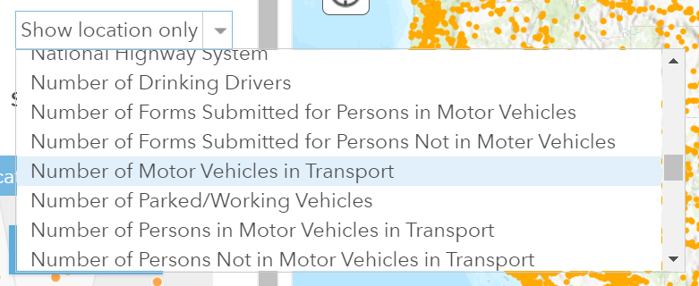
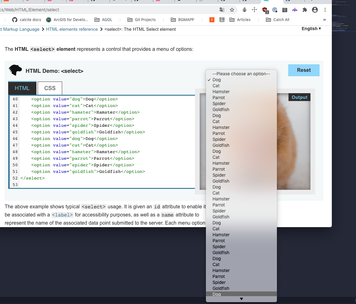
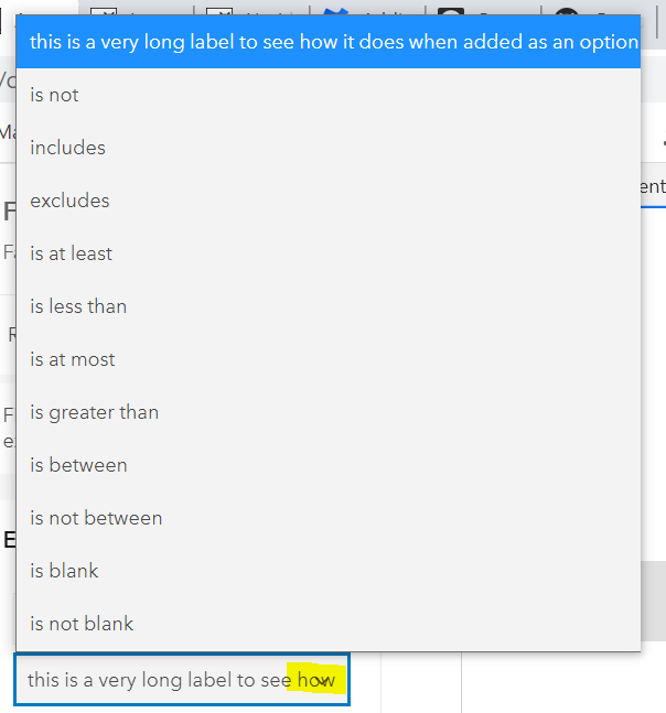
The open dropdown is longer than my browser window. It does try and open it on top of the collapsed select if there is space, but in this case there's less space above than below.
Is there a way with the current implementation to limit the displayed items in the dropdown before vertical scrollbars appear?
AdelheidF
on 7 Nov 2020
Unfortunately I think that's just the native behavior of selects... and it's variable between browsers:
Not sure if it's the same in Chromium Edge, but on Mac the scrollbar only appears when there isn't enough space to the bottom of the entire display, not the browser window (it overflows browser window like you show):
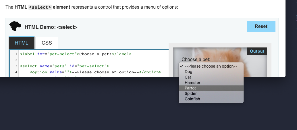
Firefox constrains to browser window with scrollbar:
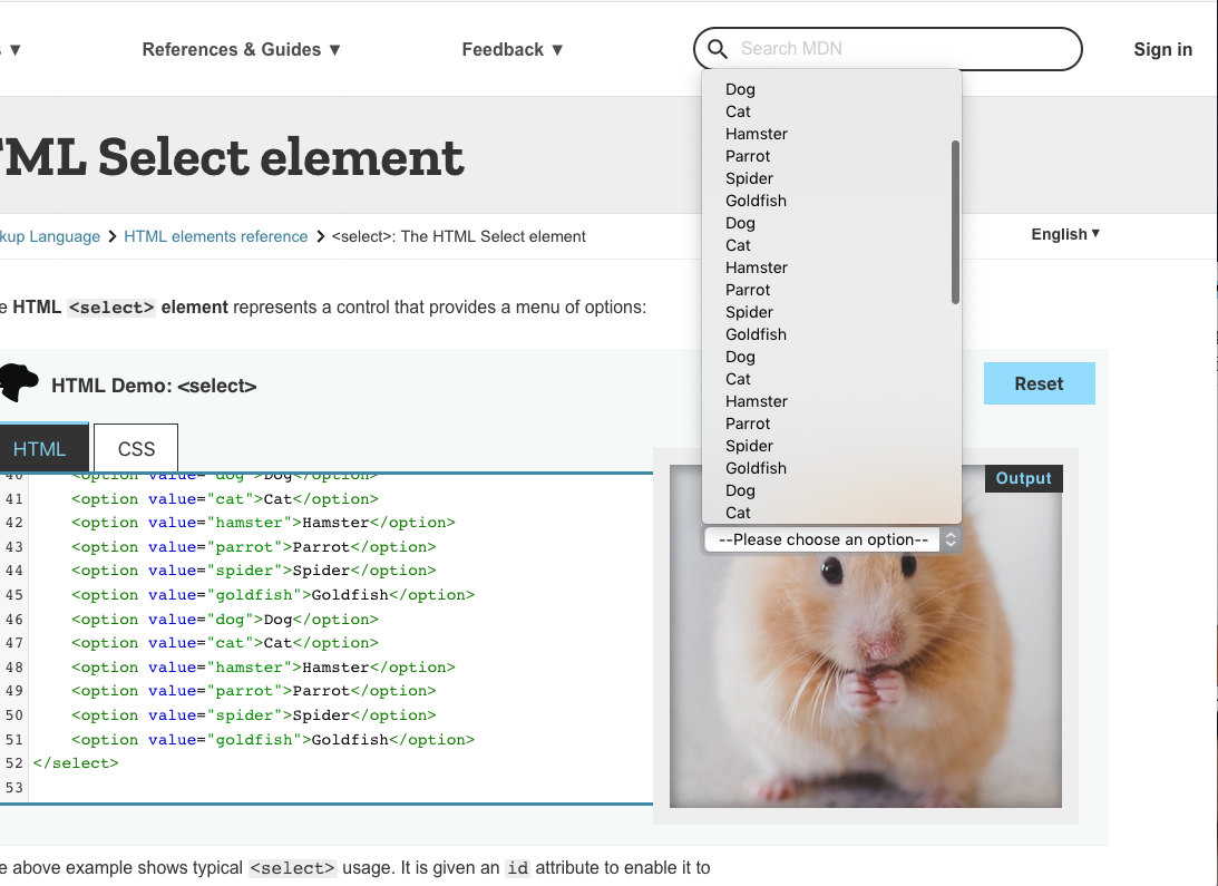
Safari behaves like Chrome:
My feeling is that we should leave as is for natively rendered options, especially since rendering these options natively gives a nice "mobile spinner" experience out of the box. If / when we add "custom styled option" version, we could definitely add a "max-items" prop like we have on dropdown / plan on having in combobox.
macandcheese
on 7 Nov 2020
So far calcite-select is working pretty well. Thanks!
AdelheidF
on 7 Nov 2020
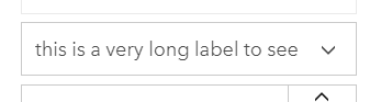
When hovering over the select and a long label is selected it overlaps with the icon.
collapsed state without hover
Also the doc needs to get more info.
AdelheidF
on 7 Nov 2020
Can you open an issue for overlap? We can probably add padding to the end of input to "protect" the icon there. Thanks!
macandcheese
on 7 Nov 2020
Issue for overlap of icon created: https://github.com/Esri/calcite-components/issues/1238
AdelheidF
on 9 Nov 2020
Thanks for verifying, @AdelheidF! Closing this one.
Also the doc needs to get more info.
The doc was updated after the release. https://esri.github.io/calcite-components/?path=/docs/components-select--basic
If there's something else missing, let me know and I'll make those changes.
jcfranco
on 9 Nov 2020
Also the doc needs to get more info.
Sorry, should have been more specific. I meant a short descriptive sentences about what the component does and at least one example.
AdelheidF
on 9 Nov 2020
jcfranco
on 9 Nov 2020
Related issues
AdelheidF
·
4Comments
jcfranco
·
3Comments
driskull
·
3Comments
 ethanbdev
·
4Comments
ethanbdev
·
4Comments
 joeyHarig
·
5Comments
joeyHarig
·
5Comments
Most helpful comment
So far calcite-select is working pretty well. Thanks!