Calcite-components: New Component: FAB
Description
A button for adding new things. It could be an extension or configuration of Action.
User Stories
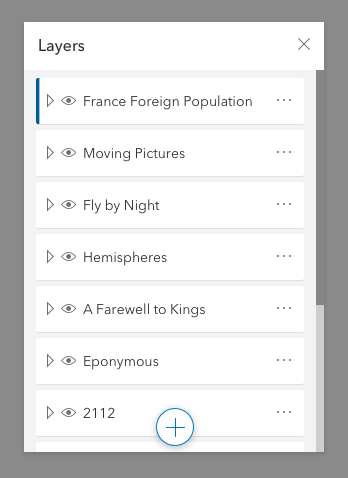
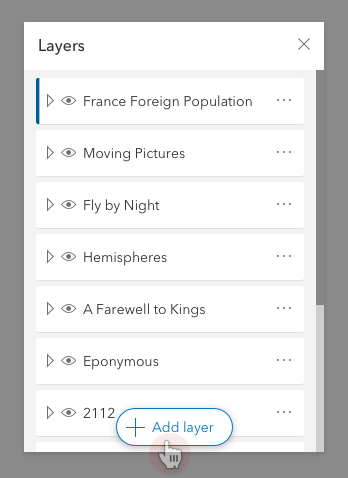
As a map author I want easy access to the "add layer" workflow. I want to be able to do this from within the LayerList but I don't want to scroll all the way to the bottom, and having it at the top is weird.
https://github.com/Esri/calcite-app-components/issues/262
Acceptance Criteria
- button can be set to "float" at the bottom of the parent element.
- and have appropriate styles
- button can be inline
- and have appropriate styles
- button is just shows the + icon by default
- button shows label on :hover | :focus
- button can be set to show label all the time (text-enabled)
Desired Behavior
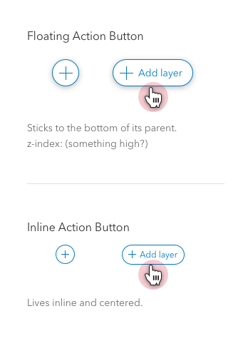
Floaty!
Inline
Helpful Details
BasemapLayerList, LayerList, SmartMapping, etc. can all benefit from this.
 driskull
All 12 comments
Use case makes sense, I wonder if parts of this can be handled by the existing button component?
For example, adding a "isRounded/isPill" and "revealTextOnHover" props (for lack of better names right now) to the existing button component could handle the design of the above (and the functionality of the inline version).
That would just leave positioning of the "floaty!" up to the implementer which, kind of makes sense to me?
Say, to achieve a FAB implementation - wrap this <calcite-button is-rounded reveal-text-on-hover /> in your own fixed / sticky position div - then you'd be able to use any combination of scales, widths, appearances, colors, etc,. that the button component already offers?
 macandcheese
on 12 Nov 2019
macandcheese
on 12 Nov 2019
Use case makes sense, I wonder if parts of this can be handled by the existing button component?
Yeah, this may be accomplished by wrapping the existing button. I wonder if we want to make it easier for the dev to just say <calcite-fab> rather than have to configure the button in a specific way.
For example, adding a "isRounded/isPill" and "revealTextOnHover" props (for lack of better names right now) to the existing button component could handle the design of the above.
Yes, I think they could.
That would just leave positioning of the "floaty!" up to the implementer which, kind of makes sense to me?
Yeah. I'm on the fence here. I think @asangma wanted it to automatically have styles for positioning.
Thanks for the good questions @macandcheese
driskull
on 12 Nov 2019
@macandcheese @driskull Do y'all think that we could for V1 of this component have a sticky prop and maybe an associate stickyAlignment prop? That is to say, for now nix any auto sticky behavior?
I also think that we could use isPill and revealTextOnHover in a <calcite-fab> wrapper and have the wrapper apply the props?
 asangma
on 2 Dec 2019
asangma
on 2 Dec 2019
Yeah we could do that.
driskull
on 2 Dec 2019
Kewl.
asangma
on 2 Dec 2019
I still kind of think positioning should be on the consumer... Wrap a <calcite-fab> or a <calcite-button is-pill reveal-text-on-hover> in a <div class="my-custom-sticky"></div> is kind of an expected story. Maybe that's just a calcite-app-component component...
macandcheese
on 2 Dec 2019
@macandcheese I can see that.
@driskull Maybe calcite-panel could have a special place in its heart for calcite-fab...and by heart I mean foot.
asangma
on 2 Dec 2019
So the more I think about this, it seems like a FAB should have the behaviors that make it a FAB
- sticky to the bottom or top
- style that distinguishes it
- dynamic label show/hide
Otherwise, it's not a FAB, right?
asangma
on 3 Dec 2019
The argument for having "fab like styles" on the <calcite-button> would be that consumers could leverage existing button config options for a fab. A product may want a solid blue fab, or a square fab, etc., and we should support that within the system, within reason (ie, inline buttons shouldn't be a FAB...)
Adding a "rounded" prop would also allow folks to use a "pill" inline for any reason if they wanted to (like in your examples above, that's really just a rounded button in that state - does the text need to be collapsed here since it's not overlaying anything?). "isFab" attribute, for lack of better name now, could add the shadow levels associated with tooltip/alert/other floating items at that plane.
The question is still should a fab position itself.
I still think positioning should be on the consumer. A calcite-component that is itself positioned sticky is only going to work if the container it's wrapped in supports that css anyway, isn't flex, etc...
macandcheese
on 3 Dec 2019
@asangma Would we nix the inline variant?
We could call it something other than "FAB" if it makes more sense. As long as it solves the UX problems we have, it doesn't matter if we follow googles naming paradigms.
 mitc7862
on 3 Dec 2019
mitc7862
on 3 Dec 2019
@mitc7862 I agree with not needing to stick with Googz names.
@macandcheese I totes get the technical aspects of a child component not being able to predict its parent's structure.
I would say that the main UX need of a FAB is to keep a primary action available and consistently positioned especially when content is scrolling. If this component doesn't solve that UX need, maybe we want to call this something else or maybe make styling-oriented props that add the box-shadow and pill-shape.
I think that yes, an app dev can definitely roll their own FAB.
I think that we can also have a few components that have a FAB slot and handle the positioning.
asangma
on 3 Dec 2019
macandcheese
on 9 Dec 2019
Related issues
 ethanbdev
·
4Comments
ethanbdev
·
4Comments
 kMcPherson1
·
4Comments
ethanbdev
·
4Comments
kMcPherson1
·
4Comments
ethanbdev
·
4Comments
 capeoples
·
5Comments
capeoples
·
5Comments
 bstifle
·
3Comments
bstifle
·
3Comments