Bookmarks: Feature request: easier sidebar closing & thumbnail resizing
I've followed the instructions of #522 and noticed that
The 'close' button of the sidebar is hard to see on a black thumbnail. Would it be possible to hide it when a background element is clicked?
On a low-resolution display, the thumbnails can be quite large. Would it be feasible to have an option to pick a thumbnail size?
 meepiquitous
All 15 comments
Thanks for taking the time to test and providing feedback :)
1) yes, that's on my list.
2) Could you provide a screenshot? I think a setting may be overkill, but it would be interesting to see the ratio on different screen resolutions and how this could be optimized.
 marcelklehr
on 24 Jul 2018
marcelklehr
on 24 Jul 2018
@marcelklehr
For information, appearance on Firefox, zoom at 100% on a 1366x768 pixels (361x203 millimeters) screen _(xdpyinfo | grep 'dimensions:')_:
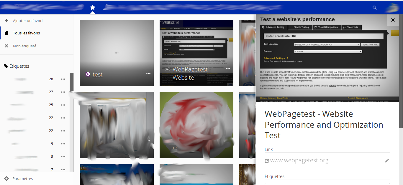
Usually as this screen resolution is quite small, I zoom at 110%, and in this case, side panel takes more space and displays until approximately half of the second bookmarks thumbnails column.
 TtuxX
on 25 Jul 2018
TtuxX
on 25 Jul 2018
Thanks the details drawer is indeed a bit clunky. The cards/tiles feel ok to me, though -- this is probably not a capture of v0.12.0-rc3 but a later, unreleased revision where I had already transitioned from cm to the magic px unit, I take it? (px, I recently learned, is more relevant for the actual device and still resolution independent...)
marcelklehr
on 26 Jul 2018
this is probably not a capture of v0.12.0-rc3 but a later, unreleased revision where I had already transitioned from cm to the magic px unit
Yes, for me, with the adjustments of https://github.com/nextcloud/bookmarks/issues/535 regarding the side panel, everything looks quite nice in regards to proportions for cards and side panel.
@meepiquitous would you please mind testing the latest bookmarks master code and let us know if everything seems ok for you now ? =)
TtuxX
on 26 Jul 2018
@meepiquitous would you please mind testing the latest bookmarks master code
I'll release a new release candidate soon, to make this easier as not everyone is inclined to install all the dev requirements ;)
marcelklehr
on 26 Jul 2018
Haha ok, perfect ^^
TtuxX
on 26 Jul 2018
@meepiquitous v0.12.0-rc4 has just been released. Please test :)
marcelklehr
on 28 Jul 2018
For me it works a little bit too good.
Behavior is this:
- Click the 3 dots of a bookmark and select details || click on the white transparent background of the bookmark label
- the sidebar opens
- click anywhere (including the description box, tags box, link edit box) on the sidebar and it closes
This makes editing the bookmark via the sidebar at the moment impossible as it is immediately on clicking anywhere dismissed.
Nextcloud 13.5, bookmarks rc4
Firefox 61.0.1
Safari 11.1.2
macOS 10.13.6
 blacs30
on 29 Jul 2018
blacs30
on 29 Jul 2018
Thanks, everyone.
Regarding the thumbnail sizing, I wanted to apologize. I didn't notice I was running dpi scaling (Windows 10, 125% @ 1280x1024), which led to only two rows of thumbnails being shown.
Screenshot PC, sidebar closed
Screenshot PC, sidebar open
However, would it be possible to have the option to switch between thumbnail- and old/text ui? This would make it easier to find something on mobile browsers, especially because text is hard to read in 'desktop mode'.
Bromide/Chromium browser on Android showing
Screenshot of old UI/v0.11.0
Screenshot of v0.12.0-rc4
Screenshot of v0.12.0-rc4 in 'desktop mode'
Regarding the finished builds vs building from source code - it's not necessarily a matter of inclination or lack of will; as a novice, I ran into fringe issues 90% of the way and gave up on several occasions, after hours of troubleshooting things like timeouts in npm or key size errors in mariadb.. so the builds are much appreciated.
meepiquitous
on 29 Jul 2018
@blacs30 Thanks, I've just fixed this in the master branch, so it'll be in the next release
@meepiquitous
Regarding the finished builds vs building from source code - it's not necessarily a matter of inclination or lack of will; as a novice, I ran into fringe issues 90% of the way and gave up on several occasions, after hours of troubleshooting things like timeouts in npm or key size errors in mariadb.. so the builds are much appreciated.
Yeah, that's what I mean. Building software without prior knowledge of the components involved potentially takes a lot of time. Plus, builds are always nice :v:
would it be possible to have the option to switch between thumbnail- and old/text ui
I won't be maintaining two views, I'm afraid, but it might be a good idea to shrink the bookmark tiles on mobile so they don't appear too bloated.
marcelklehr
on 30 Jul 2018
Alright, thanks again.
I'm new to this, so.. may i close this issue?
meepiquitous
on 30 Jul 2018
may i close this issue?
Not yet, I usually leave things open until a commit has landed in the master branch and/or has been released.
but it might be a good idea to shrink the bookmark tiles on mobile so they don't appear too bloated.
What do you people think about this:
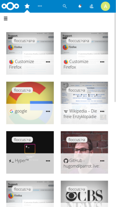
(I shrank the tiles, the favicon, the title font size and made the title wrap around the favicon to make more room for the text)
marcelklehr
on 30 Jul 2018
It looks great!
TtuxX
on 30 Jul 2018
Awesome, then we can close this :) :tada:
marcelklehr
on 30 Jul 2018
You can now observe this in action by installing the RC5 release :)
marcelklehr
on 4 Aug 2018
Related issues
 paulcalabro
·
5Comments
paulcalabro
·
5Comments
 bspire
·
4Comments
marcelklehr
·
4Comments
bspire
·
4Comments
marcelklehr
·
4Comments
 lyallp
·
4Comments
lyallp
·
4Comments
 ifuchs
·
4Comments
ifuchs
·
4Comments
Most helpful comment
Not yet, I usually leave things open until a commit has landed in the master branch and/or has been released.
What do you people think about this:
(I shrank the tiles, the favicon, the title font size and made the title wrap around the favicon to make more room for the text)