Betaflight-configurator: New Fonts and a few ideas
Impact font is from iNav and Impact mini is a smaller full bodied font that I compressed a little, to keep in the same style.
If anyone is interested. Then you can add them to a PR.
I have a few more symbols here too, with more were they come from. I just figured that the betaflight OSD glyphs could do with a little more explanation, than at present. Due to many of the newer functions (GPS rescue, Dshot telemetry) just being numbers, without giving much idea of what the number is for...unless you remember what you placed at that location on the OSD ;-)
Impact
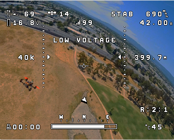
Impact Mini
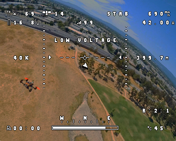
The files are in .mcm
impact_mini.zip
impact.zip


 Jetrell
All 21 comments
Yes, please! I think is a great adition. If you can't open a PR I can do it, but before, some things:
- If we add this symbols, we must add them to all the fonts. Are you able to do that?
- We have an intent to update the fonts before, please take a look to this PR to see the problems: https://github.com/betaflight/betaflight-configurator/pull/1313 The user didn't like the final decision and closed the PR :(
My suggestion: if you want to help with this, open a PR only with one or two fonts (for example the one that you have ready) for discussion. After approved, then you can modify all the fonts in the same manner.
Thanks!
 McGiverGim
on 14 Apr 2019
McGiverGim
on 14 Apr 2019
@McGiverGim Sure, you can open a PR for these ones.
I can do the glyphs for each of the other fonts. In their own styles to suit each one.
I had a look through the PR that @OlivierC-FR proposed.
What was the final outcome there?
Was @mikeller okay with the removal of SOME of the unused characters? Or do you only what me to do characters for the current empty spaces? Except 0x00 of cause.
I do understand the perspective of only changing the characters when needed. Although. At this point, there are many new, and some old functions that have no real descriptive symbols.
The present six characters above, are applicable now. So if one of you guys gets the time, you could update the present features with these symbols?
As for other features. _With all respect_. Beta Flight is starting to evolve a lot more, as expected, especially, now that it has GPS navigation. And the OSD does seem a little out dated in descriptive information, compared to other flight software.
As we all know. The OSD is the interface between us and the quad. So the easier the OSD is to read, the better.
At the risk of offending someone.... I say this in the nicest possible way. The Beta Flight mural is a work of art. Although it takes up stacks of character spaces in the 7456 memory. And i'm not sure that anyone fly's with it active?
So the only options for the future would be to remove it, make it smaller, increase the 7456 memory to 512 character. Or go pixel based OSD, but that might be a little extreme for this flight software.
Jetrell
on 14 Apr 2019
I think you have understood all more or less right :)
- By the moment, is better to add the characters to others that are blank by now. This is what was decided in the PR of Olivier.
- We don't have exactly a GPS navigation, only a GPS Rescue for emergency... so at this stage I don't think we need a lot more for the OSD in this regard, but maybe in the future... who knows.
- About the BIG logo, you have reason, there are other PR that tried to do it: https://github.com/betaflight/betaflight/pull/3461 and https://github.com/betaflight/betaflight-configurator/pull/541 but the problem with this is that it seems that to make things easy for users, we wanted to "detect" which font version is installed. But by the moment no work has been done in this respect.
- The pixel based OSD is an idea that will be adopted when a good and affordable chip for that is created/found. But again, in a future :)
Conclusion: is good to update fonts (again thanks), but by the moment adding elements in the free elements only. When full, then we will need to decide which approach to use. Maybe move the big logo to the second page of the 7456 and let the first page only for all the OSD standard elements.
I will push a PR with your fonts today later, to start the discussion.
McGiverGim
on 15 Apr 2019
@Jetrell: There are a number of things that can be done with the OSD fonts. Some of them make sense in my opinion, others don't. Here's a (not comprehensive) list:
- replace unused characters with other characters and use them: definitely;
- replace unused characters with others and don't use them: I don't see any purpose in this as it won't change a thing for users;
- optimise the font space / boot logo to gain more usable characters: definitely
- remove / make the boot logo optional: not really in favour of it, after all it is Betaflight's 'branding';
- use the extended 512 character font available on some devices: definitely
I think in order to make 3 - 5 work in a way that doesn't just result in guesswork and garbled displays for users, they should be done alongside changes that make it possible for the firmware / configurator to recognise the font that is loaded, and act accordingly. This has been attempted in the past, but never been brought to completion - part of that is that it will be a lot of work. But I think it would be a worthwhile endeavour.
 mikeller
on 15 Apr 2019
mikeller
on 15 Apr 2019
@McGiverGim but the problem with this is that it seems that to make things easy for users, we wanted to "detect" which font version is installed. But by the moment no work has been done in this respect.
@mikeller they should be done alongside changes that make it possible for the firmware / configurator to recognise the font that is loaded, and act accordingly. This has been attempted in the past, but never been brought to completion - part of that is that it will be a lot of work.
I think this proposal was implemented by @Shellixyz in the iNav configurator in 2.1.
It now recognizes which font is loaded when the configurators OSD setup page is opened.
Maybe he won't mind you using his code to save you time here.
@McGiverGim Conclusion: is good to update fonts (again thanks), but by the moment adding elements in the free elements only.
How do think it would go. Placing LON, LAT, Km, Mile in 0x20, 0x3f, 0x7a and 0x89 ? They are the 4 empty characters at the moment.
I think they would be more descriptive than the present situation.
If you say yes. I can post here the characters styles for the other fonts, of those four extra's.
Jetrell
on 15 Apr 2019
@Jetrell: See discussion in betaflight/betaflight#8008. In general, I think we should refrain from using the characters from 0x20 to 0x5f for any special characters, as they are generally the printable ASCII characters. In particular, 0x20 is the space character...
If you look at src/main/drivers/max7456_symbols.h in the firmware you will see that there are plenty of characters outside of 0x20 to 0x5f that are not currently used, and they are all available to be re-purposed for what you are proposing.
mikeller
on 15 Apr 2019
@mikeller now that 4.0 is out (and support for f3 has been dropped) could we look at getting #541, #1174 etc back on track? I should have more time to help out over the summer, and I think this ties in nicely with this and #8008 ? We just need to make a decision on font versioning and backwards compatibility...?
 frozenskys
on 15 Apr 2019
frozenskys
on 15 Apr 2019
@mikeller @McGiverGim
These are all the fonts modified with 7 extra's and 1 fix.
1) 0x89 - Latitude - was a "+" symbol
2) 0x98 - Longitude - was the GYRO symbol
3) 0x9d - Mile per hour - was the "RT" in rth symbol
4) 0x9e - kilometers per hour - was the "TH" in rth symbol
5) 0x7a - Temperature
6) 0x7f - Altitude - was a dotted vertical line
7) 0x5e - RPM - was a thick UP arrow
8) 0x21 - " ! " - was the "100" symbol either side of "FS" in failsafe
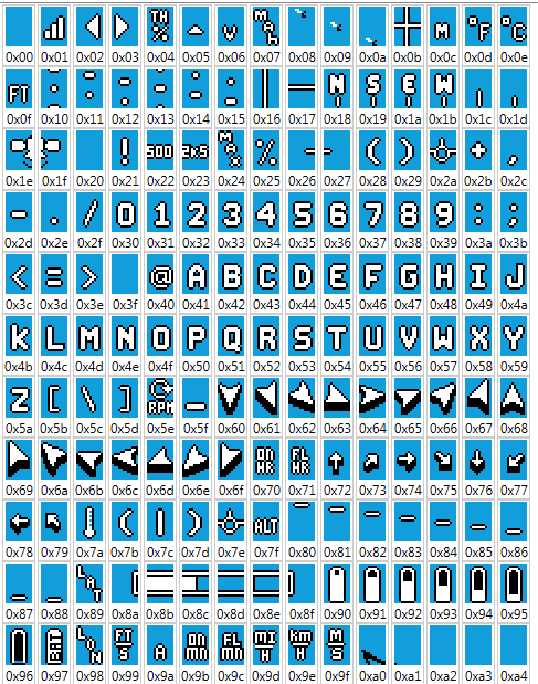
@mikeller let me know if this is acceptable?
Jetrell
on 15 Apr 2019
Great job! 😁
McGiverGim
on 15 Apr 2019
Looks good to me. 😎
@Jetrell From testing I think we're initializing the OSD chips too fast to notice anything in 0x00. But while you're at it can you clean up 0x00 in your copy of large.mcm? Just something I noticed looking at the fonts yesterday.
I'd like the exclamation marks to match styles a bit better. Here is a crappy looking preview to show what I mean.
I was also thinking of adding in 0x23 for #onepackfriday and possibly some #badjokes
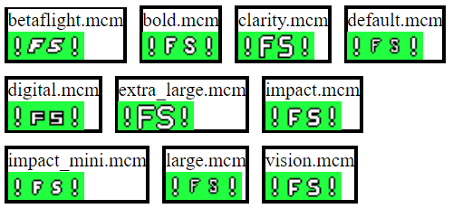
 Docteh
on 15 Apr 2019
Docteh
on 15 Apr 2019
I tweaked some of the exclaimation marks, clarity, extra_large, digital, betaflight. I think betaflight might need work? dunno.
(removed the zip, its unnecessary)
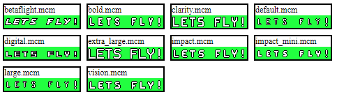
Docteh
on 15 Apr 2019
@Docteh I see what you mean.
I only changed the exclamation mark, after noticing the issue in a post. Plus experiencing it myself.
I went through and updated the Mod font zip in post 9. To make the exclamation marks suit their respective font.
As for doing work on the fonts or clean ups....That could be done. But it isn't easy. Because each font has its own individuality. And I don't want to damage that.
I first want to see what @mikeller says about the extra's.
Jetrell
on 16 Apr 2019
Yeah, it wasn't my intent to dump a bunch of work on you. I checked issue betaflight/betaflight#8008 on the firmware this morning and noticed that it was referencing here, and figured I should stick my nose in.
Right now in your bold.mcm LAT is one pixel higher than LON. Its aligned in the other files.
betaflight 
digital 
Docteh
on 16 Apr 2019
Yes, please. Both of you have modified the fonts. If you can find an agreement will be great.
McGiverGim
on 16 Apr 2019
@Docteh I re-Aligned the LAT and LON on BOLD and changed the levels on a few others as well.
Plus I put the tilted exclamation mark in BetaFlight font.
One thing that I have to say. Is that what looks okay in the editor on a 1080p PC screen, doesn't always look good on a low resolution monitors or goggles, when in flight.
I spent stacks of time with the Impact fonts, making changes then looking at them through the goggles and monitors. To get the appearance just right; and it took weeks.
The reason I mention this, is because the exclamation mark needs at least 2 black pixels between the line and the dot, for correct viewing definition. So..when placing them next to short numbers or letters in smaller fonts. The exclamation mark has to be, either a little above or a little below to keep appearance.
I changed digital, but it is a little short.
Anyway...We can tweak these fonts for ever. But the main crux of the matter. Is to add Impact and Impact_Mini....Plus add some new descriptive symbols.
Jetrell
on 16 Apr 2019
The exclamation mark will be a very useful addition. I'm going to improve the logging status element (#6177) to indicate failure with L! instead of L- as it would look more alarming that way.
 atomgomba
on 16 Apr 2019
atomgomba
on 16 Apr 2019
Yeah for digital I looked at the boxyness, and the part where the bottom line of the S was only one pixel high. Didn't consider the rest of that letter. It does look better with two black pixels between the dot and the line:  first one is in the screenshot. But take a close look at this second one:
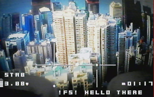
I think the new symbols will be accepted, just need to tie it together with a change to the FC eg https://github.com/betaflight/betaflight/blob/master/src/main/drivers/max7456_symbols.h
Docteh
on 16 Apr 2019
If you are happy with the actual status of the fonts, we can open a PR with them and continue the discussion from there. Is better to start with something decent, and we have time until the final release of Betaflight 4.1 (more or less 5 months) to finish things.
McGiverGim
on 16 Apr 2019
@McGiverGim I'm happy for you to move it to a PR.
Jetrell
on 16 Apr 2019
PR done. Please, discussions there ;) https://github.com/betaflight/betaflight-configurator/pull/1392
McGiverGim
on 16 Apr 2019
It's better to let this open until the PR is merged, in this way everybody can see some of the decisions made.
McGiverGim
on 17 Apr 2019
Related issues
 spatzengr
·
7Comments
spatzengr
·
7Comments
 Stavr0s91i
·
5Comments
Stavr0s91i
·
5Comments
 cusglider
·
9Comments
McGiverGim
·
3Comments
cusglider
·
9Comments
McGiverGim
·
3Comments
 Knifa
·
6Comments
Knifa
·
6Comments