Betaflight-configurator: Usability of the new custom logo feature
Some users have sent me their interest for the new feature of this PR https://github.com/betaflight/betaflight-configurator/pull/935
But after that, they tried to use it and they have a lot of problems. They have sent me a message with the problems found, so I left them here to see if they can be addressed:
- The first problem is that the messages of the console are ok, but depending on the resolution, size of the window, etc. they are hide under the font manager window:
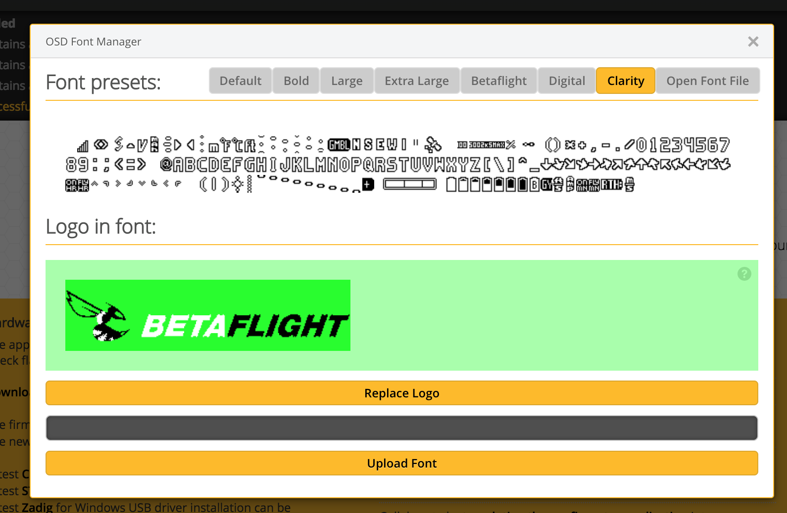
- So the user upload a custom logo, press the button and... nothing happens. A more visible error must appear (new window with the error, a message in the actual window... I don't know).
- In the image there's a
?but does nothing. The users need some instructions about size of the image, color palette, etc. There are two options: make the?functional with instructions, or I can see a lot of space in the right of the logo. Maybe a text can be put here and left the logo in the left.
@atomgomba can you verify these comments and if you have time try to address them? As I say, it seems that the feature has taken interest.
 McGiverGim
All 3 comments
The font management dialog indeed hides the log messages, good point! I'm not familiar with UI concepts here, for eg. I haven't seen a message dialog in the Configurator so far IIRC. Due to lack of established practices (meaning dialog windows aren't common either, probably the Font Manager is the only one), I'm a little bit in doubt about how to display an error message properly in this case. I have to come up with something new that won't stand out too much to break the UX of the current UI. The way of informing the user when a dialog is open is to be decided.
Regarding the ? icon, I can imagine it broke somehow due to changes in CSS styling. Definitely will have a look into that. Thank you for the feedback, @McGiverGim!
 atomgomba
on 10 Mar 2018
atomgomba
on 10 Mar 2018
This issue / pull request has been automatically marked as stale because it has not had recent activity. It will be closed if no further activity occurs within a week.
![stale[bot] picture](https://avatars3.githubusercontent.com/in/1724?v=4&s=40) stale[bot]
on 6 May 2018
stale[bot]
on 6 May 2018
This was fixed some time ago, I close this.
McGiverGim
on 7 May 2018
Related issues
 MadQ
·
7Comments
MadQ
·
7Comments
 spatzengr
·
7Comments
spatzengr
·
7Comments
 DusKing1
·
4Comments
DusKing1
·
4Comments
 MathijsG
·
9Comments
MathijsG
·
9Comments
 derdanu
·
7Comments
derdanu
·
7Comments
Most helpful comment
The font management dialog indeed hides the log messages, good point! I'm not familiar with UI concepts here, for eg. I haven't seen a message dialog in the Configurator so far IIRC. Due to lack of established practices (meaning dialog windows aren't common either, probably the Font Manager is the only one), I'm a little bit in doubt about how to display an error message properly in this case. I have to come up with something new that won't stand out too much to break the UX of the current UI. The way of informing the user when a dialog is open is to be decided.
Regarding the ? icon, I can imagine it broke somehow due to changes in CSS styling. Definitely will have a look into that. Thank you for the feedback, @McGiverGim!