Azuredatastudio: Windows 10 tile-friendly icon
The present icon looks pretty sad on a Windows 10 start menu tile. Please provide an icon that also fills the background, like the VS Code icon does.

While you're at it, could you also make the icon a nice orange hue? 😉
 CobusKruger
All 9 comments
I don't think the orange hue worked out that well the last time a Microsoft tool tried it 😉 but the request to improve the tile experience is a good ask.
 kevcunnane
on 16 Nov 2017
kevcunnane
on 16 Nov 2017
Looking at the other app icons that are available in my Mac toolbar, the one from sqlopsstudio looks a bit dated. Certainly in ref to the modern ones from VS for Mac, VSCode and recently announced Azure logo.
 Depechie
on 20 Nov 2017
Depechie
on 20 Nov 2017
With the latest Dec preview release the icon got worse. I didn't mind the old one, it was small but it was nice. Now it makes the text unreadable.
 Matticusau
on 19 Dec 2017
Matticusau
on 19 Dec 2017
@Matticusau Actually, I really like the new icon. It has that DIY vibe that makes me think I may be a talented designer...
CobusKruger
on 19 Dec 2017
Sorry I should clarify, I don't mind the logo, when you set it to the small size it looks good. But in medium size it clashes with the icon text and this makes it look worse in my opinion. Of cause just my opinion, but as most of the other application icons are sized so they do not overlap with the text I guess that is what I am looking at.
Matticusau
on 19 Dec 2017
The new icon is really NOT beautiful....
 hikidd
on 25 Dec 2017
hikidd
on 25 Dec 2017
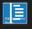
This pull request fixes the icon regression in the Dec release. https://github.com/Microsoft/sqlopsstudio/pull/382. The fixed icon will look as below.

 kburtram
on 27 Dec 2017
kburtram
on 27 Dec 2017
@kburtram Well, that's perfect. Exactly what I was hoping for, thanks!
CobusKruger
on 15 Jan 2018
I close this issue as the fix is in the Jan release.
kburtram
on 17 Jan 2018
Related issues
 kfrajtak
·
3Comments
kburtram
·
3Comments
kfrajtak
·
3Comments
kburtram
·
3Comments
 haydnlj
·
3Comments
haydnlj
·
3Comments
 carloscfcortez
·
3Comments
carloscfcortez
·
3Comments
 stevenreddie
·
3Comments
stevenreddie
·
3Comments
Most helpful comment
With the latest Dec preview release the icon got worse. I didn't mind the old one, it was small but it was nice. Now it makes the text unreadable.