Armory: [Android] Scaling problem with canvas
Description
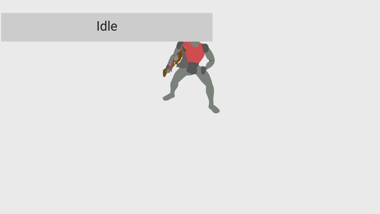
I have a basic scene with buttons, looks fine played with Krom:
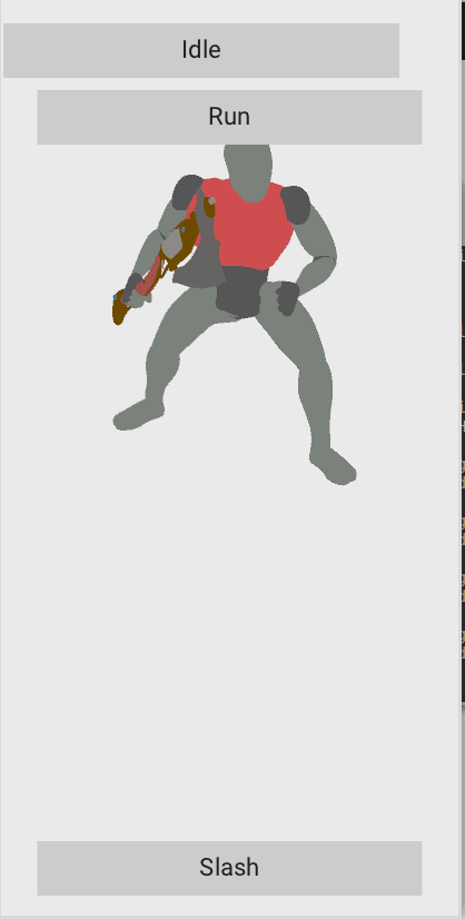
The scene has 411 x 823 px, and the buttons have the following layout:
- Idle: Top-left anchored to (0, 20)
- Run: Top anchored to (0, 80)
- Slash: Bottom anchored to (0, -20)
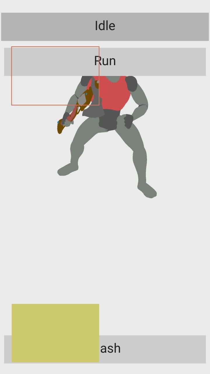
The problem is that if I publish this to Android the model and the canvas are right but the buttons are too small:
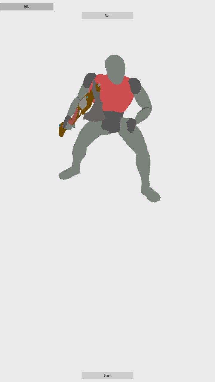
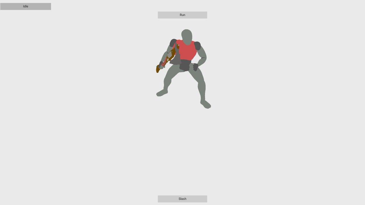
So, I've scaled up the UI using Zui.setScale with a value of 4, and in my device now the buttons look like they are of the right dimensions... but the canvas appears to be too big, so only one button gets painted in the screen... or I think so :confused:
To Reproduce
Create some scene with buttons and change the scale with Zui.setScale.
Expected behavior
I think that there is some problem with scaling vs. not scaling and the canvas vs. it's elements. I think that everything should scale or not — or maybe I'm not understanding something and doing something wrong... :sweat_smile:
System
Blender: 2.82.7
Armory: Almost git version.
OS: Linux Mint 19.2 (linux 4.15.0-76-generic x86_64)
Graphics card: NVIDIA Quadro M2000M 4 GB
 Sanva
Sanva
All 4 comments
Hi, @Sanva! In Canvas you can change the resolution of the screen and adjust the proportions for each targetted screen.

Change it to your device resolution and don't forget that the proportions can be different from PC to phones depending of the phone screen position (vertical or horizontal). You can lock the app screen rotation in Android Studio easily by editing a command line in the Manifest file.
For me you are doing this:
 knowledgenude
on 17 Apr 2020
knowledgenude
on 17 Apr 2020
Hi @knowledgenude , thanks for your help!
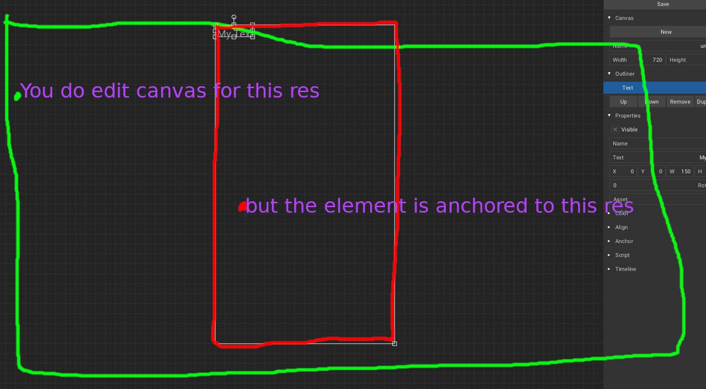
But I think there is a problem somewhere. And I think it happens because of canvas changing it's width and height automatically [1] to fill all available screen space — so the configuration you show me doesn't really work. Unless you set it to the device screen resolution, but that would mean you have to know it beforehand... :confused: But maybe I'm wrong and not understanding something... :thinking:
[1] https://github.com/armory3d/armory/pull/1616/commits/5cde1487ca20260b5bd245167c8ee88ef72a2444
If I'm understanding this right, the problem is that the canvas will always have, in its not-scaled information, the right dimensions of the screen — so, if you scale the UI, the canvas get scaled and becomes too big. That's what I think it's happening in my two last screenshots. You can see this in code here [2].
[2] https://github.com/armory3d/zui/blob/master/Sources/zui/Canvas.hx#L268-L269
My proposal is to change those two lines of code to remove the call to scaled, because canvas.width and canvas.height already have the true screen dimensions, so
- Not scaled applications won't change.
- Scaled applications will change making possible to set some scale that would affect elements, but not the canvas, not making it too big. If I understand this right, this should be the correct behavior, since the canvas is only used to positioning elements, but won't affect their size.
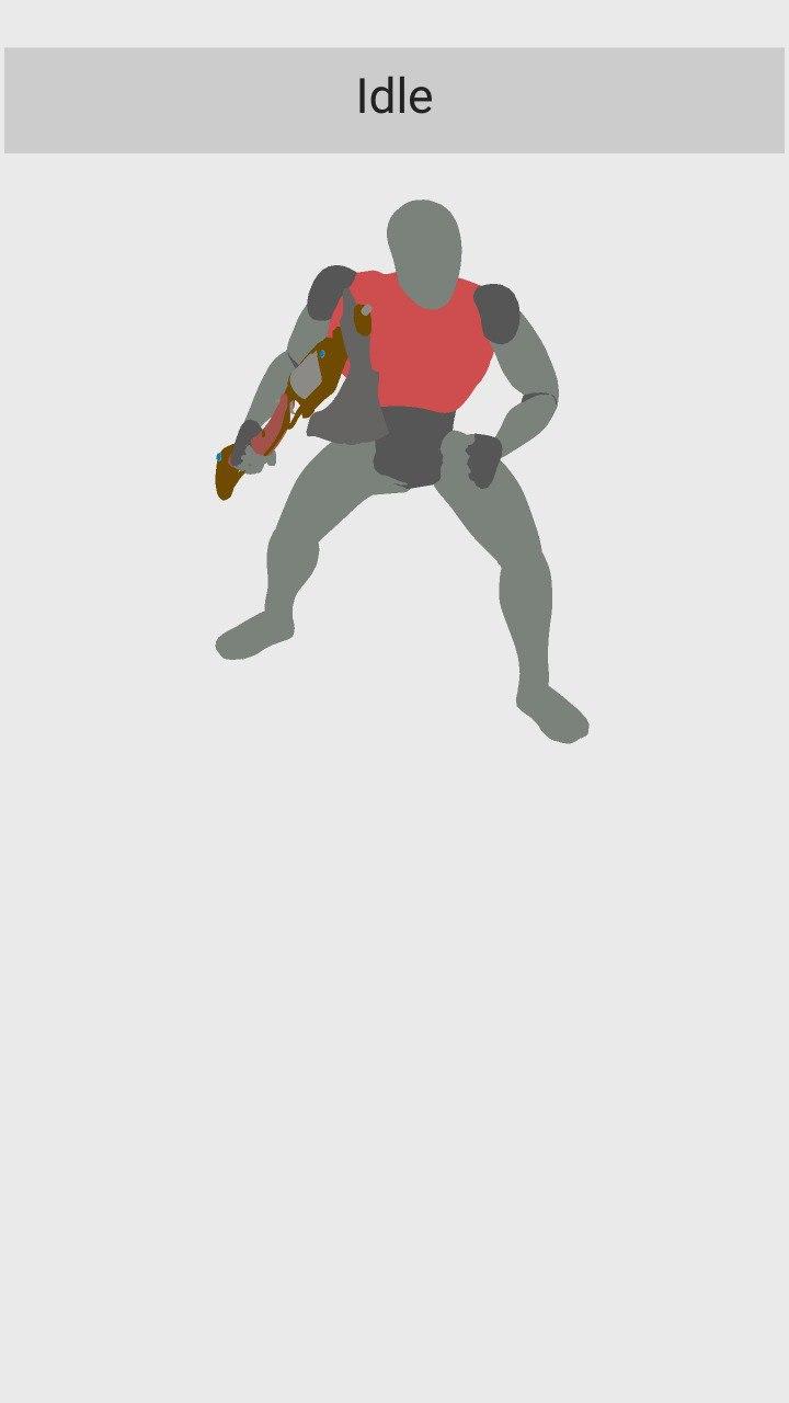
These are the same screenshots from my last comment but compiled with the new change (I've added two irrelevant rectangles in the meantime):
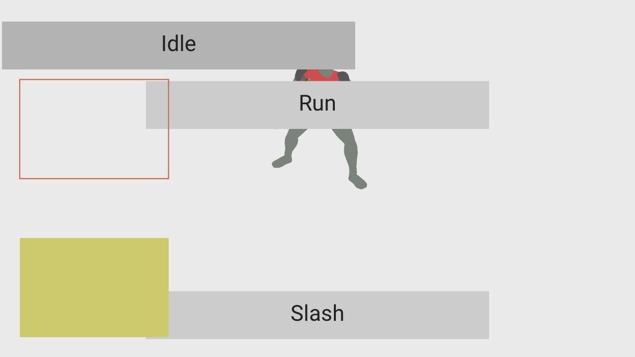
And I did not have to change my original 411 x 823 px resolution that I've chosen for original UI aspect ratio — nor anything anywhere.
What do you think about this @luboslenco ? May I make a pull request?
If I'm wrong, I will appreciate some guidance to understand whatever I'm not understanding... :sweat_smile:
Sanva
on 18 Apr 2020
Scaling the element to a resolution (1920x1080), then the aspect will be the same if your target have the same resolution. But as the phone screen is smaller, then the button will be smaller too proporcionally. If it is not happening, we have a issue here. I think that i understand what you mean, to increase the button size depending on screen size and it is a good idea, but some people can run the app in a TV for example, using the smatphone just to control it. If it happens, your metod will consider the TV size too? Anyway, from my point of view it deserves a pull request.
knowledgenude
on 18 Apr 2020
Anyway, from my point of view it deserves a pull request.
Done.
If it happens, your metod will consider the TV size too?
The method I'm suggesting is very simplistic, and assumes the target device has the same aspect ratio specified with the canvas height and width — but, the thing I was pointing out here is the way canvas is both affected by the scale and by adjusting itself to the window dimensions, behavior witch I think is incorrect and will cause problems.
With the canvas adjusting itself to the window position, you can use scaling of the rest of the UI if that simplistic approach suits your use case — if not, you always can change the buttons or other elements width, height, margins... based on whatever algorithm you came with, but it will nonetheless be useful to have the canvas anchoring points and knowing that your elements will be more or less in place.
Sanva
on 21 Apr 2020
Related issues
 SeleDreams
·
3Comments
SeleDreams
·
3Comments
 e1e5en-gd
·
3Comments
e1e5en-gd
·
3Comments
 DevMagicLord
·
3Comments
DevMagicLord
·
3Comments
 mushroomeo
·
4Comments
mushroomeo
·
4Comments
 Nos-
·
4Comments
Nos-
·
4Comments
Most helpful comment
Hi @knowledgenude , thanks for your help!
But I think there is a problem somewhere. And I think it happens because of canvas changing it's width and height automatically [1] to fill all available screen space — so the configuration you show me doesn't really work. Unless you set it to the device screen resolution, but that would mean you have to know it beforehand... :confused: But maybe I'm wrong and not understanding something... :thinking:
[1] https://github.com/armory3d/armory/pull/1616/commits/5cde1487ca20260b5bd245167c8ee88ef72a2444
If I'm understanding this right, the problem is that the canvas will always have, in its not-scaled information, the right dimensions of the screen — so, if you scale the UI, the canvas get scaled and becomes too big. That's what I think it's happening in my two last screenshots. You can see this in code here [2].
[2] https://github.com/armory3d/zui/blob/master/Sources/zui/Canvas.hx#L268-L269
My proposal is to change those two lines of code to remove the call to
scaled, becausecanvas.widthandcanvas.heightalready have the true screen dimensions, soThese are the same screenshots from my last comment but compiled with the new change (I've added two irrelevant rectangles in the meantime):
And I did not have to change my original 411 x 823 px resolution that I've chosen for original UI aspect ratio — nor anything anywhere.
What do you think about this @luboslenco ? May I make a pull request?
If I'm wrong, I will appreciate some guidance to understand whatever I'm not understanding... :sweat_smile: