Antennapod: Redesign filter dialog
App version: 2.0.0
Problem you are having:
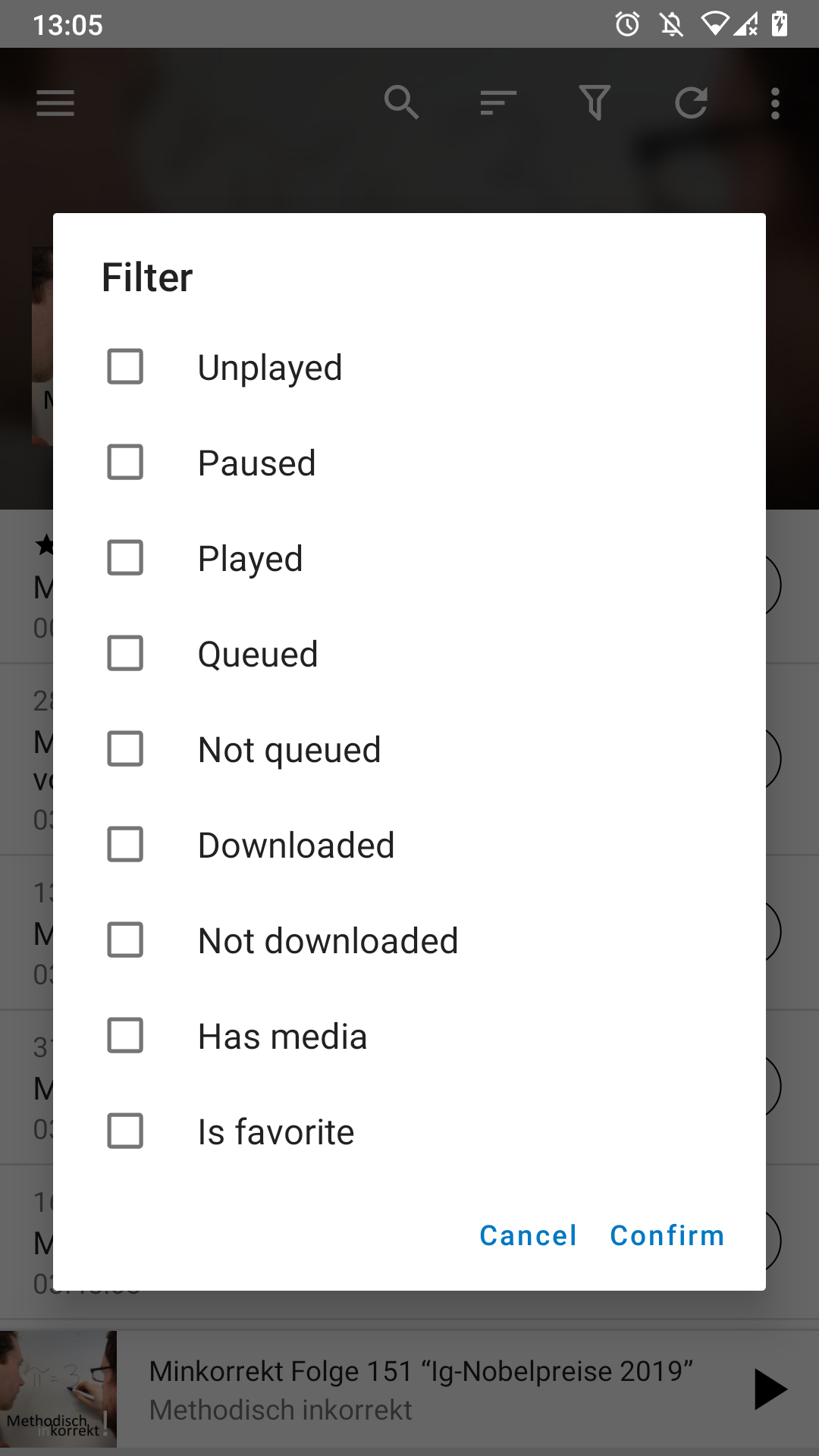
The filter dialog is confusing. At least I remember being confused when looking at it for the first time. What does checking multiple values do (AND vs OR)? You can end up with options that will never show any episodes (queued AND not queued).
Suggested solution:
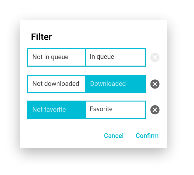
We discussed this in #4141 and came up with the follwing mock-up. It allows to still filter using one tap but it is probably easier to see how multiple values work together.
 ByteHamster
All 17 comments
I know I'm a bit late to the party, but I would've preferred to have 'titles' with consistent toggles (as I proposed), as it's easier to quickly scan the filtering options. In the current implementation one has to carefully read all button contents before knowing which ones to select, as 'left' and 'right' each time are different (even though the pattern is the same) and there is no colour-indication of the filter status.
I don't really see how 'filter'='off' would've been confusing, but if it is, it could've been replaced by 'no filter'.
I understand if the proposal won't change again. IMHO, in that case, the design of the actual implementation could be refined a bit. The current mockup with sharp corners doesn't give the modern look that's sought & implemented with other changes. Maybe making the corners round and the X icon outline-based would already help.
 keunes
on 16 May 2020
keunes
on 16 May 2020
I think you're right on time. I got the ball rolling in a certain direction and I added the code I've done so far because I didn't want to keep going in the wrong direction. If ByteHamster thinks the way I'm going about this is okay... I can keep going and I don't think it's a problem to implement rounded corners, I can add a graphic circle "x".
I understand what you're saying, when the dialog opens I can have everything set to OFF mode then you click "Downloaded" that switches to a "green or blue" ON state and the the left area would say Downloaded simulating a toggle effect.
( Downloaded | red("OFF") )
on click --> ( green("ON") | Downloaded )
 bws9000
on 16 May 2020
bws9000
on 16 May 2020
@keunes:
I don't really see how 'filter'='off' would've been confusing
I think this is basically a different way of thinking. You seem to think pretty technical, eg. I want to enable the filter that shows queued items. I (and I think most of the non-technical users) think a bit different: I want to see queued items. In my mock-up, I can directly touch the thing I want to see (queued items), while in your mock-up, I have to take two (mental) steps: enable the filter that shows queued items.
The current mockup with sharp corners doesn't give the modern look that's sought & implemented with other changes. Maybe making the corners round and the X icon outline-based would already help.
I agree. That would look better. The boxes were the first thing that jumped to my eye when opening the mock-up program (Pencil).
ByteHamster
on 16 May 2020
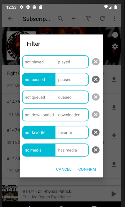
I kind of jumped into the middle of this thing. What do you think of this? (Minus the blue line down the middle). I'm not sure you want it to look exactly like this.
Some options don't have values that are part of the filter data. I just have them load into a default selected state.
bws9000
on 19 May 2020
Still not a huge fan of the approach, but already an improvement. Some feedback:
- the rounded corners and cross-circles don't seem 100% round – is that an issue with the screenshot?
- for the icon I would use an outline version, as in line with the current info & settings button in the podcast screen (in your image they're still 'solid' versions)
- I'm wondering if the cross-button could be decreased in size a bit – it feels a bit big (it should have the same size as other icons)
- I understand why you got rid of the middle blue line, but I would keep something. I think a less in-your-face colour (a light grey) would help understand each button has two parts (when seeing this screen for the first time)
- the buttons seem rather big compared to their contents – they should be less high
Is the image a mock-up or actual implementation? If it's just a mock-up I guess some of the points would be resolved when implemented :)
keunes
on 19 May 2020
- I see what you mean. I can improve the roundness.
- ok, font-awesome. i'll decrease the size also
- maybe thin blue or grey line in the middle sounds good
- I can deflate the button height
Its a screenshot of the implementation I have locally. I have to upload it. Big improvement from my initial pull request. It's usable, just working on the design elements.
bws9000
on 19 May 2020
Looking at the screenshot, it seems like you are using a pretty old branch. Also, your PR contains unrelated commits. Merging will be a lot easier if you update your branch before continuing the work.
I think it might be better to list the positive version first. To me, Queued/Not queued looks better than Not queued/Queued.
ByteHamster
on 20 May 2020
okay, I'm updating. add a new pull request when updated
bws9000
on 20 May 2020
Will the remaining filter options still be ANDed together?
Because i'd be happy if also a toggle to change this on the fly would be added.
For example, i would want to show all episodes which are unplayed but also all episodes i've marked as favorite but already played.
As for git workflows @bws9000:
You can also rebase your changes onto the current developing branch to get a clean Pull Request.
For example, you could git rebase -i upstream/develop and then only pick the commits that should end up in this PR.
For Pull Requests, i generally use the feature branch workflow, as it allows you to produce clean Pull Request, mostly containing just one commit which also allow seasy fast-forward merging.
 SebiderSushi
on 18 Jun 2020
SebiderSushi
on 18 Jun 2020
Will the remaining filter options still be
ANDed together?
Because i'd be happy if also a toggle to change this on the fly would be added.
I see where you're coming from, but to be honest I think that would clutter the already filled interface on a small screen. (A single And/Or toggle for the whole filter screen wouldn't suffice for your use case - it would need the creation of 'groups'.) It might be a wee bit more annoying, but you can filter for those two scenarios right after another.
keunes
on 18 Jun 2020
I don't see why a simple AND <> OR toggle wouldn't suffice.
What kind of "group" concept are you referring to?
SebiderSushi
on 18 Jun 2020
Will the remaining filter options still be
ANDed together?Because i'd be happy if also a toggle to change this on the fly would be added.
For example, i would want to show all episodes which are unplayed but also all episodes i've marked as favorite but already played.
As for git workflows @bws9000:
You can also rebase your changes onto the current developing branch to get a clean Pull Request.
For example, you couldgit rebase -i upstream/developand then only pick the commits that should end up in this PR.For Pull Requests, i generally use the feature branch workflow, as it allows you to produce clean Pull Request, mostly containing just one commit which also allow seasy fast-forward merging.
thank you i'll check it out
bws9000
on 20 Jun 2020
If it eases implementation or user-interface in any way, i think an option to decide between include all elements that match the filter or exclude all elements that match the filter would have the same feature-outcome as switching between AND vs. OR and might be more intuitive for most users.
SebiderSushi
on 20 Jun 2020
I think include/exclude should be another PR later. This requires quite a few logic changes in other places.
ByteHamster
on 20 Jun 2020
Not sure if this is the right place for this, but wondering if there can be a quick on/off toggle for filters that would not require opening the dialog? For example, when looking on the episode list screen, pressing the filter button would open the filter dialog, but long-pressing would enable/disable all the filters.
 lukaszkruk
on 1 Jul 2020
lukaszkruk
on 1 Jul 2020
For example, when looking on the episode list screen, pressing the filter button would open the filter dialog, but long-pressing would enable/disable all the filters.
I suppose the 'all episodes' view? For me the filter icon is in the menu, so never noticed.
keunes
on 1 Jul 2020
I suppose the 'all episodes' view?
Yes, I think that's a good way of calling it!
lukaszkruk
on 8 Jul 2020
Related issues
 yosefmizrahi
·
3Comments
yosefmizrahi
·
3Comments
 reverse-unina
·
5Comments
reverse-unina
·
5Comments
 Matth7878
·
3Comments
Matth7878
·
3Comments
 maxxo
·
4Comments
maxxo
·
4Comments
 benediktg
·
4Comments
benediktg
·
4Comments