Antennapod: Feature Request: Player screen UI style updates
App version: 1.7.2b
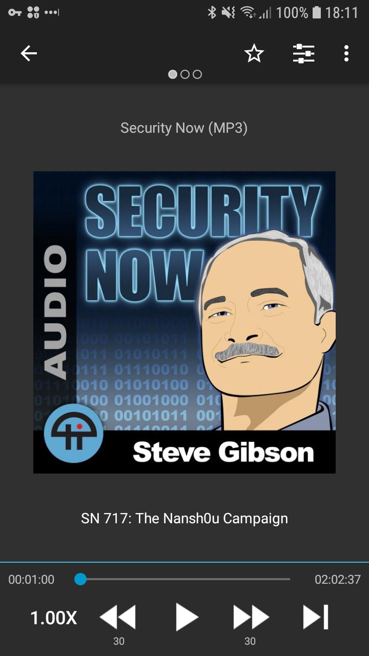
Problems:
- The spacing of the controls at the bottom means touch targets are more difficult to use for people with larger fingers.
- If the middle block becomes a duplicate play control, scrubbing through the timeline will be harder and you might accidentally pause or play the episode.
- If the middle block becomes a duplicate play control, selecting the title text will be more challenging or not possible.
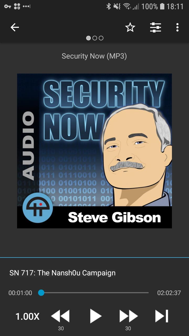
Solutions:
- Opening up the spacing on the bottom allows for better UX to control the episode.
- The above solution will prevent scrubbing from affecting the middle block if that changes to be a big play control
- The episode title and podcast title can move down and up, moving them to blocks which don't have to be touch targets for the play control and allow them to still retain the ability to select the text.
This issue is related to #3220 to give it room for the whole block to become a play control.
I'm including a current view and a modified view of what it does and could look like to help with the UX of the episode view.
Current:
Modified:
 asuh
asuh
All 10 comments
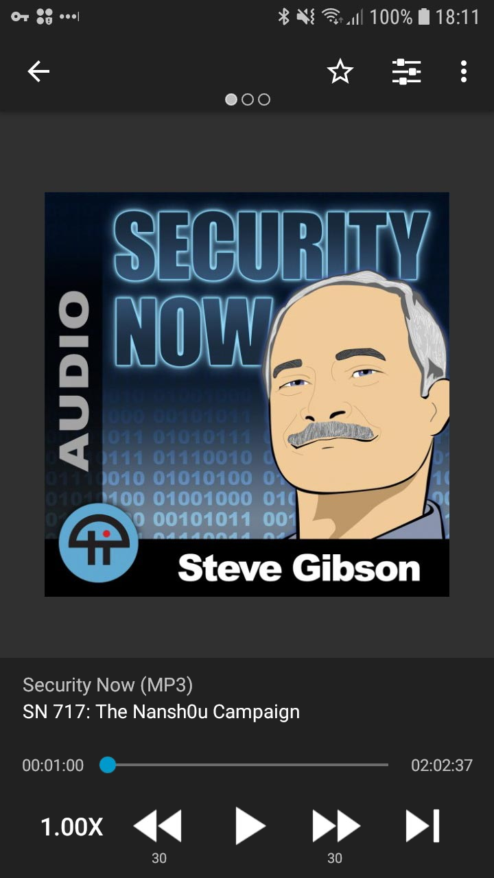
I like it! If we add both podcast and episode title to the playback control panel, it'll be super obvious what the podcast is in every screen: cover, description and chapters.
 andersonvom
on 13 Jun 2019
andersonvom
on 13 Jun 2019
I like it ;)
 ByteHamster
on 13 Jun 2019
ByteHamster
on 13 Jun 2019
Nice! I considered mocking up with the title in the controls block as well but I wanted to show incremental changes. Looks great and it allows one whole area for selecting both titles, even better!
One thing I didn't mention above is that i moved the timer count numbers a little closer into the scrubber. This appearance gives the app a bit more breathing room with a slightly wider margin and can also assist with readability and relation between the counts and the scrubber.
asuh
on 13 Jun 2019
Now that I think about it, adding the persistent title might make some users unhappy because of less screen space for shownotes. This becomes especially obvious when using a device with small screen or using multiwindow.
ByteHamster
on 29 Sep 2019
Whatever design changes are made, it makes sense for the bottom scrubber and playback controls to have more space. I use BeyondPod and my proposed changes above are in respect of their UI which i feel is great.
Pocketcast, one of the most popular podcast players, also uses white space quite effectively.
asuh
on 30 Sep 2019
But in pocket casts, the playback controls do not take away space from the shownotes. There was a redesign proposal once that moved the shownotes somewhere else but it was rejected
ByteHamster
on 30 Sep 2019
When you say "shownotes", am I right to assume you mean the notes that show when you swipe to the left on the player and it brings up an unordered list of notes? I guess I'm confused why the UI of the player affects that view?
asuh
on 1 Oct 2019
Yes, I mean that page you get when swiping left. The playback controls stay there, so if we make the bottom player bigger, the area for the shownotes gets smaller.
Shownotes don't have to be an unordered list of notes. Depending on the podcast, there is quite a lot of additional information.
ByteHamster
on 1 Oct 2019
I now understand, thank you. I also didn't realize the scrolling behind the controls.
It appears the ones I mentioned, and likely others, use a different view that doesn't include the playback controls to display the show notes.
My opinion, and based on my experience with other app UIs, is that touch targets and areas need more breathing room and space for interaction. I like the UI on this app and reminds me of others mentioned, even the Apple Podcasts player. But each of them have more space for scrubber, playback controls and touch targets.
Possible solutions:
- Episode titles as links - pop up a new view just for the show notes or chapters?
- Menu icon, such as three dots to do the same as above (
 )
) - Default episode view could also be scrollable, where show notes live below the playback controls when you swipe up
- Keep existing UI, live with smaller viewable space for show notes knowing it can scroll.
asuh
on 1 Oct 2019
I updated the player screen in #3856. It has much bigger touch targets now. It's a bit different to the suggestions in this issue but I think the main issues are solved.

ByteHamster
on 18 Feb 2020
Related issues
 Matth7878
·
3Comments
Matth7878
·
3Comments
 Rotzbua
·
4Comments
Rotzbua
·
4Comments
 ggshuini
·
4Comments
ggshuini
·
4Comments
 yosefmizrahi
·
3Comments
yosefmizrahi
·
3Comments
 maxxo
·
4Comments
maxxo
·
4Comments
Most helpful comment
I updated the player screen in #3856. It has much bigger touch targets now. It's a bit different to the suggestions in this issue but I think the main issues are solved.