Antennapod: Rework "Add podcast" screen
The "Add podcast" screen is one of the first interactions users have with AntennaPod but the screen looks really old-fashioned. I drew a mockup of a rework. The search function is unified to one single search bar. The term is looked up on all 3 providers and merged together (with a nice algorithm we need to come up with). The discover section is powered by iTunes and gpodder charts which we already have in the app. For comparison, I added the old screen next to it. Click on the screenshots to view a bigger image.
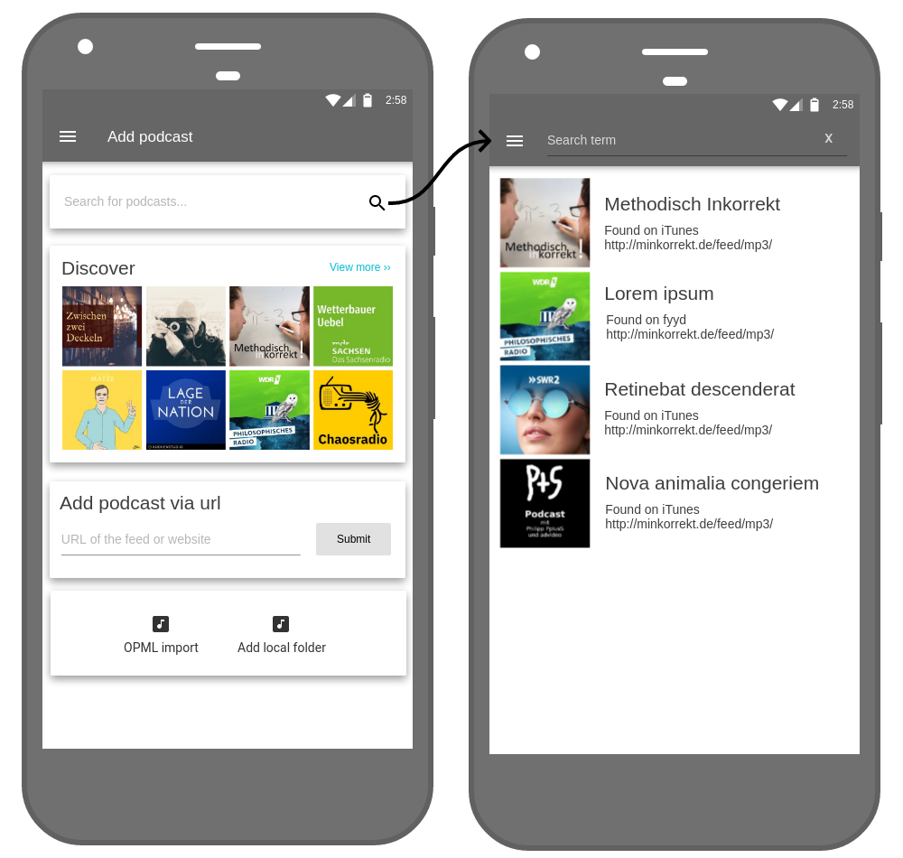
Feedback and help with implementing would be greatly appreciated. I believe that this screen can be redesigned without breaking existing user's muscle memory because the screen is not used that often. Therefore, I think we can implement this without the risk of getting flooded with complaints. Still, the screen is the first impression users have, so it should be well designed.
 ByteHamster
All 8 comments
This is awesome! I thought the exact same thing the other day as well, that this screen was pretty old fashioned.
A couple of suggestions:
- One thing I found myself needing a lot is a way to discover podcasts in different languages. It'd be nice we could add some filtering as well.
- Maybe we can collapse the "Add podcast via url" in a button, along with "OPML import" and "Local folder". I guess it depends on how often it's used by most users. If a lot of people use it a lot, maybe we can reuse the search bar for it as well?
- The very first time the user opens the app, this might be a better screen for them to land, since they'll have no podcasts and will likely just go to it anyway.
 andersonvom
on 12 May 2019
andersonvom
on 12 May 2019
Maybe we can collapse the "Add podcast via url" in a button, along with "OPML import" and "Local folder".
Please no. Keep it as @bytehamster shows it. Adding by URL is always welcome and useful to see instead of a single search box.
The very first time the user opens the app, this might be a better screen for them to land, since they'll have no podcasts and will likely just go to it anyway.
This is fine.
 Pentaphon
on 12 May 2019
Pentaphon
on 12 May 2019
One thing I found myself needing a lot is a way to discover podcasts in different languages. It'd be nice we could add some filtering as well.
In a first step, I would focus on the layout only. This sounds like a related but independent feature.
Maybe we can collapse the "Add podcast via url" in a button, along with "OPML import" and "Local folder". I guess it depends on how often it's used by most users. If a lot of people use it a lot, maybe we can reuse the search bar for it as well?
I, personally, add most of my feeds using the url. I deliberately used another layout for the two input fields so they can be distinguished more easily. If we detect that a user pastes a url into the main search bar, we could additionally use the "add via url" code path but I prefer to additionally provide an input box for the url.
The very first time the user opens the app, this might be a better screen for them to land, since they'll have no podcasts and will likely just go to it anyway.
We should totally do that. There already is an issue about better onboarding - this screen will probably help new users a lot to feel welcome in the app.
ByteHamster
on 12 May 2019
Just saw this; really looks like a great improvement!
Maybe we can collapse the "Add podcast via url" in a button, along with "OPML import" and "Local folder".
I agree with this: it creates more space for suggested podcasts, which is probably the preferred tool for most users. This isn't to say there should be one button for the three options, but three buttons horizontally aligned: "Add via url", "OPML import" and "Add local folder". This would be at the expense of adding via URL, but only introduces one extra step for ByteHamster's use-case.
 keunes
on 26 Jun 2019
keunes
on 26 Jun 2019
You should look at how the screens are combined in this app: https://play.google.com/store/apps/details?id=com.podcast.podcasts&hl=en_US which looks like it was built from a previous fork of AntennaPod (or vice versa, I'm only guessing on the lineage of the code but the screens look remarkably similar).
Notable features from the "Podcast Player" are:
- Removal of the "Add podcast" screen altogether
- Support of a FAB in the subscriptions screen with popup menu to provide access to OPML and URL imports, as well as the combined search
 promethyttrium
on 15 Jul 2019
promethyttrium
on 15 Jul 2019
which looks like it was built from a previous fork of AntennaPod (or vice versa, I'm only guessing on the lineage of the code but the screens look remarkably similar)
:open_mouth: I've downloaded the app, and it does look horribly similar! Given that that app was 'launched' in 2016 and AP's 1.0 release is from 2015 (with the initial commit from 2012) I sure think it's been copying AntennaPod. Without any reference, isn't that illegal with AP's license?
only guessing on the lineage of the code
Do you have access to the app's code-base, or do I misunderstand?
Support of a FAB in the subscriptions screen with popup menu to provide access to OPML and URL imports, as well as the combined search
I liked the approach, but until that'd be implemented (which I imagine is a lot of work) Bytehamster's contribution is a great improvement.
keunes
on 20 Jul 2019
Given that they heavily modified the app, I would consider it more or less fair. It's not just a plain copy with ads. Technically, they have to mention AntennaPod somewhere, yes. Hidden somewhere on the about screen :D We could write them an email about that.
ByteHamster
on 20 Jul 2019
@keunes I do not have access to the their source code. I simply happened upon it in the Play store. It looked like a decent player, I played with it for a bit and emailed them to ask for specific enhancements and was told they no longer supported that version (the one with the purple icon) and asked that I start using their paid version instead (https://play.google.com/store/apps/details?id=fm.castbox.audiobook.radio.podcast&hl=en_US). That's when I started to search for any podcast player in Github and found AntennaePod and noticed the similarities.
promethyttrium
on 21 Jul 2019
Related issues
 clixyz
·
4Comments
clixyz
·
4Comments
 Matth7878
·
3Comments
Matth7878
·
3Comments
 zequip
·
3Comments
zequip
·
3Comments
 fabolhak
·
3Comments
fabolhak
·
3Comments
 maxxo
·
4Comments
maxxo
·
4Comments