Antennapod: [Feature Request] Placing a name of podcast in Queue
It's really hard to identify a podcast in Queue. The logo image is always not a logo.
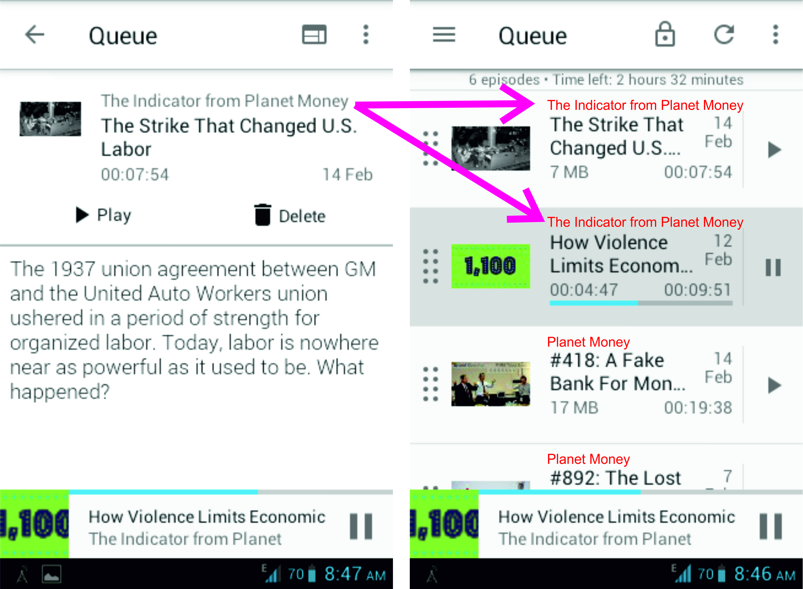
So wouldn't it be nice to place a name of podcast in Queue just like it goes here (red letters):
 whiskydotjar
All 16 comments
For me, the real issue is that these episodes have silly thumbnails. If you cannot recognise what podcast or episode it is, what good are they?
We simply don't have any room for the podcast name. Small fonts are not an option, people regularly complain that text is as "small" as it is.
Maybe we can combine this with #2945 and not show an image for some podcasts at all (this would be a setting).
 mfietz
on 26 Mar 2019
mfietz
on 26 Mar 2019
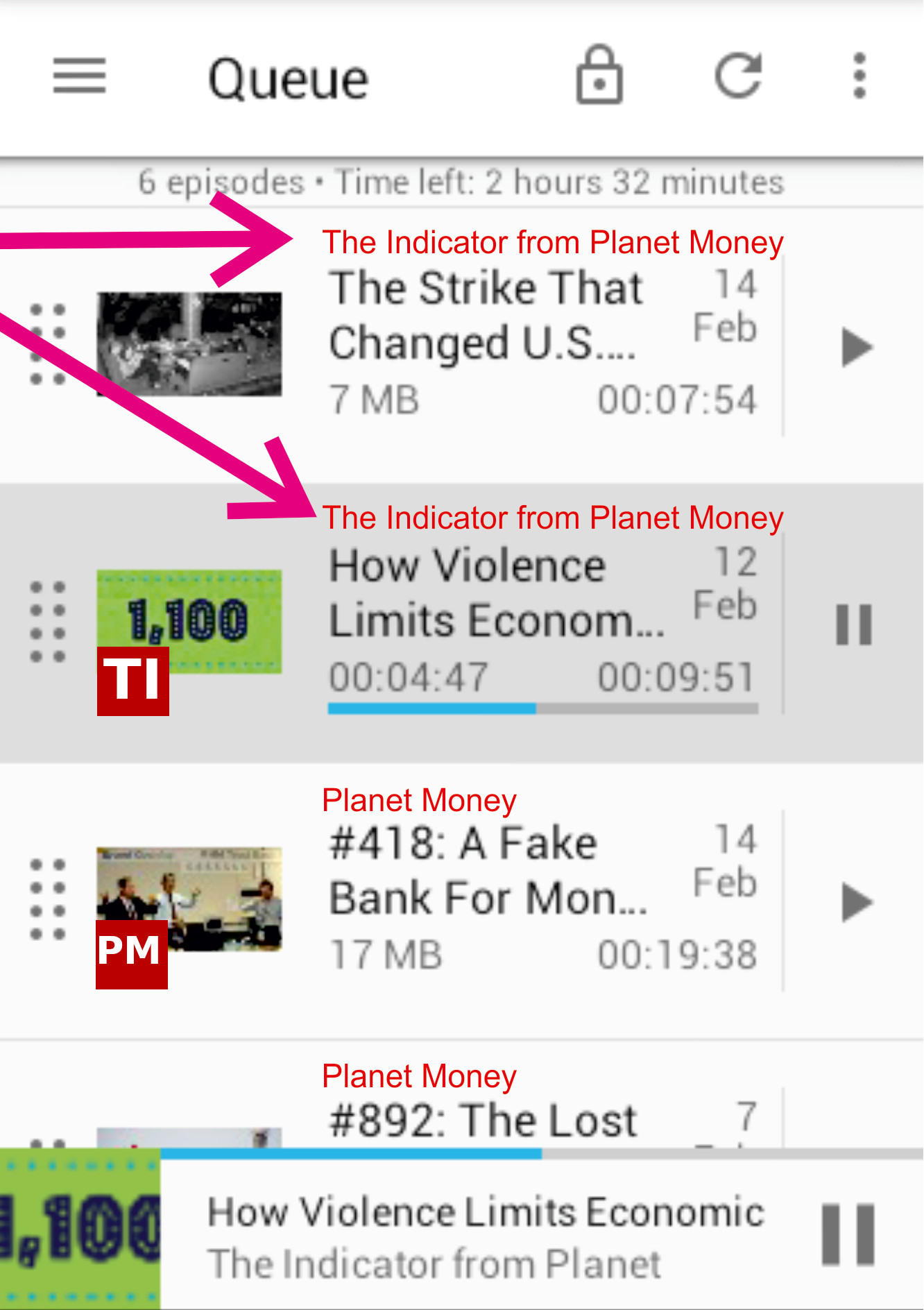
Another option is to have the thumbnail show podcast cover rather than episode cover in Queue (and Episodes screen), so that effectively the thumbnail can be used to recognize podcasts.
 orionlee
on 26 Mar 2019
orionlee
on 26 Mar 2019
It seems to me that there is a lot of information on the card and maybe not everything is necessary for the queue list, such as size or date. And if the thumbnails really do not help, as @mfietz says, we could reduce their size.
 deandreamatias
on 31 Mar 2019
deandreamatias
on 31 Mar 2019
I would gladly go without date, duration and/or thumbnail -- or a smaller thumbnail -- if it meant the name of the podcast would be displayed.
 saejo
on 1 Apr 2019
saejo
on 1 Apr 2019
Nope, not an option. If we do such heavy UI changes, we need a good reason to do so. A couple thousand people are used to the UI as it is - in my experience, even small changes can have a huge backlash.
AntennaPod does not force its users into the same use cases. I'm always amazed how some people use the app which is completely different from my workflow. Just because a certain change would optimise the workflow for one group a bit, we cannot break how everybody else uses the app.
If we show the podcast name in the queue, the change has to be minor or configurable: existing users should see no or a minor change, only new users are fair game.
mfietz
on 2 Apr 2019
@mfietz what about the proposal of making the thumbnail always show podcast cover?
As you mentioned in another thread, the current thumbnails shown are some arbitrary mix of podcast and episode-specific covers, depending on how the podcast creators set up. They are not too helpful for existing users as it is.
Changing the thumbnails to always show podcast covers should be an improvement for all users.
orionlee
on 4 Apr 2019
@orionlee that proposal is still completely fine with me...
mfietz
on 4 Apr 2019
I, personally, like episode specific covers. The creators of my podcasts put effort into the covers. They are clearly recognizable but still provide a bit of context. I am strongly voting against completely removing episode specific covers. Displaying the covers in one place but not in the other might be confusing. I doubt that the majority of users does not want to see the covers. Therefore, I am voting for adding a setting that defaults to showing the specific covers.
 ByteHamster
on 4 Apr 2019
ByteHamster
on 4 Apr 2019
@ByteHamster sorry, I thought that was clear. I fully agree.
mfietz
on 4 Apr 2019
I think that would be useful to identify a podcast in the queue. It's not an high-priority feature IMHO, but it could be useful
If you don't want to add a text in the queue, you may think about adding an option to overlay the two initial letters of the name of the podcast over the episode image.
This is just a sketch, an idea. I don't even lnow if this can really be made.
Maybe it would be enough for most of the users.
 sbadux
on 15 Apr 2019
sbadux
on 15 Apr 2019
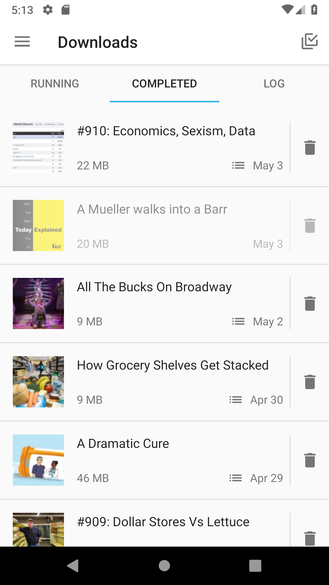
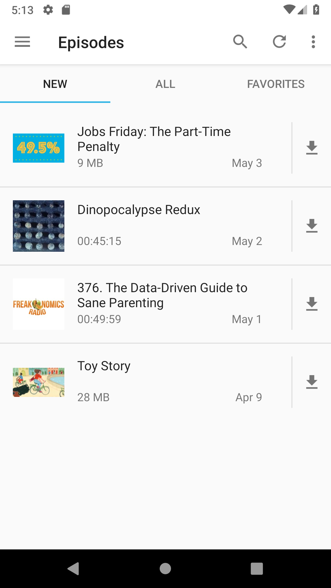
I'm not sure this is the right thread, but one thing I'd vote for is to make the duration a little bit more readable (i.e. 1h 30min instead of 01:30:12, or 25min instead of 00:24:56) and make the interface for an episode more consistent across all screens. Each screen seems to have a slightly different layout for an episode entry, as can be seen below:
 |
|
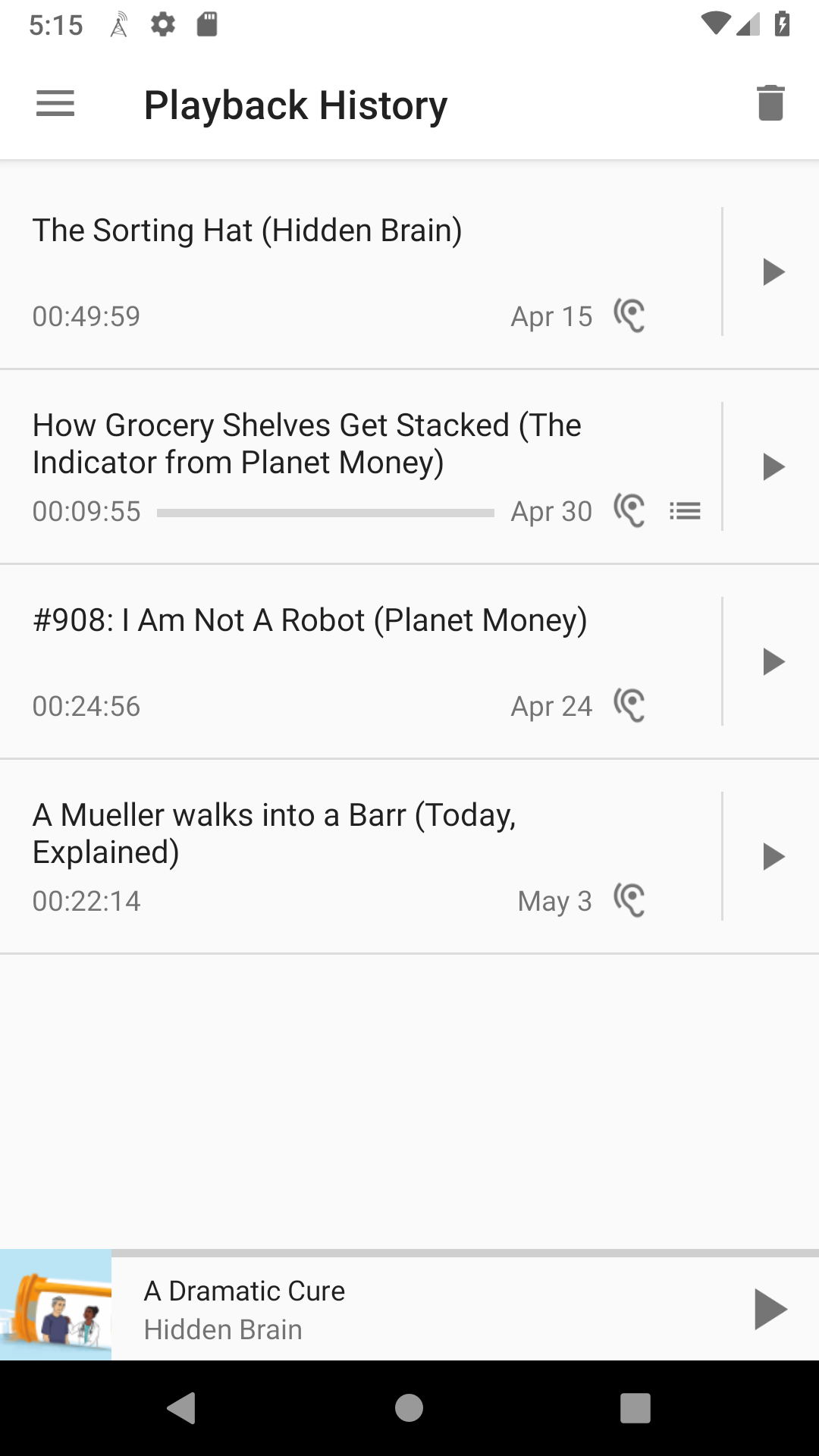
|
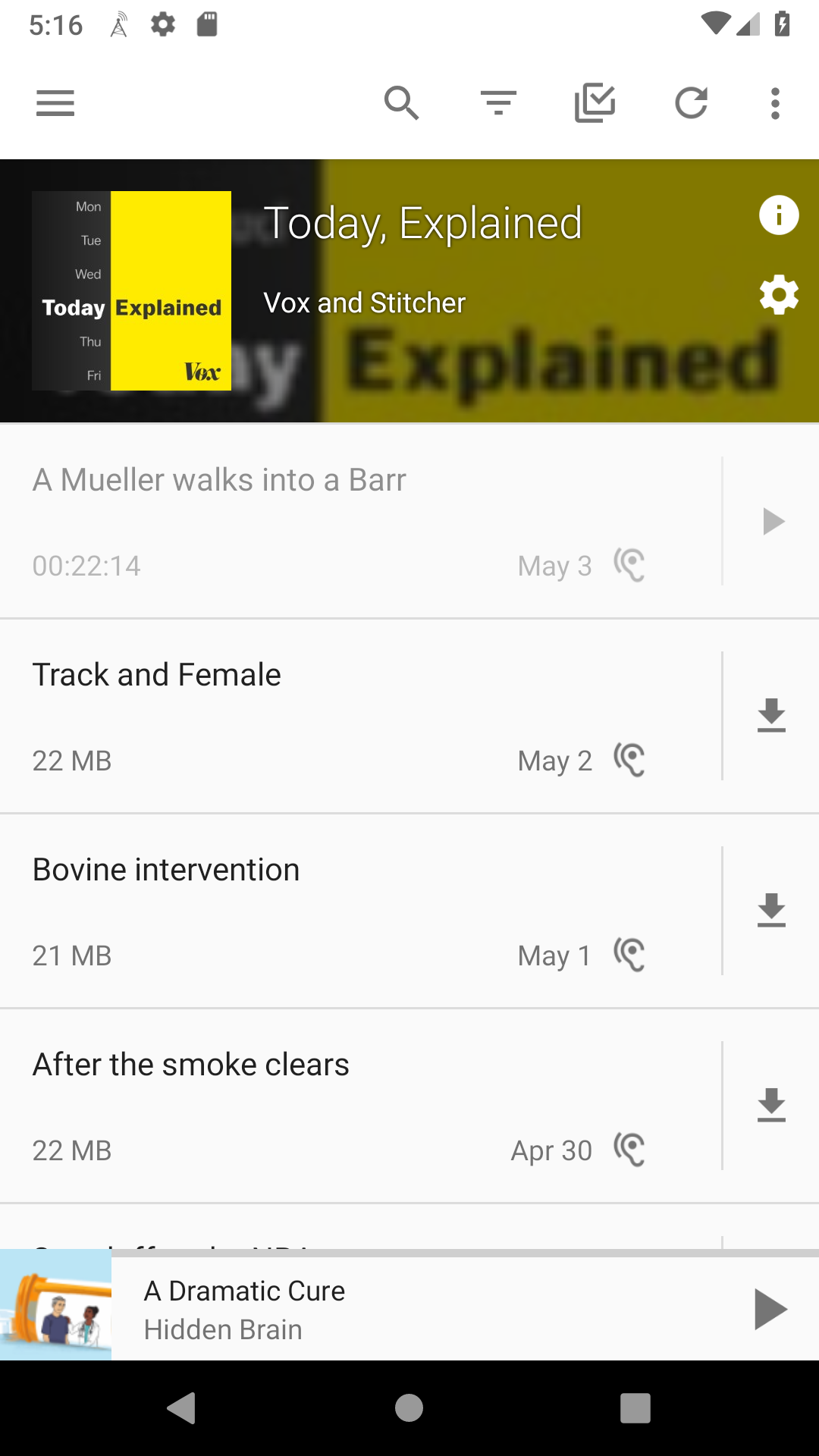
|
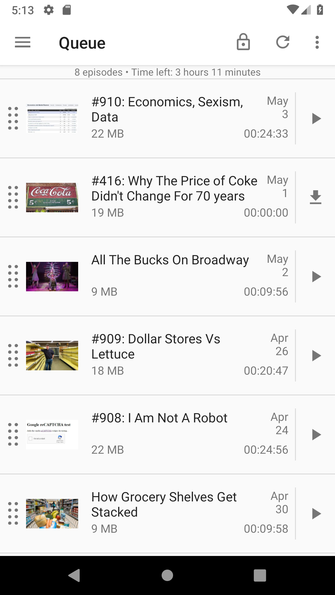
|
 andersonvom
on 4 May 2019
andersonvom
on 4 May 2019
@andersonvom Could be quite tricky to translate. Even in German, I would not know what the translation for "1h 30min" would be...
mfietz
on 5 May 2019
@mfietz h and min are accepted SI symbols [[1], [2], [3], [4]], so in theory there would be no need for translation (e.g. km/h is also used in German). Regardless of the change in how we display the duration, I would still argue that making the episode layout consistent would be nice to have, though.
andersonvom
on 6 May 2019
Why can't we just add an option to always show the podcast cover instead of the episode specific? I feel like that would make everyone happy
 IHaveADrone
on 10 May 2019
IHaveADrone
on 10 May 2019
@IHaveADrone If the default setting is the current behavior, I would accept a PR that adds the setting.
@andersonvom If you want to discuss this further, I suggest to open another issue. I, personally, like the way it currently is.
ByteHamster
on 10 May 2019
I'm working on a PR to add a setting to switch between "Using the podcast cover" / "using the episode cover (if any)"
 xgouchet
on 9 Oct 2019
xgouchet
on 9 Oct 2019
Related issues
 keunes
·
3Comments
keunes
·
3Comments
 Cj-Malone
·
5Comments
Cj-Malone
·
5Comments
 Matth7878
·
3Comments
keunes
·
4Comments
Matth7878
·
3Comments
keunes
·
4Comments
 AAM1119
·
3Comments
AAM1119
·
3Comments
Most helpful comment
Another option is to have the thumbnail show podcast cover rather than episode cover in Queue (and Episodes screen), so that effectively the thumbnail can be used to recognize podcasts.