I think the app icon needs refresh. So I have created new material styled icon. Please have a look at the icon in the attachment (512x512 for Google Play).
I can create a pull request with all icons sizes if you like it.
Let me know what you think :)

 stefan-mitrik
All 66 comments
Also throwing my hat in the ring... Designed it quite a while ago, never really got around to do all the changes. Background color is blue 500 from https://www.google.com/design/spec/style/color.html#color-color-palette

 mfietz
on 19 Oct 2015
mfietz
on 19 Oct 2015
Same here; made a quick adaptation a while ago (without tweaking for better details). I stayed as close as possible to the original logo. My background colour is light blue 700 from the Google colour palette.

For reference: the current logo
![]()
 keunes
on 19 Oct 2015
keunes
on 19 Oct 2015
Actually I think a combination of the three could be very nice, combining the following elements:
- from @stevomit's version:
- the two almost full-circle radio-waves
- the single support-bar in the middle
- the MD shadow
- the thick lines & big circle
- from @mfietz's version:
- the small angle of the legs of the antenna (45 degrees?)
- the legs of the antenna being straight
- from my version:
- the fade-out waves
- the alignment of the elements slightly from on left
Concerning the background colour I think I could pick something in between @stevomit's and my proposal. Maybe light blue 900 from Google's colour palette?
And what do you guys think of two different levels of MD-shadow: darker ones for the antenna and lighter ones for the radio waves (and extra dark where the overlap). Or maybe no shadows at all for the radio waves. Examples: Gmail 1, Gmail 2, Talon
@stevomit would you be willing to share your source file, so that I can try to make a combined proposal, based on my the things I described above? (A)
keunes
on 19 Oct 2015
the two almost full-circle radio-waves
I fear it looks a bit too much like https://play.google.com/store/apps/details?id=com.doubleiq.podcast
the small angle of the legs of the antenna (45 degrees?)
Actually not sure. Took a real A from Helvetica or something like that
Maybe light blue 900 from Google's colour palette?
I took 500 because in material design, 500 is the primary color (action bar, buttons etc.)
Maybe it is just me, but I find it rather odd to have a different shades of gr... blue in app and icon.
the fade-out waves
To be honest, I still quite like the idea of combining the antenna with the RSS icon. Not obvious enough?
mfietz
on 19 Oct 2015
Hi guys,
Long time listener, first time caller...
First of all I'm envious of you all for your design skills!
If it was to come to a vote right now I think I would pick mfietz's one, I like the point he made with the radio waves being a nod to the RSS icon. I wouldn't mind seeing it mocked up with fading colour as they move away from the antenna though, that could be a neat idea, but I think that would make more sense if there were three waves - which takes you away from the RSS icon.
If you shortened the antenna and moved it slightly to the left, as suggested, I think you could fit a third wave in.
Anyway, just my 2 cents.
Regards
 barrykeegan
on 22 Oct 2015
barrykeegan
on 22 Oct 2015
Thanks for everyone's effort. A redesign is certainly welcome. I'm somewhat leery of design by committee so I'll keep my feedback brief.
Personally, I prefer @stevomit's logo (seems kind of retro), but @mfietz is probably right in using a material color. Additionally, there's something strange about the change in angle going on in the antenna from @stevomit's logo.
For completeness, the extra supports in @mfietz's design seem unneeded, but @keunes's take is too spare.
Of course, I'm not exactly sure how we'll come to a final decision on this.
 TomHennen
on 22 Oct 2015
TomHennen
on 22 Oct 2015
Background colour:
I took 500 because in material design, 500 is the primary color (action bar, buttons etc.)
Maybe it is just me, but I find it rather odd to have a different shades of gr... blue in app and icon.
To be honest I really dislike this tone, it's too much in your face or something (hard to exactly pinpoint what I don't like). I think we should try different tones and see whichever suits best. I think we should stick to the material design colour sets, but I don't think logo's necessarily have to be a primary colour; I think the application's colour tone (shade) can be different from the logo's main colour.
Radio-waves:
To be honest, I still quite like the idea of combining the antenna with the RSS icon. Not obvious enough?
:facepalm: Didn't recognise it, but yeah: now that I know, I really like the idea :)
I agree with @barrykeegan it'd be nice to have fade-out waves, but that it makes no sense if we stick to two waves, following the RSS logo. I don't like the rounded corners in @mfietz proposal, though, so I'd change that.
Antenna:
the extra supports in @mfietz's design seem unneeded, but @keunes's take is too spare.
Agree. In that sense, I think @stevomit's take (one support bar) is the best of the three.
Process:
Actually I think most of us seem to agree on the proposals and the things that should be changed, so coming to a decision shouldn't be that hard. I imagine we take a consensus-based approach:
- make new proposal based on all our comments here
- get some ideas/feedback from actual designers
- adapt or make new proposal
- see if the active community agrees, or which of the two versions they prefer (here; on the Google Group; are there any other means?)
I don't know when you planned to get 1.4 out to the stable channel on Google? Would it be worth trying to finish the process before then?
keunes
on 23 Oct 2015
the extra supports in @mfietz's design seem unneeded
Added those because I didn't want to go too far away from the original design. Dict.cc tells me the term is "value of brand recognition" ^^
To be honest I really dislike this tone, it's too much in your face or something
Well, I'd argue that you'll basically only ever look at a rather small tiny version of the icon, next to a huge bunch of other app icons. To make an informed decision about the best background color, we should probably look at how it looks next to other app logos in the... what's that thing called? App menu? Dock? (I really like to know what idiot at Google comes up with the stupid names)
I think we should stick to the material design colour sets, but I don't think logo's necessarily have to be a primary colour
I'm leaning towards using https://www.materialpalette.com/blue/grey for the material design. So, it might make sense to use #1976D2 as the background color as it would be our dark primary color.
get some ideas/feedback from actual designers
know any? :>
see if the active community agrees, or which of the two versions they prefer (here; on the Google Group; are there any other means?)
I have honestly no good idea how to do this. I don't expect to get more than 10 responses via the Google Groups and I feel we already hit the maximum on Github. So we have something like 5+(0-10) opinions, but 55k people later have to come to terms with the new logo :/
mfietz
on 23 Oct 2015
Let the end users decide. A/B testing could help. The Google Play Console supports so called "experiments", where you can change market icon for certain percent of the play store users. (i.e. 50% original, ~=17% for 3 new variants).
I use these experiments for all "market graphics" testing. However I don't know how many users download the AntennaPod app per day. There needs to be thousands downloads for each variant so we can rely on experiment numbers.
stefan-mitrik
on 23 Oct 2015
The number of installations is pretty steady. Deducting from a higher number of new installations that these new users like the new graphics better than the old one might make some sense for more popular apps, I don't think this is a good idea in our case.
These kinds of tests probably only really make sense if you also run ad campaigns or some other sort of advertisement.
mfietz
on 23 Oct 2015
To make an informed decision about the best background color, we should probably look at how it looks next to other app logos in the... what's that thing called?
You're right. But I still don't like the tone, and it should look ok on the Play store, Fdroid and the website, too ;)
We can have Blue 700 (#1976d2) as one of the three trial colours ;)
Added those because I didn't want to go too far away from the original design. Dict.cc tells me the term is "value of brand recognition" ^^
I guess the brand recognition does not depend on the number of support bars in the antenna :p
know any? :>
Not personally, but I'm sure we could reach out to some and find a few willing to help out. I'm also in a Facebook group with a bunch of young designers, geeks & entrepeneurs, often there's a positive response if someone asks for help.
So we have something like 5+(0-10) opinions, but 55k people later have to come to terms with the new logo :/
What does 'steady' in terms of installations mean, how much within a month's timeframe, for example? If that's really small, indeed an A/B testing would provide little value as users would (hopefully) mostly triggered by the app's functionality anyway. But it might be one of the means.
Isn't it possible to send a notification (have an in-app pop-up or something) to users after an update? MyExpenses has this every time, but I wouldn't know if any new permissions would be needed? That way we can invite them for a short user survey (asking what functionality currently implemented they like most [handy for updating the website/description], would like to see added most [handy for setting priorities for development], and which of three logo proposals they would like most [obvious]).
keunes
on 23 Oct 2015
new users like the new graphics better than the old one might make some sense for more popular apps, I don't think this is a good idea in our case.
Well, If new users prefer certain icon, the old ones will probably like it too. I run several of these experiments on my apps and old users never complained.
From my experience the icons that meet certain quality level don't affect the downloads ratio ration radically. It is usually in +/- 10%.
stefan-mitrik
on 23 Oct 2015
We can have Blue 700 (#1976d2) as one of the three trial colours ;)
Do you even material design? ;)
It is not a big issue, but it is a sign of bad design to have one shade of blue in the logo and then two other shades in the rest of the app.
Assuming users will actually notice...
I guess the brand recognition does not depend on the number of support bars in the antenna :p
No, but I'd say it is a pretty big step from the current logo to stevomit's proposal.
how much within a month's timeframe, for example?
About 1k new installations per month or a growth of around 2%
Isn't it possible to send a notification (have an in-app pop-up or something) to users after an update?
Yeah, as I said, we don't have any infrastructure we could send the survey answers to.
mfietz
on 23 Oct 2015
No, but I'd say it is a pretty big step from the current logo to stevomit's proposal.
Ah, but looking at the feedback and other proposals, I think we'll end up somewhere in the middle. And then it would be ok to remove the extra support bars.
About 1k new installations per month or a growth of around 2%
I guess we can set up such an experiment to get some more feedback, no? It's not much, but still.
Yeah, as I said, we don't have any infrastructure we could send the survey answers to.
So far I think we only talked about being able to reach out to the community? Collecting answers is a whole different issue and can be solved relatively easily (e.g. using Limesurvey).
keunes
on 23 Oct 2015
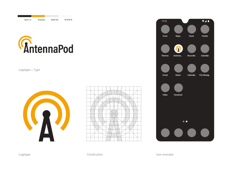
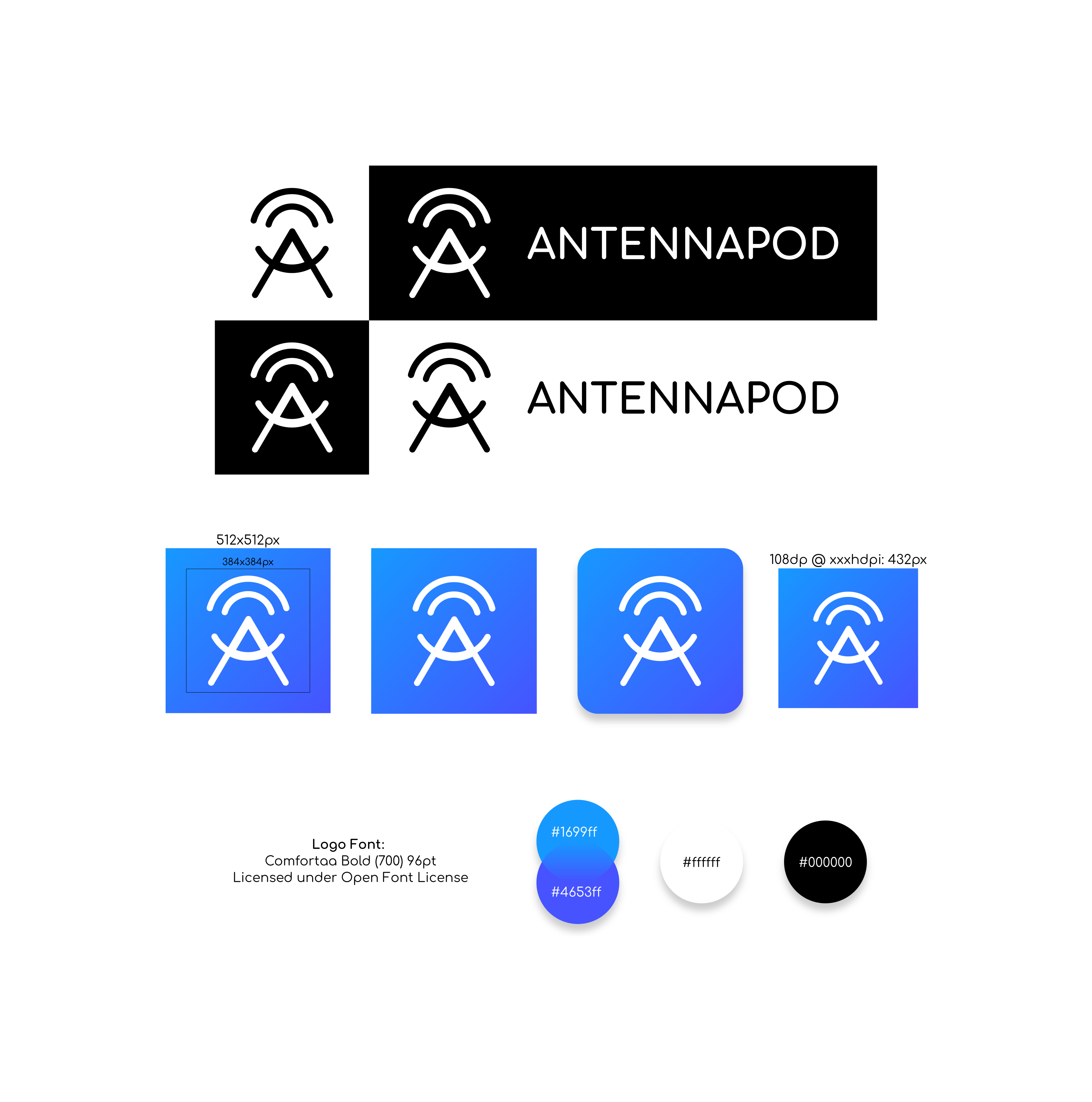
Just thought I'd throw in my attempt at an icon:

It incorporates the RSS likeness and smaller angle from @mfietz's icon, a material shadow + score, leftward alignment from @keunes, and the logo is adapted from Google's antenna icon so that it has all the right geometry/stroke width/etc.
 ghost
on 5 Jan 2016
ghost
on 5 Jan 2016
Offers his version of the icon.
He performed in full compliance with the guideline Google
Icon here: _settings input antenna_
For the generation of icons thanks to romannurik

Details can be found here: #2124
 igor-dyatlov
on 1 Oct 2016
igor-dyatlov
on 1 Oct 2016
Is a new icon still up for discussion?
ghost
on 26 Nov 2017
Bump- i saw a lot of great stuff in here and as well some great submissions on Twitter but we're still with the old school icon.
 byte9
on 23 Dec 2017
byte9
on 23 Dec 2017
LOL didn't know there were already proposals so I made mine haha

(If you're following Google's guideline I can change the background and make it solid like the others)
PS: I liked the others though, specially this one because of the "A" haha
 moshpirit
on 17 May 2018
moshpirit
on 17 May 2018
@MyNameIsTroll Did you by any chance submit another proposal? I received an email but didn't see it here. Just wanted to say I like it (with some tweaks).
keunes
on 4 Feb 2020
@keunes hi,
yes, I did make a proposal, I deleted it to work on it a little more.
I've been using AntennaPod for a long time, I love this app.
As I don't know how to code, i wanted to contribute graphically.
I saw that there was already a ticket so I took the liberty to post it here.
I used a condensed typography and I modified the crossbar of the A so that it's lower and more reminiscent of an antenna.
I used orange to remind the filiation between the podcast and the RSS feed icon.
I hope the AntennaPod community will like it.
 MyNameIsTroll
on 5 Feb 2020
MyNameIsTroll
on 5 Feb 2020
Thanks for sharing that @MyNameIsTroll. Personally I think AntennaPod could do with a rebranding, in the quest to make it feel more modern & general appealing to the general audience. However, the current main maintainer expressed not to have an interest in a logo update some time ago - that might change and you never know, but just to set expectations for you :)
(@ByteHamster would you reconsider if the community can get to an accepted logo?)
That said, I really like your proposal. There are a few things I would change, though:
- I would make the base a bit wider (less condensed)
- While I get your point about orange (and I like orange) I would stick to blue as the app's main (secondary) colour (cf https://github.com/AntennaPod/antennapod.github.io/issues/25)
- For the icon version I would keep the bars cut off, like in your version 'logo + typo' to make the icon less boring and more consistent across the two versions (icon & logo)
All together, they help to stay a bit closer also to the current logo, which I think is necessary to ensure brand stability/recognisability (over time). Lastly, I would like to get rid of the capital P in the name and just make it a small one (I would swear I read an article that provided some guidelines, including not to have capital letters half-way your project name, but I can't find it now).
Curious to hear what you think :)
keunes
on 5 Feb 2020
@ByteHamster would you reconsider if the community can get to an accepted logo?
I must say that I am still not in favor of changing the icon. If you look at other open-source projects, users constantly suggest new icons. Even if we did change the icon, there would be new suggestions within a year. We already have an icon that works well and is recognizable. Changing the shape (or even the brand color) would be confusing. If you look at known brands (Facebook, Google, Firefox, Chrome, GMail), their icons stayed basically the same over the last 10-20 years.
I would like to get rid of the capital P in the name and just make it a small one
AntennaPod are basically two words. I think that changing the spelling would make it harder to read (because you do not know where the words end).
 ByteHamster
on 5 Feb 2020
ByteHamster
on 5 Feb 2020
I'm sorry, I thought you were open to a complete change. I took the liberty of being bold :) But I understand your fear of change, it's understandable, it shakes up habits and our attachment to a symbol that is familiar to us.
I think you underestimate people's ability to adapt. It's normal that people are confused at first, but eventually they become attached and admit that the change was beneficial.
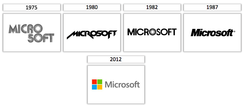
I disagree with your statement that tech logos do not evolve. On the contrary, they regularly evolve by small touches. You take examples of logos that are quite simple and above all rather well constructed from the start, so it's normal that they have not evolved much, but evolved all the same.
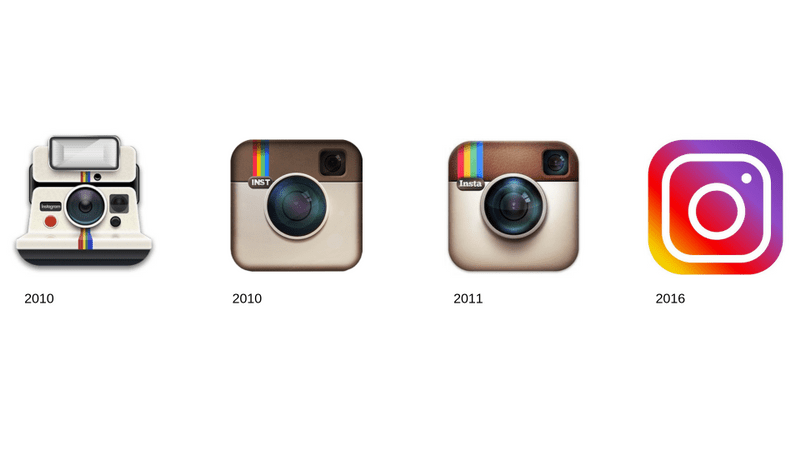
I remember that when Google changed its logo for a sans serif typeface they received great criticism from users, too geometric, too simple, without soul. I think everyone agrees that in retrospect they did the right thing in changing it.
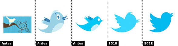
If we take the example of the bluebird of twitter it has evolved several times and radically changed its shape, only the idea of the bluebird remains. When it lost its cartoon aspect to take on a geometrical aspect many people also reacted strongly, and again they got used to it and I don't think they would want to go back. Same for instagram, microsoft or yahoo.
Don't get me wrong, I'm not saying that you should change your logo, if you're happy with it and it suits you, that's fine. I'm just saying that fear of reaction or change should not guide your thinking.
Anyway with or without a new logo I will continue to use AntennaPod ;)
MyNameIsTroll
on 7 Feb 2020
@ByteHamster would you reconsider if the community can get to an accepted logo?
I am currently preparing version 2.0.0 of AntennaPod with quite many visual changes. So if we actually want a new logo, a good time would be NOW. I am not completely happy about changing the icon but If there are some good alternatives, I can set up a poll. If there is a clear winner, I will talk to mfietz (maintainer who is not too active currently) about the proposal. This does not mean we will definitely change the icon. I am open for discussions, though.
For a new icon, my requirements would be:
- Main color and icon background should be blue (shade may change slightly but should still be recognizable)
- The lines should be a bit thicker than the ones in the current icon
- It should still be clearly recognizable as an antenna
- The icon should work with different icon shapes (round, square, etc)
@MyNameIsTroll I think your proposal is a good starting point. I like the fact that the logo combines the letter "A" and an antenna. When comparing to other suggestions, I like the general shape of your antenna the most. I also like that it has 2 arcs, just like the rss logo. The 3 arcs in the current official logo are a bit too thin, I think. I would experiment with making the arcs shorter (not a full circle), just like in the current logo. This would make it more similar to the rss icon. Additionally, when looking at Google Play, there are too many other podcast players with full-circle arcs.
Below, you can find a list of all suggestions in this thread for comparison:
![]()

ByteHamster
on 17 Mar 2020
I vote for either
or keep the current
 tonytamsf
on 17 Mar 2020
tonytamsf
on 17 Mar 2020
Same as tonytamsf !
 Matth7878
on 17 Mar 2020
Matth7878
on 17 Mar 2020
I do not like the strong shadow about that one. Maybe someone can try to make a version without the shadow. Additionally, it should have more distance between antenna and border, so that it reliably works with all icon shapes. The legs are cropped. If we just take that as a foreground, there will be parts missing in the square version.
ByteHamster
on 18 Mar 2020
For a new icon, my requirements would be
Completely agree with the requirements list
@MyNameIsTroll I think your proposal is a good starting point
Again, agree. @MyNameIsTroll, it seems there's a window of opportunity here :) Would be awesome if you'd be interested in working on a new iteration that follows up on ByteHamster's (& my) comments.
@tonytamsf @Matth7878 If the Troll's proposal is developed further I think it will get close enough (but better) than your current preference ;) ByteHamster's comments are appropriate.
keunes
on 23 Mar 2020
Casting a vote for @MyNameIsTroll design.
 dan-rally
on 26 Mar 2020
dan-rally
on 26 Mar 2020
Hi everybody, I've just read your different posts.
For me, symmetry and colour were an integral part of my thinking.
Believe me, I did a lot of tests before submitting my proposal to you, I had of course tried blue but in my logo it reminded me too much of the aquatic universe. I didn't find it very suitable. I respect your opinion, but let me take a different view.
If I make the changes you are asking me to make, it is as if I am destroying all my thinking. Outside my goal is not to be consensual and to please everyone, it is something impossible anyway. My goal is to build a coherent and identifiable logo that will stand the test of time. (I hope so) :)
I take your comments into account. Simply I have the impression that what you want is to redo the same logo as now while I want to propose you a new logo.
It doesn't bother me at all if you don't want it, but asking me to change the color, the thickness or this or that to make it fit the old logo reduces my thinking to nothing.
I could do it to please you but it would be a very bad idea in my opinion.
MyNameIsTroll
on 5 Apr 2020
but asking me to change the color, the thickness or this or that to make it fit the old logo reduces my thinking to nothing.
My comment about the thickness was not aimed at your design (it was more like a general requirement). The thickness of your icon is fine with me.
It's not that I do not like your icon. It looks great. I just have the (pretty strong) opinion that I want to keep the icon to be clearly recognizable as AntennaPod (more like Twitter's icon changes instead of Instagram's in your post above). When someone looks at the new icon, I want him/her to instantly know that it is still the same app.
ByteHamster
on 5 Apr 2020
I understand you completely.
As I said earlier, I thought you were ready to completely change your logo, that's why I took the liberty of starting from a blank page. I sincerely think that people adapt very quickly to a new logo.
But maybe you just want to refresh your logo without changing it radically.
In this case the proposals of @igor-dyatlov and @ghost seem to me to better meet your needs.
MyNameIsTroll
on 6 Apr 2020
Dear all. I'm happy to announce, as you may have already seen, we have launched a process for getting a new logo for AntennaPod.
I am aware of the many proposals, and (just) comments about setting expectations and design processes. I initiated and together with @ByteHamster developed & described a process to get to our new logo.
To find the details about the requirements we identified as well as the process that we'll follow, please see our design brief. If you are interested in (re)submitting your work, please feel free to do so (while respecting the now clear requirements).
Would like to help us find our new logo, or the designer that will help us with this challenge? Please see & share our ad on Open Source Design! Or, retweet our call on Twitter. _Many thanks for your support!_
I hope to be able to share an update towards the end of the month on our new forum. But don't hesitate to share here if you have any comments or questions in the meantime!
keunes
on 4 Jun 2020
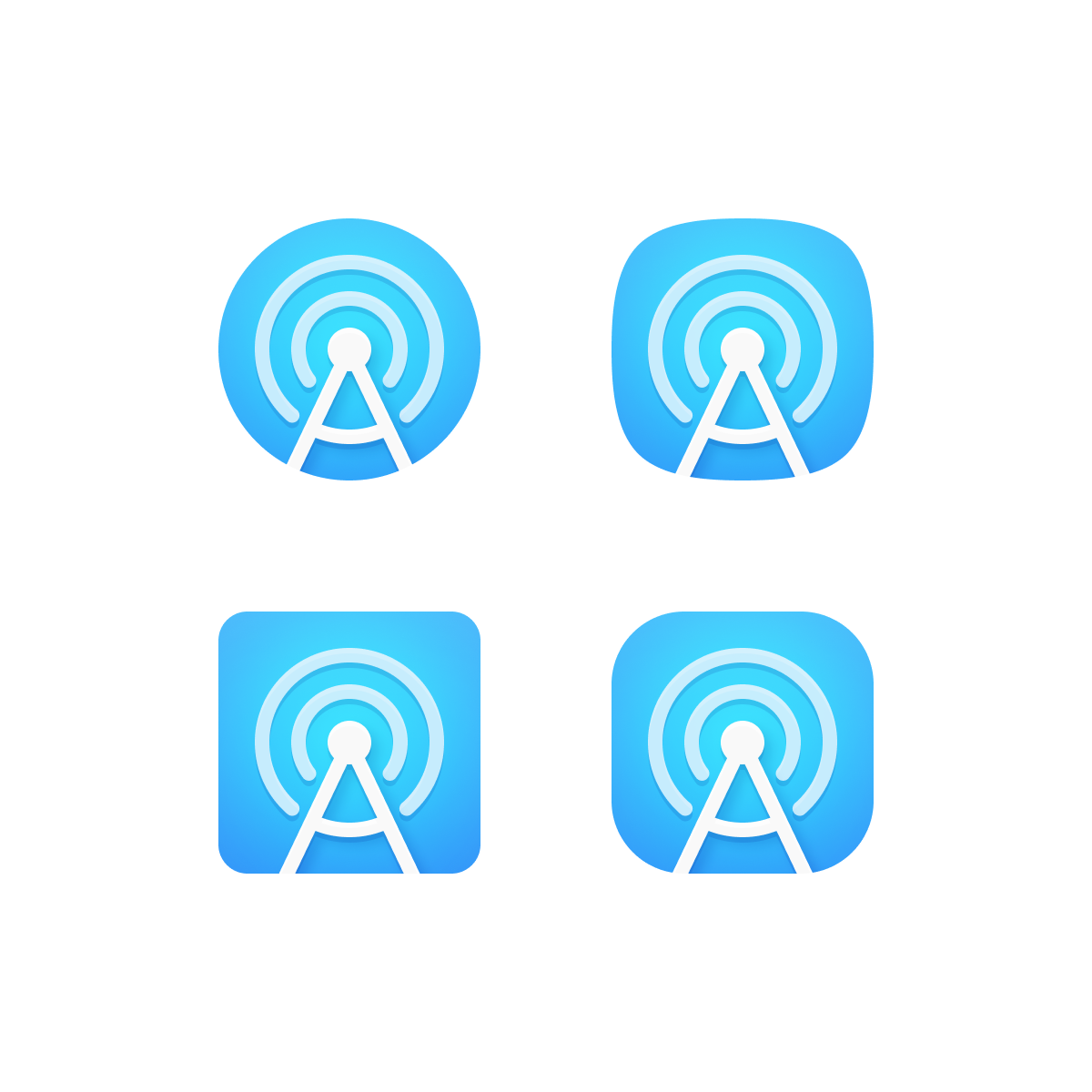
A member of the AntennaPod community reached out to us and asked us to join the contest, so here's our rendition for a new product icon for the app that also works as a logo.
The icon was designed keeping the latest Material Design Iconography guidelines in mind, so it is full adaptive to different shapes while also following the concept of the A and the Antenna from the AntennaPod name, and adding sound waves, which are a staple on podcast app icons.
Here's a link in case you want to see the icon in different shapes and animations.
Here's hoping people like it and makes the cut :)
 221pxls
on 12 Jun 2020
221pxls
on 12 Jun 2020
Hi @221pxls
Thanks for sharing your contribution! Would you mind sending it to me as per instructions in our design brief? Many thanks!
EDIT: I saw you did :+1:
keunes
on 12 Jun 2020
Hello!
I was looking at the email address I sent the previous email, and it looks like it is the same. Can you confirm?
Best regards,
The 221P team
221pxls.com
On Jun 12, 2020, 6:32 AM -0600, Keunes notifications@github.com, wrote:
Hi @221pxls
Thanks for sharing your contribution! Would you mind sending it to me as per instructions in our design brief (keunes+antennapod-logo :at: mailbox dot org)? Many thanks!
—
You are receiving this because you were mentioned.
Reply to this email directly, view it on GitHub, or unsubscribe.
221pxls
on 12 Jun 2020
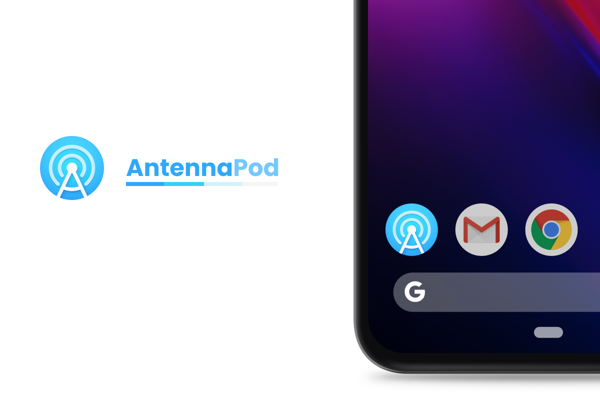
I also tried to make something today. Maybe someone gets inspiration from this.
Current Revision
Adaptive Icon preview:
https://adapticon.mariusclaret.com/#/bg=https://i.imgur.com/dvJHTwf.png/fg=https://i.imgur.com/ZbTKmli.png
Edit: I already submitted it via email
 Scrumplex
on 19 Jun 2020
Scrumplex
on 19 Jun 2020
I haven't seen any clear winners so far. They all seem to be tied to the antenna motif which makes them continue to look like the competition. I think if we want something unique from the community, we may also have to change the name Antennapod to something else. After all, this is not a radio player. The word "antenna" has little to do with podcasts, and if anything, the concept of podcasts is trying to get away from the old concept of radio transmissions since podcasts are on demand rather than live.
Possible new names to reflect the open source nature of this client:
OpenPod
OpenCast
CommunityPod
LibrePod
 Pentaphon
on 1 Jul 2020
Pentaphon
on 1 Jul 2020
I haven't seen any clear winners so far
keunes and I have gathered proposals and will start a vote in a few days. The process is outlined here: https://antennapod.org/designbrief
I think if we want something unique from the community, we may also have to change the name Antennapod to something else
No, sorry. Changing the name is something I definitely do not support. I am not 100% happy about changing the icon but if the community votes for one of the new proposals, I will accept the vote. A new name is a totally different story and more or less throws away the reputation we already have. Some amount of recognizability is important (and also was a requirement during the icon design, as outlined in the brief).
ByteHamster
on 1 Jul 2020
Hi @Pentaphon
Thanks for your reflections. I see your point of the word 'antenna' in the name. However, renaming the app is not an option for the lead developer at this point. Finding a good alternative name would also be a whole other process, and even more difficult than finding a new logo. Also, as it stands, our current name is still a unique identifier for the app (vis-a-vis competitors).
If you'd like to start a process to rethink the name, our new forum would be a better place to do so. But be prepared, you'd need some solid argumentation & evidence to convince th core team ;)
As you might have seen in the design brief linked also above, we are now approaching the end of the process of finding a new logo. One of the criteria we developed was 'recognisability', so don't expect anything drastically deviating.
Best,
Keunes
keunes
on 1 Jul 2020
To celebrate the public release of version 2.0.0, we set up a vote for a new app icon. Vote now to help shape the future of AntennaPod!
https://www.surveymonkey.com/r/T2LZCWN
Prompt for Google Play beta users: #4288
Prompt for F-Droid users: fdroid-icon-poll branch
Twitter: https://twitter.com/antennapod/status/1286945266642366468
AntennaPod Forum: https://forum.antennapod.org/t/new-icon-for-antennapod-2-0-0/88
ByteHamster
on 25 Jul 2020
Done. I like what @221pxls did the most and that is reflected in my votes.
Pentaphon
on 25 Jul 2020
When the new icon is finalized, we should submit Antennapod to the SubscribeOnAndroid.com site to help market it.
Get your App listed on Subscribe on Android
Please send the following information to cio [at] rawvoice dot com:
Application Title
URL to application on Google Play
URL to application on Amazon App Store
URL to your website (if available)
Cost of app (Free or paid)
URL to high-res app icon, which should be a square 512 x 512 px png image
Pentaphon
on 25 Jul 2020
(which was introduced in #3739)
keunes
on 26 Jul 2020
How much time did you plan for this survey? It was such a snap that just when I (and probably some other people) saw the vote it was already closed. Would one week be too much?
 Etua
on 30 Jul 2020
Etua
on 30 Jul 2020
Hi @Etua! It's sad to hear that you missed the chance. We want to collect the opinion of a uniform distribution of people. At the moment, 80% of the votes come from F-Droid users, who are probably more tech-savyy than Google Play users. The new AntennaPod icon should appeal to both, Google Play users and F-Droid users, though. Because of that, we already closed the vote for F-Droid users.
ByteHamster
on 30 Jul 2020
Hello!
Any updates regarding the results?
221pxls
on 23 Aug 2020
Hi!
@keunes and I decided to close the poll on Friday (2 days ago). Today, the poll is still open for Google Play users and he does not reply to my messages. Let's give him some more time. Only he has the permissions to manage the poll. I can see the average rating of the icons but I think we should officially close the poll before announcing the result. Also, I do not have the permission to download the raw vote data. We have prepared some nice plots that visualize the data, which should be published together with the announcement.
ByteHamster
on 23 Aug 2020
Yes, he hasn’t been replying to my emails since Aug 6 so that’s why I’m asking. Anyways, I hope he can get back to us soon.
221pxls
on 24 Aug 2020
He replied :) The poll is closed. We are now evaluating the plain-text comments and preparing the announcement.
ByteHamster
on 24 Aug 2020
Hey, I was watching this thread and I was wondering what the new icon was going to be. Despite the poll being closed (I was late in finding this thread.), I really liked @221pxls's icon.
 creepertron95
on 26 Aug 2020
creepertron95
on 26 Aug 2020
Hey, I was watching this thread and I was wondering what the new icon was going to be. Despite the poll being closed (I was late in finding this thread.), I really liked @221pxls's icon.
Same here, I don't have a Google account, but I like the same icon
moshpirit
on 26 Aug 2020
Telling your favorite icons here does not help. The poll is over, now :) I am sorry that you were not able to vote but we can not add your vote now without being unfair.
We are currently evaluating the 4000+ plain-text comments and preparing the announcement. After that, we will try to integrate some of the improvement suggestions from the plain-text comments.
ByteHamster
on 26 Aug 2020
Evaluating plain text comments? It feels like a poll with voting would have
been a better idea. 🤣
byte9
on 26 Aug 2020
The poll allowed to provide a 1-5 star rating for each of the proposals. There were plain-text comment fields, too, though. We want to announce results of both ratings and comments at once.
ByteHamster
on 27 Aug 2020
The poll allowed to provide a 1-5 star rating for each of the proposals. There were plain-text comment fields, too, though. We want to announce results of both ratings and comments at once.
I think what he's trying to say is that he thought the community would just vote for a new icon and it would immediately be merged into 2.0 and then released for all of us to enjoy. It is disappointing to now also wait for 4000+ plain text comments to be gone through by volunteers in order to get 2.0 in our hands. I actually agree with this. You should consider just pushing 2.0 with the new icon now and then using the 4000+ comments for tweaks that you eventually apply to 2.1
Pentaphon
on 27 Aug 2020
While I understand your reasoning @Pentaphon we decided to do everything in one go. Once we release the results, we'd have much less motivation to follow up, dragging the whole thing even longer. For communication purposes it's also a bad idea to make further tweaks after the initial announcement and 2.0.0 release. The new logo would have an outdated version in no-time in many databases & articles.
I understand you're eager to get the next version in your hands. I'm sorry this is taking longer than expected - I really hope we can release everything soon!
keunes
on 30 Aug 2020
Dear all,
We know we have put your patience to the test. Two months after we released the poll, and 4 years and 11 months (and 1 day) after the initial request, I have the honour to close this issue: We have a new branding and app icon!
We want to thank you all for your suggestions here and your eagerness to help out our awesome project.
For the final result and to read about the process we went through: check the page below!
https://antennapod.org/blog/2020/09/new-icon
Version 2.0.0 of the app, with a refreshed interface, the new app icon & performance improvements, will release somewhere the coming week. We're also working on a new website based on the new branding, but please bear with us as that'll take another bit of time.
keunes
on 20 Sep 2020
Version 2.0.0 of the app, with a refreshed interface, the new app icon & performance improvements, will release somewhere the coming week.
Thank god. The sooner the better.
Don't forget to add Antennapod to the https://subscribeonandroid.com/ page.
Pentaphon
on 20 Sep 2020
I mean this with no disrespect, it’s beautiful that we’ve gotten here but
it took two years to land on a simple icon change. This is an open source
unpaid project so it’s ok, but there is some reflection that could be done
on how to be more agile. Reason for opinion? Am im a project manager for
several web products. If you care about the user opinion anyways.
On Sun, Sep 20, 2020 at 16:07 Pentaphon notifications@github.com wrote:
>
>
>
>
Version 2.0.0 of the app, with a refreshed interface, the new app icon &
performance improvements, will release somewhere the coming week.Thank god. The sooner the better.
Don't forget to add Antennapod to the https://subscribeonandroid.com/
page.—
You are receiving this because you commented.
Reply to this email directly, view it on GitHub
https://github.com/AntennaPod/AntennaPod/issues/1281#issuecomment-695830163,
or unsubscribe
https://github.com/notifications/unsubscribe-auth/AAFAZSUW3QJH7UL2VVEQXRDSGZOJXANCNFSM4BSGCWEQ
.--
Vincent Marziale *
*Consultant | Developer | *956.667.7718 | byte9.net http://byte9.net*
byte9
on 20 Sep 2020
I mean this with no disrespect, it’s beautiful that we’ve gotten here but it took two years to land on a simple icon change.
I am one of the people who has wondered why 2.0 has taken so long to release but I will admit there is a lack of people who want to put in some of their time into this project. We need to encourage more people to contribute as best as we can, especially as this is the only actively maintained open source podcast client for Android.
Pentaphon
on 20 Sep 2020
Even putting up a good brand info page and asking for donations could help
this. People work better when motivated, devs could find some this way.
Antennapod just lacks a small amount of organization to take the leap.
People would donate for coffee mugs, hoodies, etc if they love the project
enough. Many do
On Sun, Sep 20, 2020 at 16:54 Pentaphon notifications@github.com wrote:
>
>
>
>
>
>
I mean this with no disrespect, it’s beautiful that we’ve gotten here but
it took two years to land on a simple icon change.I am one of the people who has wondered why 2.0 has taken so long to
release but I will admit there is a lack of people who want to put in some
of their time into this project. We need to encourage more people to
contribute as best as we can, especially as this is the only actively
maintained open source podcast client for Android.—
You are receiving this because you commented.
Reply to this email directly, view it on GitHub
https://github.com/AntennaPod/AntennaPod/issues/1281#issuecomment-695835158,
or unsubscribe
https://github.com/notifications/unsubscribe-auth/AAFAZSUQXXM2IFTP6EFJZYLSGZTYLANCNFSM4BSGCWEQ
.--
Vincent Marziale *
*Consultant | Developer | *956.667.7718 | byte9.net http://byte9.net*
byte9
on 20 Sep 2020
but it took two years to land on a simple icon change
The reason why this took so long is that we wanted to do it right. This is not just a simple icon within the app - it is the app's whole brand. Changing something like this throws away a considerable amount of recognizability. I think that we might even get a drop of app installs because users do not like change. When doing such an important change, we need to make sure that the project will profit in the long run. I am quite happy how it turned out and hope that we will go with the new brand for many years. I hope that you can understand that this is something completely different than a simple icon change :)
is some reflection that could be done on how to be more agile
To me, the most valued thing that users of AntennaPod can do is to help other users in our forum. Having to do user support in addition to fixing bugs, implementing new features, reviewing pull requests, managing releases and managing public announcements is quite a lot of work. If you want to help to speed up the development, I really suggest visiting the forum and being so active that I no longer have to visit the page every few days ;)
asking for donations could help this
There already are services like bountysource but from my experience, this does not really help. What AntennaPod needs is not money, but people.
ByteHamster
on 20 Sep 2020
it took two years to land on a simple icon change. This is an open source unpaid project so it’s ok, but there is some reflection that could be done on how to be more agile.
Simply put: it was long regarded as 'not necessary'. I'm glad the current maintainer/lead developer after a while saw the light ;) With that new attitude I was happy to contribute time to organise all this (and it does cost a lot of time).
Even putting up a good brand info page and asking for donations could help this. People work better when motivated, devs could find some this way. Antennapod just lacks a small amount of organization to take the leap. People would donate for coffee mugs, hoodies, etc if they love the project enough. Many do
Agreed. A new brand page is foreseen on our new website.
Having to do user support in addition to fixing bugs, implementing new features, reviewing pull requests, managing releases and managing public announcements is quite a lot of work.
Very true, and I hope others will step up and contribute. At the same time; it's also that you are eager to do all this. The project would also 'survive' if we let users swim in the forum and you focus on Dev ;) And I'd be happy to do public announcements but don't have access to the channels (and yes, they'd probably go out a bit slower). The thing is: stuff runs very smoothly, and there's no call for help anywhere easily visible. So there's limited incentive to step up.
There already are services like bountysource but from my experience, this does not really help. What AntennaPod needs is not money, but people.
As I've mentioned (privately) before: I disagree with this. Having money as a project allows for goodies allowing to activate & reward active community members. So I think actual donations are more beneficial to the project than any bountysource money (also because I've never seen a bounty get a fix implemented for any of the projects I care about). But yes, introducing money into the equation adds administrative hassle and other downsides (e.g. how to get agreement on what to spend the money on?). So I fully understand why the Devs so far haven't accepted donations.
keunes
on 21 Sep 2020
Version 2.0.0 of the app, with a refreshed interface, the new app icon & performance improvements, will release somewhere the coming week.
Hopefully that means today since a week has passed since this post?
Pentaphon
on 27 Sep 2020
Related issues
 reverse-unina
·
5Comments
keunes
·
3Comments
ghost
·
4Comments
reverse-unina
·
5Comments
keunes
·
3Comments
ghost
·
4Comments
 matthiasroos
·
3Comments
Matth7878
·
3Comments
matthiasroos
·
3Comments
Matth7878
·
3Comments
Most helpful comment
A member of the AntennaPod community reached out to us and asked us to join the contest, so here's our rendition for a new product icon for the app that also works as a logo.
The icon was designed keeping the latest Material Design Iconography guidelines in mind, so it is full adaptive to different shapes while also following the concept of the A and the Antenna from the AntennaPod name, and adding sound waves, which are a staple on podcast app icons.
Here's a link in case you want to see the icon in different shapes and animations.
Here's hoping people like it and makes the cut :)