Antennapod: FR: Bulk Remove from queue
I accidentally bulk added all episodes of one feed to the queue via the 'Apply actions' screen. Now I'm stuck with 145 episodes - that I already have listened to - in my queue. Would be nice to also be able to undo this via the bulk edit, rather than via individual edits from the queue screen.
This would mean yet another option in the bottom bar, and so I would propose to change the menu to some kind of 'pull up' (rather than 'drop down') menu at the bottom where the preferred action can be selected, plus an 'apply action' button on the right side of it.
This would also give more space to the descriptions of the different functions (the Dutch ones take more space than the English ones).
(I guess another option would be to add 'Bulk manage episodes' from the contextual menu in the Queue screen, but to me that wouldn't be as logical.)
 keunes
All 21 comments
In your particular case, you could just use queue > clear queue
For me, undo doesn't really make sense for download and remove episode. We could rather have an additional dialog when more than 10 items are selected to confirm the action (with an option to never ask again). Also, the list should probably start with all items not checked...
Being able to undo mark as played/unplayed is not really possible, there is only one database entry that is overwritten, the old information just is not available anymore. Changing this would be a lot of work and I don't really see the advantage.
Undo add to queue... hm... not sure where an user would look for this. As said, undo probably makes no sense for the other actions, so I would not have an undo action in the gears dialog. Having it in the queue view seems rather odd - undo last addition?
Maybe the queue also needs gears ^^
 mfietz
on 29 Aug 2015
mfietz
on 29 Aug 2015
Would an undo toast work? Like we have for other things?
On Sat, Aug 29, 2015, 9:22 AM Martin Fietz [email protected] wrote:
In your particular case, you could just use queue > clear queue
For me, undo doesn't really make sense for download and remove episode. We
could rather have an additional dialog when more than 10 items are selected
to confirm the action (with an option to never ask again). Also, the list
should probably start with all items not checked...Being able to undo mark as played/unplayed is not really possible, there
is only one database entry that is overwritten, the old information just is
not available anymore. Changing this would be a lot of work and I don't
really see the advantage.Undo add to queue... hm... not sure where an user would look for this. As
said, undo probably makes no sense for the other actions, so I would not
have an undo action in the gears dialog. Having it in the queue view seems
rather odd - undo last addition?
Maybe the queue also needs gears ^^—
Reply to this email directly or view it on GitHub
https://github.com/AntennaPod/AntennaPod/issues/1145#issuecomment-135984593
.
 TomHennen
on 29 Aug 2015
TomHennen
on 29 Aug 2015
In your particular case, you could just use queue > clear queue
Unfortunately not. That would also remove the 40 items that get added to my queue automatically (and I wouldn't know by heart which would be in there)
For me, undo doesn't really make sense for download and remove episode. We could rather have an additional dialog when more than 10 items are selected to confirm the action (with an option to never ask again). Also, the list should probably start with all items not checked...
Being able to undo mark as played/unplayed is not really possible, there is only one database entry that is overwritten, the old information just is not available anymore. Changing this would be a lot of work and I don't really see the advantage.
Agree; Undo doesn't make much sense for downloading and removing episodes, as well as marking them as played and unplayed. Especially because they can be very easily 'undone' by applying the opposite action immediately, if the checkbox selection hasn't changed. There is no such option, however, for removing items from the queue.
Undo add to queue... hm... not sure where an user would look for this. As said, undo probably makes no sense for the other actions, so I would not have an undo action in the gears dialog. Having it in the queue view seems rather odd - undo last addition?
Maybe the queue also needs gears ^^
&
Would an undo toast work? Like we have for other things?
If you really want to have the option 'undo adding to queue', an undo toaster would definitely be most logical. However, I do think that adding the option to 'remove from queue' would make more sense and allows for more flexibility at the same time. Plus it follows the logic of the other options ((un)marking as played & downloading/removing).
keunes
on 29 Aug 2015
I would like to reiterate this request.
I have a ~460 item queue. I don't want to clear it, nor do I necessarily want to delete a podcast. But I would like to remove from the queue all episodes from a particular podcast.
 Brassfield
on 1 Mar 2019
Brassfield
on 1 Mar 2019
But I would like to remove from the queue all episodes from a particular podcast.
@Brassfield That can be satisfied with a simpler feature request.
There is an existing feature on podcast screen, that you can bulk select episodes (e.g., all queued), and do something about it, e.g., remove episode, add to queue, etc.
A new action, "Remove from Queue", can be added. Such action would also satisfy the scenario that motivated the issue from @keunes
I accidentally bulk added all episodes of one feed to the queue via the 'Apply actions' screen.
The reason for bulk removal is because the accidental bulk addition on the podcast screen. So having a "Remove from Queue" action there will be natural for users.
Furthermore, the suggestion from @mfietz to provide a confirmation dialog on bulk actions would make sense, preventing the mistake from happening in the first place.
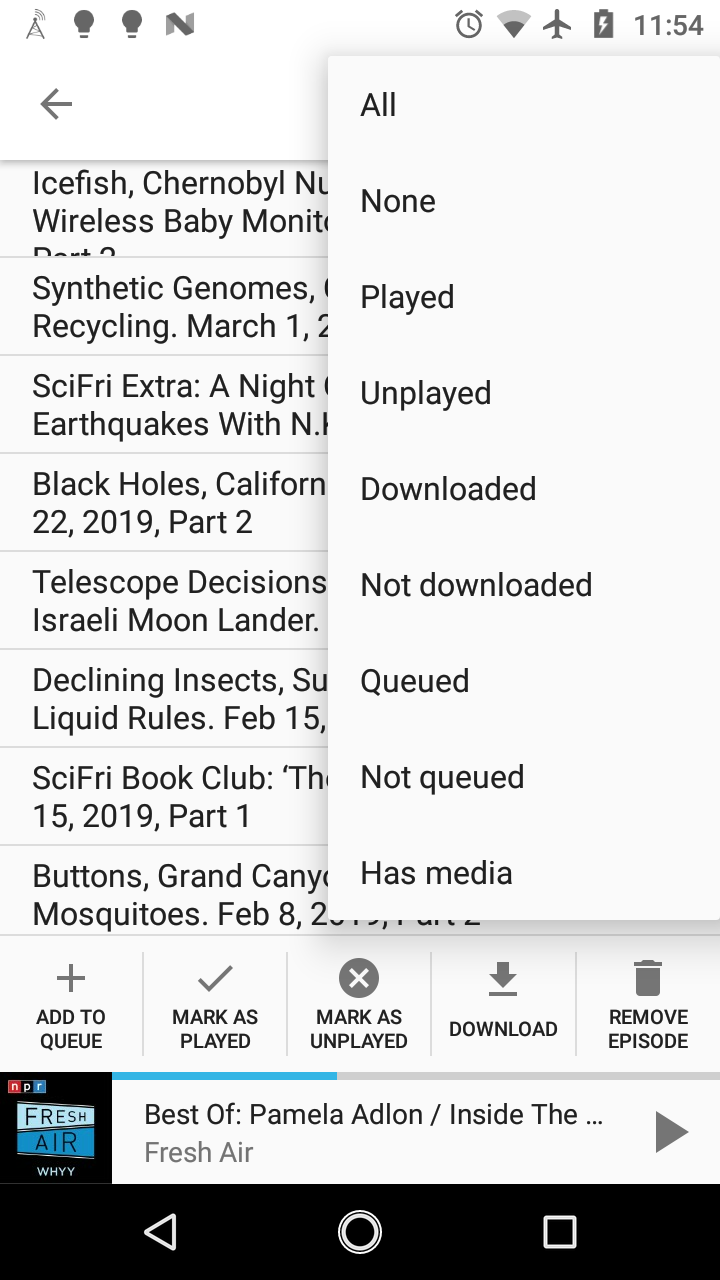
Add a new action presents some UI challenges though, as the existing UI is optimized for the 5 actions:
 orionlee
on 2 Mar 2019
orionlee
on 2 Mar 2019
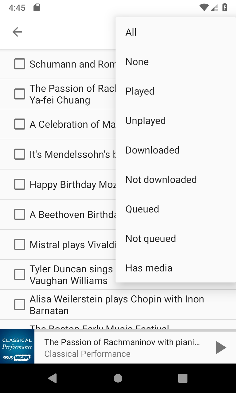
What do you think about making the bottom bar a spinner with a "Go" button next to it? The spinner can display many options, including "Remove from queue". The button next to the spinner starts the action. Because there are two clicks needed (spinner+button), we also do not need an explicit confirmation dialog.
 ByteHamster
on 3 Mar 2019
ByteHamster
on 3 Mar 2019
What do you think about making the bottom bar a spinner with a "Go" button next to it?
Functionally it will work. Though I feel average android users would expect the actions appear as action menu items (hamburger menu at top right corner).
orionlee
on 3 Mar 2019
The action bar menu already contains actions related to selecting/de-selecting and sorting. Moving the actions there could be confusing. What about adding a big FloatingActionButton that then shows a list of possible actions?
ByteHamster
on 4 Mar 2019
I feel the issue is better settled with some actual UI mockup. Anyone with more design experience, please do chime in.
orionlee
on 4 Mar 2019
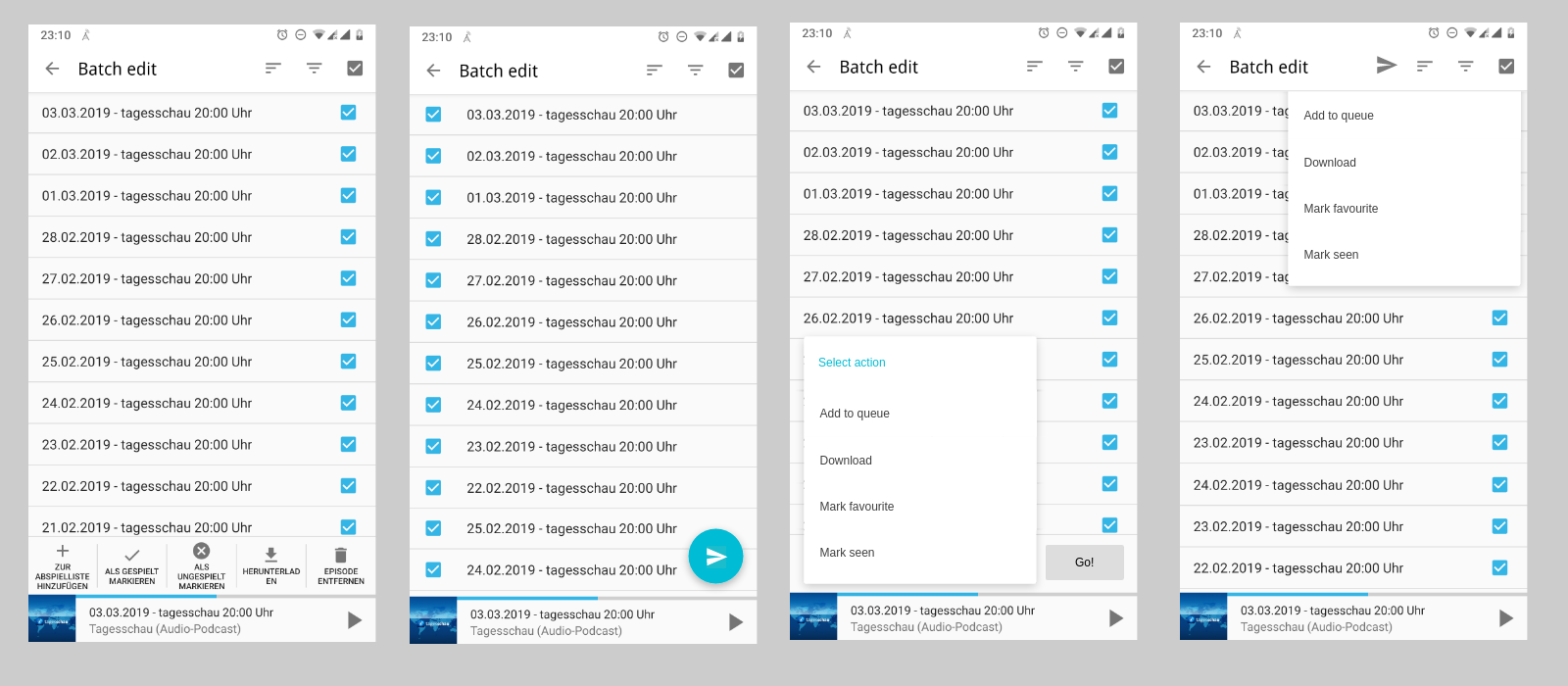
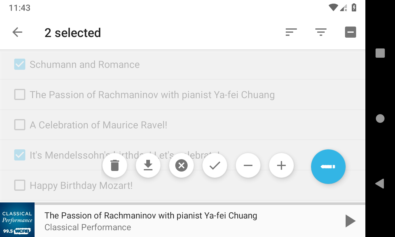
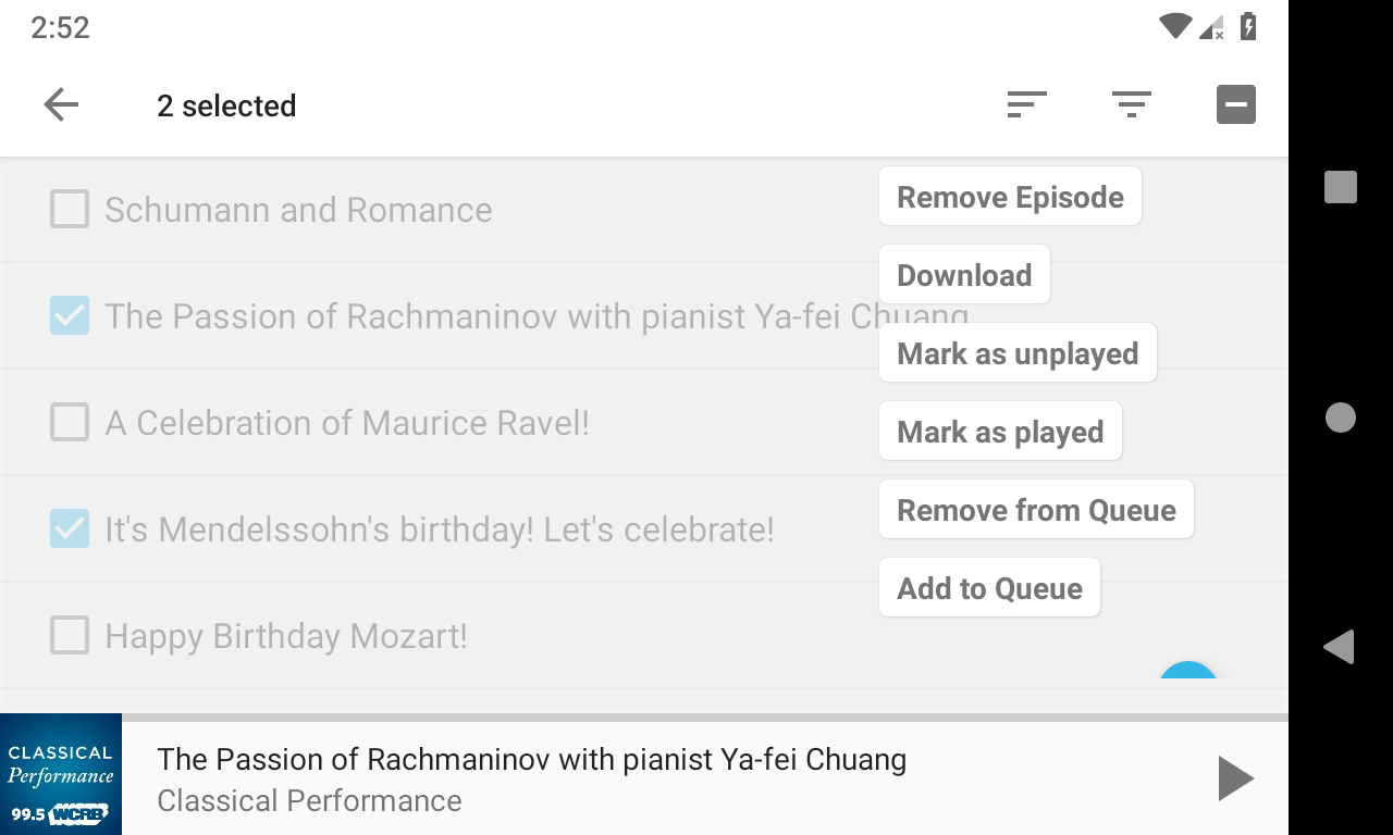
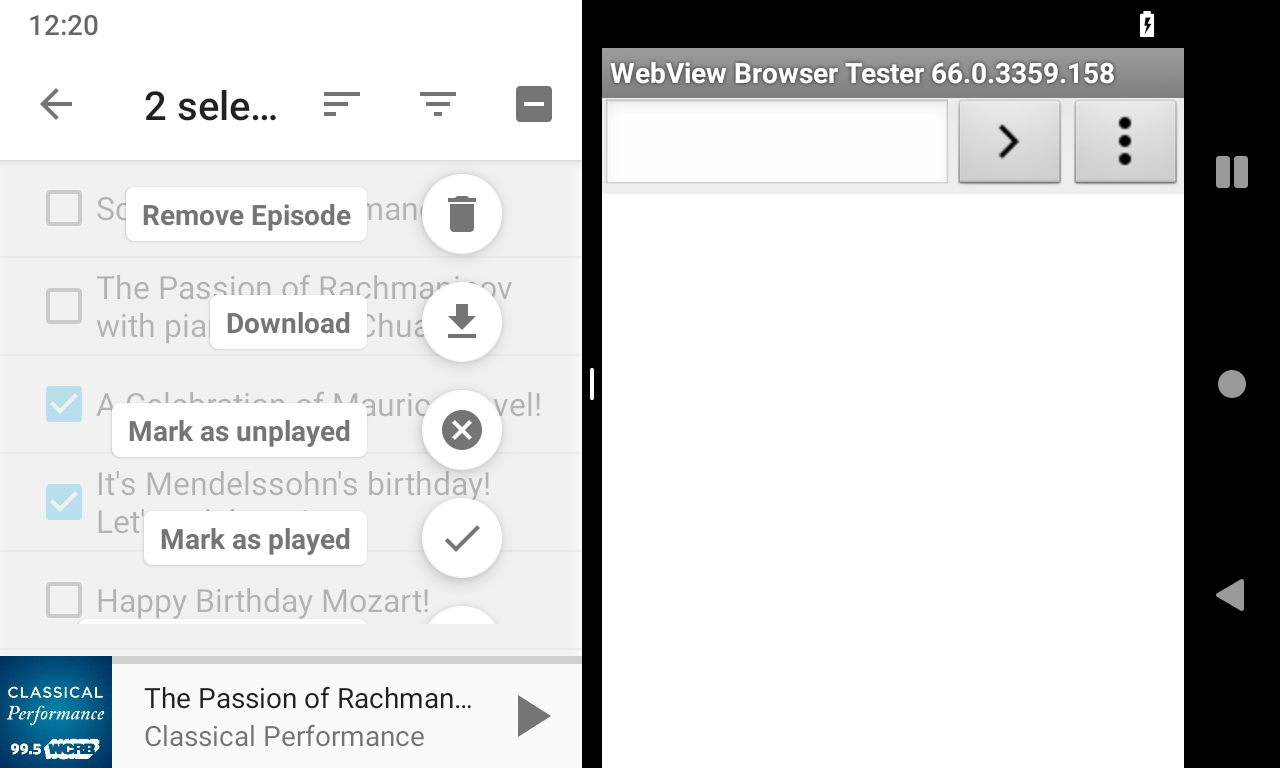
Added some mock-ups.
- Current version (+action bar title)
- FloatingActionButton (tapping opens dialog with selections, like in the other images)
- Bottom spinner with "Go" button
- ActionBar entry
ByteHamster
on 4 Mar 2019
I don't have a strong preference - any of the three will work.
- Adding to action bar would be the most conventional. I think as long as they appear in the menu (and not on the action bar as icon), they are clearly differentiated from the existing sort / filter actions.
- FloatingActionButton semantically makes sense. I just don't know what icon would convey the meaning properly: the list of possible actions are varied. Maybe a neutral hamburger menu icon (vertical 3 dots)?
orionlee
on 5 Mar 2019
I think as long as they appear in the menu (and not on the action bar as icon)
This makes them a lot harder to find than in the other two suggestions. A FAB is probably the best. What do you think about using an arrow to the right? This might be more clear than dots. Dots mean "additional, optional settings" while an arrow means "go on". At least that is my feeling. What do you think about the "go back" arrow from the ActionBar, just mirrored?
ByteHamster
on 6 Mar 2019
1. On ActionBar option appearing in the menu only:
Yes, it is less apparent. But it seems most apps with multiple select do it this way so I feel users are trained to expect it (various file managers, chrome history, wikipedia list, etc.). The exception is that they usually have a popular action (e.g., delete) as icon in the app bar, while AntennaPod probably can't / shouldn't have such.
2. On FAB icon:
It's really outside of my expertise. Right arrow is probably better. A complication is that we may need a different arrow for devices running on right-to-left languages.
3. Another possible approach
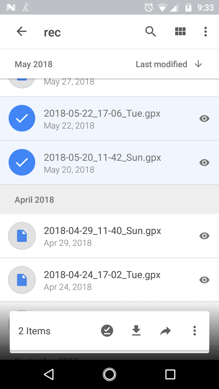
I just played with Google Drive, which have a different approach, with a floating bottom action bar when files are selected. It is certainly clear to the users, but I am not sure about just showing icons in AntennaPod's case, or the implementation complexity.
orionlee
on 6 Mar 2019
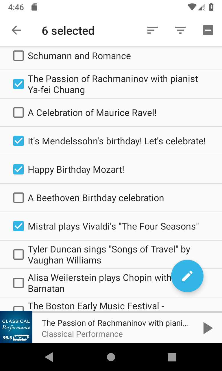
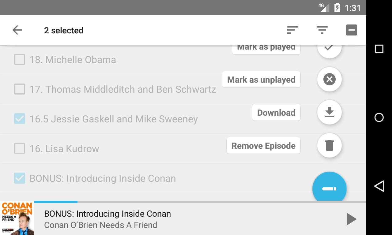
Here is proposal of a FAB Speed Dial-based user experience. Differences from the current one is in bold italic.
- Upon entering podcast episode multiple select screen: defaulted to none checked
- (No change) Users select all Queued item
a FAB is then shown when some items selected, thus emphasizing the action is applicable only when something is selected. Number of selected items is shown as well.
Users then press FAB, a FAB Speed Dial is then shown for all the options, including remove from Queue:
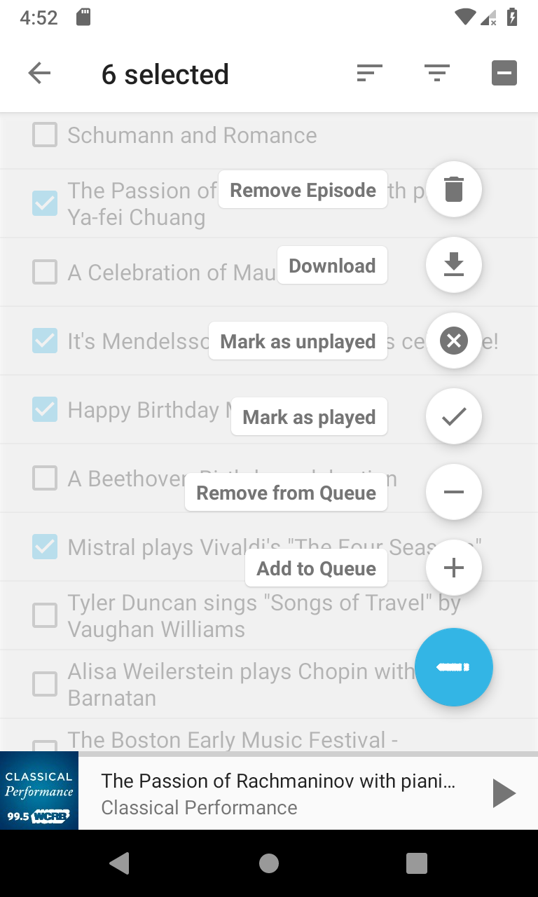
Notes:
- The edit icon is used for FAB, as it indicates some actions, without the RTL complication of a right arrow.
- The FAB Speed Dial UI pattern works for current case (6 possible actions). If even more actions are needed, FAB Speed Dial might not work.
orionlee
on 19 Mar 2019
Looks great! Does the FAB speed dial also work with smaller screens, in landscape orientation or with multi window enabled?
In my opinion, the order of the speed dial should be changed. Currently, it contains the negative action (eg delete) first and then the positive action (eg download). I don't know why but to me, it feels like the positive action should be displayed first.
ByteHamster
on 19 Mar 2019
On change action order so that positive actions are ahead of negative actions: I'm fine with it.
One note about FAB approach in general: Google's doc does explicitly state FABs should not be used with negative actions. I feel that given the nature of the batch-select screen, it could be an exception.
FAB speed dial on smaller screens:
- It does work with a screen as small as 2.7 inches, the smallest one from Android Studio emulator's list. The library used does take care of scaling the icons.
- Landscape / multi-window mode does cause problems, at least with the library used: some of the actions are not visible, nor can users scroll to get to them.
FAB Speed Dial solutions on Landscape / Multi-window mode
- Make the speed dials scale to be smaller (similar to how it scales to be smaller on small screen)
- Make the speed dials expand horizontally in landscape mode. The down-side is the text label is gone so the actions are not as clear.
- Keep the speed dials expand vertically, but hide the icons so that the actions can be fit vertically (essentially making it like a menu). But it might still have issues on small screen.
- (The current library's specific issue that can possibly be fixed) In some multi-window mode, the speed dials do not scale down to fit screen height, even though the same library does scale down on a small screen.
orionlee
on 19 Mar 2019
Make the speed dials scale to be smaller (similar to how it scales to be smaller on small screen)
This only hides the problem but does not fix it. I don't think this is a proper fix
Make the speed dials expand horizontally in landscape mode. The down-side is the text label is gone so the actions are not as clear.
I am voting rather strongly against removing the text
Keep the speed dials expand vertically, but hide the icons so that the actions can be fit vertically (essentially making it like a menu). But it might still have issues on small screen.
Then we can just use a menu instead. It works on all screens and is probably the most simple solution. Your proposals obviously look better, though.
(The current library's specific issue that can possibly be fixed) In some multi-window mode, the speed dials do not scale down to fit screen height, even though the same library does scale down on a small screen.
Would be the perfect solution but I am not sure how much work this is.
ByteHamster
on 20 Mar 2019
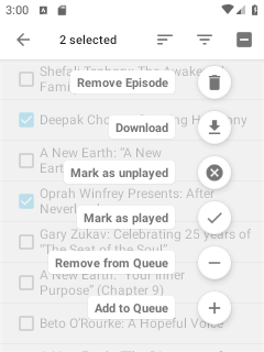
I am able to get the speed dials scroll-able so that users can still get to all actions in landscape / multi-window mode.
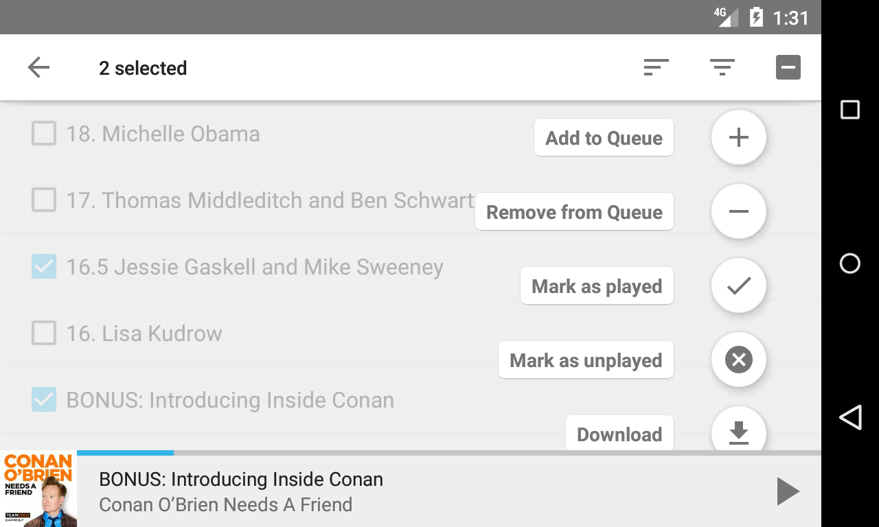
Screenshots with the order of the buttons fixed as well:
orionlee
on 20 Mar 2019
@ByteHamster If we feel comfortable with the fab speed dial UI, I can start working on a PR in my spare time.
orionlee
on 31 Mar 2019
I really like the UI you proposed :+1:
ByteHamster
on 31 Mar 2019
The fab speed dial UI carries some small risk due to the use of an external library https://github.com/leinardi/FloatingActionButtonSpeedDial/tree/1.0.2 . I feel, however, the risk in practice is minimal, after the prototype experience.
orionlee
on 1 Apr 2019
Related issues
 thom-github
·
3Comments
thom-github
·
3Comments
 AAM1119
·
3Comments
AAM1119
·
3Comments
 clixyz
·
4Comments
clixyz
·
4Comments
 ghost
·
4Comments
ghost
·
4Comments
 maxxo
·
4Comments
maxxo
·
4Comments
Most helpful comment
The fab speed dial UI carries some small risk due to the use of an external library https://github.com/leinardi/FloatingActionButtonSpeedDial/tree/1.0.2 . I feel, however, the risk in practice is minimal, after the prototype experience.