Anki-android: Improved adaptive icon proposal
I haven't been too happy with the way the Icon looks right now, compared to other apps.

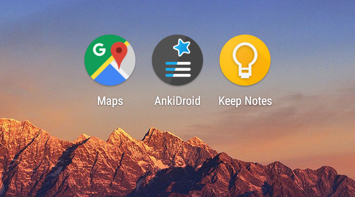
Part of the problem is that the shape that's supposed to represent a flashcard requires an additional background, which is a neutral white right now.
So I took the previous SVG, cleaned it up (SVGs generated by Illustrator are quite the mess) and turned it into a square version without the shape, but maintaining all other elements exactly the way they were.

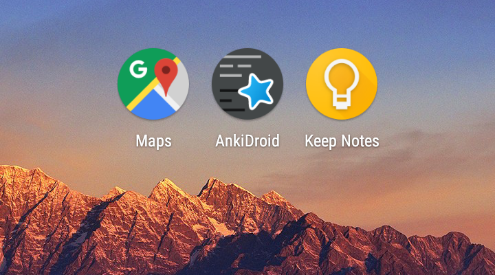
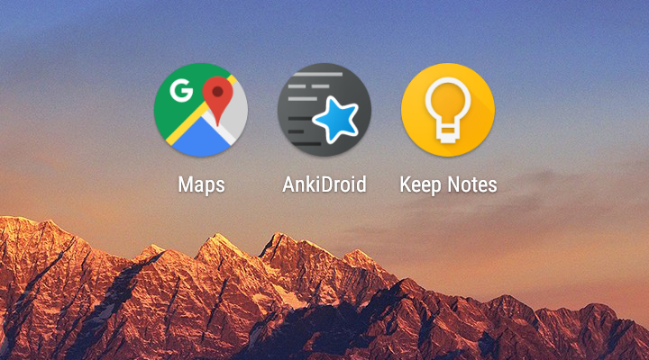
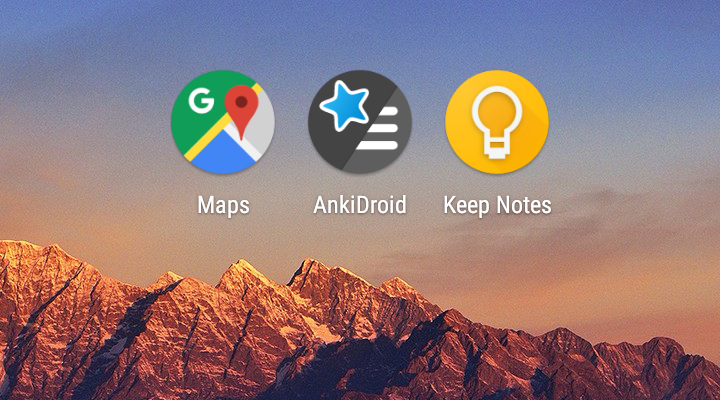
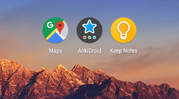
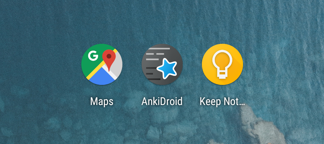
As an adaptive icon, it looks like this.

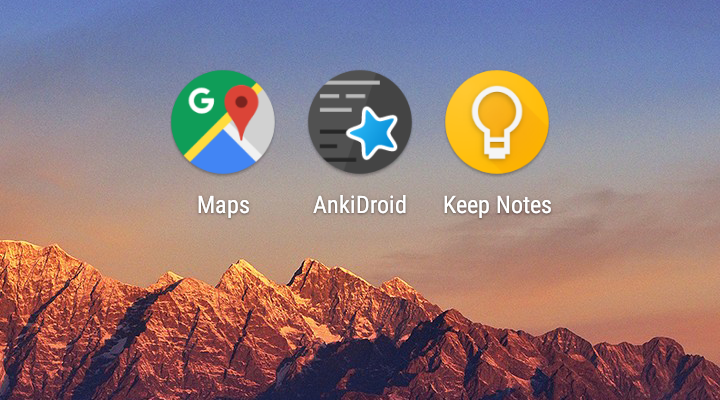
Because I thought some people would dislike the cut-off star, I reduced the star size and moved it a bit.

That's fine, but unfortunately the square version, which would still be visible in many launchers and possibly Google Play, doesn't look as attractive anymore in my opinion, because the star seems too small now.

The people I've asked so far actually seemed to prefer the first (unmodified) version with the cut-off star, because it makes the whole thing a bit more visually interesting and dynamic.
What do you think, does something like this have a chance of getting merged?
 martindisch
All 96 comments
The current one is a pretty weak effort, and I say that as the one that did it ;-)
@cydia2020 proposed a few and they looked like your proposal already, they were not accepted (yet) but if you search the issues and PRs here for "adaptive" you'll see the previous effort.
Everyone has an opinion on looks but I prefer my current (admittedly weak) effort over this just for the reason that I feel like the idea of a question and answer (a "flash card") is lost without either the shape drawing your eye to the two colors of "text lines" or maybe making those stand out more and be a very defined front and back. That said, the star is there which is the signal of Anki ecosystem identity.
Once you've read the other PRs and issues related to Adaptive icons chime in here again with how you think you'd evolve this - we are definitely open to suggestion
 mikehardy
on 9 Nov 2018
mikehardy
on 9 Nov 2018
I probably should have mentioned that I'm aware of the other efforts, but they seem pretty much stalled to me (also I'm personally not a fan of the two-tone background).
I was hoping this would gain more approval since it's about as faithful to the original as possible (at least the first one, with no modifications apart from losing the shape and turning it into a full background).
Anyway, thanks for your input. I'll leave this open for a few days to see if there's some more opinions and close it if there's no interest.
martindisch
on 9 Nov 2018
(Icon of ANZ)

I was aiming for something like this, but I am no icon designer nor illustrator user.
 cydia2020
on 9 Nov 2018
cydia2020
on 9 Nov 2018
Maybe killing the gradient on the background and making the text lines pop more would maintain the question/answer identity while letting the monolith diffuse into just a general background? Flashcards aren't about gradients as an identity anyway. Note the other two icons distill the whole idea of the app into the icon - a place marker, an idea lightbulb. The star for Anki marks ecosystem identity but we are a flashcard app, so it really needs to have the idea of flashcards in my opinion. But the problem may just be that none of us are really designers, unless you are :-), then only one of us...
mikehardy
on 9 Nov 2018
Unfortunately I'm nowhere near being a designer either :sweat_smile:
Simplifying the original in a text editor is about the extent of my abilities in that regard. Although I could probably manage what you proposed. I'll give it a try when I get home.
Do you have any opinions on the placement of the star? I love the original icon, so I don't really want to move it unless people dislike it being cut off in the round version.
martindisch
on 9 Nov 2018
I personally don't like it cut-off, and when I converted it to Adaptive I moved it just a little, as you did in one of your versions, so it wouldn't get chopped.
mikehardy
on 9 Nov 2018
Well, here it is—the version without gradient and more opaque text lines.
Since it seems a bit harsh to my eyes, another version with the same opacity of the text, but with the gradient still in the background, softening everything a bit.
I'm really fine with both, though I prefer the one that still has the gradient. Keeps a bit more of the familiarity with the original icon.
martindisch
on 9 Nov 2018
You know...that one that you softened looks pretty good to me - the last example. I'm going to tag the only other people that have weighed in at all @timrae @cydia2020 - you guys have thoughts? This is really close to @cydia2020 's work, that I also thought was really close to being good.
I only did my weak adaptation to have something and I think of it like a placeholder, I personally would be fine with this second one here replacing mine.
mikehardy
on 9 Nov 2018
One thought - in the adaptation, since the background now has the text, is the star correctly in the foreground? If so, that will have all the cool adaptive parallax and button-pushy effect that is the point, other than working well with different masks (which is easy for our icon). That's a technical tidbit I'd wait for design feedback on, but something to keep in mind - I wasn't able to layer separate the monolith and the star in my adaptation because of the background issue but I wanted to
mikehardy
on 9 Nov 2018
Well in these examples I made it easy for myself by just using a color as the background, while everything else (text, gradient, star) is in the SVG for the foreground.
But you're right, having two SVGs, one containing the background (color, gradient, text) and one with just the star and its shadow for the foreground is definitely the way to go. I'll look into it.
martindisch
on 9 Nov 2018
Update: it works like a charm, and the parallax effect is pretty nice. See video here.
The only problem is when the launcher has pretty intense parallax not only for the foreground, but also the background. Since the background doesn't go on forever like a color, you can end up seeing the edges of the background when there is a lot of movement, as demonstrated in the final part of the video. I have no easy solution for that, because we can't just make the background bigger and scale it down s.t. normally only the small center part is visible, as we'd run into problems with the gradient, which also covers all of the background. Plus it would be a pain to maintain background and foreground in different sizes.
But in the end I don't think that's too much of an issue. The launchers used by most people don't have parallax effects at all, and I'm not sure if any of those that do actually move the background enough to cause the problem.
martindisch
on 9 Nov 2018
I had to really pay attention to see the parallax issue you mention - it is visible but that is some serious jiggling going on - all of the icons are pretty crazy with that much motion.
I think this is approximately 10x better than my icon now for reasons of looks, much more interesting parallax, and it's SVG, I dig it. We'll see what others say, hopefully they chime in.
mikehardy
on 10 Nov 2018
I don't mind that last one, but as I think I wrote in the other thread, I'd like to see more variations, particularly one with a somehow more defined monolith shape
 timrae
on 10 Nov 2018
timrae
on 10 Nov 2018
I'm all for more options, but I think it's really hard to make something with a prominent foreground shape (like the monolith) work well as an adaptive icon. Since the icon outline can change shape depending on the launcher, you're confined to a limited safe area inside the icon and when you need additional space for your own shape inside of that, everything you put in there quickly becomes pretty small.
Even Google seems to have had more success turning those logos into adaptive icons that don't feature a particular shape of their own, but work on a sort of background layer that can be cut to whatever shape the launcher requires. The other icons are still stuck in the halfway limbo of retaining the shape, but not quite fitting in with all the other apps that fully embrace adaptive icons.
Since the current proposal seems to be at least somewhat of an improvement, how about doing it the same way it's been done with the current icon, by going with it until an even better option emerges?
On a sidenote: I think it's a bit of a travesty that about half of Google's Android apps still use the halfway icons with white backgrounds. Considering that they presumably have some pretty decent designers on staff, I think Mike is entitled to take some pride in the current icon :wink:
martindisch
on 10 Nov 2018
Yeah as I mentioned in the other one the solid background requirement is the restriction. Without a clear idea of what to do with it an icon like this is what comes out or it's the old icon-ish like mine. If they had allowed transparency we'd have options but we don't have that capability.
mikehardy
on 10 Nov 2018
The current adaptive icon in the development version was pretty non-controversial because it looks the same as the current round icon in 2.8.x. The last time we changed the icon we got 4 options made and took it to a vote. Hence ideally I'd like to get more submissions and do a similar thing this time.
timrae
on 12 Nov 2018
I wouldn't mind that either, it's just that I don't have more ideas for other designs solving the problem and at the moment I don't see anybody else who does. Although I do remember @cydia2020 mentioning something about maybe having time after the exams. Is this still a thing?
martindisch
on 12 Nov 2018
Kinda, finishes in EOM
cydia2020
on 12 Nov 2018
Tho I don't know if I can come up w/ more ideas or not.
cydia2020
on 12 Nov 2018
In that case it looks like we're either stuck with the current icon or this. I'd appreciate it if everybody could quickly say if they'd rather keep the current one or go with my last suggestion for a while until somebody comes up with a better solution. Just so we can close this issue and get on with it.
Regardless of how it turns out, I pushed my updated SVG to a branch in my fork at martindisch/Anki-Android@52be9aee5f5695db0afed6ac3498af7e6af118e0, so if somebody wants to base their future efforts on the simplification of the original SVG I did for this, they can.
martindisch
on 13 Nov 2018
@martindisch - thanks for making sure it's available for the future, just in case. @timrae what's the right way to do a vote? Seems like @cydia2020 actually had a couple different looking designs, there's my no-change adaptation, and there's this one? Maybe that's enough to gather the vote to gain approval? I'd drive this I don't know what you want, and I don't want to do what turns out after the fact to be a half-measure
mikehardy
on 13 Nov 2018
@martindisch @mikehardy
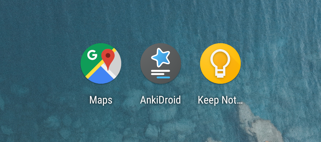
If you would like another design added to the mix, I created a simplified version of the current icon.

The lines represent a simple flashcard with an answer, and the star can be in the foreground either alone or with the lines to create a nice effect.
 nickdvlpr
on 3 Jan 2019
nickdvlpr
on 3 Jan 2019
Nice and yes I think we are just waiting for enough submissions to do a competition
mikehardy
on 3 Jan 2019
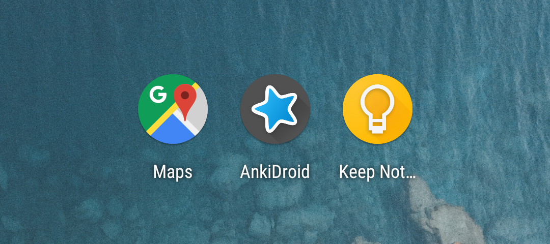
That looks really nice, can you show how it looks on a launcher home screen?
timrae
on 4 Jan 2019
Thank you so much Nick! I was just recently thinking about closing this because I didn't expect there would be any progress, but now we can move forward. This is great!
martindisch
on 4 Jan 2019
Glad you guys like it! It's two .png files right now, but the shapes are simple enough where it could be converted to .svg format easily by someone.
@timrae Here it is on a home screen with round and square icons.

nickdvlpr
on 5 Jan 2019
That's two contenders we have now in my books. I'd like to see at least one more new concept, and/or a few variations on the existing concepts before making an official poll.
timrae
on 5 Jan 2019
Since you're looking for one more, I asked my friend Kaminaji who is a bit more talented in the graphics department to give it a shot and he came up with this.
While he didn't find a way either to retain the monolith, he managed to emphasize the duality of the flashcard with the two-tone background, which is nice.
By the way, shouldn't we also consider @cydia2020's proposals from the old issue for the vote? With that we would already have at least 4 options to choose from.
martindisch
on 7 Jan 2019
Interesting. I like how both the last two give me this feeling that you do the cards and you get the star (i.e., a good grade etc) - like the star is leaping off. I agree @cydia2020 should definitely be included, and just in general now I want to delete my boring icon after seeing the development here, so hopefully we can have a vote and do that before too long. Thanks everyone - and of course if there are any more ideas, the more the merrier
mikehardy
on 7 Jan 2019
I'd love to include one of @cydia2020's concepts, since I think he was the one that started this whole thing, but I think a bit more work is required before they are ready for final inclusion.
While I definitely don't have any desire / intention to decide the final logo myself, I do want to make it clear that all core members of the team have "veto power", so effectively only proposals that I personally like will be included in the final poll.
timrae
on 8 Jan 2019
Sorry I accidentally pushed the close button.
timrae
on 8 Jan 2019
While he didn't find a way either to retain the monolith, he managed to emphasize the duality of the flashcard with the two-tone background, which is nice.
The two-tone background is nice, but I really like how the star is emphasized in your one due to it being physically bigger. The star is the most recognizable part of the Anki logo, so my preference is that it continues to take up at least 50% of the available area. Perhaps you could try incorporating his background into your original concept?
timrae
on 8 Jan 2019
I'm also curious how it would look having the star in the bottom rather than the top, like in the current logo. Also, as I previously wrote in the other thread, I'm also curious to see a logo that's almost entirely composed of just the star and some shadows.
timrae
on 8 Jan 2019
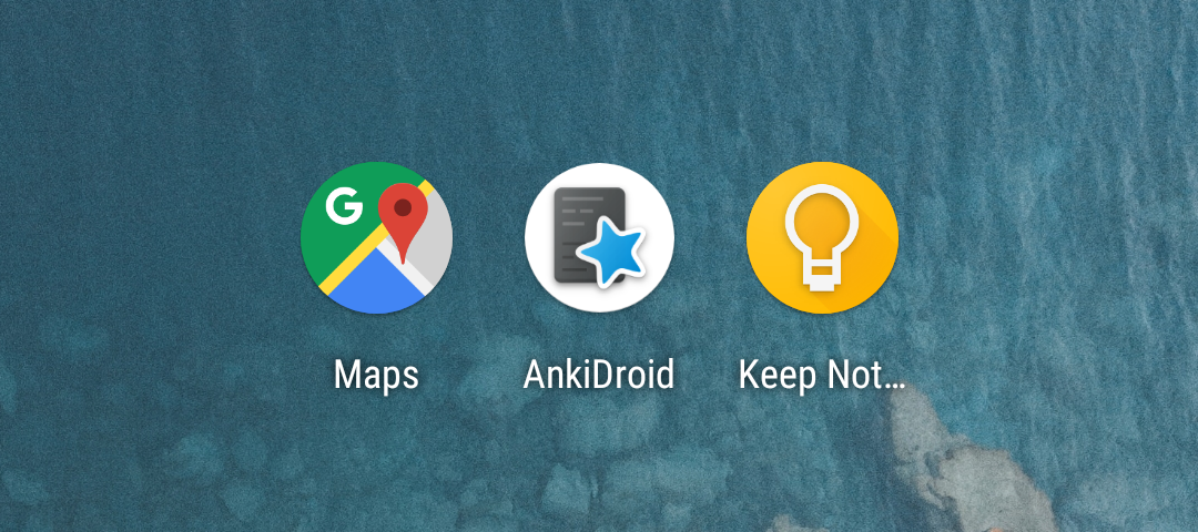
Kaminaji's background with my concept is actually a pretty good idea, here's how it looks.
That was easy to accomplish by editing the source, but I'm not proficient enough with the "real" editing tools to produce the other ones.
martindisch
on 8 Jan 2019
And Kaminaji just made a version with a bigger star at the bottom.

martindisch
on 8 Jan 2019
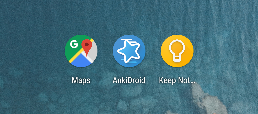
Here's just the star with shadows.
He's pumping these out faster than I can generate the previews :smile:
martindisch
on 8 Jan 2019
Maybe a bit smaller star and a bit more shadow, like in the keep icon next to it?
timrae
on 8 Jan 2019
He's been very productive. Here's the star, a bit smaller:

And this is the smaller star with an even more pronounced shadow:
A new concept:
And another one, symbolizing the choices you get when doing your cards:
martindisch
on 8 Jan 2019

Here's another version I had made similar to the previous one that I figured we could throw in the mix.
nickdvlpr
on 17 Jan 2019
That's cool! Again could you please show how it looks on a launcher? It's pretty hard to visualise how it looks on a round background.
I'll try to get the ball rolling with this as soon as I'm out of job interview hell. In the meantime, the more ideas the better!
timrae
on 18 Jan 2019
Checking in to see how it's going, since I'd like to get this moving again. If you don't have enough time, I'd be happy to put together a small poll with the candidates you want, which you can give to people to vote on this.
martindisch
on 29 Mar 2019
Yeah sorry I forgot about this and don't have too much time to put into this. The main thing is to generate a screenshot on the simulator with all the icons side by side. Would you be able to do that?
For example see the previous poll
https://docs.google.com/forms/d/18_IJ83I5hfaLeFek9D9qg_JKyn7vtGrU2kk13C5fUug/edit
timrae
on 29 Mar 2019
I might be able to get it done this weekend, although I can't make any promises. What I need is the exact list of which icons should be part of the poll. Since we've had lots of them in this thread and some are variants of each other, the best way to make sure we don't get them confused is probably if you paste the links to the images as they've been posted here, so I get the right ones.
I have the sources for all the icons I've posted, but not the ones from Nick. If you want them I need to get these as well.
martindisch
on 29 Mar 2019
@nickdvlpr
Could you please post the source?
timrae
on 29 Mar 2019
a bit of opinion here
somehow in all screenshots the default slightly rotated star (like this one or this one) it looks a bit off center, to the right. not enough to the right to seem deliberate, feels like a bad placement
vertical bars like these or these look like menus and not like something related to anki
the higher contrast lines like here stand out too much; bright lines look brigter then the black lines look darker. also the distance between rows could be made more consistent, and that one black line that touches the star could not touch it
of all images posted in this thread i like the first suggestion best of all
 oakkitten
on 29 Mar 2019
oakkitten
on 29 Mar 2019
I think we need to advertise that we're looking for a new icon design more
widely by notifying all the beta testers and asking more people to submit
designs. Then we can ask everyone to vote in the 2.9 release, and include
the winner in 2.10.
On Sat., 30 Mar. 2019, 12:21 am oakkitten, notifications@github.com wrote:
a bit of opinion here
somehow in all screenshots the default slightly rotated star (like this
one
https://user-images.githubusercontent.com/5547518/50839519-c4bcb380-1360-11e9-9923-ab10ddecf087.png
or this one
https://user-images.githubusercontent.com/6563631/50719990-78c0f480-106a-11e9-80b9-7236e620a1d7.jpg)
it looks a bit off center, to the right. not enough to the right to seem
deliberate, feels like a bad placementvertical bars like these
https://user-images.githubusercontent.com/5547518/50839550-d605c000-1360-11e9-8ced-4bbe69344847.png
or these
https://user-images.githubusercontent.com/5547518/50825445-53b5d580-1339-11e9-82f1-d9f306cea5b4.png
look like menus and not like something related to ankithe higher contrast lines like here
https://user-images.githubusercontent.com/5547518/48277666-9cd9ce00-e44b-11e8-84f9-493e1689cb14.png
stand out too much; bright lines look brigter then the black lines look
darker. also the distance between rows could be made more consistent, and
that one black line that touches the star could not touch itof all images posted in this thread i like the first suggestion
https://user-images.githubusercontent.com/5547518/48252523-4cd81880-e405-11e8-9275-581f92c53914.png
best of all—
You are receiving this because you modified the open/close state.
Reply to this email directly, view it on GitHub
https://github.com/ankidroid/Anki-Android/issues/5110#issuecomment-478037794,
or mute the thread
https://github.com/notifications/unsubscribe-auth/ACsA4qEEHLD5MViS1ZcHM6t4W3undR5tks5vbi-KgaJpZM4YWM8F
.
timrae
on 29 Mar 2019
I was really hoping we could finally finish this, almost 5 months after it started. In the beginning you said that the last time, you got 4 options made for the vote, and reasonably asked for more variations. Thanks to the efforts of my friend and Nick, we now have around 8 relatively unique designs. If you wanted even more options, asking the beta testers for their proposals earlier in the process could have saved some time.
But this is your show, and as long as we get a nicer icon out of it, I don't mind too much how long it takes. In that case I won't bother to produce the screenshot with the options just yet.
martindisch
on 30 Mar 2019
If you wanted even more options, asking the beta testers for their proposals earlier in the process could have saved some time.
We haven't released a beta version in the last 5 months, so there was no way to speed it up unfortunately. Besides I was busy with job hunting.
timrae
on 30 Mar 2019
As long as we get a nicer icon out of it, I don't mind too much how long it takes. In that case I won't bother to produce the screenshot with the options just yet.
Maybe we can roll out a poll on Google Docs with all the current entries, and instructions on how to submit a new icon proposal, and then start advertising that in the alpha channel? Then we can use that same poll in the beta channel when the beta finally gets released.
timrae
on 3 Apr 2019
Sure, whatever it takes. Just tell me what you need and I'll try to get to it on the weekend.
Maybe we don't even have to create a new screenshot for the icons, since at least the ones I proposed are all on the same background using the same crop. The only difference between the screenshots is the Ankidroid icon, so they're directly comparable to each other without external bias.
Doing that would save some time, although if there's a good reason, I'll gladly create new screenshots.
martindisch
on 3 Apr 2019
Sorry for not replying sooner, but here are the source files for my two icon designs. I use GIMP (free photoshop alternative) so the file type is .xcf unfortunately. If you use photoshop, GIMP might have a conversion to .psd.
anki_icon_gray.zip
This zip file contains the ic_launcher_background.xcf and ic_launcher_foreground.xcf source, along with an example PNG of what they will look like combined (the same icon I posted earlier).
anki_icon_blue.zip
This zip file contains the source for the blue variant I posted.
@oakkitten I agree. The Anki star I used in my icon designs was from the source @martindisch had shared. Upon rotating the star, however, I noticed that it does not have perfect horizontal symmetry (if the top point of the star is centered, the bottom middle crevice of the star is slightly offcenter).
nickdvlpr
on 20 Apr 2019
Sorry for not replying sooner, but here are the source files for my two icon designs. I use GIMP (free photoshop alternative) so the file type is .xcf unfortunately.
Thanks a lot, we can definitely work with that.
Upon rotating the star, however, I noticed that it does not have perfect horizontal symmetry (if the top point of the star is centered, the bottom middle crevice of the star is slightly offcenter).
Interesting, I haven't noticed because I never rotated it. In fact I didn't make any changes to the star, it's the same as in the original. Maybe we could redraw it from scratch (with its original geometry of course, minus the asymmetry) and fix that for the final version of the icon that gets chosen.
martindisch
on 20 Apr 2019
@nickdvlpr
Thanks for getting back to us with the source.
@martindisch
Just tell me what you need and I'll try to get to it on the weekend.
Hmm I'm not really sure, we just need to advertise a central place to discuss designs and submit new ones. It could be here, the forum, a google doc, or some combination. What are your thoughts?
timrae
on 21 Apr 2019
Our wiki, link advertised everywhere?. Then for next competition there will be an easy to find template...
mikehardy
on 21 Apr 2019
The wiki definitely is a central place, although I'm not sure how well it lends itself to an ongoing discussion like you usually have it when people propose different ideas. It would probably need an accompanying issue for discussion, and at that point why even have a page on the wiki?
But maybe I don't fully understand what you imagined. For accepting new proposals I would have just continued in here, then put all candidates in a Google Forms poll for the final decision.
martindisch
on 21 Apr 2019
Fair point - I can see your sketch working fine, go for it? I'd still like maybe a summary of the process on the wiki later as this issue has been a little start/stoppy and part of that was process-oriented. But that's more like mop-up after whatever decision is made on the icon itself
mikehardy
on 21 Apr 2019
Absolutely, documenting the process for future iterations seems like a very good idea. As for the next concrete steps, since it's just about letting people know they can still submit their ideas before the decision, I'm not sure what I can do to support you at this stage. But like I said, I'm happy to help put together a poll once we have a list of all candidates.
martindisch
on 21 Apr 2019
This one looks promising, I'd love to see it in context and perhaps a bit more cropped with more distinct bottom "text" (reverse gradient? gray background?):
Regarding the cut off in the first one, I think either none, or enough to make the blue be cut off as well.
 svenper
on 23 Aug 2019
svenper
on 23 Aug 2019
Thanks for reviving this, I almost forgot about it. Since it seems that there are a lot of beta releases being tested currently, maybe now's the time to get a poll up for this?
martindisch
on 23 Aug 2019
That would be ideal I think - we might be able to sneak it in just before 2.9 🙏 - do you have time to run the poll? (mostly it's creating the screenshots and doing the google-magic to make a poll I guess? according to the comment above)
mikehardy
on 23 Aug 2019
Sure. I just realized I already said what I need to say previously, so let me quote myself here:
What I need is the exact list of which icons should be part of the poll. Since we've had lots of them in this thread and some are variants of each other, the best way to make sure we don't get them confused is probably if you paste the links to the images as they've been posted here, so I get the right ones.
Since Tim made the point that maintainers can veto proposals, it would save me a lot of time if the two of you could list your candidates so I only have to create screenshots for the intersection of your choices.
martindisch
on 23 Aug 2019
I abdicate any veto I'd have, I'm happy to let @timrae cull the list without complication/interference just so we don't have a Boaty McBoatface moment
mikehardy
on 23 Aug 2019
Very well, I'll whip something up once I get his selection.
martindisch
on 23 Aug 2019
timrae
on 30 Aug 2019
Ok, here's v1 of the poll: https://forms.gle/4UJCMTSrN9cjFokG8
Please don't submit anything until it's been decided that it's ready.
It shuffles the order of entries between attempts to prevent any bias that could be introduced by that. Once it's closed, I can post the CSV with the responses here. Or I could add a maintainer as a collaborator on the poll, to verify I didn't manipulate the results :wink:
martindisch
on 31 Aug 2019
Nice touch with the randomization :-), also to put them all nicely on the same background using the same icon mask. I'm not worried about manipulation, just really curious to hear the results. Poll looks good to me
mikehardy
on 31 Aug 2019
By the way, it's also possible to require people to submit their email address (guess that's for cases where you want to control who gets to vote) or even make them sign in (to prevent submitting multiple times). In case you think that may be necessary.
martindisch
on 31 Aug 2019
that's a good point - I wasn't worried about manipulation by us, but I could see someone stuffing the ballot box so to speak. I'm not anti-sign in though some may not want a google account for personal reasons it might be a reasonable trade-off. Not sure how Tim ran it last time w.r.g. protecting the vote integrity
mikehardy
on 31 Aug 2019
Great, thank you for keeping this moving despite my terrible responsiveness! I guess we should include the current icon in there as well to accommodate the people who don't want to change.
I'd also like to include some text to explain the background and encourage people to engage in discussion and submit any alternative ideas or variations they have in mind. I guess we can keep using this thread as the central place for that discussion unless someone has a better idea?
timrae
on 1 Sep 2019
Added some text explaining the rationale behind the change, a link to this discussion, as well as the current icon as a fifth option. Let me know if you have anything you want to change about the text.
martindisch
on 1 Sep 2019
That's perfect, thank you so much!
timrae
on 2 Sep 2019
@martindisch
I've created a PR that prompts the beta users to complete the poll in #5425, so should be live for them over the next few days. Could you please update the explanation text to note that we will make a new additional poll if more icons are proposed?
timrae
on 4 Sep 2019
Thanks, I'm excited to see how it goes! I've updated the text. Just FYI, the poll already received 3 responses since I last updated it, even though I said to wait until it was done. But since these respondents saw the same poll we have now (the current icon was already added as an option then) I guess these are valid results too. But if you'd rather start with a clean slate, I can remove them.
martindisch
on 4 Sep 2019
Great, thank you for taking care of that! Looking at the wording of the poll in general again objectively, it seems quite verbose, but since this initial poll is aimed at beta testers who tend to be a bit more invested in the app, I think that's probably fine! What do you guys think?
By the way, are you able to give me owner access to the form, just in case something urgent comes up for you that prevents you from responding?
timrae
on 4 Sep 2019
Oh and I think it's fine to keep those initial votes there! It wasn't me ;)
timrae
on 4 Sep 2019
Done. Feel free to change the wording however you like.
martindisch
on 4 Sep 2019
Beta user here, i love one of the new icons, voted my preference 😀
 Magneticdud
on 5 Sep 2019
Magneticdud
on 5 Sep 2019
@nickdvlpr
Would you be able to make a version of this with a grey background?
timrae
on 7 Sep 2019
I made a super rough version just to see for myself what it would look like. I guess it didn't turn out as good as I had hoped.
timrae
on 7 Sep 2019
@martindisch
Shall we close the poll now and publish the results?
timrae
on 16 Sep 2019
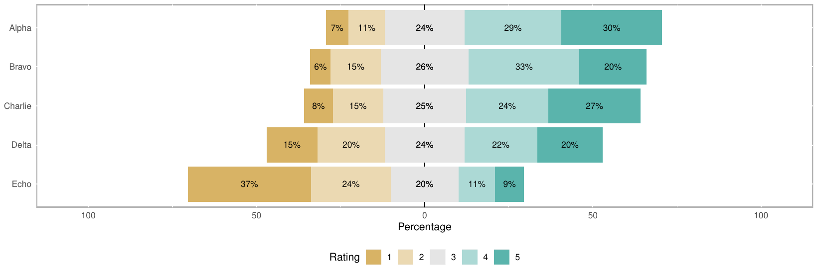
Sure, seems like a good time. I'm very happy with the number of people who participated. We got 769 responses, which is much more than I'd hoped for.
GitHub won't let me upload the CSV directly, so here it is in a ZIP.
Since people could give every entry 0 to 5 points, I just summed up the total every one got, but the same could be achieved by taking averages. Here are the results in my book:
1. Alpha with 2638 points
2. Charlie with 2546 points
3. Bravo with 2511 points
4. Delta with 2256 points
5. Echo with 1654 points
I hope I didn't make any mistakes, but that's why I uploaded the results, so somebody else can verify that.
martindisch
on 16 Sep 2019
Yeah, it's pretty clear to me that no matter how you tally the results, Alpha was the winner. So could you make a pull request to make Alpha the new AnkiDroid icon? Of course anybody is still encouraged to submit an alternative icon at any time. I don't think Alpha is perfect, but it's clearly a big improvement on Echo.
timrae
on 16 Sep 2019
Will do. I'm a bit busy and can't say for sure if I'll get it done by tomorrow, but it shouldn't take longer than 3 days. I hope we're still in the beta window by then.
martindisch
on 16 Sep 2019
No problem at all, we'll most likely be in beta for another few weeks.
timrae
on 16 Sep 2019
I had a couple of minutes and was able to do it already. Now I just hope it'll hold up and there's no weird device/launcher where it looks bad for some reason.
martindisch
on 16 Sep 2019
Happy to see "echo" (my get-'er-done) icon die, and alpha was my favorite too :-). My takeaway is people like the color scheme at minimum, and they like something that references the idea of the cards. I'm excited to see the new icon show up on my launcher
mikehardy
on 16 Sep 2019
Right, the color scheme really is very attractive and unique, I'm glad we get to keep it.
Since this will probably be closed soon, I'd like to thank everybody who gave their opinion or submitted proposals on their own, and especially the maintainers for putting up with it. This has been a long one, but I really think it'll be worth it.
martindisch
on 16 Sep 2019
I guess I'm too late (now that the PR is already done) but I will post this anyway. The only thing that I don't like about design Alpha is that the lines are cut off by the shape of the circle. Do you think we could move them slightly, so they have a little bit of padding to the boundaries of the circle?
If you agree, I can experiment with that a little bit within the next 4-5 hours.
 ByteHamster
on 16 Sep 2019
ByteHamster
on 16 Sep 2019
Yeah I agree, please do!
timrae
on 16 Sep 2019
Might turn out well, I'm looking forward to it!
martindisch
on 16 Sep 2019
I just plotted the csv you uploaded using R. I am getting the same vote sum as @martindisch, that's a good sign. Interesting enough, when looking at the number of 3+ votes, Charlie and Bravo are swapped (see plot below). Alpha is still the winner.
ByteHamster
on 16 Sep 2019
Very nice, thanks for taking a good hard look at the numbers.
martindisch
on 16 Sep 2019
As promised, I wanted to play around with the position and size of the lines. I added an overlay of some common adaptive icon shapes to show what parts of the image would be stripped off.
Old / New:


My changes:
- Moved lines closer together
- Reduced length of first dark line on the right
- Reduced all line lengths on the left
- Moved everything a tiny bit to the right
If you agree with those changes (especially @martindisch), I can create a PR.
ByteHamster
on 16 Sep 2019
not sure about the rest, but I think those changes can almost be considered bugfixes vs the various adaptive icon masks, still clearly in the spirit of the winning icon
mikehardy
on 16 Sep 2019
Agreed, I'm pretty sure all the people who voted for mine would like this one too. I'd say go ahead with the PR and we'll see what @timrae thinks tomorrow.
martindisch
on 16 Sep 2019
Yes, absolutely, great job!
On Tue., 17 Sep. 2019, 4:16 am Martin Disch, notifications@github.com
wrote:
Agreed, I'm pretty sure all the people who voted for mine would like this
one too. I'd say go ahead with the PR and we'll see what @timrae
https://github.com/timrae thinks tomorrow.—
You are receiving this because you were mentioned.
Reply to this email directly, view it on GitHub
https://github.com/ankidroid/Anki-Android/issues/5110?email_source=notifications&email_token=AAVQBYXRNLQHUL2SVWAMPTTQJ7LSBA5CNFSM4GCYZ4C2YY3PNVWWK3TUL52HS4DFVREXG43VMVBW63LNMVXHJKTDN5WW2ZLOORPWSZGOD62G6GI#issuecomment-531918617,
or mute the thread
https://github.com/notifications/unsubscribe-auth/AAVQBYWDEDW2VORUP2AYUJDQJ7LSBANCNFSM4GCYZ4CQ
.
timrae
on 17 Sep 2019
Related issues
 Mornon
·
5Comments
Mornon
·
5Comments
 david-allison-1
·
4Comments
david-allison-1
·
4Comments
 SimonePols
·
3Comments
SimonePols
·
3Comments
 kanjieater
·
4Comments
kanjieater
·
4Comments
 OoDeLally
·
4Comments
OoDeLally
·
4Comments
Most helpful comment
He's been very productive. Here's the star, a bit smaller:
And this is the smaller star with an even more pronounced shadow:
A new concept:
And another one, symbolizing the choices you get when doing your cards: