Anki-android: Move navigation bar to bottom
I believe there are many people dealing with the same problem.
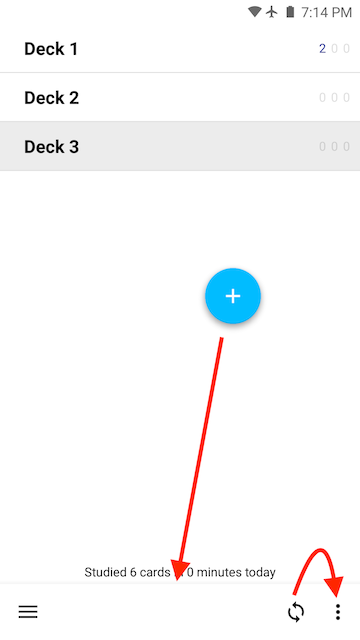
That is to reach the whole navigation bar that is positioned at the top of the screen in ankidroid (draw button, back button, favorite button). Please if someone could move it to the bottom, above the one existing structure the bottom (the learning grade color bar).
Also an "edit information" button would be ideal to have at the grasp of your thumb as the the bottom.
When studying my vocabulary I usually add comments , so reaching to the top to the three dots Menue to get to the edit choice is stressful if done repeatedly .
The navigation bar on top is out of reach of the thumb and the risk of letting my phone slip when trying to reach the bar rises.
There is no way of fast learning and comfortably holding your phone in today's age with a top bar unfortunately.
Thanks for any help.
 dezorianguy
All 19 comments
Strange - I feel like I commented about this somewhere with some links to the material design docs on the subject but I can't find them now.
At any rate, in my recent material design reading I have head that in larger format devices (current big phones, phablets, tablets in portrait mode) the action bar at the top is the most difficult part of the screen to hit. Which is just to say that I do tend to believe this affects people.
It's a non-trivial change though as it's a lot of UI code, and we're trying to stabilize things currently for 2.9. So this would be a bit in the future but probably long enough to get right that if someone wanted to start working on it they could probably start now and land it for 2.10
Here are the relevant design docs - note several things would need to be thought about and decided as a design thing:
- interaction/prioritization with any navigation / actions on the top (move them all down? everywhere? just for reviewer? as a preference or just move them as a full-app design decision)
- the interaction with the show answer button (above it? below it? below it I think)
- interaction with type to answer (above it? below it? below it I think)
- interaction with FAB and snack bars? (typically should be below them)
https://material.io/design/components/app-bars-bottom.html
Most likely would need a sketch, or a prototype with video demonstrating all the interactions
 mikehardy
on 29 Sep 2018
mikehardy
on 29 Sep 2018
In the meantime I say this sort of joking but also serious since this affects most apps - best solution is probably hardware - a phone grip (either a ring or collapsible handle thing that sticks to the back). Super popular now too ;)
mikehardy
on 29 Sep 2018
Thanks for the reply and that joke (seriously,no cannot put anything on my back case as it is featuring a moveable part which doesn't allow for attaching anything on top of it ).
I would pay some money for that bar to bottom feature as the usage for me and my rather large phone unfortunately became nearly impossible. And i need to study...
I don't really care about how it is done as long as the important buttons (mentioned above) are reachable with a thumb. :)
dezorianguy
on 3 Oct 2018
Well, it's always possible to try sponsoring development - the project has used bountysource before though I haven't personally (yet) but if bountysource is doing their job right no money changes hands unless there's a real feature implemented:
https://github.com/ankidroid/Anki-Android/wiki/Contributing#sponsor-development
https://www.bountysource.com/issues/64036465-move-navigation-bar-to-bottom
I also can't use a holder ring because I have one of those sticky wallet pouches on there, so we're in the same boat
mikehardy
on 3 Oct 2018
@dezorianguy
I was thinking the same thing, so I started redesigning the main activities to look more like the Google Tasks app. I'll have more time to work on it over the next week and will post some screenshots then too!
 nickdvlpr
on 16 Nov 2018
nickdvlpr
on 16 Nov 2018
Excellent - for reference I should say I try really hard to shepherd pull requests to a merge but "I'm new here" and for very good reasons (read as: I make mistakes and don't know project history) I can make no promises, just try to help. That said, it has been my experience that sketches and screenshots that show the layout are gold though. Feedback before really spending time. So just getting some general layout (even if it's ugly and doesn't work) and snapping it then posting it here is probably the most efficient way to make sure you're on a path towards acceptance. Cheers!
mikehardy
on 16 Nov 2018
@mikehardy Thanks for the quick reply! That sounds good to me, I'll keep you posted on my progress. Here's an example from my own app of the layout I'm aiming for: https://play.google.com/store/apps/details?id=com.onepersonco.periodic
I'd make adjustments to include the current buttons, and perhaps we could edit the floating action button in the future as I noticed there was another open suggestion to change the library utilized for that. The navigation drawer could eventually be moved to a bottom sheet as well.
Best,
Nick
nickdvlpr
on 16 Nov 2018
Yeah - the FAB issue is mine as well, so carries the same disclaimer as above - worth noting also. The problem with it is that our FAB library is unmaintained and most of what I've been doing is under-the-covers work porting the app forward on Android APIs and getting it on a sustainable footing with it's dependencies.
One thing maybe worth mentioning is to have a look at the issue on plugins #2982 - especially the link to the template project that is beautifying the review experience in a way that works across the Anki ecosystem. I have no idea if that's interesting or not, but the advance in web standards since AnkiDroid began is pretty phenomenal and maybe handles much of your UI needs, or at least relates to them. With regards the "hard" UI components (those surrounding the reviewer WebView) that would have to be a PR here of course
mikehardy
on 16 Nov 2018
@mikehardy
Ok! I actually really like the current implementation of the FAB, I just wanted to make sure I wasn't jumping in while someone was making a major change. I'll be honest, much of the link you posted is beyond my understanding, but I have to say I'm impressed with the overall structure of the code for this project and the work you've all done thus far.
One question I had was if you are able to utilize Instant Run with this project. My problem is this:
The option setting 'android.enableUnitTestBinaryResources=true' is experimental and unsupported.
The current default is 'false'
which can be solved by disabling Instant Run in preferences. Humorously enough, this eventually led me to your comments in the Robolectric GitHub https://github.com/robolectric/robolectric/issues/4026
If you know of a quick fix it would make the UI work a little easier! Otherwise, no big deal.
nickdvlpr
on 20 Nov 2018
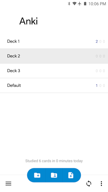
Progress update
(Above) Main app screen. I've successfully converted the default theme (Theme_Light) from it's original blue color to white. The toolbar text and icons all correctly adapt to be black on this white background, and white on all the other themes. It took longer than expected, but I think it was worth it in order to preserve the current theme options.
(Above) One of the settings screens. I kept the toolbar at the top for the Preferences (Settings) screens as it made more sense to keep it there. On the main screen, one of the main issues is that in order to center the Floating Action Button, we'll have to either remove the labels or change libraries. The current library takes into account the length of each label when positioning the closed FAB, so centering it is not possible (not that we necessarily have to center it).
Let me know what you think of the progress so far! Obviously these are big changes, so no hard feelings if you don't want to commit them once all is said and done.
nickdvlpr
on 21 Nov 2018
Interesting - after looking at the current UI so long it's like I have screen burn-in I guess, because this just looks weird to me. I'm clear from my material design readings that this is both a possibility and desired in some cases, which appear to be our case but I can't shake that "this doesn't look right" feeling. I think it's probably just lack of perspective from too much familiarity though. Can I ask a favor I hope is not too large? Are there any other UIs with bottom action bars we could reference just to get an idea what it looks like (and help me and anyone else looking get over the initial alien-ness)?
I can fully appreciate the difficulty of theming though, that's for sure. Separately - I wouldn't want to add FAB library replacement to it but having logged that issue I know our FAB implementation is unmaintained so I'd want to keep them separate but it would be a net positive if there were a replacement (or just native framework API implementation) to replace the current FAB.
mikehardy
on 21 Nov 2018
Sure thing. Here's Google News and Google Tasks:
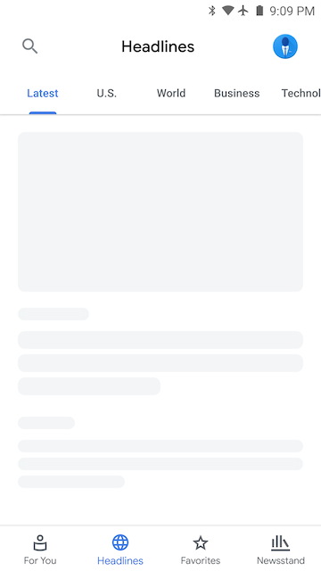
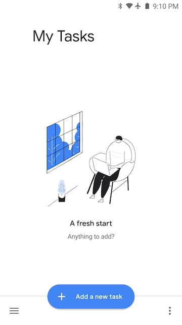
Google Tasks has a similar "Add" function on its main page, so I'm attempting to imitate that layout.
nickdvlpr
on 21 Nov 2018
And indeed those look just as foreign indicating it is likely me :-). Many thanks for posting them up.
I will reiterate that I'm not the UI approver in general as mentioned here https://github.com/ankidroid/Anki-Android/issues/4998#issuecomment-439273899 - but if it meets the design guidelines, is a clean implementation, and is optional I'd be +1 for what it's worth
mikehardy
on 21 Nov 2018
It's definitely a new and admittedly jarring style (especially with all the white). Once I get it polished up some more it might grow on you. Worst case I'll just use the new design for my own Anki studying!
Here is an updated look at my FAB implementation. It reduces the number of clicks at the expense of the spinning animations.
nickdvlpr
on 21 Nov 2018
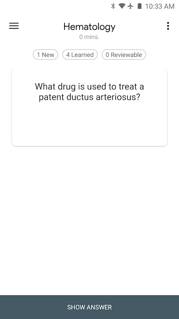
Reviewer page
I made the flashcards the focus of this page by using the Material Card component (https://material.io/develop/android/components/material-card-view/) and removing color from the surrounding area. This way, flashcards that contain images will really stand out. It's still a work in progress as I'll be adding the "Undo" button back in and increasing the size of the bottom buttons.
nickdvlpr
on 21 Nov 2018
I'm not sure that fits with "move navigation to the bottom" - but that is pleasing on the eyes. It would expand this to more of a "material (re-)design".
Does it work with the project attempting to replace the review UI with modern web techs linked in the last comment here? #2982
The other parts of the anki ecosystem seem to support them so I'm curious if this blows that up or not - we should display cards the same way Desktop/iOS/Web does unless it is prevented somehow by the platform
mikehardy
on 21 Nov 2018
For the FAB the icons aren't speaking to me as specific choices, but I think the design direction is interesting. And the nav bar on bottom is growing on me, though per usual I will always point out I'm not the decider for UI :-)
mikehardy
on 21 Nov 2018
Good idea, I'll start a new "Issue" thread for the overall redesign.
I believe it will work with the project replacing the review UI. The only difference now is that the flashcard contents are contained in a slightly smaller card instead of being allowed to spread to the edges of the screen. I'd have to look into this a little more to be sure though.
nickdvlpr
on 22 Nov 2018
Hello 👋, this issue has been opened for more than 2 months with no activity on it. If the issue is still here, please keep in mind that we need community support and help to fix it! Just comment something like _still searching for solutions_ and if you found one, please open a pull request! You have 7 days until this gets closed automatically
![github-actions[bot] picture](https://avatars2.githubusercontent.com/in/15368?v=4&s=40) github-actions[bot]
on 3 Jun 2020
github-actions[bot]
on 3 Jun 2020
Related issues
 OoDeLally
·
4Comments
mikehardy
·
5Comments
OoDeLally
·
4Comments
mikehardy
·
5Comments
 david-allison-1
·
4Comments
david-allison-1
·
4Comments
 Acelya-9028
·
4Comments
Acelya-9028
·
4Comments
 mashinbaz1
·
6Comments
mashinbaz1
·
6Comments