Anatole: Sticky Table of Contents to the right of Blogposts
First of all a big compliment and thank you for the beauiful theme.
I recently saw this blogpost and thought that the sticky ToC would be a good fit and nice addition to the theme. Especially on larger displays, there is much unused space to the right of the posts where such a ToC would look very nice imho.
I have almost no experience in web design, therefore I do not know whether it would be easily implemented or not; or whether I can implement this easily by myself. If this is the case and you do not consider such a ToC a valuable addition to your theme, maybe you could point me towards some information to implement this myself.
 tlary
tlary
All 8 comments
@tlary Yes that is technically possible. It may look something like this:
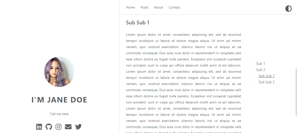
There are a couple of things, which you would need to change:
First of all you would need to add the ToC in the single.html of the template:
{{ if gt (len .TableOfContents) 80}}
    {{ .TableOfContents }}
{{ end }}
Add the following CSS to your custom CSS or change the main style.css.
/* Sidebar Navigation */
#TableOfContents {
    margin-right: 1em;
    margin-top: 2rem;
    padding-left: 0;
    border-left: 1px solid #efefef;
    float: right;
    width: 20%;
    position: sticky;
    top: 15rem;
    align-self: start;
  }

  #TableOfContents a {
    text-decoration: none;
    display: block;
    padding: .125rem 0;
    color: var(--body-color);
    transition: all 50ms ease-in-out;
  }

  #TableOfContents li {
    list-style: none
  }

  #TableOfContents ul {
    padding-inline-start: 10px;
  }

  #TableOfContents a:hover,
  #TableOfContents a:focus {
    color: #666;
  }

  .post-content-text{
      width:70%;
      text-align: justify;
  }

  html {
    scroll-behavior: smooth;
  }

  body {
    scroll-padding-top: 100px;
  }
Please not that I've placed the content in a seperate div with the class post-content-text, as by default, it would span the whole width of the right column.
In the CSS file you might also want to make sure that the ToC is not shown on mobile devices. This could look like the following:
@media screen and (max-width: 960px),
print {
    #TableOfContents {
        display: none;
    }
    .post-content-text{
        width:100%;
        text-align: justify;
    }
}
If you want to support the smooth scrolling in older browers you would need a bit of JavaScript. Add this to a custom JavaScript file.
// Smooth scrolling for browsers that don't support CSS smooth scrolling
if (window.getComputedStyle(document.documentElement).scrollBehavior !== 'smooth') {
    document.querySelectorAll('a[href^="#"]').forEach(internalLink => {
        const targetElement = document.querySelector(internalLink.getAttribute('href'));
        if (targetElement) {
            internalLink.addEventListener('click', (e) => {
                targetElement.scrollIntoView({
                    behavior: 'smooth',
                });
                e.preventDefault();
            });
        }
    });
}
I hope this helps to get you started.
 lxndrblz
on 2 Feb 2021
lxndrblz
on 2 Feb 2021
This works like a charm, thank you! :)
However, if I'm understanding this correctly, the floating ToC takes up some space which was previously allocated to the text body of the blog post, i.e. the total width (text + ToC) is identical to the text width before. Therefore, there is still some unused space to the right of the post, see the attached image.
Would it be possible to put the ToC next to the post as it was before, if there is enough space on the screen?

tlary
on 2 Feb 2021
@tlary Yes you could increase the useable space of the post+ToC. Would you mind sharing, what display resolution you are using? I am asking because ultra-wides and HD resolution are handled slightly different.
lxndrblz
on 2 Feb 2021
On an ultra-wide you could override the default behaviours using this query:
@media (min-width: 1921px){
    .content {
        padding-right: 10%;
        width: 50%;
    }
}
Just tested it on my ultrawide and I thought it looks quite decent.

lxndrblz
on 2 Feb 2021
I'm using a 27'' 2560x1440 monitor.
@media (min-width: 1921px){
    .content {
        padding-right: 10%;
        width: 50%;
    }
}
Just tested these settings and they look good on my monitor as well. Thanks! :)
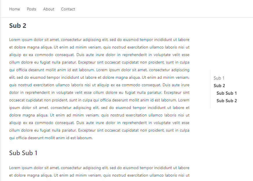
One last question: is it possible to somehow highlight the current section in the ToC, .e.g. displaying the active section in bold? I assume it can be achieved by tweaking the code from here under the third point, but I cannot get it working.
tlary
on 2 Feb 2021
@tlary I believe it's done using the ScrollSpy. Lemme give it a try.
lxndrblz
on 2 Feb 2021
TYG
window.addEventListener('DOMContentLoaded', () => {


    const observerForTableOfContentActiveState = new IntersectionObserver(entries => {
        entries.forEach(entry => {
            const id = entry.target.getAttribute('id');

            if (entry.intersectionRatio > 0) {

                clearActiveStatesInTableOfContents();


                document.querySelector(`nav li a[href="#${id}"]`).parentElement.classList.add('active');
            }
        });
    });


    document.querySelectorAll('h1[id],h2[id],h3[id],h4[id]').forEach((section) => {
        observerForTableOfContentActiveState.observe(section);
    });

});

function clearActiveStatesInTableOfContents() {
    document.querySelectorAll('nav li').forEach((section) => {
        section.classList.remove('active');
    });
}
li.active{
    font-weight: bold;
}
Awesome, works perfectly and looks amazing! Thanks again for your work and your help! :)
tlary
on 2 Feb 2021
Related issues
 abraithwaite
·
4Comments
abraithwaite
·
4Comments
 Corfucinas
·
5Comments
Corfucinas
·
5Comments
 xiangli2pro
·
3Comments
xiangli2pro
·
3Comments
 isa-chavarria
·
5Comments
isa-chavarria
·
5Comments
 cwpearson
·
5Comments
cwpearson
·
5Comments