Amp-wp: Settings screen: Make template mode and reader theme sections more compact
Feature description
From @amedina on Slack:
- ~Make the Template Mode an accordion of sorts, when the selected theme is open, and the others are collapsed.~ Make each template mode selectable and expandable.
- Provide a way to browse available themes without having all them on the screen at the same time
And from @westonruter:
it would make sense as a subsection inside the Reader mode box which only appears when Reader is selected. In this way, it would be similar to the Supported Templates section which only displays the post types and templates when the toggle is off
And the themes could be displayed as a carousel there perhaps.
Acceptance criteria
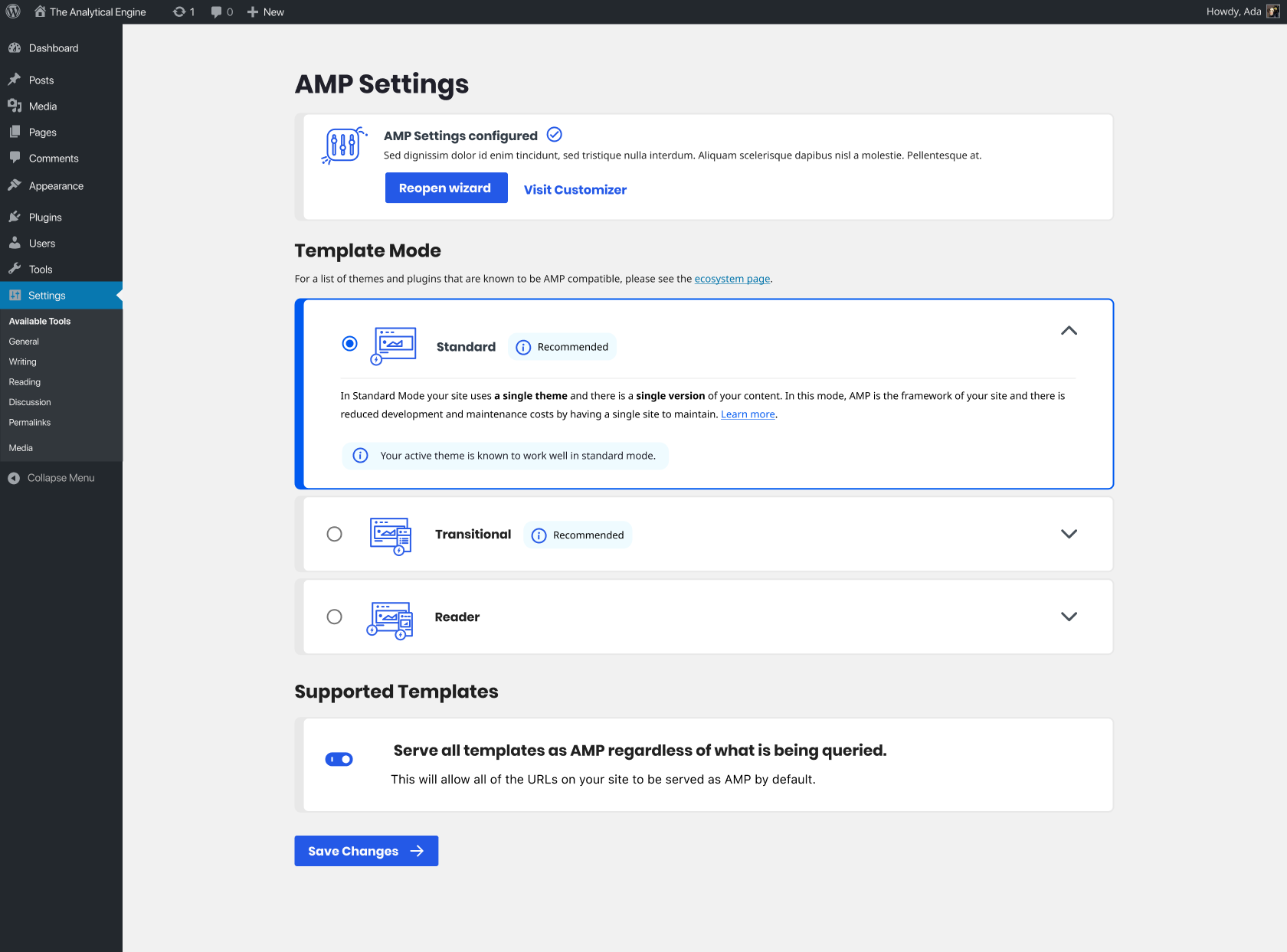
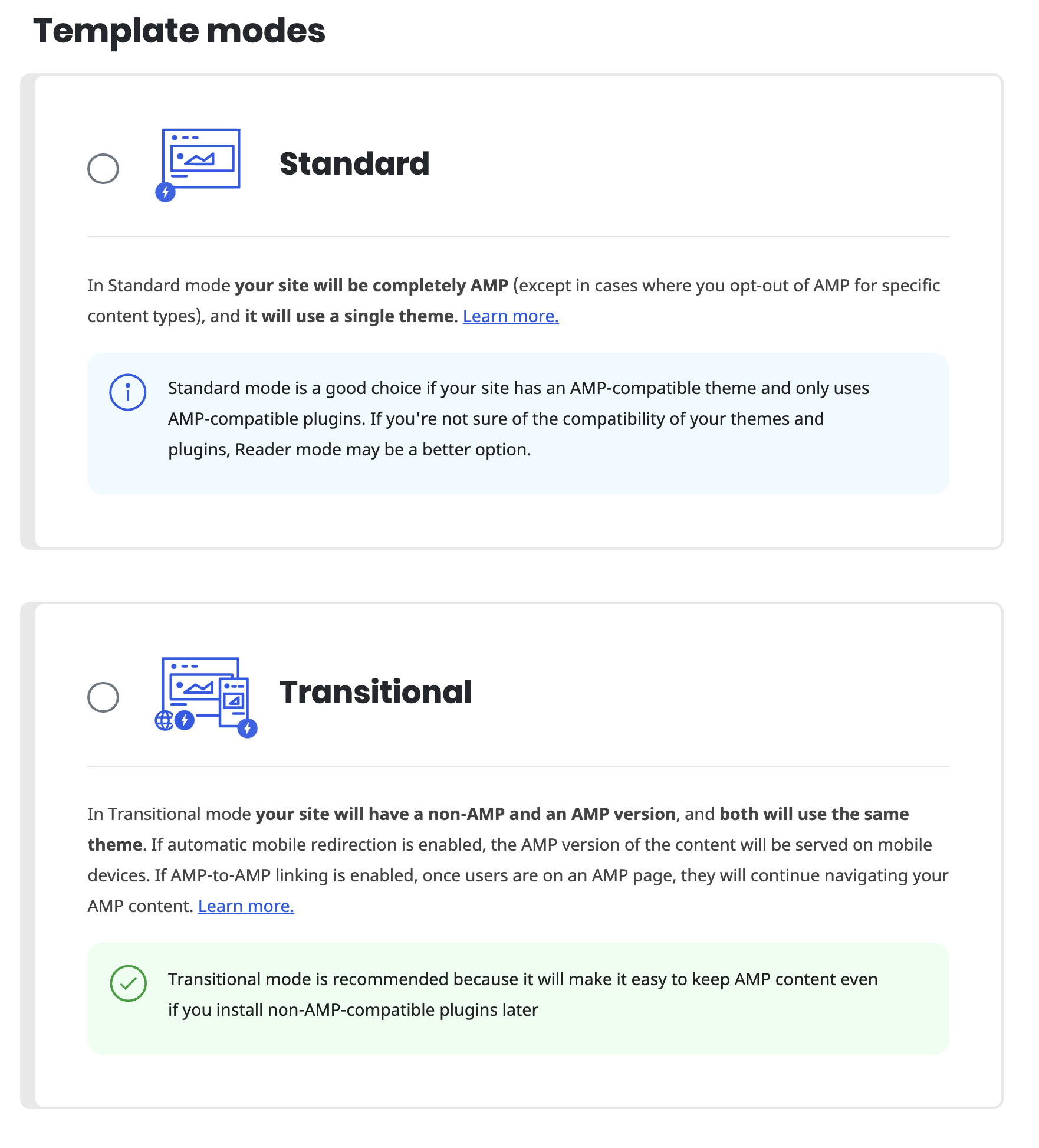
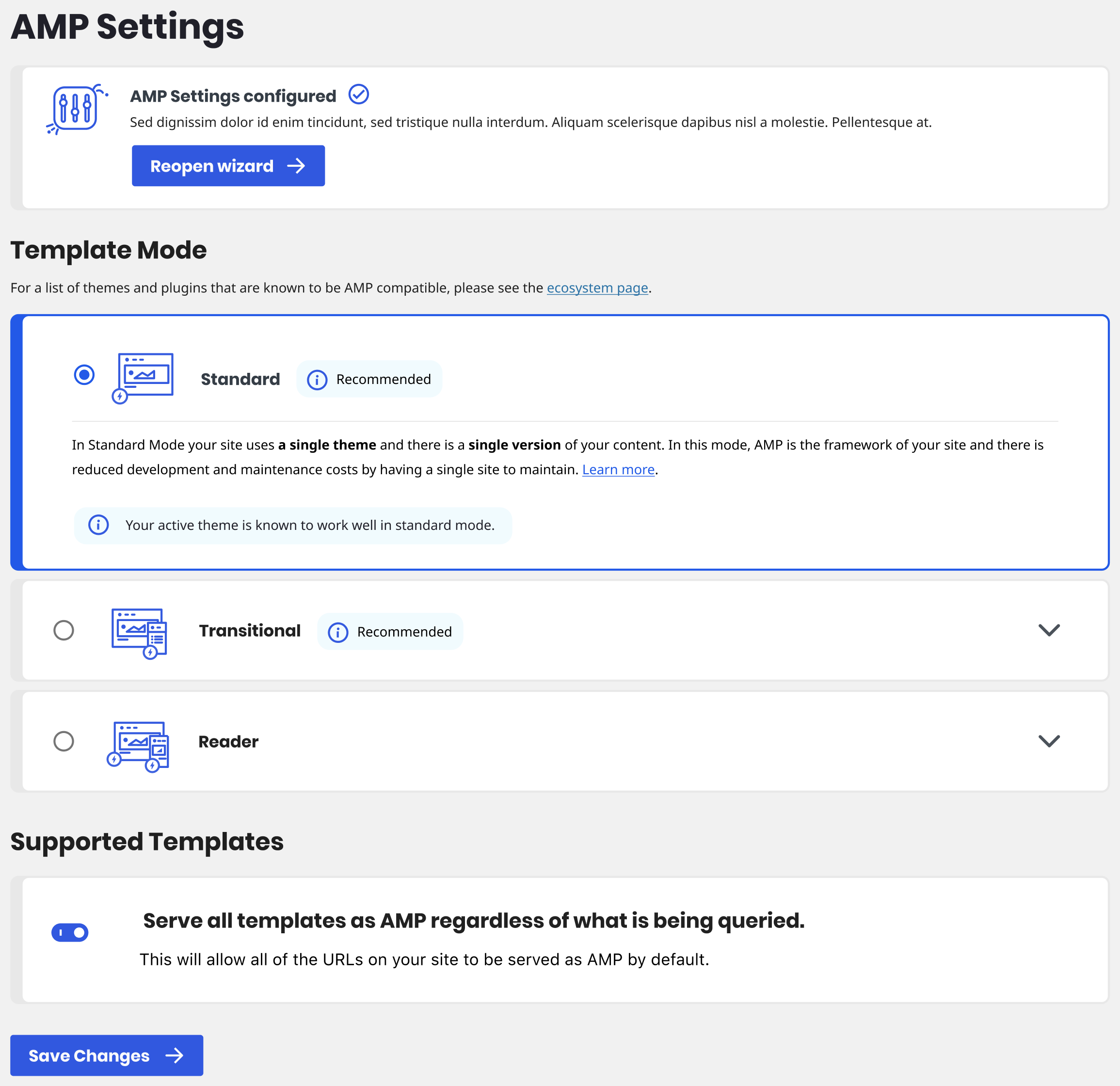
- Template mode will display three selections as radio boxes. Each can be expanded to display more information.
- By default all template modes will be collapsed.
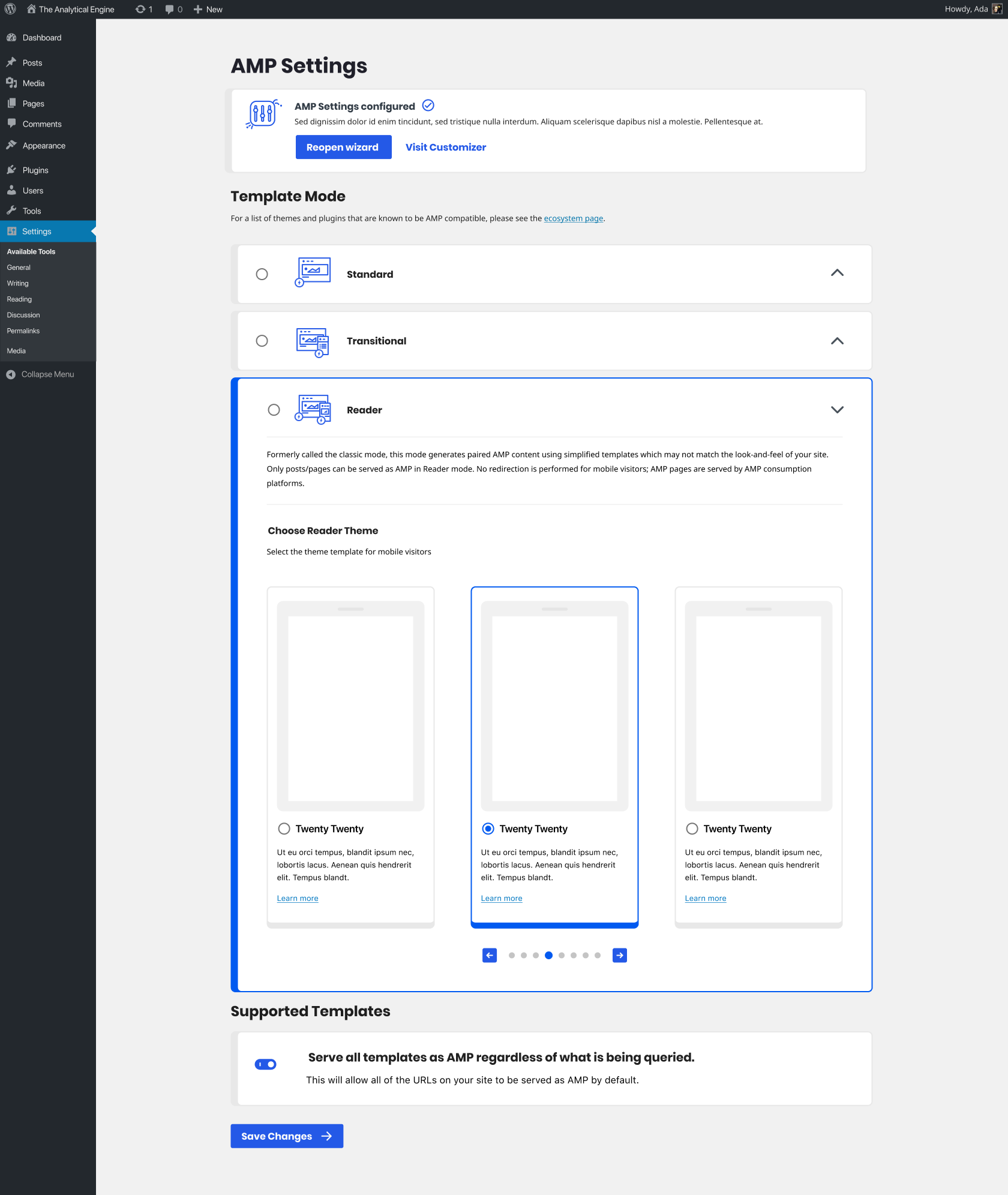
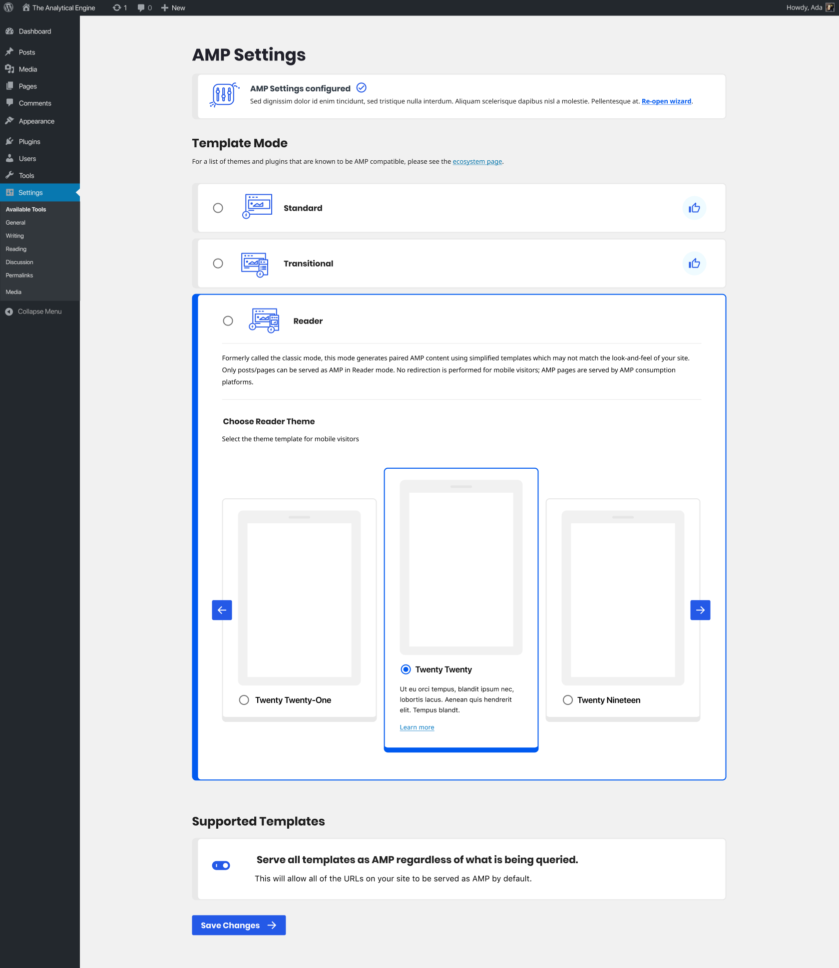
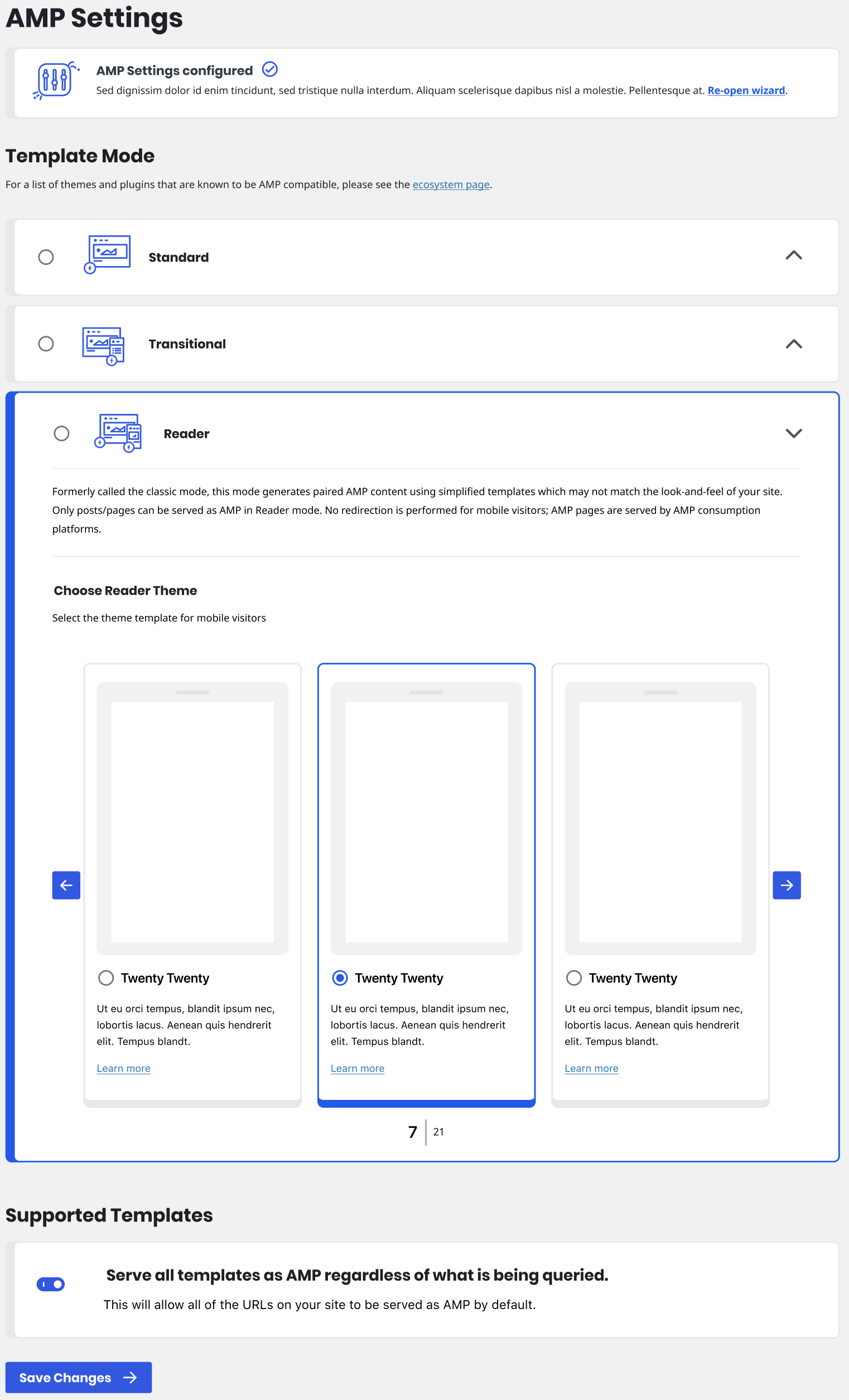
- When reader mode is expanded you'll be able to choose a theme from an accordion.
- The boxes will have a max width (likely 1060px) and the content within the boxes will have a max width (likely 960px). The boxes will be centered in the page.
Implementation brief
QA testing instructions
Demo
Changelog entry
 johnwatkins0
All 26 comments
@jwold Not sure if we want to save this for after 1.6 or not (I'll leave that decision to you, @westonruter and @amedina), but I'm going to assign this to you to consider options and maybe mock something up when the time comes.
johnwatkins0
on 10 Jul 2020
I think we have time. Milestoned.
 westonruter
on 10 Jul 2020
westonruter
on 10 Jul 2020
Working on some ideas now for this.
 jwold
on 10 Jul 2020
jwold
on 10 Jul 2020
Ok, got a few concepts I'd like to discuss.
- Let's set a max-width on the content boxes and center them in the screen. Thinking 1060px. The exact padding inside and spacing between elements is still WIP.
- Shrink the illustrations to 48px.
- Add a simple thumbs up icon when the mode is recommended. Then selecting it gives the expanded answer below.
- Try a carousel WITHIN the reader mode. Put up an initial idea. Not happy with it, but it's worth discussing.
- Shrink headlines within the white boxes.
- Shrink all body copy to match.
cc @amedina, @westonruter, @johnwatkins0
jwold
on 10 Jul 2020
Yeah, I think these are definite improvements.
For the carousel, one challenge will be how the first and the last theme appear when selected, as they couldn't be centered, correct? Is it intended that the selected theme always be in the center?
I don't think we need to make the center/selected theme taller. I presume that clicking the left/right arrows should not cause cause selection to happen, so I'd want to be able to read the description and see click the Learn more link without having to click to select it.
westonruter
on 10 Jul 2020
- Let's set a max-width on the content boxes and center them in the screen. Thinking 1060px. The exact padding inside and spacing between elements is still WIP.
Sounds good. If we do so, should we do the same with the blue info messages inside the boxes?
- Shrink the illustrations to 48px.
It sounds good. What is the current px value?
- Add a simple thumbs up icon when the mode is recommended. Then selecting it gives the expanded answer below.
This I am not sure about this. It is not clear for users what the thumbs up icon means, especially in the case shown where there are two of them and there is no associated message about it.
I am reconsidering the perspective of having the template modes as an accordion. When selecting one of them, it would be useful for users to have the three options open to compare. Also, in that case the recommendation message canb be made clear.
- Try a carousel WITHIN the reader mode. Put up an initial idea. Not happy with it, but it's worth discussing.
I like this. One thing we could do, if is not too challenging, is to put bubbles/dots underneath of the carousel to give a sense of the multiplicity of themes that are available and for the user to have a sense where they are in the set of themes (i.e. are there two more?, 100 more?)
- Shrink headlines within the white boxes.
+1
- Shrink all body copy to match.
+1
Other comments:
- Not sure abut shrinking the first box
- I liked the "Reopen Wizard" button in the current design
 amedina
on 10 Jul 2020
amedina
on 10 Jul 2020
I don't think we need to make the center/selected theme taller. I presume that clicking the left/right arrows should not cause cause selection to happen, so I'd want to be able to read the description and see click the Learn more link without having to click to select it.
+1
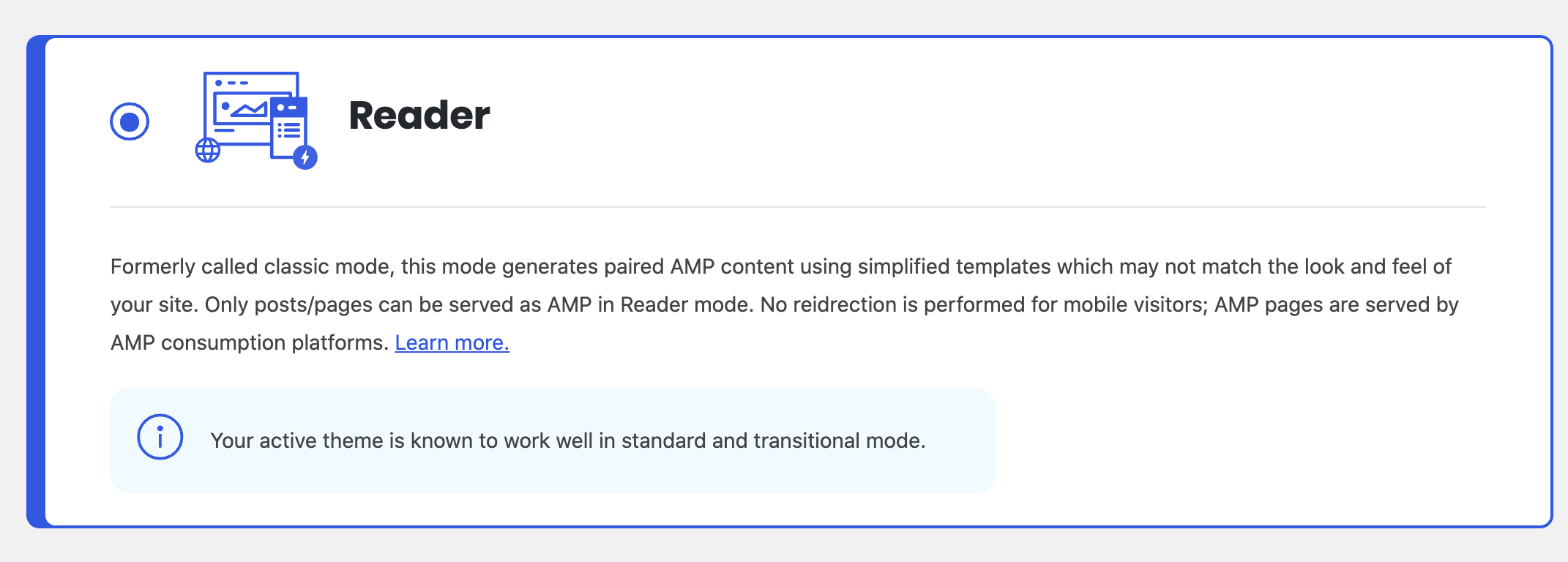
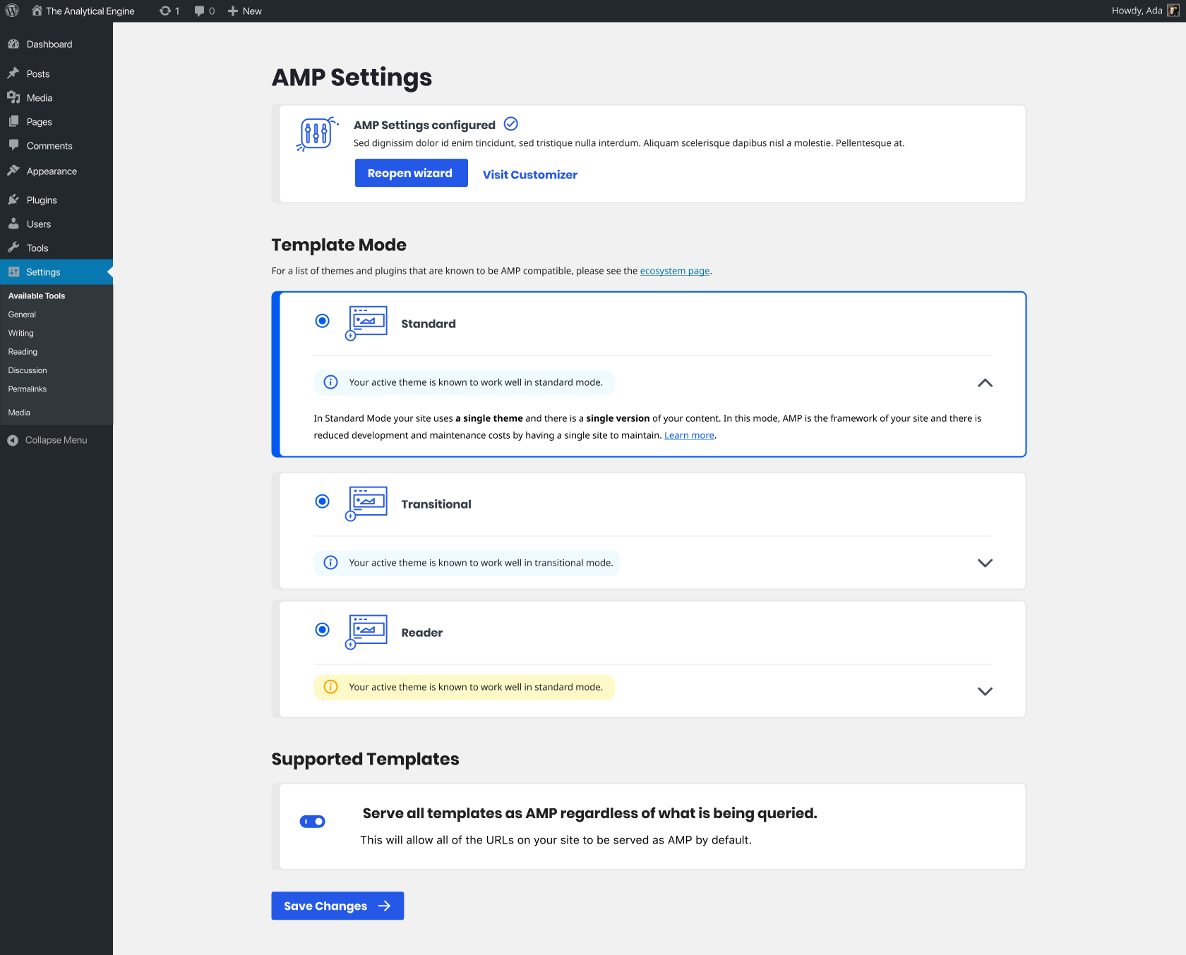
Following up on my comment: I think we should keep (at least not v1.6) the template modes as they are now, as well as the inner boxes with the info and recommendation messages:
amedina
on 10 Jul 2020
Following up on my comment: I think we should keep (at least not v1.6) the template modes as they are now, as well as the inner boxes with the info and recommendation messages:
I'm not sure because these take up a lot of space, and there is a lot of elements on the settings screen. In the wizard we show them fully expanded but that makes sense to me because the modes are the only things shown on the screen. But on the settings screen having them collapsed seems better. But I also realize that it will be somewhat annoying to only expand the box when the radio button is selected, for two reasons:
- You'd have to select the box to see what the description is, making you have to remember what the original mode was if you end up deciding to not make a change.
- It causes content shifting when clicking the buttons (maybe not a problem here).
The only way I can see to resolve this is to re-introduce the 🔽/🔼 toggle to show/hide the description. This would be instead of the proposed 👍, I suppose. If we wanted to retain the recommendation then I think it'd need to be explicitly shown as a “Recommended” label appearing right after the template mode name. For example (disregard my poor colors and toggle design!):
The “Recommended” label would appear in the place of the “Previously selected” label, which is only used on the wizard instead of the settings screen. And there's no need for the “Recommended” label on the wizard anyway, since the mode descriptions would be all be expanded anyway (without there being a 🔽/🔼 toggle).
Again, these proposed changes are just for the modes on the settings screen, _not_ for the modes in the wizard. The modes screen in the wizard would stay as is.
Thoughts?
westonruter
on 12 Jul 2020
Yeah; this is a good approach. I like conciseness and less text.
amedina
on 14 Jul 2020
@Weston
For the carousel, one challenge will be how the first and the last theme appear when selected, as they couldn't be centered, correct? Is it intended that the selected theme always be in the center?
Agreed. We probably just should keep them all the same height.
@alberto
Sounds good. If we do so [set a max-width of 1060px], should we do the same with the blue info messages inside the boxes?
I'm thinking the blue info boxes are ok to just go to their natural max width, however long the content is. The boxes will be max-width 1060px, and the content inside will be max width 960px. Like this: https://d.pr/i/XXvgJp.
It sounds good. [Shrinking the illustrations to 48px] What is the current px value?
Actually, I'll modify that slightly. I want to do a max-height of 48px (or 50px, I think the line width might extend slightly), but the width could be up to 60px, since some of the image are more rectangular. Before we had an image up to 150px the top banner), and some of the images down below were as tall as 62px height.
[Try a carousel] ... put bubbles/dots underneath of the carousel to give a sense of the multiplicity of themes that are available and for the user to have a sense where they are in the set of themes.
Not a bad idea. There are some great ways we could approach pagination. There are also some simpler ideas. Here's a few I threw together really quick. Are we going to be adding many themes in the near future? If so, we should think about a true pagination UI. If not, we could just pick something simpler. A few ideas: https://d.pr/i/LtLDoO
I liked the "Reopen Wizard" button in the current design
Copy that.
jwold
on 14 Jul 2020
jwold
on 14 Jul 2020
Updating description at the top with the latest.
jwold
on 14 Jul 2020
I'm including several of the small updates here in #5049.
Not including;
- Themes carousel
- Expandable template modes
Wanted to call out one piece in the comps:

This came up during an earlier stage when we were working through the wizard. Having a user-interactable element (the radio input and its label) inside of another element (the panel drawer open/close button) presents challenges. As a user when I see that down arrow, I expect that whole row to be the drawer button. But as shown in the screenshot we have that radio input to the left (along with its label, which is all the text), which needs to be clickable on its own. Ideally the radio input would be outside the drawer toggle button. On a technical level it can be done -- though it is slightly challenging because we wouldn't be able to use the core panel component in this case -- but I still think there's an issue from a UX perspective. @jwold reach out if you want to discuss.
johnwatkins0
on 15 Jul 2020
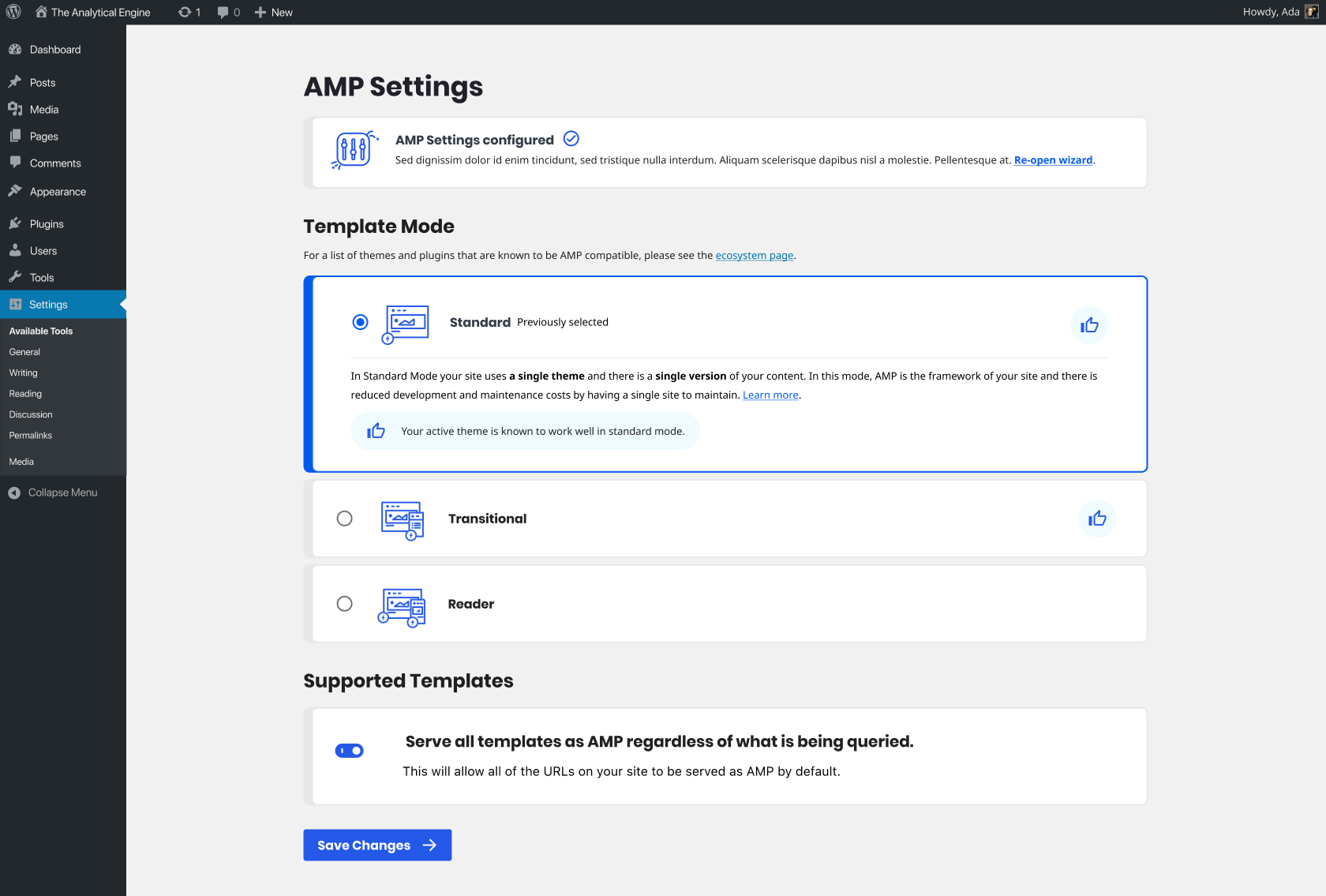
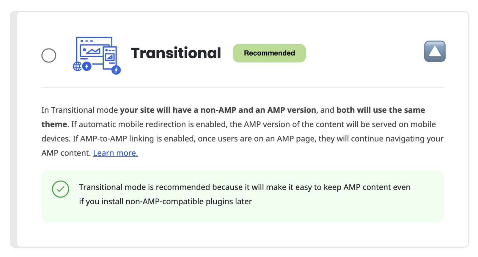
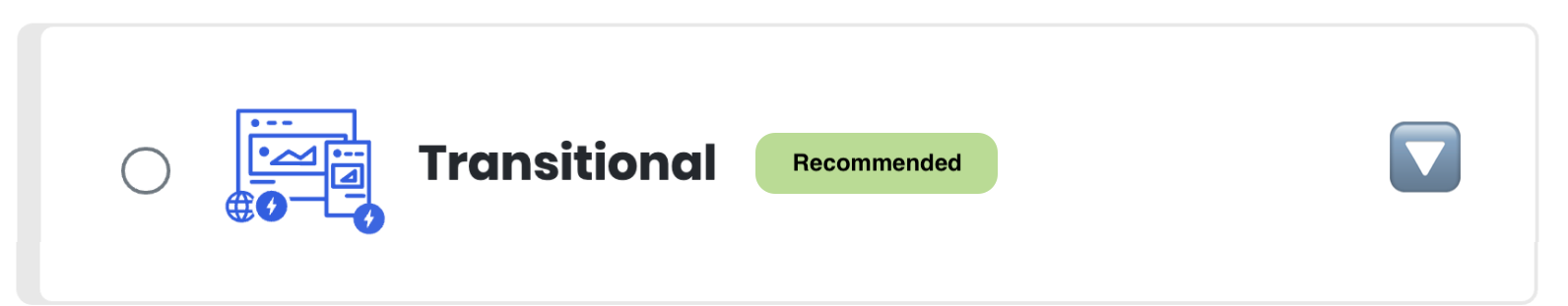
Here's a concept that's worth discussing. It makes the boxes a little bigger, but should simplify the technical work to select the radio button at the top, while the arrow expands the box. Thoughts?
cc @amedina and @westonruter
jwold
on 15 Jul 2020
I like it very much.
amedina
on 15 Jul 2020
Here's a concept that's worth discussing. It makes the boxes a little bigger, but should simplify the technical work to select the radio button at the top, while the arrow expands the box. Thoughts?
Will every mode always have a notice, whether info, warning, or error?
westonruter
on 15 Jul 2020
Will every mode always have a notice, whether info, warning, or error?
We haven't officially decided on this. It works better if there IS a notice, but I wouldn't want to just add noise if it's not relevant.
jwold
on 15 Jul 2020
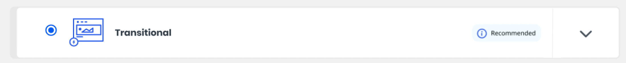
@jwold How about doing this instead: add a vertical separator between the toggle side and the radio side to make it clear where the dropdown button target is. Like this:
westonruter
on 15 Jul 2020
I didn't realize we could have them on the same line. I think that's a great idea @westonruter if we can pull it off technically :)
jwold
on 15 Jul 2020
I will give it a try.
johnwatkins0
on 15 Jul 2020
+1 Having the notice in the same line with the separator before the toggle would make it the UI sleeker and more compact.
+1 on the notice. Once we have site scan, there should be a meaningful notice in every case.
amedina
on 15 Jul 2020
The full notice text can be displayed once expanded, however. Otherwise, a short “Recommended” can be shown when for the option(s) which are recommended. No need to show a warning if the user is not trying to select the mode in the first place.
westonruter
on 15 Jul 2020
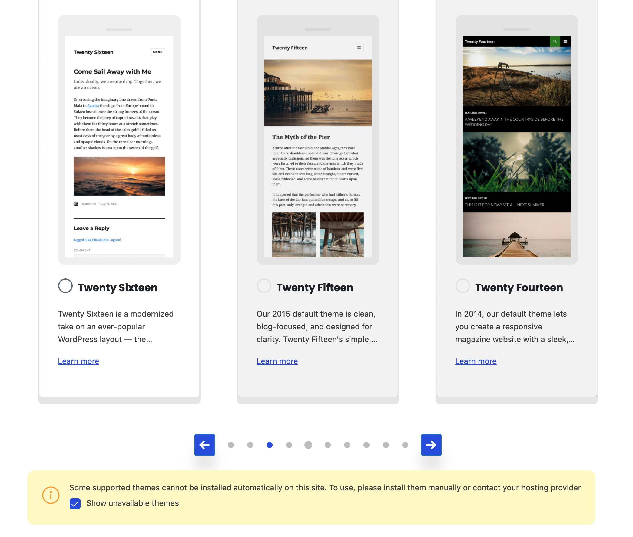
@jwold @amedina @westonruter How do you think we should handle uninstallable themes on the settings screen? Having no put a great deal of effort into it so far, here's how it looks currently. Feels like it should be much, much smaller but I'm not sure how best to fit it all in.
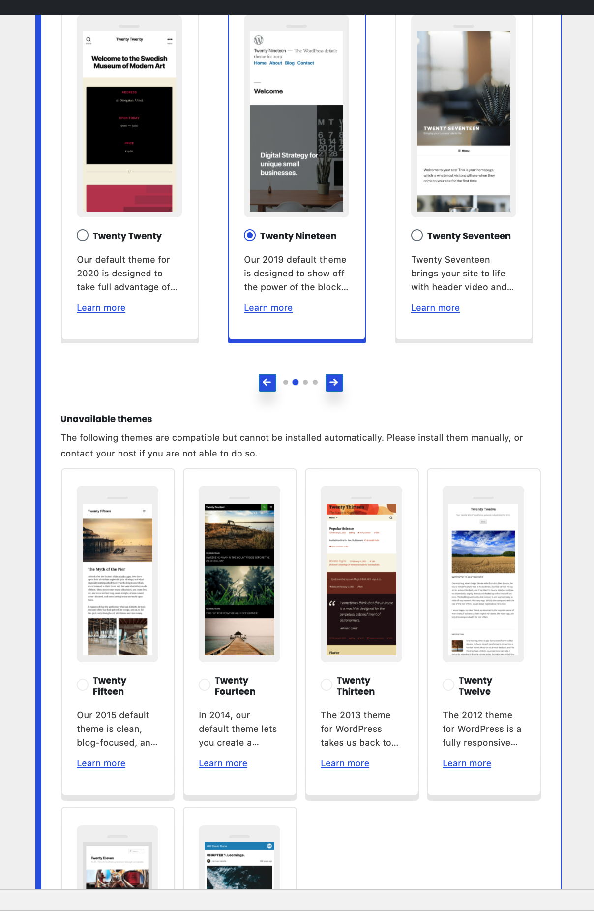
johnwatkins0
on 21 Jul 2020
Humm. Good question. What if the unavailable themes are not shown in a section below… what if the “Unavailable themes” heading and description were put into a notice, and that this notice can contain a checkbox or button to toggle whether the unavailable themes are included in the carousel? The unavailable themes will have radio buttons which are disabled, and perhaps the entire card should have some transparency to make it clear it is not available.
westonruter
on 22 Jul 2020
Here's how I have that looking now (note items with the gray overlay). The toggle is off by default.:
johnwatkins0
on 22 Jul 2020
I think that's pretty good. An idea to make it more clear which themes are unavailable: put some text over the _image_ that says “Unavailable”. This could have an rgba background with 50% opacity or something and rounded corners positioned in the center over the unavailable theme screenshot.
westonruter
on 23 Jul 2020
Related issues
 swissspidy
·
33Comments
swissspidy
·
33Comments
 chvillanuevap
·
26Comments
chvillanuevap
·
26Comments
 spacedmonkey
·
30Comments
spacedmonkey
·
30Comments
 postphotos
·
30Comments
westonruter
·
35Comments
postphotos
·
30Comments
westonruter
·
35Comments