Amp-wp: Tooltips for Compatibility Tool
As a developer user debugging an error in the Compatibility Tool, I should have tooltips that hint at what given columns do to explain what they mean and how I should use that information.
As a user gets stuck or confused, they should have both user-friendly hints and more verbose documentation at what the plugin does, why it's organized this way and how the tool intends to allow them to activate AMP quickly.
- [x] AC1: Based on #1361, #1362, #1363 and #1364 decide which columns need tooltips. Currently the Error by Type, Error by URL and Single screens all have tooltips on the header of the
StatusandDetailcolumns. - [ ] AC2: For each tooltip, write copy and link to relevant URLs on the Plugin product site. (similar to #1401.)
- [ ] AC3: Implement each tooltip (per view, per column) based on what is decided in AC1/AC2.
- [ ] AC4: Re-implement to meet the spec of #1479.
 postphotos
All 30 comments
I've fleshed out the requirements for this story.
postphotos
on 10 Sep 2018
Hey @postphotos , I've been working on #1362 and have gotten to the point I need some content for the tooltips and some clarification about how they should look.
The only way I'm aware of to make tooltips in core WP is to use admin pointers. It'd look like this:

How does that look? It opens when the user hovers over the "?" icon and closes when they click the dismiss link at the bottom.
 jacobschweitzer
on 11 Sep 2018
jacobschweitzer
on 11 Sep 2018
Thanks for sharing your thoughts/WIP @jacobschweitzer!
While it does vary from the mocks that @jillchu had presented at an earlier state, I'm OK with this as it matches the design styles of the pointer from #1254, especially if it's leveraging a WP Core design pattern and if may be less engineering effort to complete.
@jwold - are you OK with this for a "tooltip" style?
postphotos
on 11 Sep 2018
@jacobschweitzer using this tooltip you mentioned should be perfect. Thank you! cc @postphotos
 jwold
on 11 Sep 2018
jwold
on 11 Sep 2018
Moving this to code review, @kienstra and @westonruter. The PR is #1448. Thanks!
 johnwatkins0
on 20 Sep 2018
johnwatkins0
on 20 Sep 2018
Tooltip text needs to still be finalized.
 westonruter
on 22 Sep 2018
westonruter
on 22 Sep 2018
Minor Styling Issue
The triangle of the 'tooltip' now points to the right of the ?, but ideally, it should point to the ?:

This looks to be the case wherever the tooltips are used:
- Invalid URLs page
- AMP Validation Error Index
- Single Error URL page (#1365)
Please move the entire admin pointer to the left.
 kienstra
on 24 Sep 2018
kienstra
on 24 Sep 2018
@afercia @rianrietveld - what is the WP core approach for accessible tooltips? I don't recall seeing any other plugins using the admin pointers for this?
 GaryJones
on 24 Sep 2018
GaryJones
on 24 Sep 2018
Good question, @GaryJones!
kienstra
on 25 Sep 2018
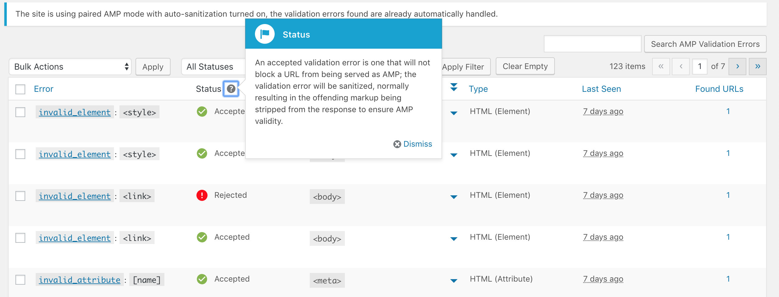
Current 'Tooltip' Copy
As @westonruter mentioned, the tooltip copy still needs to be determined.
Here's the current copy:
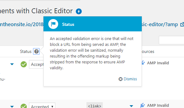
Status
An accepted validation error is one that will not block a URL from being served as AMP; the validation error will be sanitized, normally resulting in the offending markup being stripped from the response to ensure AMP validity.

Details
The 'tooltip' for Details is only a placeholder, and still needs copy.
kienstra
on 25 Sep 2018
@GaryJones the legacy core "pointers" aren't accessible. They've been discussed a few times in the last years and their usage generally discouraged. Reading in the comments above:
It opens when the user hovers over the "?" icon
how about keyboard users? how about communicating to users the "?" icon opens a sort of modal? I'd rather look at the popover implementation in Gutenberg, where a toggle button with a proper aria-label and visible button tooltip opens a floating panel that behaves like sort of a modal.
 afercia
on 25 Sep 2018
afercia
on 25 Sep 2018
Possible 'Tooltip' Text
Status
"Rejected" and "New Rejected" will block the URL from being AMP, when in Paired mode, with "Automatically accept sanitization" unchecked
Details
The parent element of where the error occurred
kienstra
on 25 Sep 2018
These tooltips are finicky when positioning them. I've got it centered but in a different position.
How does this look @postphotos @jwold ?
jacobschweitzer
on 26 Sep 2018
@jacobschweitzer that looks like it should work from a positioning perspective. Thank you!
@afercia are you thinking it'd make more sense to use a popup like this?
jwold
on 26 Sep 2018
@jwold yes, that used to be called popover in Gutenberg :)
afercia
on 26 Sep 2018
Ok I've applied the position change to the tooltips in PR #1472 . @westonruter It is a very small change, could you take a quick look?
jacobschweitzer
on 27 Sep 2018
Request For Testing
Hi @csossi,
Could you please test this on:
Every ? icon should have a 'tooltip':
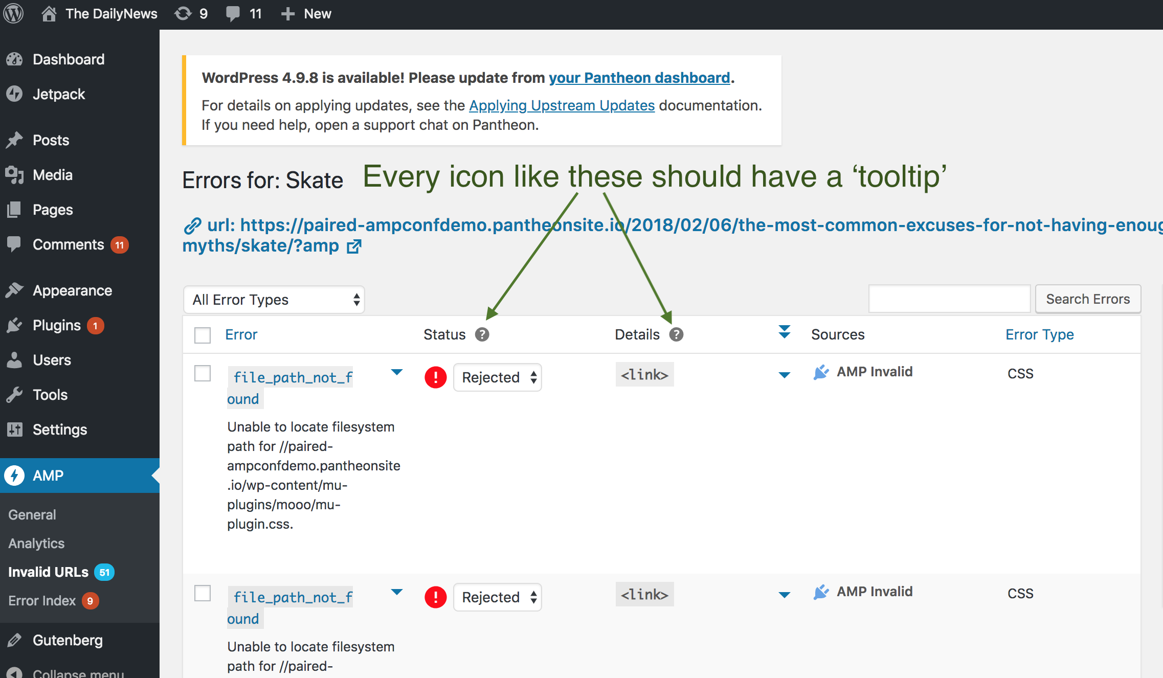
And these 'tooltips' should now appear to the right of the icon.
The copy is still being considered, though.
kienstra
on 27 Sep 2018
Tooltip Copy
Hi @jwold,
Happy birthday!
Could you please help with the copy for the 'Status' and 'Details' tooltips?
Here's some possible copy.
Thanks, and no need to do this today 😄
kienstra
on 28 Sep 2018
QA review: all tooltip popups appear onClick. Needs re-checking after copy finalized
 csossi
on 30 Sep 2018
csossi
on 30 Sep 2018
The work seems to be progressing on using the legacy pointers. Did the fact they are not accessible, and discouraged, get ignored? That they may not support keyboard-only users, or tell screen-reader users what the behaviour is?
https://github.com/Automattic/amp-wp/issues/1400#issuecomment-424232988
GaryJones
on 30 Sep 2018
@GaryJones Yes, I believe the goal is to switch to using the Gutenberg popovers as soon as possible.
westonruter
on 30 Sep 2018
Opened #1479 to switch pointers to popovers.
westonruter
on 1 Oct 2018
Request For Testing
Hi @csossi,
Could you please test the updated tooltip copy on this staging site?
Thanks!
kienstra
on 4 Oct 2018
@kienstra
Followup up on feedback from @afercia I'd like to propose a design change to all the tooltips in the AMP Plugin, using popover as the base for the tooltips, similar to how Gutenberg now does this.

It appears we can still do bold text, even increase font sizes (for inline headers, just not in blue backgrounds), and a "x" for dismiss.
Here's an example of changes we could make to the AMP Plugin tooltips to be more in line with the design style of the popovers from Gutenberg.

My guess is that we could take more liberties in the style and design of these updated popovers to be more eye catching, but for now we should probably stick to what's been done in Gutenberg.
cc @postphotos
jwold
on 9 Oct 2018
Updated to add AC4 (see #1479).
postphotos
on 13 Oct 2018
Question About AC4
Hi @postphotos,
What do you think about removing AC4 (Re-implement to meet the spec of #1479)? Issue #1479 is on the v1.1 project.
Thanks, Leo!
kienstra
on 22 Oct 2018
Status
This issue is awaiting the product site to be able to link to it in the copy (AC2, AC3). There's no action needed now.
kienstra
on 22 Oct 2018
Moving Into To Do
As there is no action needed now, I'm moving this into 'To Do.'
When the product site has the URL ready, I'll add it to the tooltip, and request QA from @csossi.
kienstra
on 24 Oct 2018
Moving To 1.1 Project
PR #1670 was the only remaining task for this issue planned for the 1.0 release.
But the links in it aren't to a live site, so I'm moving this issue out of the 1.0 project.
kienstra
on 30 Nov 2018
This should be tackled with #2316.
westonruter
on 14 May 2019
Related issues
westonruter
·
3Comments
westonruter
·
4Comments
 miina
·
5Comments
miina
·
5Comments
 swissspidy
·
4Comments
miina
·
5Comments
swissspidy
·
4Comments
miina
·
5Comments
Most helpful comment
@GaryJones the legacy core "pointers" aren't accessible. They've been discussed a few times in the last years and their usage generally discouraged. Reading in the comments above:
how about keyboard users? how about communicating to users the "?" icon opens a sort of modal? I'd rather look at the
popoverimplementation in Gutenberg, where a toggle button with a proper aria-label and visible button tooltip opens a floating panel that behaves like sort of a modal.