Altair: Tooltips not showing up in chart
I have been puzzling over this for awhile. I have developed a small reproducible example but I still have been unable to uncover the issue.
Here is the reproducible example:
data = {'week_ending': ['2020-03-22', '2020-03-08', '2020-03-15',
                       '2020-03-22', '2020-03-08', '2020-03-15',
                       '2020-03-22', '2020-03-08', '2020-03-15',
                       '2020-03-22', '2020-03-08', '2020-03-15',
                       '2020-03-22', '2020-03-08', '2020-03-15',
                       '2020-03-22', '2020-03-08', '2020-03-15',
                       '2020-03-22', '2020-03-08', '2020-03-15',
                       '2020-03-22', '2020-03-08', '2020-03-15'],
       'impact_event': ['a', 'b', 'c',
                       'b', 'c', 'a',
                       'c', 'a', 'b',
                       'a', 'b', 'c',
                       'b', 'c', 'a',
                       'c', 'a', 'b',
                       'a', 'b', 'c',
                       'a', 'b', 'c'],
       'impact_level': [1, 4, 9,
                       2, 7, 2,
                       3, 9, 4,
                       1, 7, 9,
                       2, 7, 2,
                       3, 2, 4,
                       1, 4, 9,
                       1, 4, 9,],
       'typeof': ['g1', 'g1', 'g1',
                 'g1', 'g1', 'g1',
                 'g1', 'g1', 'g1',
                 'g1', 'g1', 'g1',
                 'g1', 'g1', 'g1',
                 'g1', 'g1', 'g1',
                 'g1', 'g1', 'g1',
                 'g2', 'g2', 'g2',]}

df = pd.DataFrame(data)


df['agg_value'] = df.groupby(['week_ending', 'impact_event', 'typeof']).transform('sum')
df['cum_num'] = df.groupby(['week_ending', 'impact_event', 'typeof']).cumcount()

# Generate the Chart

selector = alt.selection_single(empty='none',
                                fields=['week_ending', 'impact_event', 'typeof'])
base_data = alt.Chart(df)

base = base_data.mark_rect(color='green', opacity=.2).encode(
    x='week_ending:O',
    y='impact_event:O'
).transform_filter('datum.cum_num==0')

textof = base_data.mark_text(color='white').encode(
    x='week_ending:O',
    y='impact_event:O',
    text='agg_value:Q')

detail_breakout = base_data.mark_circle(color='orange', size=250, opacity=.3).encode(
    x='impact_level:N',
    y='impact_level:N',
    tooltip=['impact_level', 'agg_value']).transform_filter(selector)

alt.vconcat(detail_breakout, alt.layer(base.add_selection(selector), textof).facet(row=alt.Row('typeof:O')))
To make sense of the data structure look at it this way:
df.sort_values(['week_ending', 'impact_event', 'typeof'])
Upon execution it looks like this:
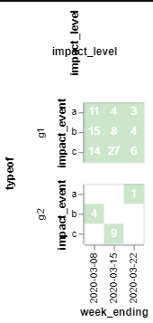
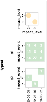
Click on the top left cell (I have left out coloring rules to keep the example as simple as possible), where the value is 11 and the chart will look like this:
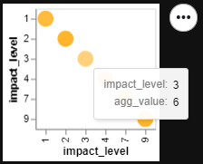
The issue is when I hover over the yellow circles, I am not getting the tool tips.
Generating that top chart on its own gives me the tool tips, but when it is all put together, I am not getting them.
For example:
base_data.mark_circle(color='orange', size=250, opacity=.3).encode(
    x='impact_level:N',
    y='impact_level:N',
    tooltip=['impact_level', 'agg_value'])
Produces:
 afonit
All 2 comments
Thanks for the report. This is a known vega-lite bug: https://github.com/vega/vega-lite/issues/6003
Here's a more concise reproduction of the issue:
import altair as alt
data = {'values': [{'x': 1}]}
chart = alt.Chart(data).mark_rect(tooltip=True).encode(x='x:O')
chart | chart.add_selection(alt.selection_single())
You can work around this by adding a dummy selection to the chart on which you want the tooltips to show up. In your example, you would add this line:
detail_breakout = detail_breakout.add_selection(alt.selection_single())
 jakevdp
on 10 Mar 2020
jakevdp
on 10 Mar 2020
Thanks for the report. This is a known vega-lite bug: vega/vega-lite#6003
Here's a more concise reproduction of the issue:
import altair as alt
data = {'values': [{'x': 1}]}
chart = alt.Chart(data).mark_rect(tooltip=True).encode(x='x:O')
chart | chart.add_selection(alt.selection_single())
You can work around this by adding a dummy selection to the chart on which you want the tooltips to show up. In your example, you would add this line:
detail_breakout = detail_breakout.add_selection(alt.selection_single())
Thanks a lot! This is what I am searching for my same problem.
 SangHuynh24
on 9 Jul 2020
SangHuynh24
on 9 Jul 2020
Related issues
 firasm
·
3Comments
firasm
·
3Comments
 zanarmstrong
·
4Comments
zanarmstrong
·
4Comments
 HalukaMB
·
3Comments
HalukaMB
·
3Comments
 DentonGentry
·
3Comments
DentonGentry
·
3Comments
 nielsmde
·
4Comments
nielsmde
·
4Comments
Most helpful comment
Thanks for the report. This is a known vega-lite bug: https://github.com/vega/vega-lite/issues/6003
Here's a more concise reproduction of the issue:
You can work around this by adding a dummy selection to the chart on which you want the tooltips to show up. In your example, you would add this line: