First of all, thanks for this fantastic library! I've only recently started using it and I like it much more than other tools I've used so far.
In the Line Chart with Points example, is it possible to move the x-axis to the zero of the y-axis? And if yes, how? I've searched in the docs, but I can't find any hints. Thanks in advance!
 robertodr
All 5 comments
Hi there,
Are asking how to adjust the axis limits?
If so, would this work for you?
import altair as alt
import numpy as np
import pandas as pd
x = np.arange(100)
source = pd.DataFrame({
'x': x,
'f(x)': np.sin(x / 5)
})
alt.Chart(source).mark_line(point=True, clip=True).encode(
x='x',
y=alt.Y('f(x)', scale=alt.Scale(domain=[0, 1]))
)
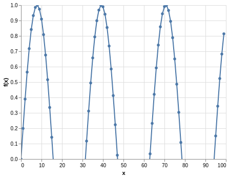
If this is what you are looking for, you can find more information here in the docs
 Alcampopiano
on 28 May 2019
Alcampopiano
on 28 May 2019
Not quite. I want to keep the y < 0 plot (grid, line, points), but have the x axis in the position your plot shows.
import altair as alt
import numpy as np
import pandas as pd
x = np.arange(100)
source = pd.DataFrame({
'x': x,
'f(x)': np.sin(x / 5)
})
line = alt.Chart().mark_line(point=True).encode(
x='x',
y='f(x)', #alt.Y('f(x)', scale=alt.Scale(domain=[0, 1]))
)
hline = alt.Chart().mark_rule().encode(y='a:Q')
alt.layer(line, hline, data=source).transform_calculate(a="0")
This one gets the a line there, but the actual x axis stays at the bottom.

robertodr
on 28 May 2019
Hmm, good question. You could try something like this:
import altair as alt
import numpy as np
import pandas as pd
x = np.arange(100)
source = pd.DataFrame({
'x': x,
'f(x)': np.sin(x / 5)
})
alt.Chart(source).mark_line(point=True).encode(
x='x',
y='f(x)'
).configure_axisX(labelPadding=-150)

Perhaps there is something else that might help in the axis config section of the docs
Alcampopiano
on 28 May 2019
A better way of doing this is with the axis offset property:
import altair as alt
import numpy as np
import pandas as pd

x = np.arange(100)
source = pd.DataFrame({
  'x': x,
  'f(x)': np.sin(x / 5)
})

alt.Chart(source).mark_line(point=True).encode(
    x=alt.X('x', axis=alt.Axis(offset=-150)),
    y='f(x)'
)

 jakevdp
on 29 May 2019
jakevdp
on 29 May 2019
Fantastic, thanks! Closing.
robertodr
on 29 May 2019
Related issues
 dyuval
·
34Comments
dyuval
·
34Comments
 lzamparo
·
39Comments
lzamparo
·
39Comments
 HalukaMB
·
31Comments
HalukaMB
·
31Comments
 pagpires
·
21Comments
jakevdp
·
48Comments
pagpires
·
21Comments
jakevdp
·
48Comments
Most helpful comment
A better way of doing this is with the axis
offsetproperty: