_(Code provided at the bottom)_
Consider the results of two experiments
|Trial A | Trial B|
|------|---------|
| 0.397371 | -0.600645|
| -0.110611 | -1.075366|
| 0.518151 | -1.940370|
| 1.218424 | -2.646937|
| -0.187323| -1.301777|
After tidying up the data I create a plot of overlapping histograms.
Under the plot of the overlapping histograms I would like to include a bar representing the amount of overlap. I would also like the graphic to include an interval selection linking the two.
I am unsure how to do this.
Thanks for any advice.
-Eitan
import pandas as pd
import altair as alt
import numpy as np
np.random.seed(42)

# Generating Data
source = pd.DataFrame({'Trial A': np.random.normal(0, 0.8, 1000),
                   'Trial B': np.random.normal(-2, 1, 1000)})

interval = alt.selection_interval(encodings=['x'])

# Tidying Data
source = pd.melt(
    source,
    id_vars=source.index.name,
    value_vars=source.columns,
    var_name='Experiment',
    value_name='Measurement'
)

# Overlapping Histograms
hist = alt.Chart(source).mark_area(
    opacity=0.3,
    interpolate='step'
).encode(
    alt.X('Measurement', bin=alt.Bin(maxbins=100)),
    alt.Y('count()', stack=None),
    alt.Color('Experiment')
).add_selection(interval)

# Amount of overlap (???)
bar = alt.Chart(source).mark_bar().encode(
    x = alt.X('count()', scale=alt.Scale(domain=(0, 2100)))
).transform_filter(interval)

hist & bar

 eitanlees
All 6 comments
What do you mean by "amount of overlap"? Do you mean the integral of the product of the two histograms? Or something different?
 jakevdp
on 11 Feb 2019
jakevdp
on 11 Feb 2019
(full disclosure, I am asking this question for a friend, so I don't know the full context)
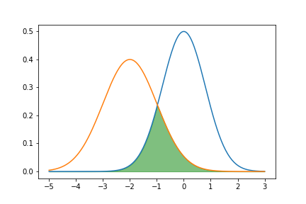
hmmm, I guess I would describe it as an integral over the minimum of the two histograms.
With PDF's it would look something like this
import numpy as np
from scipy import stats
import matplotlib.pyplot as plt

n1 = stats.norm(0, 0.8)

n2 = stats.norm(-2, 1)

x = np.linspace(-5, 3, 200)

plt.plot(x, n1.pdf(x))
plt.plot(x, n2.pdf(x))
plt.fill_between(x, np.min(np.vstack((n1.pdf(x), n2.pdf(x))), axis=0),
                 color='green', alpha=0.5)
eitanlees
on 11 Feb 2019
Long-belated reply, but here's how you can calculate the overlap (the sum of the minimum count in each bin) using transforms:
import pandas as pd
import altair as alt
import numpy as np
np.random.seed(42)

# Generating Data
source = pd.DataFrame({'Trial A': np.random.normal(0, 0.8, 1000),
                   'Trial B': np.random.normal(-2, 1, 1000)})


base = alt.Chart(source).transform_fold(
    ['Trial A', 'Trial B'],
    ['Experiment', 'Measurement']
).transform_bin(
    field='Measurement',
    bin=alt.Bin(maxbins=50),
    as_=['Measurement_min', 'Measurement_max']
).transform_aggregate(
    count='count()',
    groupby=['Measurement_min', 'Measurement_max', 'Experiment']
)

hist = base.mark_area(
    opacity=0.3,
    interpolate='step'
).encode(
    x=alt.X('Measurement_min:Q', bin='binned'),
    x2='Measurement_max:Q',
    y=alt.Y('count:Q', stack=None),
    color='Experiment:N'
)

overlap = base.transform_impute(
    impute='count',
    key='Measurement_min',
    value=0,
    groupby=['Experiment']
).transform_aggregate(
    overlap='min(count)',
    groupby=['Measurement_min']
).mark_bar().encode(
    x='sum(overlap):Q'
)

hist & overlap

jakevdp
on 24 Nov 2019
Here's the same with an interval selection to choose which points to include:
import pandas as pd
import altair as alt
import numpy as np
np.random.seed(42)

# Generating Data
source = pd.DataFrame({'Trial A': np.random.normal(0, 0.8, 1000),
                   'Trial B': np.random.normal(-2, 1, 1000)})

interval = alt.selection_interval()

scatter = alt.Chart(source).mark_point().encode(
    x='Trial A',
    y='Trial B',
    color=alt.condition(interval, alt.value('steelblue'), alt.value('lightgray'))
).add_selection(
    interval
)

base = alt.Chart(source).transform_fold(
    ['Trial A', 'Trial B'],
    ['Experiment', 'Measurement']
).transform_filter(
    interval
).transform_bin(
    field='Measurement',
    bin=alt.Bin(maxbins=50),
    as_=['Measurement_min', 'Measurement_max']
).transform_aggregate(
    count='count()',
    groupby=['Measurement_min', 'Measurement_max', 'Experiment']
)

hist = base.mark_area(
    opacity=0.3,
    interpolate='step'
).encode(
    x=alt.X('Measurement_min:Q', bin='binned'),
    x2='Measurement_max:Q',
    y=alt.Y('count:Q', stack=None),
    color='Experiment:N'
)

overlap = base.transform_impute(
    impute='count',
    key='Measurement_min',
    value=0,
    groupby=['Experiment']
).transform_aggregate(
    overlap='min(count)',
    groupby=['Measurement_min']
).mark_bar().encode(
    x='sum(overlap):Q'
)

scatter | (hist & overlap)
Very cool! Thanks for the response. I need to practice my transformations.
eitanlees
on 25 Nov 2019
Yeah, TBH I probably couldn't have answered this when you first asked it, but creating the http://github.com/altair-viz/altair-transform package has given me more practice with thinking in terms of Vega-Lite transforms...
jakevdp
on 25 Nov 2019
Related issues
 mroswell
·
21Comments
mroswell
·
54Comments
jakevdp
·
24Comments
mroswell
·
21Comments
mroswell
·
54Comments
jakevdp
·
24Comments
 dyuval
·
34Comments
dyuval
·
34Comments
 HalukaMB
·
31Comments
HalukaMB
·
31Comments