Altair: Stack bar graph - issues with x axis range
Hello
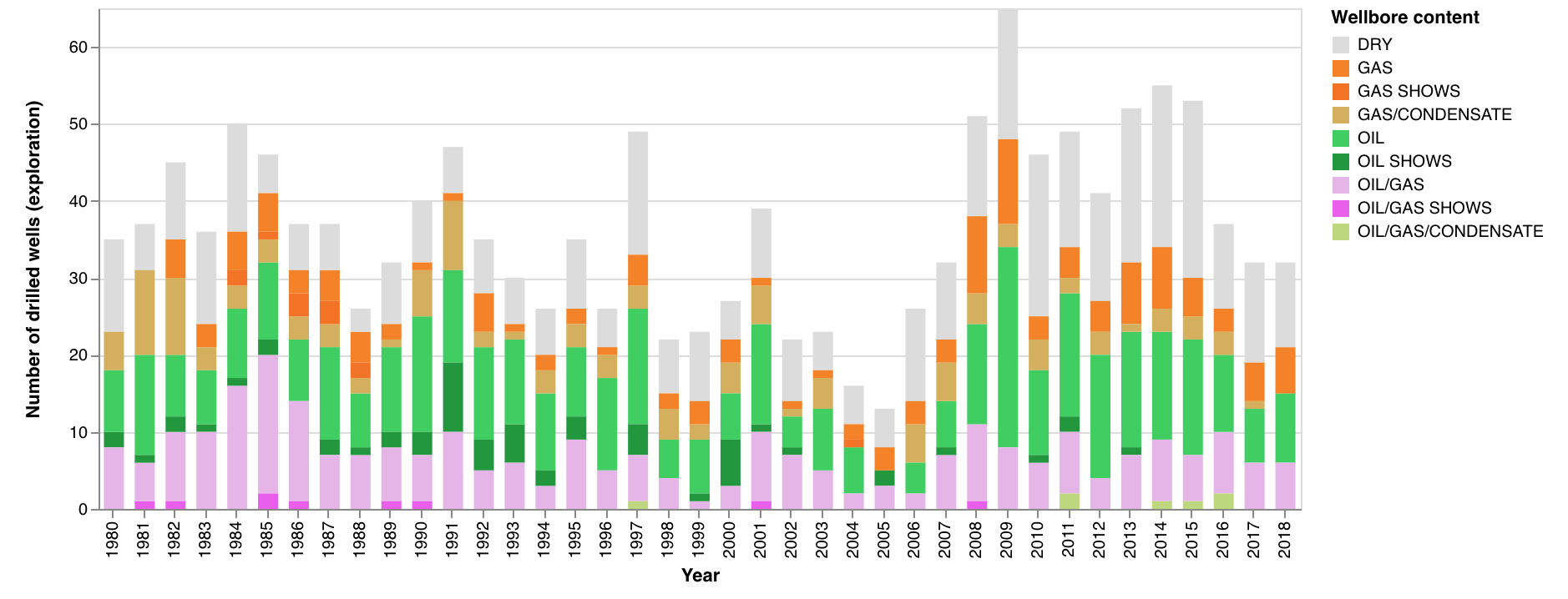
I am using a stack bar chart and I am observing some strange behaviour. I must say that I started with Altair yesterday. I am using Jupyter notebook, Python 3.
Ok one chart looks just how it should. The years which are shown match my dataframe, and the labels on the x axis (years) looks right.

Ok, then I created a new dataframe, selecting years between 1980 to 2018. I display it the same way as the one above. No matter what I do, the years labels on the x axis are overshooting, and it does not look nice. Plus the labels are skipping, and suddenly they are turned the wrong way and show a comma to separate the thousands.

Here the csv file with the data which is in my dataframe for the second bar graph:
wells_all_explo_extract_col_1980_2018.txt
I have been fidgeting hours trying to find out what is happening, re designing the graph in a clean jupyter notebook, etc.
Could you please help me with that?
Let me know if you need more info,
Many thanks in advance,
Cheers
Anne
 AnneEstoppey
All 6 comments
Hi Anne,
Try adding the N so that Altair interprets your year column as a nominal variable:
x='wlbEntryYear:N'
More information on data types and how they interact with colors and scales can be found here
 Alcampopiano
on 20 Nov 2018
Alcampopiano
on 20 Nov 2018
Ahhh thanks a lot, it was just that!
Ok, I am glad I mentioned that I started with Altair only yesterday...
I saw these letters (':O', ':P', etc), but I didn't find mention about it in the altair documentation.
Do you have a link where these letters are explained?
Grazie mille :-)
Cheers
Anne
AnneEstoppey
on 20 Nov 2018
Prego! The link to the documentation is in my initial reply.
Alcampopiano
on 20 Nov 2018
Hi Anne,
Encoding data types are discussed in the documentation at https://altair-viz.github.io/user_guide/encoding.html#encoding-data-types
Encoding types are perhaps a bit counterintuitive if you're used to a more imperative approach to visualization. If you want to hear more about the philosophy behind it, I'd recommend the PyCon tutorial from last year: https://www.youtube.com/watch?v=ms29ZPUKxbU
 jakevdp
on 20 Nov 2018
jakevdp
on 20 Nov 2018
Thanks Jake,
That's very helpful. Well I guess if I would use ':T' for my well entry date, I would have to have it defined as a date (or time?) in my pandas dataframe?
Aha, yes I saw this vid on the pycon 2018 youtube channel, but haven't watched it yet, so I know what I have to do, and it's you talking, that's cool :-)
Fantastic, a lot of progress done since yesterday!
Cheers from Norway
Anne
AnneEstoppey
on 20 Nov 2018
I guess if I would use ':T' for my well entry date, I would have to have it defined as a date (or time?) in my pandas dataframe?
Sort of. When you use a temporal encoding (what :T is a shorthand for) you are telling Altair to interpret your input as a date. Because Altair data is encoded in JSON, and JSON has no native date format, all dates are encoded as strings... and so Pandas datetime columns will be serialized as strings when they are passed to the Altair chart.
jakevdp
on 20 Nov 2018
Related issues
 Hisham-Hussein
·
29Comments
Hisham-Hussein
·
29Comments
 wmayner
·
22Comments
wmayner
·
22Comments
 XaviFar
·
19Comments
XaviFar
·
19Comments
 mattijn
·
23Comments
jakevdp
·
34Comments
mattijn
·
23Comments
jakevdp
·
34Comments