Altair: How do I plot multiple columns of a dataframe on the same Chart?
I want to plot multiple lines on the same Chart, but I can't figure out how to do it without making multiple Charts and layering them.
For example:
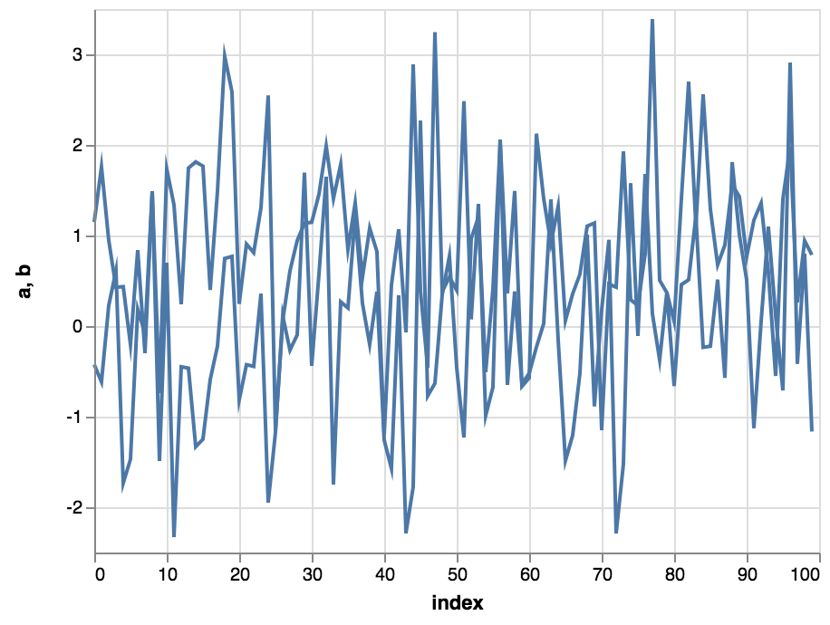
df = pd.DataFrame({"a": np.random.randn(100), "b": np.random.randn(100)+1, "index": np.arange(100)})

alt.Chart(df).mark_line().encode(
    x: "index",
    y: # What do I put here to plot multiple columns
)
It appears in the examples that the way to do this is with a whole bunch of pivoting and unstacking. (though this isn't explicitly mentioned anywhere in the examples, because all the dataframe structure is hidden behind an import...):
df = pd.DataFrame({"a": np.random.randn(100), "b": np.random.randn(100)+1}, index= np.arange(100)).unstack().reset_index()
df.columns = ['color','index','value']

alt.Chart(df).mark_line().encode(
    x= "index",
    y= "value",
    color='color')
But this is really ugly and requires restructuring the DataFrame to fit the plotting task...
Is there a way to do this without the whole unstack().reset_index() thing?
 spott
spott
All 2 comments
I think that is conceptual question that described in documentation Long-form vs. Wide-form Data
You can do something like this, but I guess that is not what you expect :)
Or take a look on https://jakevdp.github.io/pdvega/ it is not limited by vega-lite's declarative grammar concept and implements usual pandas.plot interface. But you will lose a beauty and flexibility of vega-lite grammar
~~~python
df = pd.DataFrame({"a": np.random.randn(100), "b": np.random.randn(100)+1, "index": np.arange(100)})
base = alt.Chart().mark_line().encode(x="index")
alt.layer( *[base.encode(y=col) for col in df.columns if col!='index'], data=df)
~~~
 iliatimofeev
on 22 Jul 2018
iliatimofeev
on 22 Jul 2018
We discuss the particulars of Altair's data format here: https://altair-viz.github.io/user_guide/data.html?highlight=wide#long-form-vs-wide-form-data
In short, the only way to plot multiple columns on the same chart is to use layers, as you have found. If you reshape your data (using something like pd.melt, as shown here) then you can use Altair's grammar to plot the groups in the same chart without layering. This is what pdvega does behind the scenes.
Hope that helps
 jakevdp
on 23 Jul 2018
jakevdp
on 23 Jul 2018
Related issues
jakevdp
·
36Comments
 XaviFar
·
19Comments
XaviFar
·
19Comments
 Hisham-Hussein
·
29Comments
jakevdp
·
17Comments
Hisham-Hussein
·
29Comments
jakevdp
·
17Comments
 choldgraf
·
20Comments
choldgraf
·
20Comments
Most helpful comment
We discuss the particulars of Altair's data format here: https://altair-viz.github.io/user_guide/data.html?highlight=wide#long-form-vs-wide-form-data
In short, the only way to plot multiple columns on the same chart is to use layers, as you have found. If you reshape your data (using something like
pd.melt, as shown here) then you can use Altair's grammar to plot the groups in the same chart without layering. This is what pdvega does behind the scenes.Hope that helps