Altair: How do I draw a multiline graph from dataframe columns?
I have a dataframe with multiple columns similar to this one:
import pandas as pd
import altair as alt
df = pd.DataFrame([[x ** 2, x ** 3] for x in range(10)], columns=["squared", "cubed"])
df.index.name = "x"

# print(df)
   squared  cubed
x
0        0      0
1        1      1
2        4      8
3        9     27
4       16     64
5       25    125
6       36    216
7       49    343
8       64    512
9       81    729
How do I plot these columns in the same graph? So far I can only do this:
chart = alt.Chart(df.reset_index()).mark_line().encode(x="x", y="squared").interactive()
How can I add the cubed column to this? What about even more columns?
What I see in the multiline examples are other ways of storing the data by having two columns with one having all values and one telling where they come from.
Also, is there no other way to use the index of the dataframe as the x-axis other than to reset the index and then use it as a normal column?
 tweakimp
All 2 comments
One way to do this is using a layered chart:
base = alt.Chart(df.reset_index()).encode(x='x')

alt.layer(
    base.mark_line(color='blue').encode(y='squared'),
    base.mark_line(color='red').encode(y='cubed')
)

That requires manual specification of colors.
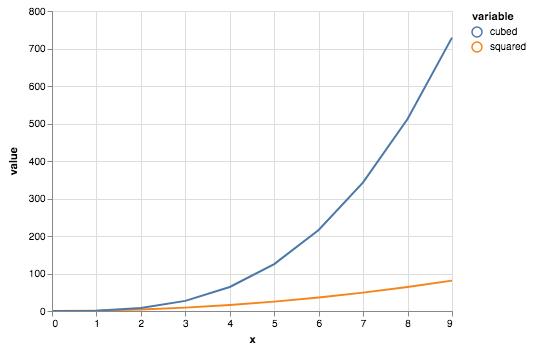
A better way to do this is to reshape the data using pd.melt() to combine the multiple columns into one:
data = df.reset_index().melt('x')
alt.Chart(data).mark_line().encode(
    x='x',
    y='value',
    color='variable'
)
See Long-form vs Wide-form data for more details on the data formats that are best supported by Altair.
 jakevdp
on 26 Jun 2018
jakevdp
on 26 Jun 2018
Thank you for your answer and keep up the good work :)
tweakimp
on 26 Jun 2018
Related issues
 pabloinsente
·
3Comments
pabloinsente
·
3Comments
 fischcheng
·
4Comments
fischcheng
·
4Comments
 DentonGentry
·
3Comments
DentonGentry
·
3Comments
 nielsmde
·
4Comments
nielsmde
·
4Comments
 SuperShinyEyes
·
3Comments
SuperShinyEyes
·
3Comments
Most helpful comment
One way to do this is using a layered chart:
That requires manual specification of colors.
A better way to do this is to reshape the data using
pd.melt()to combine the multiple columns into one:See Long-form vs Wide-form data for more details on the data formats that are best supported by Altair.