UI mockup:
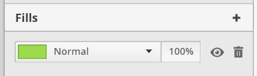
- The fills box appears only if an object has the ability to edit this attribute (fill, background color, whatever it's called). Eg. Shape and image layers can have a fill attribute, text and group layers can't.
- Create the possibility to have multiple fills by clicking on the
+icon. - Each fill row can independently control its color, blending mode, and opacity.
- For v1, implement the most common blending modes: Normal, Multiply, Overlay, Soft Light, Hard Light, Lighten, Darken, Screen, Difference, Luminosity, Hue.
 Alecaddd
All 10 comments
Fills box and border box #92 could be used to define the default properties for shapes before added. That means one fills box and one border box are always shown and have a default value that change when you selected an item.
Makes sense? any drawbacks?
 albfan
on 6 Mar 2019
albfan
on 6 Mar 2019
I wouldn't recommend it as it could create some confusion and it adds a layer of complexity in the user experience.
If Fills and Borders options appear only when a shape that has those attributes is selected, the user will know that editing those values will affect an existing shape.
If we leave those options always visible, the user might get confused in thinking a shape is selected, or maybe he thinks he's editing the default values to edit a new shape, but he had a shape pre-selected, and he's accidentally modifying those attributes, or even vice-versa.
I experienced this issue in Affinity Designer, where this behaviour caused me some confusion.
Alecaddd
on 7 Mar 2019
fair enough, let's find how to add shapes in any other way
albfan
on 7 Mar 2019
Hi all!
I'm currently working on this PR, I think it might be good to share my progress there.
I also need some feedback and maybe get some help regarding some design issues.
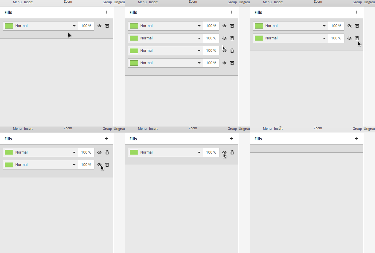
Right now I've created a model-view based widget, in which there is a ListModel entity which holds the Fills array and a repeater widget which is in charge of displaying the content of the Fill item.
With this model based approach it is possibile to make every change right on the data and not on the view. Whenever a change in the list is triggered (element added, removed or modified) the view changes accordingly without any manual redraw.
At the moment it is possibile to add, remove and toggle visibility of single items.
Here a screencast of the panel in action:
I need some clarifications in order to proceed:
- How is the colorpicker supposed to work? I think that a solution like @Philip-Scott Spice-Up color picker might be the right choice. I think we can actually take the entire widget and use it in Akira.
- How is the blending mode supposed to work? Will a popover list of possibile blending modes that is triggered by either the arrow button or the entry click fit with the design?
- How is the opacity chooser supposed to work? Whitout much fantasy, I think that a popover solution with a slider triggered by click on the opacity entry would work fine.
It would be extremely useful to have a mockup to follow, the only sad thing about that is that we need to rely on external tools instead of using Akira for design atm :)
Another question, related to colors: are the one provided in the screencast right? I think that in the mockup there are more gradients, but I don't know what colors/shades to use in order to make the UI to comply with both dark and light theme, so any help would be very appreciated :)
I will be working hard on this and, as soon as this part is finished, I'll be doing the same for the Borders Panel!
 giacomoalbe
on 2 Apr 2019
giacomoalbe
on 2 Apr 2019
@giacomoalbe
Thanks for working on this.
I'm currently working on this PR, I think it might be good to share my progress there.
GitHub released a new feature called Draft PR, you can maybe use it.
How is the colorpicker supposed to work? I think that a solution like @Philip-Scott Spice-Up color picker might be the right choice. I think we can actually take the entire widget and use it in Akira.
Yes! Steal it!!! :smile:
The color picker should be triggered by clicking on the colored square, while the dropdown should list blending modes. It might be worth exploring the possibility to visually separate the colored square from the dropdown selector with in the same way the opacity entry is separated.
How is the blending mode supposed to work? Will a popover list of possible blending modes that is triggered by either the arrow button or the entry click fit with the design?
A simple dropdown triggered by a click on the entire area, not just the arrow. So the clickable area goes from the beginning of the text "Normal" and the arrow.
How is the opacity chooser supposed to work? Without much fantasy, I think that a popover solution with a slider triggered by click on the opacity entry would work fine.
I love the popover approach, but we should also allow users to manually write the value. Maybe adding another chevron to the right of the opacity entry to allow opening the popover?
It would be extremely useful to have a mockup to follow, the only sad thing about that is that we need to rely on external tools instead of using Akira for design atm :)
I will try to design something quickly tomorrow if what I wrote is not clear.
I don't know what colors/shades to use in order to make the UI to comply with both dark and light theme, so any help would be very appreciated :)
Check the artboard.css file and take a look at how we're handling the background and text color of the layers panel. Example:
background-color: shade (@bg_color, 1);
color: @fg_color;
@bg_color and @fg_color are variables available from the distribution's stylesheet. The shade is one of the various available methods of GTK css to create variations.
Take a look at this link to see the various options: https://developer.gnome.org/gtk3/stable/chap-css-overview.html
Alecaddd
on 3 Apr 2019
@giacomoalbe Feel free to open a WIP PR, I miss this to interact with backgrounds and borders (see #92) and provide an almost full interactive akira experience.
I can connect objects and properties to see this in action.
albfan
on 3 Apr 2019
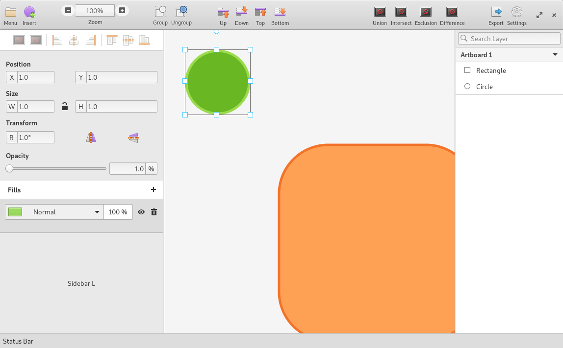
hmm, maybe https://github.com/giacomoalbe/Akira/tree/new-fills-box? Will try to connect objects with this (so your work finally gets merged.
albfan
on 7 Apr 2019
It seems so! :wink:
albfan
on 7 Apr 2019
Yes, that's the branch I'm currently working on for the fills box!
I think I'll be finishing this today, I miss just the color-picker part.
Regarding the connect signals phase, at the moment (as I previousely written in this thread) the fills area is modeled using a list of fills that trigger a signal whenever something change (add, edit, delete).
This way, it is possibile to store the properties of the object in a structured way and when one gets selected the fills box can simply copy the "fills" section of the object's structure and update the list accordingly. Very nice :)
At the moment, the green background is hardcoded since it's the default, it is not linked with the shape created by the canvas.
I think that we can attach to this signal (the update_fills) to correctly recalculate the fill of the selected object.
So you can already connect your login to this signal and I can implement the rest without having to worry about conflicts or API change. Pretty neat :)
giacomoalbe
on 7 Apr 2019
Closed by #139
Alecaddd
on 12 May 2019
Related issues
Alecaddd
·
6Comments
Alecaddd
·
3Comments
 piiskop
·
6Comments
piiskop
·
6Comments
 e200
·
4Comments
e200
·
4Comments
 isneezy
·
5Comments
isneezy
·
5Comments
Most helpful comment
It seems so! :wink: