Adaptivecards: [ReactNative-iOS]Adaptive Card within a bubble stretching indefinitely
Platform
- iOS
Version of SDK
React Native v. 0.60
RN AdaptiveCard v 2.0.1
RN Gifted Chat v. 0.9.11 (https://www.npmjs.com/package/react-native-gifted-chat)
Details
While using the AdaptiveCard with a Gifted Chat I am experiencing a problem where the adaptive card within a bubble is stretching vertically indefinitely. Consequently, that is preventing any other bubble to be displayed. I am attaching a gif animation that explains best the issue I am experiencing.

 UncleZen
All 13 comments
@UncleZen , I tried your use case where showing Adaptive Cards as bubble message content in react-native-gifted-chat. I'm able to view all the bubble messages properly and also the message that contain the card occupies only the height required for its content. (Attached screenshot) below
In order to reproduce, can you share the card payload you are using for this ? along with styles(if any) you are applying to adaptive card elements.

 BalajiR
on 5 Apr 2020
BalajiR
on 5 Apr 2020
Thanks for the prompt reply @BalajiR. Please see the payload I am using below:
{
'type': 'AdaptiveCard',
'body': [
{
'type': 'Container',
'items': [
{
'type': 'ActionSet',
'actions': [
{
'type': 'Action.Submit',
'title': 'Button #1',
'data': 'Button #1'
},
{
'type': 'Action.Submit',
'title': 'Button #2',
'data': 'Button #2'
},
{
'type': 'Action.Submit',
'title': 'Button #3',
'data': 'Button #3'
}
]
}
]
}
],
'$schema': 'http://adaptivecards.io/schemas/adaptive-card.json',
'version': '1.2'
}
And here is the custom theme config:
{
input: {
borderColor: '#000000',
backgroundColor: '#F5F5F5',
},
button: {
'ios': {
textTransform: 'none',
'borderRadius': 5
},
'android': {
textTransform: 'uppercase'
}
}
}
UncleZen
on 5 Apr 2020
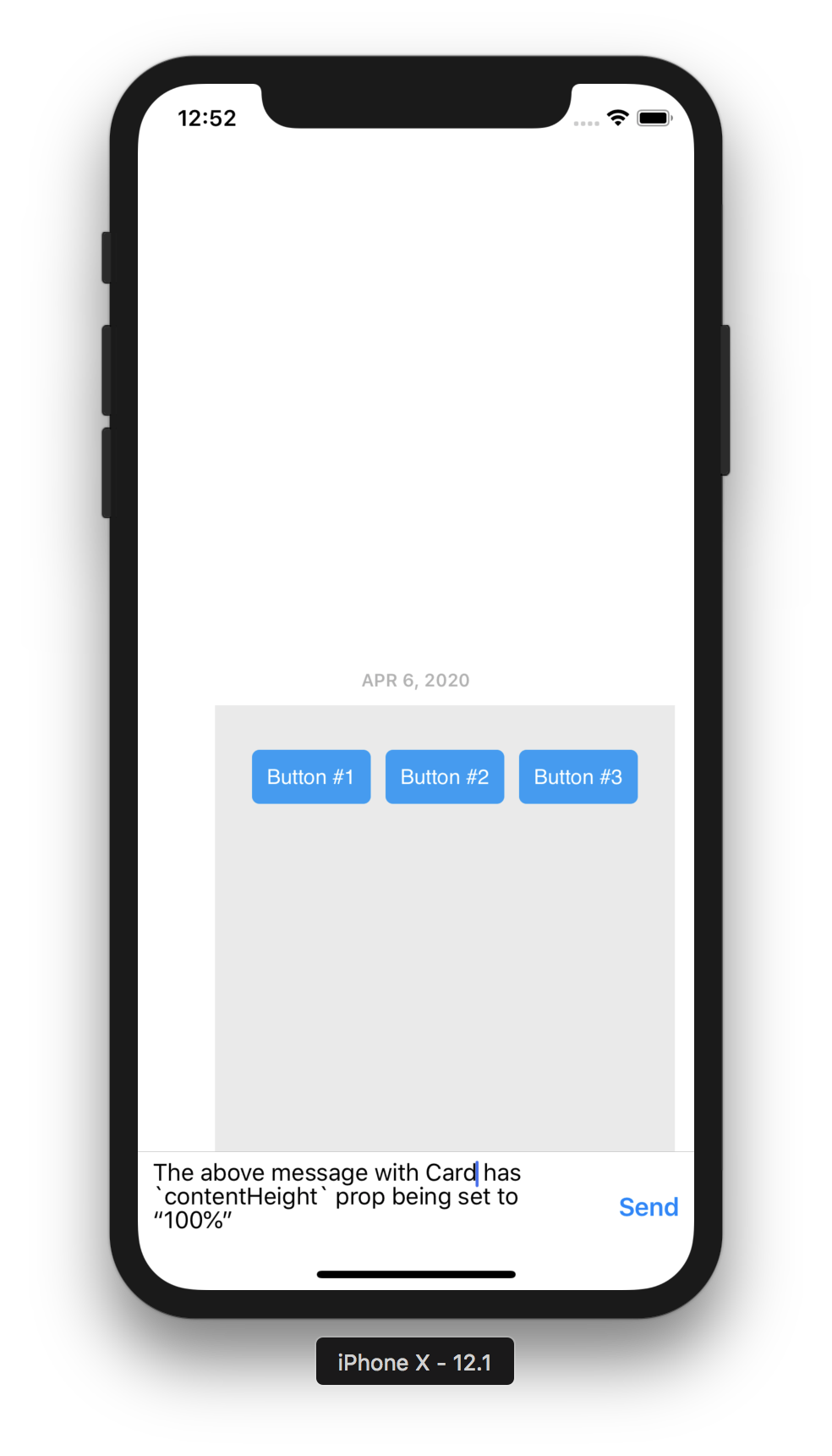
@UncleZen , Thanks for sharing the payload and other details. Tried few combinations along with this payload and I'm not able to reproduce the issue you mentioned except the below scenario.
The only way where I can reproduce your issue is when i use contentHeight prop of <AdaptiveCard/> with the value "100%". This prop is used when we want a fixed height for the card, that too as a fixed number say, 100 or 200 but not in %.
Can you confirm whether the same prop is being used in your case ?
Have attached the screenshots for both working & error case for same payload.
| Working | Height Issue |
| ------------- | ------------- |
| Allowing card to take height based on its content ( which is also default behaviour) | This occurs because of the above said contentHeight prop usage with inappropriate value |
|  |
|  |
|
BalajiR
on 5 Apr 2020
@BalajiR, Thank you very much for your efforts. I can confirm that I am not using the AdaptiveCard's contentHeight prop:
<AdaptiveCard payload={samplePayload} themeConfig={customThemeConfig} onExecuteAction={this.onAdaptiveCardAction} />
I am going to test the AdaptiveCard one more time, but this time around out of the context of the application I am working on. I just want to rule out that this behavior is not caused but the current version of the gifted chat I am using or any of its dependencies.
I'll keep you updated.
Thanks!
Zen
UncleZen
on 5 Apr 2020
@BalajiR, one more quick thing. I was able to avoid stretching, by enclosing the AdaptiveCard in a View or ScrollView element like:
<View style={{maxHeight: 300}}>
<AdaptiveCard payload={samplePayload} themeConfig={customThemeConfig} onExecuteAction={this.onAdaptiveCardAction} />
</View>
Obviously, this would not be an acceptable solution for us, because the adaptive cards will be of different heights as they are quite unique in the number of elements they contain.
Zen
UncleZen
on 5 Apr 2020
@UncleZen , Thanks for quick reply 👍
May i know how your are adding the <AdaptiveCard/> component into the chat message ?
When i tried the examples, i used renderBubble method of gifted chat to customize the content of the bubble with AdaptiveCard.
Issue might be because of any wrapper component from our side OR from gifted chat component itself (not sure though).
Below is the way how i added card to a message.
// message renderer for gifted chat bubble
renderBubble = (props) => {
const isCard = props.currentMessage.isCard;
return (
<View>
{isCard ? (
<AdaptiveCard payload={payload} themeConfig={themeConfig} />
) : (
<Bubble {...props} />
)}
</View>
);
};
@BalajiR, First I used the renderCustomView and then I tried renderMessageText. In both cases the outcome was the same. Very similar to your code:
renderCustomView = (props) => {
const isCard = props.currentMessage.isCard;
if (isCard) {
return (<AdaptiveCard payload={payload} themeConfig={themeConfig} />)
} else {
return null;
}
};
UncleZen
on 5 Apr 2020
@UncleZen,
Issue is because of the <ScrollView/>'s behaviour used inside AdaptiveCard component.
Temp Solution :
When i wrap the card with <View/> with style as {flexBasis: 0}, the card occupies the height based on its content only 👍
This is one way of controlling the card's container layout.
  renderCustomView = (props) => {
    const isCard = props.currentMessage.isCard;
    if (isCard) {
      return (
        // flexBasis as 0 to avoid scrollview issue in <AdaptiveCard/>
        <View style={{ flexBasis: 0 }}>
          <AdaptiveCard payload={payload} themeConfig={themeConfig} />
        </View>
      );
    } else {
      return null;
    }
  };
Proper Solution : (Not yet available as of RN renderer 2.0.1)
Would be nice to control the container level styles of AdaptiveCard from outside as a prop say, containerStyle. so that the developer can control the root level styling of AdaptiveCards.
<AdaptiveCard containerStyle={}/>
*Styles passed via containerStyle prop will be merged with other existing container style of card element.
BalajiR
on 6 Apr 2020
@BalajiR
First off, I'd like to thank you for your efforts in finding the solution to this issue.
I just tested the temp solution you suggested and worked very well. We will adopt this solution in our project until such a time when we can control the root component styles via containerStyle prop.
Thanks again,
Zen
UncleZen
on 6 Apr 2020
We have acknowledged this issue report. Please continue to follow the issue for updates/progress/questions. @matthidinger / @dclaux / @rebeccaanne / @paulcam206 / @nesalang / @almedina-ms FYI.
![msftbot[bot] picture](https://avatars2.githubusercontent.com/in/26612?v=4&s=40) msftbot[bot]
on 6 Apr 2020
msftbot[bot]
on 6 Apr 2020
@BalajiR thanks for engaging on this so promptly! Is this something that you have a PR out for ? What's the next steps for the Proper solution you quote above?
 shalinijoshi19
on 6 Apr 2020
shalinijoshi19
on 6 Apr 2020
@shalinijoshi19,
Yes. As mentioned above, the temp solution is one right way for the developers to control container styles of card element.
Reg PR, the team is currently working on few planned items (listed by @Vasanth-S in the email thread) that target RN renderer release 2.1. This extra style prop requirement is already added to the same list and will be part of 2.1
BalajiR
on 6 Apr 2020
As mentioned above, we have added container styles in release 2.1
 IbrahimSulai
on 4 Jan 2021
IbrahimSulai
on 4 Jan 2021
Related issues
 schemburkar
·
4Comments
schemburkar
·
4Comments
 sadviramana
·
4Comments
sadviramana
·
4Comments
 jyoti-ms
·
6Comments
jyoti-ms
·
6Comments
 andrewleader
·
3Comments
andrewleader
·
3Comments
 rajjagani021
·
4Comments
rajjagani021
·
4Comments
Most helpful comment
@UncleZen,
Issue is because of the
<ScrollView/>'s behaviour used inside AdaptiveCard component.Temp Solution :
When i wrap the card with
<View/>with style as{flexBasis: 0}, the card occupies the height based on its content only 👍This is one way of controlling the card's container layout.
Proper Solution : (Not yet available as of RN renderer 2.0.1)
Would be nice to control the container level styles of AdaptiveCard from outside as a prop say,
containerStyle. so that the developer can control the root level styling of AdaptiveCards.*Styles passed via containerStyle prop will be merged with other existing container style of card element.