Accessibility-insights-web: High Contrast mode: "Pass unmarked instances" button does not have enough contrast between 'active' and 'disabled' states
Describe the bug
It is tough to tell if the "Pass unmarked instances" button in assisted manual tests is active or disabled when in high contrast mode. The button is not having enough contrast across the states
To Reproduce
Steps to reproduce the behavior:
- Run assessment on any page
- Enable high contrast mode from settings panel
- Navigate to landmarks assessment -> 1. landmark roles (test step)
- Click the "Pass unmarked instances" button
- The button goes into disabled state
- Observe that there is not much contrast between the active and disabled states
Expected behavior
Users should be able to visually distinguish between active and disabled states
Screenshots
Active state

Disabled state

Extension
- Accessibility Insights for Web - prod
- Browser Version: Chrome 75.0.3770.80
- Target Page: Any page
Did you search for similar existing issues?
Yes
 iamrafan
All 8 comments
This issue has been marked as ready for team triage; we will triage it in our weekly review and update the issue. Thank you for contributing to Accessibility Insights!
 msft-github-bot
on 10 Jun 2019
msft-github-bot
on 10 Jun 2019
This issue has been marked as requiring additional investigation by the Accessibility Insights team. When the issue is ready to be triaged again, please update the issue with the investigation result and add "status: ready for triage". Thank you for contributing to Accessibility Insights!
msft-github-bot
on 10 Jun 2019
@cheade Peter and I agree this is an issue, could you suggest other color?
 ferBonnin
on 10 Jun 2019
ferBonnin
on 10 Jun 2019
Hi guys!

This purple should be in our high color contrast palette as a disabled color.
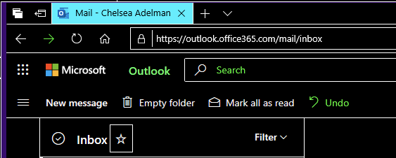
Something else I've noticed in default windows high contrast apps, the actionable command buttons in high-contrast are outlined in white to further help define that it's an action, in lieu of the subtly that is removed in high contrast. (for active buttons).
Example (sharepoint):
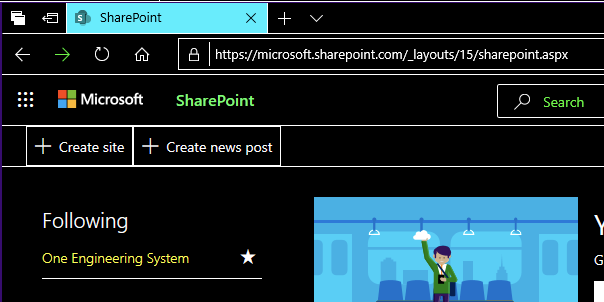
However, the new outlook online does not consistently do this:
 ichelsea
on 10 Jun 2019
ichelsea
on 10 Jun 2019
It seems to me the ActionButton OfficeFabric component does not support semantic styles yet for its disabled text color. I filed an issue here to validate this: https://github.com/OfficeDev/office-ui-fabric-react/issues/9418
If the button can use the disabledText semantic slot instead, then we'll just need to update OF once the fix is in. Otherwise we can look into workarounds on our end.
 karanbirsingh
on 12 Jun 2019
karanbirsingh
on 12 Jun 2019
@cheade I have a couple of questions:
- should we use #C285FF as the text color? or the background color?
- should the color be applied to all the buttons? That sounds like it'll need proper validation throughout the extension
 smoralesd
on 22 Jan 2020
smoralesd
on 22 Jan 2020
@smoralesd Hi! I'm back from my OOF, so apologies on the delayed response. In the case of the Pass all unmarked instances button, it's just the text that is visible as there is no defined border so we'd change the text to the purple color.
Any button that does have a defined background, the background color should change.
ichelsea
on 27 Jan 2020
Validated the fix in prod version 2.15.0
iamrafan
on 10 Mar 2020
Related issues
 LiLoDavis
·
6Comments
LiLoDavis
·
6Comments
 pshrmn
·
5Comments
LiLoDavis
·
7Comments
pshrmn
·
5Comments
LiLoDavis
·
7Comments
 waabid
·
4Comments
ferBonnin
·
5Comments
waabid
·
4Comments
ferBonnin
·
5Comments
Most helpful comment
Hi guys!
This purple should be in our high color contrast palette as a disabled color.
Something else I've noticed in default windows high contrast apps, the actionable command buttons in high-contrast are outlined in white to further help define that it's an action, in lieu of the subtly that is removed in high contrast. (for active buttons).

Example (sharepoint):
However, the new outlook online does not consistently do this:
